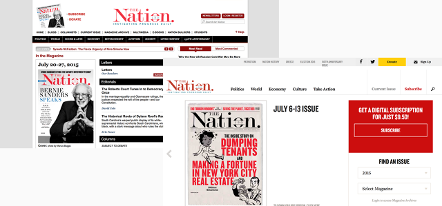
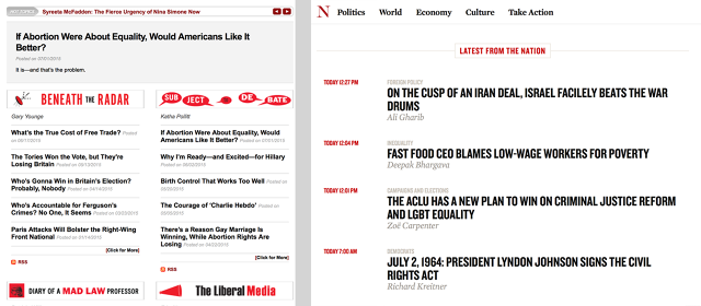
The Nation, America's oldest continuously published weekly magazine, is 150 years old today and up until last week, its website at TheNation.com looked at least that old. Now, the self-described "flagship of the left" is getting a redesign, courtesy of Blue State Digital, the guys behind Obama's 2008 and 2012 digital strategies. Gone is the circa-2005, tri-columned front page, chronologically streaming progressive and left-leaning political news at a rate of about 15 stories per day. In its place is something distinctly modern—a 21st-century digital publication that looks just as deliberately designed and laid-out as what goes to presses every week.
"For a long time, The Nation was a print magazine that also had a website," says Executive Editor Richard Kim in a phone interview. "Since 2010, though, we've really grown our online presence to around 90 stories a week, but the site's design never kept up with that. It looked like an afterthought."

According to Blue State Digital's executive creative director Matt Ipcar, there were a few problems the redesign had to solve. First and foremost, it had to be responsive and mobile-friendly: over 50% of TheNation.com's daily visitors were accessing the device on smartphones and tablets, which the site couldn't natively accommodate. Now it does.
It also needed to allow for editorial flexibility so The Nation's editors had choices in how to group content on the homepage. Consequently, the new design has two dozen modules, which editors can mix-and-match to turn the homepage into less of a chronological news stream and more of a living magazine page.
The biggest challenge was figuring out how to present stories in an engaging way, without necessarily relying on full-bleed images to liven things up. Ipcar points out that unlike many digital publications, The Nation doesn't always have art to accompany its content: it's a magazine just as likely to publish a piece with half a dozen big photos as it is a three-line haiku. That meant that the new website had to be typographically beautiful. As a nod to The Nation's print heritage, the redesign relies heavily on the Mercury typeface family by Hoefler & Co. for both story headlines and bodies. First created for Esquire and the New Times newspaper chains, the font was designed to take into account the way that different humidity levels could distort a typeface, depending on the environment in which it was printed, says Ipcar. It's not the same typeface The Nation's print mag uses (although that could soon follow) but it's still meant to evoke the feel of pages hot off the press.

Another important goal of the redesign was to lift The Nation's archive from obscurity. "If you look over our history, we've been quite prescient about writing about important issues before they've become part of the national consciousness," Kim says. "But one of the problems about being prescient is that by the time everyone else is talking about it, the content's no longer on your homepage." TheNation.com can now can easily group past coverage together in sidebar modules as a sort of dynamic primer on hot-button issues, embedded right in the text of a new article. "Our archive's no longer just this dead thing that only librarians are interested in. If we write an article about climate change, we can easily group past articles in a module, explaining to readers why they should care."
The redesign was relatively cheap. Kim declined to provide a specific figure, but says, "The Nation is a for-profit magazine that has run at a budget deficit for 148 out of 150 years. You better believe it was a shoestring." Ipcar pegged the budget as in the "very low six figures." (A typical redesign for a major media property may cost anywhere from $250,000 to $500,000.)
But Ipcar says his agency jumped at the chance to work on the project. (The fact that Kim tells me Ipcar's wife is a Nation writer probably didn't hurt either.) "The Nation just has so much history behind it," Ipcar says. "It's a magazine that started publishing 10 years before Custer's Last Stand, a publication that reviewed Gone With The Wind the week it was published. Given the alignment between what we stand for and what The Nation does, we jumped at the opportunity to work with them."