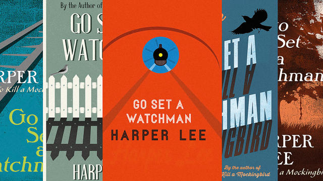
For a graphic designer, being asked to come up for a cover for Harper Lee's Go Set A Watchman (available this week) must have been like walking into a minefield.
Not only is the novel a long-delayed sequel to the beloved American classic, To Kill A Mockingbird, but its publication has been heavily criticized by some who say that of an aging, senile author who never meant for it to be published. And that's without taking into account that early reviews suggestGo Set A Watchman transforms the character of the beloved civil rights hero Atticus Finch into a card-carrying member of the Ku Klux Klan.

No wonder it took so many tries to get right. Penguin UK designer Glenn O'Neill shares with It's Nice That many of the rejected covers to the UK version of Go Set A Watchman—as well as the design process behind the one that made the cut.
Although he was not allowed access to the text of the novel coming up with his design, O'Neill explains why the parallels between the titles, themes, characters, and worlds of To Kill A Mockingbird and its sequel required a sort of dark symmetry in the cover's design:
It plays on the similarities in the wording of the two titles, Go Set A Watchman and To Kill A Mockingbird: the four words, each of a similar length, and of a similar rhythm. One title is a reflection of the other, both historically and typographically..
However, after much discussion, it was apparent that a further visual element was required, at first a mockingbird seemed too obvious in the weight of the previous book's history. But, after implementing many other symbols and illustrations, the bird silhouette began to re-emerge as the best solution. The mockingbird chosen gives animation to the cover, the way the tail points up between the words, the way the beak is open. It sits on a branch stripped of leaves, the back cover features leaves falling, Time has passed.
Although O'Neill's design only graces the cover of Go Set A Watchman in the UK, it's worth noting how different his cover is to the HarperCollins U.S. edition. The latter similarly tries to imply a symmetry with To Kill A Mockingbird, not just through typography but through stylistic choices and arrangement of the art. But as the gallery of rejected covers for Go Set A Watchman posted over at It's Nice That shows, such an approach was hardly self-evident: Many other covers focused more on a watchman's lamp as a nod to the title, or Scout grown up into a sophisticated woman, coming home.
You can see more of Penguin UK's rejected covers for Go Set A Watchman here.