Quantcast
Channel: Fast Company
Viewing all 2723 articles
Browse latest View live

Trump's Libertarian Rival Just Admitted To Stealing Designers' Work

$
0
0

The campaign of presidential candidate Gary Johnson lifted a Florida branding agency's web designs—but botched the execution.

He might not have much chance of winning, and he may not command the same attention in the news cycle, but there's another hopeful in the 2016 presidential election besides Hilary Clinton and Donald Trump: libertarian Gary Johnson, a socially liberal, fiscal conservative whose campaign rests on the idea that he can bridge the divide between the left and the right. Unfortunately, the branding of the Johnson campaign wasn't getting that idea across, so as a fun exercise, the Florida-based branding agency Spark decided to mock up an identity for him.

Then things got weird. Without crediting Spark or paying for the work, a contractor for the Johnson campaign stole Spark's brand identity wholesale. To add insult to injury, the contractor didn't even steal the work correctly. The execution was so bad, Spark felt obliged to publicly release a style guide to its own pilfered work, in the hopes that the Johnson campaign would start using it right.

In a statement to Co.Design, the Johnson campaign acknowledged the screw-up. "At the senior level of the campaign, we were completely unaware until receiving a media inquiry Saturday evening that our website contractor had seen and clearly used the concept and design ideas posted on the web by Spark," said Joe Hunter, communications director for the Johnson campaign. "Upon seeing the obvious connection, we immediately contacted Spark and have since had a very constructive conversation with them—hopefully with no hard feelings. It was never our intent to use anyone's creative work, spec or otherwise, without giving appropriate credit, and we regret that our contractor apparently failed to communicate our desire to use Spark's work. It won't happen again, and we look forward to continued conversations with Spark about putting their excellent work to good use in the campaign."

Between the time the Johnson campaign sent me that statement and I wrote this story, the official website for Gary Johnson has tweaked its design. For instance, it has a new color scheme. However, many other elements, including a two-color design and the use of fonts, remain identical.

Spark's spec work for the Johnson campaign began as a feature for the latest issue of the agency's regular publication, Stick Quarterly. The theme of the issue was "underdogs.""We noticed that Hillary and Trump are dominating the conversation," says Elliott Bedinghaus, Spark's vice president of creative, tells me in an interview. "Hillary, of course, has a very well-crafted brand. Trump, uh, not so much, but he's loud and gets attention. It got us wondering: What could a strong brand do for an underdog like Gary Johnson? Because in our view, he didn't have a brand, and was in desperate need of one."

Spark's spec identity for the Johnson campaign embraced the candidate's position as a middleman between the right and the left. The identity uses a background split between red and blue, with Gary Johnson's last name bridging the gap in purple. The "on" in Johnson is separated by the chromatic split from the rest of the word. Along with a short message from the candidate in white serving as a bold headline, Spark's identity quickly conveys to voters where Johnson stands on various political issues like border patrol, health care, abortion, and more. So, for example, an ad might literally read, "A big wall will only produce bigger ladders—Johnson on Border Patrol."

But that's not how the Johnson campaign is using it. As of noon yesterday, Johnson's campaign website had adopted Spark's red, white, blue, and purple motif— which has since been changed to yellow and blue—as well as Spark's choice of Hurme Geometric Sans for a typeface. But it ignored the central concept of the identity: that the way the red and blue split Johnson's name in half to show where Johnson stands on the issue. Spark thinks that a contractor for the Johnson campaign liked how it looked, but didn't actually get what made it work. This casual ineptitude finally prompted an exasperated Spark to put up a charmingly passive-aggressive website called "Hey Gary, Let's Talk," making all of their spec assets available for the Johnson campaign to download. If the designers were going to be ripped off, they wanted to at least be ripped off correctly.

Spark heard from the Johnson campaign after "Hey Gary, Let's Talk" launched. "They apologized for taking the work, and we're currently working with them to try to come to a solution," Bedinghaus says. "They've been humble, so it's been an amicable exchange." Bedinghaus says they don't want payment for the work—despite the exercise, their agency has no interest in getting involved in politics—just for that work to be acknowledged and executed properly. "What happened was surprising and upsetting to us, but our intent was to show that a brand can be a powerful force to create change, so by using it properly going forward on a national stage, we hope this will serve as a case study for our industry."

And hey, at least it was Johnson, not Trump who stole their ideas. "Based on the way he's managed other aspects of his campaign, and his history paying contractors, I think we can make some assumptions about how that dialog would have gone," Bedinghaus laughs.

[All Images: via Stick Quarterly]

Meet the man who designed Trump's vodka bottle of "envy and status"

18 Quintillion Planets, 0 Fun: My Day With The Year's Most-Anticipated Video Game

$
0
0

No Man's Sky is the most beautiful video game ever made. So why is it boring?

The windshield of my spaceship turns ember as I plummet through the atmosphere of another strange planet. As I drop through charcoal clouds, I see the blood red expanse of an iron rich planet below me. On the horizon are storm clouds of acid rain, and below me, I can see herds of vaguely stegosaurus-like creatures, lowing and munching on exotic flora. I have just dropped onto this planet—which I, childishly, christen Pooptopia—from a pyramid-like space station, above. I scan the planet for signs of intelligent life, and my ship's onboard computer tells me there's an alien artifact, a monolith, two minutes away. I set my course.

I am playing No Man's Sky, a new space exploration game (already available on PS4, and out today on Windows) by U.K.-based indie gaming studio Hello Games. It's perhaps the most hyped game in recent memory—Ars Technicadescribes it as a sort of "wish-fulfillment engine for everything potential players might want to project onto its massive galaxy." But for a wish-fulfillment engine—especially one with 18 quintillion planets to explore—there's actually not much to do in No Man's Sky. Like the universe it aims to simulate, it's pretty, but surprisingly vacuous: sporadic moments of wonder randomly distributed through an infinite expanse of nothing at all.

Back on Pooptopia, I arrive at the Monolith: a massive, glowing temple of basalt covered in strange runes. The architecture alone shows that an alien mind created this. In fact, in my explorations of No Man's Sky, I know that these monoliths were distributed throughout this random part of the galaxy by the mysterious Gek, and that by activating it, I will learn a few more words in the Gek language—and, if I'm lucky, how to rediscover an ancient artifact.

So far, I have learned a number of distressing words in the tongue of the ancient Gek, including "spawn,""destroy,""annihilation,""war," and "blood." It is a rather alarming vocabulary. As I touch the glowing monolith, I apparently have some sort of vision of a planetary massacre, and learn a new Gek word: "slaughter." Fucking great. None of this bodes well, because right now, literally the only sentient species I've found in the galaxy are Gek. True, they've all been roly-poly lizards in space helmets wearing quite-frankly amazing jumpsuits. Still, clearly there is a darker side to this species, making me wonder when one of my transactions with them will go awry, leading a previously cuddly Gek to split my entrails open with its sharp beak like a turtle eating a strawberry.

I'm getting bored of planet Pooptopia, a barren hellscape with radioactive weather, so I jump back into my spaceship and point its nose at the sky. Soon, I'm back in the asteroid field around the planet, looking for another planet to explore. I aim my ship at the nearby planet, Erinogobuz-Siy VW993, which I resist renaming Pooptopia-2. As I begin entering the atmosphere, though, my ship starts beeping. I have apparently been scanned by some incoming ships. I don't quite realize they're space pirates until they come swooping in under my ship, blasting away. There are four of them, and between them, they quickly pin me down and blast me to smithereens. I've only figured out how to lead my shots before I evaporate in a molten shrapnel storm over Erinogobuz-Siy VW993, while my screen fades to black.

It's in these moments of unexpectedness that No Man's Sky is at its best. But far from creating a teeming universe full of wonder, I can't get over the fact that there's a semblance of sameness to almost everything I'm experiencing. The central allure of No Man's Sky is that the game contains a vast, procedurally generated galaxy. The developers claim there are so many planets in No Man's Sky, that if you visited one planet every second, our own sun would burn out before you saw them all. They also claim that there are over 10 million unique species in No Man's Sky, "more than there are on Earth." (Although this is a gross exaggeration).


Yet, the truth is that in the 10 hours or so I played No Man's Sky, most of this so-called scope remained hidden from me. Instead, what I felt was an overwhelming sense of homogeneousness. Perhaps this is realistic: An infinite universe might still only ever have a finite supply of wonder within it. Armed with a ticket to ride a faster-than-light starship, perhaps the natural result of touring the galaxy is a sort of existential ennui, as you realize that, actually, most gas giants, asteroid belts, and red dwarfs actually start looking the same, when they are trivially within reach. Maybe the same is true with 10 million alien species, and even galaxy-spanning civilizations too?

I think, though, I could deal with that more than the feeling that there's not much to No Man's Sky besides 18 quintillion planets. It would be one thing if the game just presented me with a simulation of a breathtaking universe to explore, but it doesn't. This is still, ostensibly, a game, so it's filled with all sorts of artificial barriers to overcome, none of which are very fun. I can't just jump in my starship to go see anything I want. First, I have to build a warp drive, which requires me to zap a bunch of space rocks for an hour or until I have the proper materials. Even when I build my warp drive, though, it can only jump one star system away; to go any farther, I need to blast more space rocks for a few hours, to upgrade the drive. Then I need to blast space rocks for the warp cells to fuel that drive. It turns out that in No Man's Sky, exploring the cosmos is just a momentary interlude to busting up rocks in an extraterrestrial chain gang.

Ten hours is, of course, only enough time to scratch the surface of a game like No Man's Sky. But perhaps what makes the game seem disappointing is that it feels like there isn't actually much beneath that surface. No Man's Sky feels wide, but not deep. As a universe sim, it's perhaps a little too accurate, because in No Man's Sky, just like in reality, most of the universe is actually pretty similar, and traveling far enough to see something truly unique is a huge pain in the butt.

[All Images: via Hello Games]

Meet The Man Who Designed The Iconic Font In "Stranger Things''

$
0
0

"I just wanted to make a buck!"

From the moment the credits of breakout Netflix show Stranger Things start, they transport you to the '80s. Creative studio Imaginary Forces accomplished that largely through Benguiat, a decorative serif typeface that screams '80s mostly because of its associations: the covers of Stephen King paperbacks and Choose Your Own Adventure novels, the copyright notice on old VHS tapes, and the covers of old Smiths albums, to name just a few of the cultural artifacts it has been tied to over the years. It's homey, langorous, and yet a little fancy.

[Photo: via FontShop]

Type designer Ed Benguiat created ITC Benguiat (pronounced Ben-gat) in 1978 for the International Typeface Corporation. You might not know his name, but you know his work. Over the course of a nearly 70-year career, Benguiat has designed or redesigned the logos for Esquire, Playboy, the New York Times, Sports Illustrated, and more. He's also active in the film industry: He designed the logo for Planet of the Apes, Superfly, and Twin Peaks. All told, he's designed more than 600 typefaces.

Now 89, Benguiat tells me by phone that he never set out to create a typeface that encapsulated a certain period of time, the way his eponymous font seems to be viewed. His goals in designing ITC Benguiat were simple. "I just wanted to make a buck!" he says. "That's the reason I did all of those fonts for ITC." When he designed ITC Benguiat, he set out to design something "like Times New Roman or Bodoni—a pretty, readable font" that could be used in a lot of different contexts, and consequently, generate plenty of money in commissions and licensing fees. "Some people describe it as having an art nouveau look, but I never thought of it that way," he says. "I just wanted people to use it as much as possible."

By any standard, Benguiat accomplished what he set out to do. As the 1980s started, something about ITC Benguiat spoke to people. It smacked of the quaintness of Americana, of adventure in small rural towns, of Reaganism and the Cold War. That's probably why people seem to so strongly associate it with Stephen King. A bespoke, hand-modified version of ITC Benguiat was used on several Stephen King covers through the '80s, sometimes more heavily modified than others (compare the cover Carrie to Pet Sematary, where King's name is much more compressed). "Stephen King and I were friendly for a while," says Benguiat. "His publisher based all their type on Benguiat, just changed the serifs, made it more Latin-looking." So while not always identical, both typefaces share the same creative DNA (like Stephen King and his alter ego, Richard Bachman).

[Photo: Flickr user Chris Drumm]

"It wasn't hard for a typeface to take off back then," Benguiat says. "I mean, these days, there are millions of typefaces. You can just download them. Back then, companies might have access to just 10 or 15." He says that when the ITC sent out a brochure with a new typeface, he almost always saw it for months or even years afterward. "It's always been popular," he says. "You can use it in a film title, a book cover, or on the sign of a small-town pizza shop. It's really easy to use. It works everywhere."

Even so, he says ITC Benguiat was uniquely successful. "Stranger Things has really made Benguiat into a big deal again," he admits. Stories about the typography of the credit sequence are everywhere now. "Now everyone's using it. I think I just saw it on a loaf of pumpernickel bread. It makes me proud." As for Stranger Things: While Benguiat says he has yet to watch the show, he likes how his typeface was used in the credits. "They paired it with Avant Garde, which was designed by my old ITC partner, Herb Lubalin," he notes. "Herb named Benguiat after me, so it's like old times. We're back in the driver's seat together again!"

Ikea's 2017 Catalog Is A Terrifying Glimpse Into The Tiny Apartments Of The Future

$
0
0

Time to move to Alaska, kids. The cities are officially full.

Micro apartments. They're all the rage, mostly because they're all that the majority of metropolis-living millennials can actually afford. But the jury is still out on whether micro apartments are going to be the utopian cure to cities' housing shortages . . . or just another step toward a crowded Earth dystopia where we're all packed together like pink, gill-less krill.

My feelings on micro apartments after checking out Ikea's 2017 furniture catalog, which was released yesterday? Dystopia, all the way down.

The Swedish furniture giant—which has been predicting that millions more people will be living in micro apartments by 2020—has made smaller and smarter living the theme of its annual catalog. But even Ikea couldn't make living in a pallet-sized studio for half your salary look anything less than comically nightmarish, like outtakes left on the cutting-room floor from Woody Allen's Sleeper. Here is the eight most terrifying micro-apartment designs from the new catalog.

[Photo: Ikea]

"Table for one, please"

"It's strange that eating alone gets a bad rap, because it's something many of us really enjoy," asserts Ikea. So why not do it in style, on one of its Ingatorp expandable tables, as opposed to crouched over your bathroom sink, eating greasy fried chicken like some kind of micro-apartment-dwelling Mogwai? After all, Ikea says, "[this is] a place you you can share a meal with quiet and entertaining companions, like a magazine . . . or a favorite TV show." Because God knows you can't squeeze anything as tangible as a friend into the $4,000-a-month studio-cum-sarcophagus you rent.

[Photo: Ikea]

"Share a meal—anywhere"

In the 2017 catalog, Ikea spends a lot of time trying to convince people that not being able to fit a table into their apartment is all the rage. Here, after saying that a "meal with friends or family doesn't have to happen around a perfectly set table . . . [or] even include chairs," the company suggests eating your food off the floor like a dog . . . as long as it's from a 99¢ Oftast bowl, that is!

[Photo: Ikea]

"A kitchen that moves with you"

Remember the hot plate you weren't supposed to keep in your dorm room? Ikea has built a $170 kitchen around it. Seemingly aimed at the man-bunned micro-apartment dweller who would rather have a room full of cubbies for denim than a functional cooking space, there's nothing you can't cook here, as long as it comes from the recipe files of the original celebrity chef himself, Hector Boiardi. Everything's been thought of, from the spacious fridge with room enough to keep a ramekin of cold milk, to the ample cupboards, which can fit both a bottle of soy sauce and two packets of instant ramen . . . with room for a disposable set of chopsticks to spare!

[Photo: Ikea]

"The 24-hour life of a sleeper sofa"

"As many migrate to cities, smaller spaces have become the new dream home," asserts Ikea. And what a dream! An apartment literally taller than it is wide, with walls made of concrete blocks like a prison, only painted gray to be even more depressing. Note that the $599 Holmsund sleeper sofa, when fully extended, is literally the same width as the apartment; Ikea also touts a single chair hanging near the ceiling as "wall decor," because there isn't any space for it. Wacky! Nevertheless, Ikea insists this apartment leaves you "plenty of room for a refined, urban tea party with friends. Pinky fingers up!" And right into your guest's nostrils.

[Photo: Ikea]

"Climbing and cuddling"

"Precious moments with our kids are the memories that stay with us," Ikea lyrically waxes. "But in the everyday, it can be hard to find time for those moments. So we came up with an unconventional fix." And trust me, your kids are going to love it! It's called: "Don't give your kids their own bedroom! Install a bunk bed in the living room instead!" Why would a child on the verge of pubescence need privacy anyway?

[Photo: Ikea]

"No little sisters allowed"

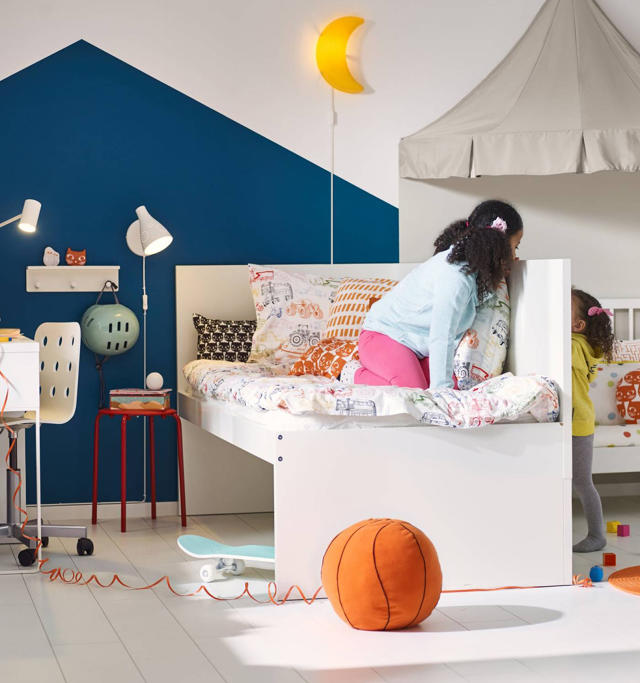
For the spacious micro apartment with a wall space to cram the kids into, Ikea recommends the $189 Flaxa twin bed frame and sideboard, which also operates as a half-hearted room divider. Because if your little ingrate kids wanted privacy so bad, one of them should have absorbed the other in the fucking womb.

[Photo: Ikea]

"More space for pampering"

"When a small, shared space stands in the way of getting a dream bathroom, it's time to think outside the box—literally," Ikea says. "With a bit of imagination, you can extend the bathroom beyond its walls to create an indulgent and roomy getting-ready space for all?" For example, by using a $39.99 Vittsjö table, and a $24.99 Råksog stool, as a vanity? After all, why shouldn't your bathroom just slop into your bedroom, like a sausage exploding from the end of its casing? And who says you can't put a toilet next to your bed, anyway? Not Ikea!

[credit][Photo: Ikea][/url]

"Date-worthy dining for two"

Here's a micro apartment for you baby boomers. This is the way Ikea describes it: "When the kids have grown up and moved out, it's a chance to reconnect—and reinvent how you spend time together." Because isn't that just how you envisioned your life with your partner after retirement? Sitting on a stack of drawers in front of $79 Tunholmen patio table, because you only own one $59 Janinge chair between the pair of you? In a make-shift dining nook located just inches from your couch, with a greasy paper takeout bag on the floor, no less? Still, what else can you expect? Considering you'll need to save at least $2.25 million each to retire in New York, on top of the roughly $200,000 it'll cost to get each of your kids through undergrad, you might as well retire into an apartment roughly the same size as the coffin you'll be buried in. You literally can't afford anything else.

Do you have a microapartment horror story? We want to hear about it! Email us: CoDTips@fastcompany.com.

Related Video: Micro-apartments Are Coming to the U.S... Are You Moving In?

North Korea's Answer To Missed Construction Deadlines? Crystal Meth

$
0
0

According to Radio Free Asia, project managers in Pyongyang are giving overworked builders ice to help meet deadlines.

In the United States, doing crystal meth on the job will get you fired. In North Korea? It's just part of the job, especially if you're in the construction trade, where project managers in Pyongyang are reportedly encouraging employees to catch a bad case of meth mouth, as long as it results in high-rises going up more quickly. Radio Free Asia reports (via Archinect) that project managers at a large building site in the North Korean capital are "openly supplying their exhausted workforce with power methamphetamines called 'ice.'"

Radio Free Asia's report is anonymously sourced, so should be taken with a grain of salt. But as Breaking Bad fans will know, "ice" is a highly purified form of crystal meth. Why would you give construction workers meth? Side effects include hyperactivity and increased movement, so theoretically, if you could keep it to that alone, workers on meth might be able to finish their work faster. Unfortunately, other side effects include diarrhea, blurred vision, and dizziness—not exactly symptoms you want to encourage when your workers are going to be walking the girders of 70-story-tall apartment complexes.

[Photo: shuige/Getty Images]

Apparently, though, this was a trade-off that Pyongyang project managers were willing to make. At stake is the on-time construction of Ryomyung Street, sometimes called Pyonghattan, a massive initiative by the North Korean government to open up to 60 new buildings as a symbolic rebuke to international sanctions relating to the regime's ongoing nuclear weapon tests. Although "hundreds of thousands of workers" have allegedly been brought in to complete the initiative, it looks as if officials will be hard-pressed to finish the work before the cold season starts later this year.

According to Radio Free Asia, the North Korean government is now aware of the use of methamphetamines at its construction sites. "Investigators are warning construction workers that they will be severely punished for further incidents of this kind," RFA's anonymous source told them.

It Was Only A Matter Of Time: This Neural Net Dreams Up New Pokémon

$
0
0

And it reveals how well-designed the original monsters were.

Neural networks and Pokémon Go. It was only a matter of time before some computer scientist realized this was a chocolate-and-peanut butter combination and programmed a convolution neural network like Google's Deep Dream on Pokémon Go's dataset of 151 cute, collectible monsters. Now we have it, courtesy of a Japanese researcher known as Bohemia highlighted today by Prosthetic Knowledge.

What you get from the results are abstract impressions of Pokémon. The sense of a Snorlax. The premonition of a Pikachu. The hunch of a Horsea. The notion of a Nidorino. The alliterative of an Alakazam. These blurry Pokémon blobs end up looking like pocket monsters that have viewed through the gene-slimed porthole by Professor Oak after being put through the telepods together. They're less new Pokémon than chromatic smears of the mashed-up attributes of existing Pokémon.

To me, what's fascinating about the exercise is that it really shows just how well-designed the original 151 Pokémon were. Even when a neural network is hallucinating them, the core traits of various Pokémon usually come through. This is actually by necessity. The original 151 Pokémon, which is what Pokémon Go uses, were originally designed in the mid-'90s so that they would appear distinct when viewed on the original Nintendo Game Boy's 160x144 resolution screen. So to be successful, a Pokémon needed to have its own distinct silhouette, and ideally one distinct highlighting feature—like the big spiral Poliwhirl has on his stomach—in addition to the colors that would never be seen on a Game Boy's screen (but would be seen in cartoons and merchandise).

It's a credit to how successful these designs were that even when a neural network is mashing them up, you can look at the results and say, "That's, like, 70% a Pikachu, and 25% a Bulbasaur, and 5% a Magikarp." In fact, that sounds like a pretty fun game variant of Pokémon in its own right.

Is Open-Sourced Design Any Good? Mozilla Is Finding Out

$
0
0

Check out the seven finalists in the company's completely transparent search for a new identity.

Mozilla, the company behind the third-most popular web browser Firefox, is a nonprofit organization with a mission of promoting freedom, transparency, and collaboration on the Internet. So when Mozilla decided two months ago to design a new identity for itself, it did so in a very Mozillan way: it opened the design process up to its 30,000-developer strong community, asking for feedback on every step of the process.

Now, in collaboration with outside agency Johnson Banks, which is overseeing the design process in response to feedback from the community, the earliest designs are in. This week, Mozilla has published draft versions of several new possible identities, each one based off of a different theme, ranging from the Godzilla-inspired origins of Mozilla's name, the tribal nature of the company's supporters, the open ideal of Mozilla software, and more. And some of them aren't half bad.

The Eye
Perhaps the logo most clearly tied into Mozilla's heritage—Mozilla's earliest logo was a Tyrannosaurus head—The Eye puts the dilating pupil of a thunder lizard right in the middle of the company's name. According to Mozilla's creative director Tim Murray, Mozilla envisions The Eye as working well in animated form, and being symbolic not of surveillance, but the idea that Mozilla has its eye open for the best interests of its users.

Tribal
An attempt to evoke the tribal-like qualities of Mozilla's developer community, the Tribal identity uses colorful, textile-like patterns to not only spell out the company's name, but also evoke the feeling of a circuit board diagram.

Open Button
An identity based upon the open button of an elevator door, the meaning of this logo isn't obscure. It's a direct callout to Mozilla's mission to help create a freer, more open Internet. Murray says one of the reasons he likes this identity is because it uses a symbol that everyone is familiar with—but which, surprisingly, hasn't been used in any corporate branding so far.

Protocol
The safe, geeky logo, Murray says the point of this identity is "to show that Mozilla is indivisible from the Internet" by associating it with the http:// protocol field that precedes every web address—albeit, admits Murray, at the possible expense of getting across Mozilla's warmth as a nonprofit.

Wireframe World
This identity, which reduces the Mozilla logo to a wireframe M, looks like a sticker Mr. Robot might slap on the back of his laptop, or a sign at MIT Media Lab. Murray says that it's supposed to represent the interconnectedness of Mozilla, and the world wide web as a whole.

The Impossible M
An Escher-esque design that conveys the "M" in Mozilla as an impossible shape, like a devil's tuning fork or a penrose triangle. Murray says it's meant to represent the designer side of the Mozilla community.

Flik-Flak
Mozilla's most colorful and playful potential identity, Flik-Flak uses a folding origami logo to get across Mozilla's appeal to open-source makers and DIYers.

Now that Mozilla has made these seven draft identities public, the organization will begin to collect feedback from the community. "We want to know a few things," says Murray. "We view Mozilla as gutsy, optimistic, buoyant, and existing for good, so first: which identities fit that criteria? But we also want to know which identities our users feel will be most scalable, which will resonate most strongly, and which will stand the test of time?"

Once that feedback is collected, Murray says Mozilla and Johnson Banks will concentrate on further fleshing out up to three of the most popular identities, before officially announcing Mozilla's new logo in September. People who want to contribute to the feedback process can do so here. Not to unduly influence things, but hey, everyone go speak out against Protocol and Open Button, stat! Because seriously, man: woof.

[All Images: courtesy Mozilla]

7 Wearable Breakthroughs To Watch For In Rio

$
0
0

Keep your eyes peeled for these innovative items.

As of writing, the United States has won 84 medals at the 2016 Summer Olympics in Rio, almost twice as many as any other country competing this year, and the most gold medals Team USA has ever won at a single Olympic Games. Most of the credit for this incredible record undeniably goes to the athletes. But America also has a technological and design edge when it comes to the Games: Our athletes tend to have the best and most innovative gear first.

You might miss some of these details while you're watching from the couch, so here's what to look for during the remaining days of competition, which wraps up next weekend.

Nike AeroSwift and AeroBlades

[Photo: Nike]

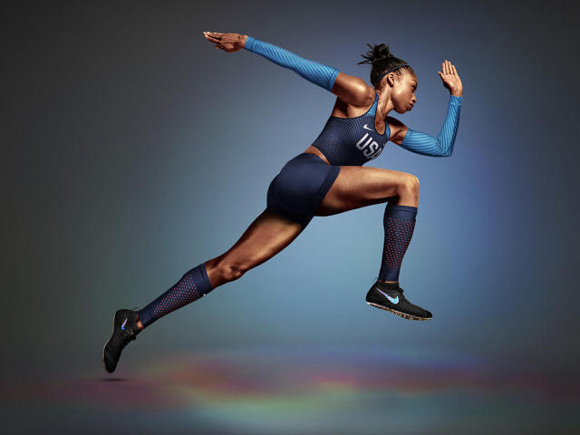
Usually, athletes try to get faster by getting sleeker, wearing tight-fitting uniforms or shaving their hair to cut down on wind resistance. As part of Rio 2016, though, Nike's taking the opposite approach. The company created AeroBlades: little patches made up of tiny hooks or spikes that runners can wear either as leg or arm sleeves, or as a Nicoderm-like patch they can stick to their skin. The AeroBlades subtly influence the way air moves over an athlete's body to essentially give them their own natural jet streams, pretty much the same way fins on a fast car or airplane work. It's an effective bit of gear that has helped some of the runners on America's track and field team win 11 medals so far, including four-time Olympic champion Allyson Felix.

Hykso Punching Sensors

[Photo: Hykso]

Data tracking is a big part of not just Olympic competition, but Olympic training. In the field of boxing, the newest wearable is the Hykso: a Y Combinator-funded sensor developed specifically for boxers. The Hykso—used by the U.S. and Canadian boxing teams—can tell what kind of punch a fighter is throwing, as well as measure their intensity and velocity. In sparring sessions, fighters are able to go to town on each other—then look at the statistical data afterward to get a better sense of their own (and their opponents') weaknesses. So far, the Hykso punching sensor has helped the U.S. win the bronze in boxing. Amateur pugilists can preorder a pair here.

Speedo LZR Fastskin Suits

[Photo: Speedo]

Ever since the international governing body banned"high-tech swimsuits" (that cover the entire body in non-permeable, highly compressive polyurethane) from the sport, Speedo has essentially had to make its LZR line of suits less effective than they were when they completely upended competitive swimming seven years ago. These advantages were seen as a form of "tech doping" by some commentators, and new rules dictate how much of a swimmer's body a swimsuit can cover and that it be made of permeable materials.

Nevertheless, Speedo continues to innovate with its LZR series, outfitting teams from not just the U.S., but Australia, China, Spain, Japan, Canada, and Israel, at Rio 2016 with two new suits: the Fastskin LZR Racer X and Fastskin LZR Racer 2. Both suits compress a swimmer's body to make them more hydrodynamic, resulting in faster speeds. This tech comes at the expense of convenience: Speedo says it can take a swimmer up to 10 minutes to get into one of the Fastskin suits. The Fastskins were designed based upon data from 330 elite swimmers, including Ryan Lochte, to make them more comfortable to wear. The theory goes that the more natural an athlete feels, the better their performance ought to be in the water. Sadly the swimming events are now over, but tech seems to have worked: American swimmers won 33 medals this year.

Nike Wing

[Photo: Nike]

In appearance, the Nike Wing sunglasses look like a hologram folded around the face; an early Lawnmower Man-era experiment in CGI, turned into a fashion statement. The Wing's single-piece, hingeless design, though, serves a purpose. It helps reduce drag for members of the U.S. Olympics track team, while also weighing four grams less than traditional eyewear. Useful for a runner in Rio's blinding sun, but if you're not a member of the U.S. track team, these shades will cost you a staggering $12,000 a pair.

Solos AR Cycling Glasses

[Photo: Solos]

A set of smart cycling glasses with a built-in HUD micro-display, the Solos AR Cycling Glasses have been used by the U.S. Cycling Team during training to let them know their speed, heart rate, power (in watts), and cadence (in rotations per minute), according to USA Today. The glasses can connect via Bluetooth to a cyclist's bike computer or their iPhone to provide further data analysis, and feature dual microphones and speakers so the cyclists can stay in touch with their coaches and be heard over the rush of the peloton. This is one of the few tech innovations on this list you can order for yourself, too.

Nike Zoom Superfly Shoes

[Photo: Nike]

Most of Nike's shoes at Rio 2016 aren't that different from the ones sold in stores, but there's one notable exception. Nike's premier shoe of the Rio 2016 Olympics is the Zoom Superfly. The upper part of the shoe is Flyweave, which is, of course, an old Nike staple—but that's not the interesting part. Rather, it's the spike plate on the bottom of the shoe that makes the Zoom Superflys innovative. Thanks to an algorithmically generated honeycomb pattern that maximizes strength while minimizing the amount of material needed, the spike plate on the bottom of these shoes is four times stiffer than normal, yet still weighs less than previous spike plates. The result? Sprinters get a better grip on the track as they run, without compromising on the weight of their shoe.

Whoop Strap

[Photo: Whoop]

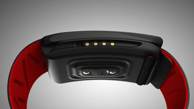
Remember Whoop, the wearable fitness tracker for elite athletes worn by LeBron James we wrote about earlier this year? U.S. swimmer Ryan Lochte (otherwise known as Pizzerina Sbarro's sex idiot from 30 Rock) is also boasting a Whoop at this year's Olympic Games. Unlike most fitness bands, which mostly track movement, the Whoop can measure everything from how much athletes have strained themselves during a session, to how they'll perform next day, thanks to advanced sensors that provide an EKG-like level of detail. The Whoop also allows athletes to measure their fitness more accurately than other wearables, because an innovative removable battery solution means it never needs to be taken off to recharge.


There's A Nosulus Rift And Guess What It Lets You Smell?

$
0
0

FARTS!!!!!!

Virtual reality has already mastered sight and touch, two of the five senses. Now, video game maker Ubisoft is trying to bring a third sense into the virtual world—the sense of smell. Probably not in a form you're keen to try, though.

The Next Webreports that as an accessory to its upcoming South Park game, South Park: The Fractured But Whole, which features farting as a gameplay element, Ubisoft has created the Nosulus Rift—a device which will give you the eye-watering experience of smelling the game's farts in real-life.

Forgive the pun, but there's just so much to unpack here.

My first question was how exactly this technology is supposed to work. Does the mask burst open little stink bomb micro-capsules according to signals sent by the game? Or does it use the odiferousness of the average South Park fan against him—a gas mask attached to a giant rubber diaper that directly pipes the smell of a player's escaping flatulence into his or her own nostrils? According to the first cosmic rule of farts, this mechanism would make a lot of sense—he who smelt it usually dealt it. But who would buy such a device?

As it turns out, no one. Ubisoft apparently recognizes that the Nosulus Rift has limited consumer appeal, and so the headset will instead go on tour. Gamers will be able to try it for themselves at this month's Gamescom, the second biggest gaming event in the world.

Have you ever been to Gamescom? I have. But before I get to that, let me tell you a story. Because I want to put this all in perspective for you.

Once, several years ago, I farted the worst fart I ever farted. I wasn't sick or anything, but my involuntary expulsion was so reek and pungent that it caused my wife, who is blessed with a powerful sniff machine, to immediately—immediately, as in the amount of time it takes for a light bulb to illuminate a dark room—throw up. Later, in describing the smell, she compared it to the stench of a forgotten chicken parmesan sub that her college boyfriend had once accidentally left in her microwave for six months, at the moment when she finally flung open the door to discover it in horror.

This, I assure you, is what Gamescom smells like. And let me tell you something. If I were at Gamescom, I would happily put on Ubisoft's South Park-branded fart gas mask. Because compared to the stench of 183,000 gamers tightly packed into an ill-ventilated convention hall, a mouthful of Cartman's virtual ass biscuits would be a literal breath of fresh air.

Fast Company's senior design reporter, everyone! Good night!

[All Images: via UbiSoft]

Brainstorm Better With This Simple Card Game, From Obama's Campaign Designers

$
0
0

Cards Against Humanity for brainstorming is here.

Brainstorming is dumb. Oh, sure, it sounds good: an open forum for ideas to bounce off one another in a democratic group sesh where everyone's views and opinions are considered equally. In reality, though, the best ideas lose out to the loudest ideas put forward by the most popular group members, like that well-coiffed son-of-a-bitch Chad with his incessant chants of "Pizza Car!"

An alternative to brainstorming? Brainwriting, a technique where you put all ideas on the same footing by taking a complaint box approach to ideation. Instead of a big group of people brainstorming together on a big whiteboard, individual ideas are anonymously scribbled down on individual cards, instead of being shouted out in real-time. Then, everyone calmly reads the ideas aloud, and discusses them rationally as a group. It's a proven technique that has been shown to generate 20% more ideas and 42% more original ideas as compared to traditional brainstorming.

Now on Kickstarter, the Brainstorm Deck is a new product by Chicago design firm Simple Honest Work (the firm behind Obama's 2008 campaign design and creator of The Brand Deck). Despite its title, the Brainstorm Deck aims to make it easier to field brainwriting sessions. The Brainstorm Deck is a pad of about 100 individual cards, each of which contains a field for a description of the idea, and a drawing that visualizes it. They will also contain helpful cues to help brainwriters think out of the box—for example, "Think big like Claes Oldenburg!" would encourage brainstormers to think about their idea with a different sense of scale.

After all the cards have been filled out by a group, it's time to discuss them, which the Brainstorm Deck encourages through a Cards Against Humanity-like game. In the first round, ideas are explained, and the group either puts them in a pass or fail column. Then, the votes that pass go through a second round of voting, where each player can vote for their favorite cards with a "Love It" card that, ultimately, will serve as a scoring tally for the ideas the group decides to go forward with.

It's a simple idea, one that mainly just gives some structure to what would normally be done on Post-it pads. Thanks to the game aspect, though, the Brainstorm Deck hopes to pull in neonate brainwriters, who might otherwise be skeptical that moving away from the ubiquitous conference room whiteboard is a good idea. You can preorder a Brainstorm Deck on Kickstarter now starting at $20.

Related Video: Are you a good brainstormer?

Why Architects Design Chairs

$
0
0

Working at a small scale has some surprising benefits.

Eero Saarinen, Zaha Hadid, Norman Foster, Thomas Heatherwick, Walter Gropius, Shigeru Ban, Rem Koolhaas, Frank Gehry: If it seems like every architect of note has also designed a chair, it's because that's pretty much true. Why? In her new book Chairs by Architects (Thames & Hudson), art historian Agata Toromanoff says that chairs afford architects an opportunity to distill their techniques, innovations, and style into a new medium. Importantly, they also serve as a rite of passage.

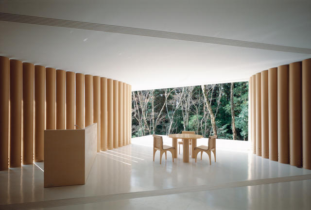
Shigeru Ban Paper House, Yamanashi, Japan 1995Photo: Hiroyuki Hirai/© courtesy of Shigeru Ban Architects

Chairs by Architects is filled with dozens of examples of chairs laid out side-by-side with pictures of their designers' most iconic buildings. Viewed this way, it's easy to see how a designer's personal style makes the leap from architecture to industrial design. Alvar Aalto's No. 41 lounge chair, for example, was designed for a tuberculosis asylum, so it was made to function in a clean, clinical aesthetic much like the buildings he designed. Richard Meier's Armchair 810, originally designed in 1978 for Knoll, is just as informed by the Modernist vocabulary of proportion, scale, and geometry as the Ara Pacis Museum, which he designed in 2006. The Washington Skeleton and Washington Skin chairs, designed by David Adjaye in 2013, are cantilevered in such a way that they look like they defy gravity, every bit as much as the Skolkovo School of Management he designed in Moscow in 2010. "Designing a chair presents the opportunity to express my position — it is like a testing ground for ideas that interest me, " Adjaye told Toromanoff.

"One of my favorite chairs in the book is the Kuki Chair by Zaha Hadid," Toromanoff says. A limited-edition chair developed in collaboration with Sawaya & Moroni back in 2013, Toromanoff cites it as an example of how an architect's style gets distilled down into his or her chairs. The Kuki Chair is made up of cylindrical sheets of plastic, folded together to resemble a navy blue fortune cookie. As much as any of Hadid's building designs, like her proposed Japanese National Stadium or the City of Dreams Hotel Tower in Macau, it shows the architects obsession with creating unusual facades by folding, crumpling, and bending.

Mario Botta Quarta Chair, 1984. Photo: Aldo Ballo/© courtesy Mario Botta

One might assume that chairs provide an easy way for architects to explore a new technique before using it at the architectural scale. That's not why so many architects design chairs, though, Toromanoff says: "Almost everyone I spoke to says that a chair is a way of demonstrating an architect's credentials as a designer to a wider audience." In fact, some architects become more famous for their chairs than their buildings: Charles and Ray Eames, for example. Architects turn to chairs, Tormanoff says, because people can have a more intimate relationship with them than they can with one of their buildings. What, after all, is a chair but a dedicated building for your butt?

[All Photos: courtesy Thames & Hudson]

How Kickstarter Is Tackling Its Vaporware Problem With UI

$
0
0

A new feature puts proof front and center that a campaign has a functional prototype.

"There's absolutely no question that the health of the Kickstarter platform is founded on trust and transparency," says CEO Yancey Strickler.

Without that trust—specifically, the trust that the service provides a modicum of protection preventing scammers from bilking crowdfunders—there'd be no Kickstarter at all. Yet high-profile hardware failures, like the infamous Zano drone and the nonfunctional Scribble Pen, have piled up. Now, Kickstarter is making some changes to its platform and UI to help ensure would-be funders that a hot new piece of hardware isn't too good to be true.

It's called the Prototype Gallery, a new slide-show panel located at the top of hardware Kickstarters, right below the pitch video. It's not flashy, but the gallery gives Kickstarter creators a standardized, high-profile locale to present their backers photographic evidence that the project they are funding is where it says it is in the design process. It's split up between four different phases: proof of concept (explorations that test ideas and functionality), functional prototype (a prototype that proves the final product will work), appearance prototype (a nonfunctional device that shows off the finished product's industrial design), and design prototype (a prototype that matches the function and appearance of the final product, but is made in a different way—i.e., not mass-produced).

Kickstarter's rules have always required hardware projects to have a functional prototype before their projects were approved. But in practice, that rule was academic. "It's not like we ask creators to physically mail us their prototypes to check out," says Strickler, who says Kickstarter's review team looks for evidence in the video to make sure a new hardware project isn't a scam. But even if a hardware creator does have a functional prototype, that's still not the biggest challenge getting to market. There's simply no shortage of Kickstarters that have failed because creators underestimated the difficulty of getting a product to market—past the initial prototype phase.

Strickler hopes the new Prototype Gallery will help solve these problems in a couple of concrete ways. First of all, it provides guidance to creators of the kind of milestones they need to hit to get a product to market, and the kind of updates they should be giving their backers as they go along.

But it also makes proof of prototype highly visible on Kickstarter hardware pages, in a way they weren't before. Strickler says that up until now, the only requirement on creators to show off their prototypes was that they put that proof somewhere in their video. That meant creators, who were further behind on their path to market than their marketing might have suggested, could bury a glimpse of their wonky prototype in a random part of their video. With the Prototype Gallery, backers will be able to see at a glance which hardware products are transparent about their prototypes, and which ones aren't. A campaign without a prototype gallery will automatically seem suspicious.

Debuting today in beta on a handful of opt-in Kickstarters, Strickler tells me he's not sure if the Prototype Gallery will be a mandatory part of the Kickstarter template for hardware projects going forward. "We want to see how people start using it first before we decide if we require it from everyone," he says. That's because the Prototype Gallery alone isn't a universal cure to Kickstarters going off the rails. Working prototypes are just one part of a successful Kickstarter, which still require a lot of invisible skills—like supply chain management, budgeting experience, and manufacturing—to get off the ground.

So the absence of a well-curated prototype gallery will only be a tip-off to the most obvious Kickstarter vaporware. You'll still need to trust that creators can deliver what they promise. Even so, the Prototype Gallery should provide some level of assurance for those wary of being burned on Kickstarter vaporware. Why not be transparent about your prototypes—unless you have something to hide?

[Cover Photo: peangdao/iStock]

The Easiest Way To Pilot Your Smart Home? Try A Button.

$
0
0

Logitech's cute, easily programmed buttons offer a vastly simplified way to control your burgeoning network of smart appliances.

The Internet of Things is a confusing place. You may have several smart products in your home, like a Wi-Fi-connected fridge, a Bluetooth-enabled air conditioner, a pair of Sonos speakers, and a Philips Hue lightbulb in your lamp. But how do you control them all? The smartphone has been the traditional answer to that, the universal remote for the Internet of Things. But here comes Logitech, with another idea: most appliances—even smart ones—don't need a remote. They just need a switch.

The Logitech Pop Home Switch aims to be that switch. A colorful button you can affix to any surface, the Logitech Pop offers light switch-like simplicity for any number of daisy chains of connected gadgets. To set up a Pop switch, first you plug in the base station into a spare wall socket, then set it up to connect to Wi-Fi through a companion smartphone app. Once that's done, each Pop switch can be assigned to issue up to three different command sequences to nearby smart devices, depending on how a user interacts with it: pressing it, long pressing it, or double tapping it. It's all done through an intuitive app that lets you assign each command to a different smart object in your home.

For example, you could set up a Pop Switch so that it sets the thermostat on your smart A/C to one of three different settings, depending on how you press it: cool, chill, or arctic. But you could also set it up so that pressing the Pop Switch turns on your lights, your air conditioner, and your Sonos at the same time. And because the Pop can work in conjunction with a Harmony hub-based universal remote, which blasts a room with radio waves to control your "dumb" gadgets, you can even teach it to interact with some non-smart appliances: for example, you could program a Pop Switch to turn on your dumb TV at the same time as it turns off your lights and lowers your smart blinds.

Right now, the Pop works with three major smart platforms—SmartThings, Belkin WeMo, and Lutron—so if your connected gadgets are compatible with those, the Pop should work out of the box with them. And if they aren't? Logitech supports IFTTT, the online recipe maker that lets you link online services with if this then that logic statements, allowing you to hook the switch up to hundreds of other connected gadgets. Even cooler? IFTTT support allows you to use it as a button for the regular Internet as well, meaning you could set up a Pop Switch to, say, call your phone for you when you lose it, or check your Gmail. The Pop is available for $100 for the base station and two buttons, or $40 for just a single button.

Eventually, voice assistants like Siri and Alexa might well function as the heart of your home's IoT—but the AI still isn't quite there yet. Until then, a dumber solution to controlling your smart home is probably the smarter option.

[All Photos: via Logitech]

Wikipedia Is A Giant Unfathomable Universe--Now You Can Explore It Like One

$
0
0

Forget the universe. Enter the Wikiverse.

If Wikipedia's mission is to embody the universe of human knowledge in one freely accessible, crowdsourced encyclopedia, Wikiverse is that universe. This newly launched interactive data visualization—the latest and largest version of an ongoing Wikipedia mapping project by data designer Owen Cornec—uses Wikipedia's index to sketch out a three-dimensional universe, with each encyclopedia article serving as a single star in Wikipedia's firmament.

Conceptually, Wikiverse isn't that hard to grasp. Every star in the Wikiverse is first grouped into constellations, representing the articles it is most closely linked to: for example, in the Wikiverse, you might have a constellation of German romantic poets, or a constellation of transgender athletes. From there, these constellations get pulled together into nebula, which represent sub-categories, which in turn get gravitationally drawn towards one another, to form galaxy categories like philosophy, religion, politics, and more. No matter where you are in the Wikiverse, though, you can always zoom way in to click on a star and read it's associated Wiki entry.

Explore the universe here. [Image: Owen Cornec]

The interactive makes a Silver Surfer out of those looking to wile away their afternoons Wikipedia-surfing. It's also a fantastic way of getting a feeling for the sheer scale of the platform: Cornec's original version of the map included just 100,000 articles. Cornec has more than doubled that with 250,000 nodes, but even still, it only represents 5% of Wikipedia's 40 million-plus articles.

Now consider the fact that the Wikiverse is only 1/400,000th the size of the real Universe, and put into perspective exactly how insignificant the "universe" of human knowledge really is.

Play with the Wikiverse for yourself here.

Let's Face It: These Minimalist Toy Cars Were Designed For Parents

$
0
0

Your kids, on the other hand, probably won't love them. That's okay. Just more opportunity to play with them yourself.

It's insult added to injury as you, a parent, peel your kid's spiky metal Hot Wheels racer from the fleshy and quite sensitive underside of your bare foot: If our kids are going to insist on leaving their toy cars where we can step on them, why can't they favor ones with the soft contours of the midcentury design movement?

Called Midcentury Americana, the set of wooden toy cars from Candy Lab are for every parent who has ever asked themselves why their kid's toy cars have to be so garishly and god-awfully designed. Made of wood, these simple but attractive toys distill the design cues of the Mad Men era of vehicle design. There are three separate vehicles—two cool race cars and the Pioneer, a wood-paneled station wagon with a canoe on top. There are also a couple of modernist buildings for kids to put-put their toy cars around, including a vintage drive-in and a motel.

As an adult, I love it. If I was going to play with toy cars again, these are the ones I'd choose. But let's face it. This is the kind of beautifully designed aspirational gift that parents give their children, only for them to collect dust in the toy box. Given their druthers, there's no kid on earth who is going to choose a 1957 wood-paneled station wagon to play with over, say, a Hot Wheels monster truck with a Tyrannosaurus on the side and its engine poking out of the hood.

Kids are design savages, and don't you forget it. So if you're going to preorder one of these wooden race cars on Kickstarter (they're about $20 apiece), you might as well be honest: You're keeping it to play with yourself.

[Photos: via Candy Lab]


Why Dark Patterns Won't Go Away

$
0
0

Users hate them. They're bad for business. So why do they persist?

Since October of last year, Microsoft has been sending customers of Windows 7 and Windows 8.1 desktop pop-ups, asking them to update to Windows 10 for free. About a month ago, users who had resisted the Windows 10 siren call suddenly found themselves being tricked into updating, when Microsoft made clicking the pop-up's bright red "Close" button actually initiate the update instead.

This is a dark pattern: a misleading or otherwise deceptive UI/UX decision that tries to exploit human psychology to get users to do things they don't really want to do. Dark patterns are pretty much as old as the web. The classic pop-up ad, saying you've won a random sweepstakes, is a less sophisticated version of the bait and switch Microsoft pulled. Users hate them. Experts say they're bad for business. So why do they persist? The answer suggests that design is not as prevalent at a strategic level as many companies would have you believe.

Know—And Name—Your Enemy

Since 2010, UX designer Harry Brignull has been cataloging examples of dark patterns online at his website DarkPatterns.org. A few years before Brignull launched the site, he was pickpocketed. "This group of people came up to me, for all appearances out for a night on the town, and one who seemed friendly tried to dance with me," he remembers. When he found his wallet missing, Brignull did a search online and discovered what had happened to him had a name: the drunk dancer technique. "I realized that now that I knew the name for what had happened to me, I would never fall victim to it again," Brignull says. "That's empowering. Naming something deceptive is a way to give you control over it."

Brignull started DarkPatterns to help empower users who had fallen prey to UI/UX scams by naming the deceptive techniques. He specifically gave each family of dark pattern he catalogued a provocative name, so that people could remember what they were. For example, a company that makes it almost impossible to delete your account or unsubscribe is a Roach Motel, after the famous cockroach spray tag line: "They check in, but they don't check out!" A Zuckering, meanwhile, is named after Facebook founder Mark Zuckerberg and describes a UI that tricks users into sharing more information about themselves than they really want to. And some dark patterns are so ubiquitous that they're industry standards. Try to think of a major publisher or subscription-service provider that doesn't use forced-continuity dark patterns to automatically bill your credit card at the end of a so-called "free" trial.

Why Companies Use Dark Patterns

Over the years, Brignull has caught some very big names using dark patterns, including Microsoft, Facebook, Skype, LinkedIn, TicketMaster, LiveNation, Amazon, Adobe, Wired, the Boston Globe, and many, many more. But why do these companies use them?

Mostly, because they work—in the short term. "In most organizations, designers are just implementers; they're not responsible for strategy," Brignull says. Many designers, and possibly even most, hate using dark patterns in their work, but they are forced to implement them by managers. These managers only care about one or two individual metrics, not the experience of the site or brand as a whole. So a manager who is tasked with increasing the number of people who sign up for a company's newsletter might order a website designer to use a dark pattern to capture email addresses, because it's an easy short-term solution that doesn't really require any effort.

Take LinkedIn. The company was forced to settle a $13 million class-action settlement for surreptitiously sending emails on users' behalf. That would seem to be a victory against dark patterns, except that most companies would be happy to pay only $13 million in legal fees to experience the sort of explosive growth LinkedIn achieved using dark patterns in a few years. Even sites like Netflix use slightly less nefarious dark patterns to convert a seven-day free trial into a subscription, by automatically billing your credit card at the end of it.

But dark patterns are short-sighted, says Hoa Loranger, vice president of the prestigious UX consulting firm Nielsen Norman Group. "Any short-term gains a company gets from a dark pattern is lost in the long term," she says.

The Problem With Dark Patterns

Loranger would know. At NNG, Loranger and her colleagues are often called in by clients when a dark pattern, which previously had led to short-term gains, starts backfiring. "When we work with potential clients, we often hear them say: 'Hey, we did this misleading thing and immediately saw a boost in our numbers. Now it's not working anymore; our numbers are going down. Help us fix it,'" says Loranger. "We then have to explain to them that there are no short-term fixes. They have to design their user experiences in a way that treats their customers with respect."

The reason dark patterns don't work in the long term, explains Loranger, is that a loyal customer is always more valuable than a new customer. "Loyal customers are willing to pay more for your products, engage with your brand on social media, and recommend you to their friends," she says. Dark patterns might result in a boost in new customers, but they're less likely to be loyal customers because they'll soon realize they've been tricked.

Dark patterns aren't just damaging to a brand trying to win new customers. They can also be damaging to brands trying to retain customers. One example Loranger cites is the way that many subscription websites make it easy to sign up, but incredibly obtuse and difficult to unsubscribe—for example, by requiring a person to call, or to send an email. "In these cases, the company has made a conscious choice to use good design principles for the sign-up experience, but bad [design principles] for unsubscribing," Loranger says. "The reason this backfires is because you don't know why a customer is unsubscribing. They could have been laid off, or be going on a long vacation." In other words, by making the unsubscribing process antagonistic, a brand that is just trying to retain subscribers actually has the opposite effect and drives them away.

The Big Picture

Asked if she's ever seen a dark pattern result in a long-term benefit to a client's business, Loranger is blunt: no. So why do companies keep on using them? "I think there's a pressure nowadays on teams to meet or exceed their business goals, to constantly grow at a faster and probably unsustantaible rate," she says. This pressure ends up making even good companies adopt dark patterns to satisfy very short-sighted aims (see Microsoft).

Brignull, though, thinks the atmosphere is getting better. He argues that as companies elevate the role of designers within their organizations to management roles, the tendency to adopt dark patterns will drop. Sophisticated tools are also making dark patterns less alluring to companies, he says. Even just a few years ago, A/B testing to quantify the effects of design decisions was out of the reach of most organizations, says Brignull; today, anyone can sign up for an easy-to-install A/B testing tool. This makes it easier for organizations to quantify the benefits of honest design decisions, such as changing the color of a link, or increasing font sizes, as opposed to defaulting to a dark pattern at the expense of brand perception as a whole.

via LinkedIn

Ultimately, Brignull and Loranger argue, companies that use dark patterns are at a long-term competitive disadvantage against companies that don't. "If you manipulate your customers, eventually, they won't be your customers anymore," Brignull says. "It's just a matter of time before a competitor comes along who provides a better experience. If your business depends on dark patterns to succeed, you're just leaving yourself open to being disrupted."

All Images (unless otherwise noted): via Darkpatterns.org

What If Smart Homes Were Designed For Seniors, Instead?

$
0
0

Young people are often the internet of things' target market, but elders might make more sense, argues one designer.

The smart home of the future is designed for millennials: tech-savvy, hyper-social, Marie Kondo-reading youngsters who aspire to keep their lives clean and orderly forever. But life is messy, and technology is perhaps, ultimately, more life-improving to the old than to the young. What millennial, after all, needs a titanium hip, or a replacement heart?

So when Kevin Gaunt envisions the future of the smart home, he doesn't think of it in terms of millennials, or their "picturesque Airbnb-style houses inhabited by attractive people who effortlessly interact with technology, dealing with all our chores and reading our deepest wishes before we are even aware of them." Instead, he asks what the smart homes and conversational interfaces of the future can do for the elderly. And his answers seem a lot less empty than the thermostat-automating smart home bots of today.

As part of his graduate project at the Umeå Institute of Design's Interaction Design in Sweden, Gaunt imagined a series of smart home bots aimed at helping the elderly, as opposed to these devices' current roles as "gatekeepers to a particular company's ecosystems," as Gaunt puts it. "That led me to think about what if a future smart home had multiple [assistants] that each focused on a narrow set of tasks, like online shopping, managing the daily budget, or spying on the neighbors' whereabouts," says Gaunt.

Gaunt's concept imagines the smart home of the future as having the equivalent of a fuse box full of bots, each of which are denoted by simple symbols (a stack of coins for banking, or a bag for shopping) and can link their functionality together to battle boredom in the elderly. Gaunt gives three examples of bots that could be formed this way, just by installing their related modules in the central controller.

The first bot is a surprise bot: It keeps track of the household budget, and when its human is feeling down, orders them a surprise gift within their budget aimed at evoking delight. The second bot is a neighborhood-spying program that keeps an eye out for annoying buttinski neighbors, and warns you when they're at the door (so you can avoid answering it, if you prefer). The third is most poignant—and reveals the conceptual underpinnings of the project: a bot that mimics the behavior patterns of a dead spouse, playing their music, ordering their cookies, and even cracking some of their jokes.

According to Gaunt, he thinks these ideas hint at a more accurate vision of the smart home of the future. "As these bots ultimately try and quite possibly sometimes fail to do the 'right' thing, I see our relationship with this technology changing to something more alike having pets at home." A collection of virtual Pokémon, if you will.

While his bots are mere concepts meant to provoke questions about who technology is designed to serve, Gaunt eventually hopes that they will help shift the dialog around smart homes to be more inclusive.

"Bots, AIs, and conversational interfaces have become a huge trend in design recently. As new technologies arrive, we tend to assume that—as in the past—younger generations will be the early adopters. But quite honestly? As chips and production costs become cheaper, and technology in our everyday objects become more ubiquitous, maybe this won't actually be true."

In other words, perhaps the smart home of the future will be smart enough to be designed with the elderly in mind. After all, we only spend a third of our lives as young people, at best. But for the rest? We're old—and we need all the help we can get.

[All Images: via Kevin Gaunt]

Donald Trump Has An App, And It's A Rip-Off Of Hillary's. Surprise!

$
0
0

Earn points you can't spend by giving away your money and attention to the GOP nominee through a ramshackle app designed by the lowest bidder. It's Donald Trump in a nutshell, folks!

Donald Trump has an app. Actually, it's the best app, believe him. It's called America First, and Donald Trump is hearing a lot of people saying: maybe this is the best app of all time? Donald Trump agrees with them. Only haters and losers would say it's a rip-off of Crooked Hillary's app and to those who say it's more poorly designed, Donald Trump has just two words for you: says who? Not Donald Trump. Besides, why isn't the corrupt media talking about how Hillary's app ripped off Farmville first? Disgraceful! Donald Trump's app is way better than Crooked Hillary's app, because it's all about The Donald. At least, that's what Donald Trump's hearing a lot of people saying. Believe him!

Like a thin stream of flatulence squeezing inaudibly past two widely spread ass cheeks, the America First app was released with little fanfare last week by the Trump/Pence campaign. Even by Trump standards, it's a slipshod, phoned-in affair—an app so inconsequential, it's hard to gather one's stochastic impressions together into something as fully formed as a review. It's exactly like Hillary Clinton's app, which we previously reviewed here, except without anything that made that app fun or well-designed, and with an extra dose of bitterness for good measure.

As in Clinton's app, America First serves to keep Trump supporters apprised of all the important rallies and debates coming up in the campaign, inform users about what could charitably be called Trump's plans and policies, gather information on voters, distribute talking points, and solicit for campaign contributions. What made Clinton's app so well-designed was that it did a pretty good job gamifying these things. Users won stars for completing a set number of in-app tasks every day (take a quiz, like Hillary Clinton on Facebook, watch a campaign ad), which could then be spent as an in-app currency to upgrade your virtual campaign office, FarmVille style. Every day, there were more tasks, encouraging people to come back.

Trump's app is basically the same idea, except with zero refinement, sense of regulation, or substance. Just like Trump! In America First, you win action points instead of stars for finishing quizzes, watching ads, and more. ("It is up to Donald J. Trump for President campaign to decide how many points an action is worth and how often it can be accomplished for points," the app's FAQ sternly warns.) Unlike in Clinton's app, though, there's nothing to spend those points on: all earning points does is place you higher in the rankings of the Trump Faithful, with rankings like "Apprentice,""Patriot,""TeamTrump,""TrumpForce 1" (Does Donald Trump intend on renaming Air Force One if he's elected president? Apparently so!) and so on.

There's also a newsfeed, which is just a feed of Trump's famously unhinged Twitter account, and an Info & Events tab that gives information on Trump's official positions—the Trump app conspicuously avoids calling them campaign promises—as well as calendar entries for upcoming events. But it's all just so barebones: the digital design equivalent of a "Make America Great Again" rally hat. Where as Clinton's app had design talent from Etsy, Timehop, Livestream, and DreamWorks Animation behind it, Trump's app looks like it was designed over a weekend using some off-the-shelf app toolkit, which probably isn't that far from the truth: the app's developer, Political Social Media LLC, has created nearly identical apps for the NRA, Rand Paul, and even Ted Cruz.

The kindest thing that can be said about the America First app is it's at least doing better in the App Store rankings than Trump himself is doing in the polls. ("What polls?""All of them.")

Download it here.

Design Furniture Just By Prancing In Front of A Kinect

$
0
0

Nate Asis's Digital Hand allows you to design a table, a blanket, and a dish with your body, not your hands.

Design is the product of the mind and the hand. What does design look like, though, when it's performed by the subconscious, and realized not by human hands, but by an algorithm?

These are the questions that Toronto-based industrial designer Nate Asis's latest project, the Digital Hand, asks. Hooked up to Microsoft's motion-sensing Kinect controller, it's a tool for designing furniture and home objects with your body's motions, not through direct manipulation with your hands.

Using the Digital Hand, users can move their bodies to help design three different parametric objects, which can then be 3D printed. The first is the Skeleton Table. The top of the Skeleton Table is defined by lines "drawn" when a trapezoidal box is stretched between a user's head, hands, and feet (as seen by the Kinect), while the legs are derived from the positions of the neck, shoulders, elbows, hips, and knees.

The next is the Wave Dish, a porcelain-like candy dish with a rippling pattern determined by the the Kinect's ability to track finger points. For each finger in every frame of the recording, the Kinect draws a translucent black circle, which is then translated into a 3D topography for printing, resulting in a unique, wave-like pattern.

Finally, there's the Dot blanket, in which the Kinect draws a pattern determined by how close a user is to the camera. It does so by breaking a user's silhouette down into pixels, the size of which are determined by their distance in space to the Kinect: An arm pointed at the Kinect, for example, will render in a tighter knit than an arm pointed away from it.

Speaking to Co.Design, Asis says that the Digital Hand was created as a way to examine what it means to design something in a world where generative design is ubiquitous, and craftsmanship is handled by automated CNC machines and 3D printers.

"Possibly the biggest advantage to CAD software and digital manufacturing is the ability to create perfectly defined objects. It's really great in the way that things are exactly as rendered and what you see is what you get," he says. "But it's almost at the expense of the human connection. The Digital Hand is a bridge between the physical world and the digital world. Creating objects that aren't defined by perfect numbers or round dimensions but by the feeling of human intuition and spontaneity."

Sadly, right now, the Digital Hand isn't a tool that just anyone can use to design an object. However, if you like the aesthetics of what the Digital Hand can create, Asis says a ceramic version of the Wave Dish will go on sale on his website soon.

Google Goes To War Against One Of The Web's Most Annoying Dark Patterns

$
0
0

Hate interstitial ads? So does Google, and come early next year, the search giant will start punishing websites that use them.

You might not know what an interstitial ad is by name, but I guarantee you hate them.

They're those obnoxious ads that pop up when you click on a link you want to read, which you then have to close-out—or click through before you get to the content you actually came for. They're another example of a dark pattern, a dirty UI/UX trick that fools users into doing something they don't want to do: in this case, sit through an ad.

Luckily, interstitial ads might be going away soon, because Google's just taken a hard stance against them. On its official Webmaster Central Blog, the Big G says that it will now penalize sites that serve up interstitials to their users in search rankings. Google explains the move this way:


Although the majority of pages now have text and content on the page that is readable without zooming, we've recently seen many examples where these pages show intrusive interstitials to users. While the underlying content is present on the page and available to be indexed by Google, content may be visually obscured by an interstitial. This can frustrate users because they are unable to easily access the content that they were expecting when they tapped on the search result.

[Image: via Google]


Pages that show intrusive interstitials provide a poorer experience to users than other pages where content is immediately accessible. This can be problematic on mobile devices where screens are often smaller. To improve the mobile search experience, after January 10, 2017, pages where content is not easily accessible to a user on the transition from the mobile search results may not rank as highly.

Google defines three separate of interstitials it'll be going to war against. There are pop-up ads with a tiny "close" button in the corner you need to click before you can see a site's content; a standalone interstitial you need to click through to get to your page; and a layout that displays a huge, screen filling ad above the fold. It's worth noting that Google will only penalize websites for using interstitials for ads: sites that use interstitials for legal warnings or login boxes will be exempt.

The good news about this move is that there'll probably be fewer interstitials to annoy us, and soon. The bad news? As we've previously shown, while individual dark patterns might fall out of favor, deceptive UI/UX designs will never entirely go away. If interstitials die, another dark pattern will just spring up in its place to annoy us anew.

Viewing all 2723 articles
Browse latest View live