Quantcast
Channel: Fast Company
Viewing all 2876 articles
Browse latest View live

The Inventor Of These MagSafe Headphones Thinks He Outsmarted Apple

$
0
0

Over the past decade, untold numbers of people have taken a look at the MagSafe cable charging their MacBook and thought to themselves, "Wouldn't it be fantastic if there were a MagSafe for headphone cables?" It's a great idea that needs little justification, but time after time, companies that tried to make that idea a reality found themselves walking into a legal minefield of patents, the biggest of which was held by Apple itself.

But Jon Hallsten, a 37-year-old self-described innovator from Akron, Ohio, thinks he knows his way through the minefield. Having just launched a new product called Magzet (really!) on Kickstarter, an adapter that allows you to unplug a pair of headphones just by magnetically snapping off the jack from the cable, Hallsten not only thinks he has outsmarted Apple, but that he has also solved problems with magnetic audio cables that no one else even thought to address.
We've talked before about how brilliant Apple's MagSafe patent is. Not the tech (which is also brilliant), but the patent itself. It's a masterpiece of legal wording that basically put the kibosh on all other magnetic cables for over a decade. "A beautifully crafted patent," is how Hallsten puts it.

Nevertheless, to create MagZet, Hallsten had to figure a way around it, or end up like the other inventors whose lawyers said "no frickin' way" the second they tried to sell their own would-be MagSafe for headphones.

According to Hallsten, the key obstacle in designing around Apple's MagSafe patent is reversibility. The magnetic tip of a MagSafe cable can be attached in two different ways: right side up or upside down (although visually they're identical). Any similarly reversible magnetic cable automatically violates Apple's patent. But Apple's MagSafe patent accounts for only two degrees of reversibility: A MagSafe can only be attached at 0° and 180°, not 45°, 240°, and so on. Magzet gets around Apple's patent by having infinite degrees of reversibility. The adapter is 360° around, so no matter how you slap it on, it just works.
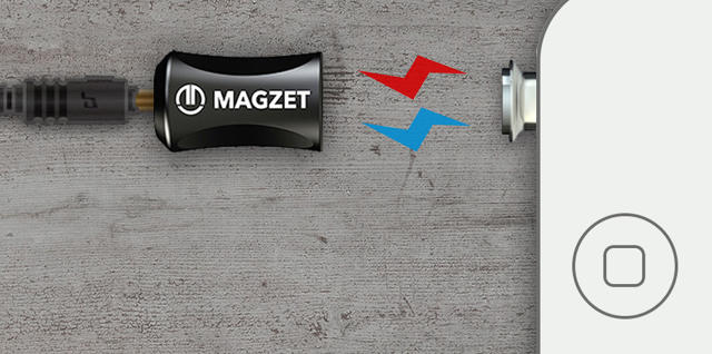
That, Hallsten says, is enough for Magzet to sidestep Apple's patent. But MagSafe's not the only patent that has kept previous magnetic headphone cables off the market.

A particularly troublesome patent for magnetically detachable headphones was filed by a company called Replug in 2008. Its product concept got a good deal of buzz at the time, and the patent awarded to it stopped a company we reported on two years ago from releasing its own magnetic headphones.

But Replug never actually delivered fully on the concept. While it shipped an adapter, the magnetic connection was so weak, it required plastic end pieces to hold together. Then its website went belly up. Here, serendipity benefited Hallsten: Replug's patent has since expired, the grace period for renewing it has ended, and the company itself seems to have gone under.

But Hallsten thinks that it would be wrong to dismiss his company's magnetic audio cable as just a sneaky ripoff of what has come before, saying there's at least one problem that Magzet solves that no other magnetic headphone maker has attempted.
Let's imagine you have a set of magnetic headphones plugged into an iPhone. The easiest way to "unplug" your headphones from the device would just be to break the magnetic connection. But if you did that, the jack would still be inside the iPhone, effectively leaving it on mute. Your phone would just keep trying to pump audio through the jack, even though no headphones are connected to them.

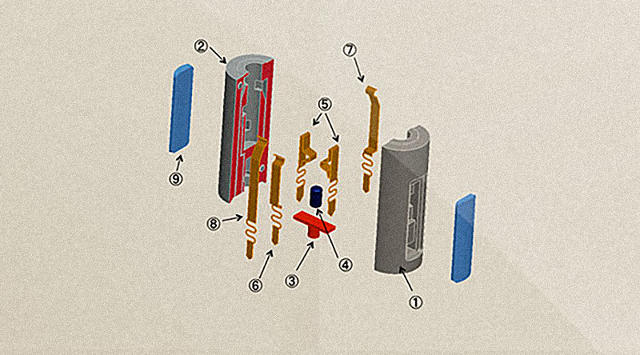
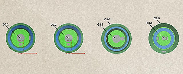
Magzet solves this problem by making the audio jack electrically "disappear" when the magnetic connection with the cable is broken. The secret is that the Magzet jack is actually made up of three separate pieces of metal that are ever so slightly separated from one another. When the the jack is magnetically connected to the cable, the gaps between each piece are bridged, allowing a smartphone to detect that a headphone is plugged in. But when that connection is broken, your iPhone can't see the plug anymore, even though it's sitting right in the jack. Electrically, it's now invisible.

Whether or not the Magzet adapter is as impervious to patents as Hallsten thinks will only be proved in court. But Hallsten sounds confident that he's put in his due diligence, and he has big visions that Magzet's technology could be applied to all sorts of other cords and cables. "You know Intel Inside?" he asks me. "We see 'Magzet Inside' becoming the next Intel Inside."

If he's right, let's hope Hallsten changes the name. Magzet sounds a little too close to something the Insane Clown Posse might dream up, even if we do want all our cables to be as magical as MagSafe.

You can preorder a Magzet magnetic audio adapter through Kickstarter starting at $35.


A Pen For People With Parkinson's

$
0
0

Lucy Jung never thought much about designing for sick people. Then she was diagnosed with a brain tumor. She recovered, and the experience has driven her toward what she now thinks of her calling: to use design to help improve the quality of life of hospital patients and those with chronic conditions.

It drove the 27-year-old designer to create the Arc, a pen for people with Parkinson's disease. Along with three fellow students at the U.K. College of Design (Hwan Soo Jeon, Tian-jia Hsieh, and Danny Waklin), Jung designed the pen to not only make it easier for people with Parkinson's to write legibly, but to actually loosen up the muscles of their hands after they've put the pen down.

The Arc Pen works by addressing a common symptom of Parkinson's patients: micrographia. As the disease takes hold, patients find their muscles seizing up, which then impacts their handwriting, and their letters appear abnormally small and cramped.

Why a pen? "When you're talking about designing for the chronically ill, a lot of designers focus on basic life needs," Jung tells me. "But our lives aren't just eating and breathing. It's also writing, and drawing, and singing, and a load of other things that give people joy. So we wanted to focus on that."

Originally, the team thought about creating a pen that would help people empathize with Parkinson's sufferers by giving off small jolts of electricity when writing, so they could feel for themselves what a tremor is like. In testing, though, the designers discovered that vibration motors inside a pen actually made patients feel as if they had more control of their hands.

After testing the prototype with 18 British sufferers, the Arc team came up with a wedge-shaped form factor that was easy for patients to grip. The designers say the effects of using it last up to 10 minutes after the device is turned off, giving people some time to use their improved dexterity for other tasks.

Jung says she and her team are currently looking for partners to help refine the pen.

You can see more of Lucy Jung's design work here.

Watch A Calligrapher Recreate Famous Logos In Mere Seconds

$
0
0

The best logos in the world are so precisely crafted that every aspect—from the color to the shape—has been plotted to the nth degree, typically with digital tools. Which makes it all the more impressive that calligrapher Sebastian Lester can effortlessly blaze in and reproduce them with a few quick strokes of the pen.

Lester is based in Sussex, England, and he has developed typefaces and type illustrations for the likes of NASA, Apple, Nike, Intel, and The New York Times. He even did work on J. D. Salinger's final reissue of Catcher in the Rye.

With cred like that, I suppose it's no surprise that recreating nearly perfect replicas of logos from companies like ESPN, Google, FedEx, The Gap, Converse, and more is like second nature to him. Even so, it's eerie to see how quickly and accurate these hand-drawn logos are, especially since each one takes him only a few seconds. He's just as good at logos for Led Zeppelin, Star Wars, and American Horror Story.

Check out more of Lester's work on his website and on Instagram here.

5 Lessons On Apple Watch Design From Evernote

$
0
0

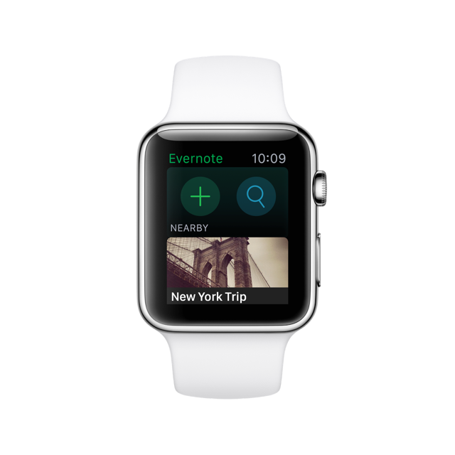
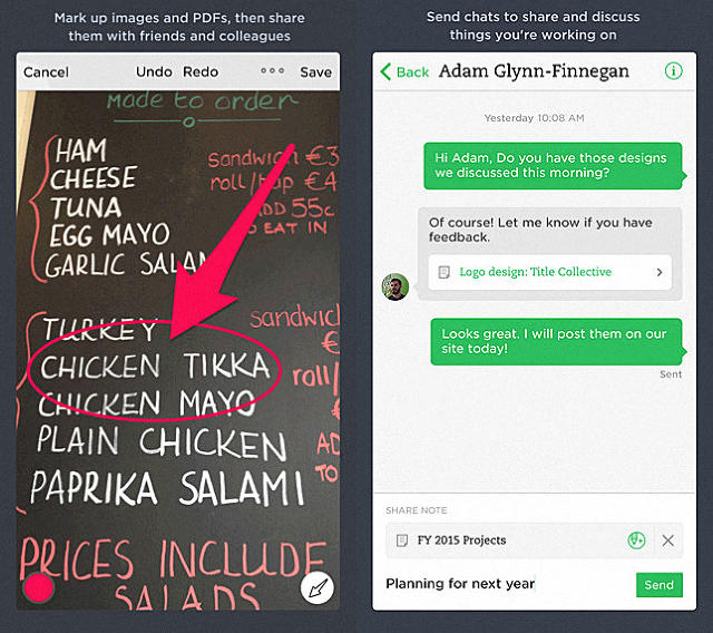
Although the Apple Watch isn't out until April 24, popular note locker service Evernote has already released an app for it. Unsurprisingly called Evernote for Apple Watch, it allows users to dictate a note, search their note libraries, or surf through a handful of contextually useful notes.

Since it's one of the early entrants into the Apple Watch arena, we asked Evernote's VP of mobile products, Jamie Hull, to tell us what the Evernote team had learned from developing the app. Here's what she told us.

Iconography And Color Is Paramount

Even more so than on other devices, the use of clear iconography and strong colors in a user interface is important in an Apple Watch. There's just not enough room on a cramped screen for labels, says Hull. The Evernote app, for example, has three different top-level interactions competing for attention on a very small screen. By using strong, colorful iconography, like a green plus button to add a new note, Evernote for Apple Watch can communicate what buttons do in an intuitive way without wasting pixels on a label.

The Shorter An Interaction, The Better

The Apple Watch user interface guidelines recommend that developers keep their interactions on the watch to under 30 seconds. "In our opinion, that's actually too long," says Hull. "It should be only three to five." Having released apps for wearable platforms like the Pebble smartwatch and Android Wear, the Evernote design team has seen that after 30 seconds, users' arms get tired. The lesson? Design to get people in and out of your app as quickly as possible.

Context Is King

Although Evernote's previous efforts on the Android Wear platform tried to give users full access to their note library on a smartwatch, Evernote for Apple Watch takes a step back. Instead, it surfaces only five or ten notes automatically, based on how useful it thinks it will be to you. For example, if you had taken a photo to remember your airport parking space, Evernote might automatically surface that to your Apple Watch when you fly home from your trip. Because it's hard to pull off complex navigation on such a small screen, in such a short time frame, a good smartwatch app has to anticipate a user's needs as much as possible.

Expect To Have To Rapidly Iterate

Evernote is trying to develop the best Apple Watch app it can, but the Apple Watch isn't out yet. So once it's released, Hull says, Evernote plans to be nimble on its feet to react to customer feedback; not just with bugs, but also with core features it thinks are most valuable. In some ways, release is where an app's development truly begins, not ends. "It's always true with new platforms," says Hull. "Expect rapid iteration."

Remember That Almost Every Action Will Be Better On Your Phone

The number-one rule of Apple Watch app design, according to Evernote, though, is ultimately not to get carried away. Hull says very few actions will actually be better on an Apple Watch than on an iPhone, iPad, or Mac, so it's important to focus on those that make sense. In Evernote's case, that's quickly dictating a note, accessing a useful note, ticking off a grocery market checklist, and so on. Don't try to recreate the same app for another screen: Remember, a user's iPhone is just a pocket away.

You can download Evernote for iPhone, iPad, and Apple Watch for free here.

This Clever Lamp Grows Out Of Your Wall

$
0
0

Off-center lighting is the only way to go in your living room, but it comes with a lot of trade-offs. Lamps have ugly cords you can trip on, and they either take up a big part of your floor or a big part of your table.

Not so the Wald Plug Lamp, by Feltmark. It functions as a table lamp or a floor lamp that doesn't have a cord, doesn't need a table, and doesn't take up any room on the floor. Instead, it grows right out of your wall socket, giving off-center light at the perfect height, without any of the drawbacks.

The Los Angeles-made Wald Plug Lamp looks like some sort of elegant Victorian lighting fixture. It plugs directly into a wall socket as an elbow of blue or olive metal piping, terminating at a small block of white ash or black walnut wood. This block in turn houses a small, stylish T10 tubular incandescent bulb.

It comes in two different lengths. If you want one that is a little closer to the floor, there's a 2-foot version starting at $139, and a 3-foot version for $159. Some might be put off by the fact that it doesn't have a lampshade. But why hide a bulb that pretty?

You can purchase a Wald Plug Lamp from Feltmark here.

Volvo Creates A Glow-In-The-Dark Paint To Save Cyclists' Lives

$
0
0

In collaboration with Grey London and the spray paint company Albedo 100, carmaker Volvo has created a new reflective paint that is invisible in sunlight and easily washes off. Now Volvo is encouraging U.K. bicyclists to spray it all over themselves, like Axe body spray, before they hit the roads, as a potential solution to the U.K.'s 19,000 annual bicycling-related accidents.

LifePaint, as it's called, is really less of what we'd traditionally call a paint and more of a spray containing thousands of tiny, transparent spheres. When light enters the sphere, it boomerangs back to the source, making the spray glow-in-the-dark, a concept we previously saw applied to bicycles with the Lumen Bike. But unlike the reflective paint on the Lumen, LifePaint can be applied to your existing bike, as well as helmets, jackets, and more. If you don't like it, you can wash it off, or it will fade totally within 10 days.

Cool tech—and a tagger's dream and a raver's fantasy—but why is Volvo mucking around with paint to begin with? According to Volvo, it's all about safety.

Volvo has built its brand on a reputation of safety and reliability since the 1940s, when the company first introduced a safety cage to its cars. Many safety innovations we take for granted, like the three-point safety belt, are Volvo inventions. Lately, Volvo's safety innovations have focused protecting cyclists: The company introduced a cyclist detection system in 2013 that automatically brakes a car when it's about to sideswipe a cyclist. But there's only so much Volvo can do to design cars that won't hit cyclists.

"Every year more than 19,000 cyclists are injured on the U.K.'s roads," Nick Connor, managing director at Volvo Car U.K., said in a statement. "At Volvo, we believe that the best way to survive a crash is not to crash, and are committed to making the roads a safer place by reducing the number of accidents."

LifePaint is partly a marketing exercise for the new Volvo XC90. But that doesn't mean it's not a good idea, if it actually works as advertised. Right now, Volvo is giving away LifePaint on a limited basis in six cycling shops in Kent and London, but if the product does well, Volvo says it might bring the product to market internationally.

You can read more about LifePaint here.

Update: A previous version of the article said that there were 19,000 bicycling-related deaths the U.K. every year, instead of 19,000 injuries. It has been corrected.

How Design Could Help Prevent Subway Deaths

$
0
0

It's a rare, if particularly awful, public health problem: people drunkenly falling onto subway tracks, then getting hit by a train. In Japan, the West Japan Railway Company, which oversees much of Japan's commuter rail system, recently conducted a study to find out why intoxicated people ended up stumbling to their deaths on train tracks. The study's conclusion is not only the opposite of what you might think, but strongly suggests that a simple design tweak might be enough to stop as many as 90% of such incidents.

Common sense would seem to suggest that drunk people fall onto the tracks because they stumble when walking parallel to the tracks. But over the course of the two-year study, the group discovered that, in over 136 incidents captured on video, 90% of the people who fell on train tracks were actually sitting on a bench right before their accident occurred. Almost every time, the same thing happened: Seconds before falling onto the tracks, the victim would lurch suddenly to his or her feet, march resolutely forward as if he knew exactly what he were doing, then topple directly off the end of the platform. Only 10% of drunks fell off the platform any other way.

What's the solution? West Japan Railway is considering a sweeping reorientation of all of its subway benches so that they are now perpendicular to the tracks. It is hoped that with the new configuration, drunk passengers will stumble down the platform, not face-first into the third rail.

You can read more about the West Japan Railway Company at Spoon Tamago.

This Stroller Doubles As A Bike Seat

$
0
0

Sometimes when I see parents in the wild, I just can't believe the amount of things they are capable of carrying. The average parent seems to me like a walking, talking version of Fibber McGee's closet—just one item away from collapsing into a clattering pile of parental bric-a-brac.

I suppose that's just one of many reasons why I love the Påhoj concept by Swedish designer Lycke von Schantz. It's a beautiful, elegant design combining a bike seat with a stroller, consolidating what is usually two separate objects parents need to carry around with them, and consequently enabling parents to be more active with their children.

It's that last part that's the most important thing about the concept. Because let's face it, parents can use all the freedom they can get. The Påhoj allows parents who might have otherwise been tied to a stroller to commute with their kid on a bike, as opposed to having to throw a stroller in the trunk and drive. "Growing up in Lund, Sweden's largest bike city, and living several years in Amsterdam, biking has always been the natural way of transportation for me," Lycke says. "Why should becoming a parent put an end to that?"

The Påhoj isn't for sale right now, although it's under development as a commercial product, and was recently tested at the former lab operated by Brio in Osby, Sweden, a leading manufacturer of safe wooden toys for kids. It's expected to launch on Kickstarter soon. You can keep your eye on the project at the official website here.

[via Design Milk]


Pentagram's New School Rebrand: Best Thing Ever Or Unbearable Monstrosity?

$
0
0

It's appropriate that Pentagram's new algorithmic typeface for the New School looks like a wonky take on the Star Wars font, because to paraphrase the words of Obi-Wan Kenobi, the Internet has reacted to it with a great disturbance, like millions of voices suddenly crying out in terror, then refusing to shut up about it.

The identity, designed by Pentagram's Paula Scher, was meant to give the New School a modern, innovative look that is widely adaptable to many different platforms and doesn't look as dated as its old spray-paint logo. But check out the Twitter hate it's getting!

Commenters on our story about the new identity seem to agree:

Brian Piper:

The "School House Rock" font now looks edgy to me. Fan of the idea, not the execution.

Joyce Xu:

Incredible ugly. The type is terribly disharmony!

Isabel:

I don't know what went through their minds while they where designing this. I'm a Parsons alumni and I feel so disappointed in this work. Parsons has the name, reputation and color to be an iconic/strong brand, but yet it fails at this. It has Star Wars written all over it.

Laura Yeh:

I used to think the used logo was bad... but this is even worse

Manny Hernandez:

The Nevv School

Scott Walker:

Sorry Pentagram but this is woeful by your very high standards. It's predictable and doesn't promote any interactive qualities. If Pentagram is REALLY one of the biggest design and branding agencies around, and Parsons specifically is REALLY one of the biggest design schools out there, then you can and should do considerably better.

But this view isn't unanimous and there are also a whole lot of people who really like the new visual direction. The more articulate defenders of the New School's fresh identity include graphic designer Andrew M. Fishman, who argued in our comments:

I disagree entirely with the previously stated opinions; this is clean, modern design influenced by a variety of factors. The concept of utilizing architectural design elements and the use of a font completely unique to the school itself illustrates a well orchestrated rebranding. The font itself does not speak to me from a design perspective. However, what strikes me is the fonts use a unique element that captures the spirit of this brand specifically, completely 'Nue' school.

Nor is he alone in coming to the identity's defense. Popular graphic design critic Armin Vit gave the new identity a good review on his blog, UnderConsideration (even if his commenters largely disagree with him):

I've always been a fan of Siegel+Gale's spray-painted identity. It was (and still is) a bold move for an educational institution, even one deep in New York City where such shenanigans are to be expected. What made it great wasn't so much that it was spray-painted but that it defied expectations and set itself apart by being purposely different and slightly uncomfortable. The new logo and identity achieve a similar effect. The wordmark is not classically pretty—the odd "W" has already been the subject of many hate-Tweets—but it commands attention in the way that odd New Yorkers (in their styles and behaviors) command attention: by being uniquely personal and slightly off.

What do you think? Is Pentagram's new identity for the New School a quirky triumph that time will redeem, or a total disaster that will be quietly swept under the rug a year from now?

Read more about Pentagram's New School redesign here.

MIT Student Develops A Facebook For Depression

$
0
0

Koko, an upcoming app based on an MIT experiment, is designed to build the world's first social network for dealing with depression. If it takes off, it could change the way some of us think about our problems.

Robert Morris grew up in the heart of Silicon Valley, just a few streets away from the garage where Steve Jobs got his start. But technology wasn't his passion. The only operating system he really cared about was the human mind. After getting his undergraduate degree from Princeton in psychology, Morris moved on to MIT for PhD work on how to make mental health accessible to everyone, where his failure to more than dabble in computer science quickly caught up to him.

"Everyone around me was this brilliant coder, and there was this expectation that if I had an idea, I could just whip up a platform instantly to test it, like anyone else," Morris remembers. He began getting depressed as he bashed his head against beginner's programming mistakes. "I thought to myself: I'm a horrible programmer. I'll never survive at MIT."

Then Morris discovered Stack Overflow, the computer programming Q&A site. When he had a programming issue, he'd make a post, and within hours, someone would chime in, telling him how he could fix it. Epiphany struck: "If a network like Stack Overflow can help me fix bugs in my code, why can't something like it also address bugs in my thinking?"


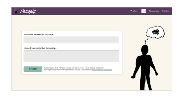
In Panoply, the experimental social platform Morris built as part of his dissertation at MIT, 166 volunteers were asked to join a social network for depression. Where Facebook asks, "What's on your mind?" when you post, Panoply would ask, "What's wrong?" The user is asked to describe what happened (for example, because she just lost her job) and then to try to quantify why that makes her upset (for example, because it means she has failed her family or worries she might never get hired again). The point is to articulate these morbid thoughts out loud so that other people on Panoply can help the user iron out the "bugs" in her thinking.

"Some people go into a downward spiral when laid off, where others are resilient and bounce right back," Morris says. "The best differentiator between those two types of people lies in their interpretation of what happened." With Panoply, a network of fellow users helps each other reinterpret what happened in a more productive light. For example, being laid off might just be the beginning of a new opportunity, and the person who was laid off might not have liked her job that much anyway. Meanwhile, the community rewards good answers with an upvoting system. But "good answers" aren't just well-meaning, stream-of-consciousness answers: The community is coached at every turn to pin their answers down so that they fall within the guidelines of cognitive therapy techniques that are proven to work.

During his time working on Panoply, Morris discovered that people who were suffering from mental stress and depression felt significantly better using Panoply than using other software-based depression techniques. Now, Morris is hard at work, spinning the ideas behind Panoply into an iPhone app called Koko, which he says will be available to everyone by fall.

KieferPix via Shutterstock

Why mobile? According to Morris, the biggest challenge facing anyone who is looking to receive, or even give, mental health advice is staying engaged. "To be good at giving productive advice, or to think in a more healthy way, you have to practice, just like diet and exercise," Morris says. A mobile app encourages people to "snack" on Koko throughout the day, spending a few minutes here and there to practice positive thinking. Going mobile also removes some of the stigma of pursuing psychological help: An iPhone is inherently a more private and personal device than your work computer, or even your laptop at work.

The UI is still under construction, though Morris says he favors minimal design and simple UI patterns. Apps he aspires to emulate are Timehop and Duolingo. "They both do an exceptional job with UI design, and we'd love to make learning therapeutic techniques as fun and accessible as Duolingo makes learning different languages," he tells me.

Morris says he's not worried about how to monetize the app right now. It's pure startup mode: build the product, then figure out how to make it a sustainable business down the road. The idea of Koko someday selling ads against its users' depression is an unpleasant one, but Morris says that he wouldn't let that happen; his real goal is to help people.

Koko is still in the early stages of development, although it will probably be released before fall. As for the fact that the kid who once wanted to have nothing to do with Silicon Valley is now a full-time app developer? He just laughs. "I wasn't interested in tech at all until I got to MIT," he tells me. "I guess it must have seeped in."

You can sign up to get emailed when Koko is released here.

Never Walk Home In The Dark Again With This Simple App

$
0
0

A 2007 campus sexual assault study by the U.S. Department of Justice found that one in five female college students is the target of an attempted or completed sexual assault.

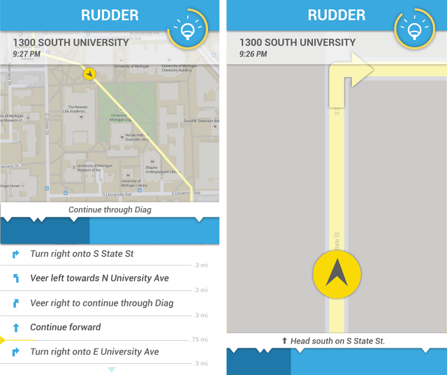
Needless to say, on campuses all around the country, it's not particularly safe to go walking alone in the dark. With that in mind, Rudder is a new app from two University of Michigan graduates that aims to make sure that no college freshman—or, for that matter, anyone—ever has to walk alone through the dark again. How? By showing them the best-lit route.

Rudder works like any other mapping app on your smartphone, with an emphasis on walking directions. The biggest difference is the algorithm behind the scenes, where instead of calculating the shortest path between two points, Rudder figures out the shortest and best-lit path between two points, by comparing routes to a database containing information about a given city's public light data. The app will never take you more than five to eight minutes out of your way, and it even taps into your smartphone's camera to give users a built-in light meter, letting them know how well lit your environment really is.

According to designer Hannah Dow, Rudder is targeting colleges first not just because she and her lead programmer, Steve Coffey, recently graduated, but because campuses are such a natural place to start. "Young students often have a hard time getting their bearings," she says. "They might be new to that city, and have to try to find their way between all these different buildings. We're hoping that students will use our app not just to help them get to know their environments, but to make smarter decisions about where they are walking, especially at night."

Even outside of its core functionality, Rudder is bringing attention to this growing problem of campus attacks, which hasn't been addressed with much urgency. Accurate campus crime rates are hard to come by. Colleges infamously underreport them to protect their reputations, especially in the case of sexual assault, and that means the available statistics are woefully inaccurate.

But beyond college campuses, Dow argues there's a need for an app like Rudder. "The experience of traveling at night is just completely different than during the day," she tells me. "It's harder to see, and even if you know where you're going, it's easier to miss landmarks and street signs at night." Yet beyond a token "night mode" that, at best, might make an app easier to read in the dark, most navigation apps don't account for any of this.

And rudder isn't just an app for people who are worried about being attacked in the dark. My wife, for example, has partially detached retinas that make it very difficult for her to walk home alone at night. Rudder could change that.

Right now, Rudder has collected street lighting data from 11 cities: Ann Arbor, Chicago, Paris, Boston, Seattle, Portland, Austin, Vancouver, San Francisco, Chicago, and more. And while the initial beta will include only navigation and light meter functionality, features that the Rudder team hopes to include in the future is the ability to adjust your route to favor speed over lighting, or share travel progress with friends or family members to let them know where you are.

Rudder is expected to launch on the iOS App Store the first week of May. You can sign up to join the beta here.

Nendo's New Glass Tables Bring A Little Bit Of "Miami Vice" To Your Living Room

$
0
0

How do Euclidean shapes dress up when they hit Miami? Japanese design firm Nendo's latest is a collection of three low tables that look like panes of softly frosted glass, glued together with neon.

A collaboration with Glas Italia, an Italian furniture maker that specializes in glass designs that Nendo has worked with before, the Soft line of tables consists of three low-sitting tables. Comprised of five sheets of frosted glass, they are joined together by colorful gradient strips, which fade from purple to red, from orange to yellow, and from blue to purple.

The joints aren't the only part of the Soft tables that color shift though. The frosted glass also has a subtle gradient, which you might initially assume is just an optical illusion from juxtaposition with the joints. It's actually more straight forward than that, though. Nendo has softly printed a subtle gradient pattern on the backside of each glass sheet.

"We tried to create a natural and soft image, as if the colors on the edges were blurring," explains Nendo."By combining the extremely difficult technique of printing gradation colours on the diagonal edges with a technique that expresses a delicate "blurriness," we achieved an appearance that contradicts the conventional image of glass, which is of a hard and sharp material."

Nendo plans on debuting the Soft series at Milan's Museo della Permanente on April 14 through 19, where the design studio will exhibit over 100 pieces of work it has done for over 19 brands, including Häagen-Dazs, Italian furniture brand Moroso, and fashion brand Tod's.

[via: Dezeen]

How Google Destroyed Internet Explorer, Visualized

$
0
0

Sometimes visualizations are really bad at conveying information about an entire data set, but really good at telling a story about just a couple data points. Case in point? This chart tracking global browser market share from 2009 to 2015, which shows how Google destroyed Microsoft in the browser wars.

This visualization is objectively terrible at giving an accurate overview of how the browser wars of the last few years have played out. For example, what the heck's happening with Firefox, circa late 2011? Did its market share just plummet overnight? Definitely not: It was a slow decline, as this other chart representing the same data makes clear. Yet as a bump chart, the gradual nature of this decline is confusing as hell.

So why do we like it? For one reason: It really highlights how Google Chrome came out of nowhere to destroy Microsoft's Internet Explorer and its domination of the web browser market. While we take for granted today that Google is a browser giant, the meteoric rise of Chrome is ultimately a design story about how a lightweight, speedy, and minimalist browser stopped a clunky juggernaut that didn't give a shit about adhering to design standards in its tracks.

Chrome might have become a little less spry and more bloated with age, but its triumph over Internet Explorer was a triumph of design. As Microsoft puts Internet Explorer out to pasture and introduces its next-gen Project Spartan browser—which feels, in its disruptive intent, sort of like Chrome did back in the day—you've got to wonder if the tables will turn themselves all over again.

[via Reddit]

In This Museum, You Don't Learn About Senators. You Are A Senator.

$
0
0

How do you design an experience that makes learning about the U.S. Senate fun? You let visitors role-play senators. Opening this month, Boston's Edward M. Kennedy Institute for the U.S. Senate is to the young Leslie Knopes of tomorrow what Dungeons & Dragons is to LARPers (or live-action role-players): an interactive, day-in-the-life simulation of the U.S. Senate, housed in a full-scale replica of the chambers themselves.

Designed in tribute to the late Massachusetts senator Ted Kennedy, who spent almost 50 years in the Senate, the institute was designed by Ed Schlossberg of experience design firm ESI Design. Schlossberg is no stranger to the Kennedys, as his wife is Caroline Kennedy, Ted Kennedy's niece. According to Schlossberg, the plan for the institute began to take shape in 2002, when he presented Kennedy with a sketch of what a museum in his honor might look like.

Kennedy neither wanted his institute to be a vanity project, nor a boring museum telling the Senate's history. Rather, Schlossberg and Kennedy imagined it as an interactive simulation, in which visitors could LARP as a senator and pass bills into law.

Although Kennedy died in 2009, Kennedy's widow, Victoria, worked with Schlossberg and consulted on the development of the Institute to bring the senator's vision to life. The main message Kennedy wanted to convey in his institute? The importance of compassion and compromise to the American political system... bywords which sadly seem all too absent from today's political landscape.

It's located across from the JFK Presidential Library overlooking Massachusetts Bay near the University of Massachusetts Boston in a minimalist building designed by architect Rafael Viñoly. The centerpiece of the institute is an exact clone of the Senate chambers, complete with polished wood desks, spangled blue carpet, and gold eagles. Student groups occupy these desks by appointment, and role-play the process by which bills become law. Outside the Senate chambers is a general area filled with interactive exhibits projected on the walls, as well as a recreation of Ted Kennedy's offices during his time as a senator.

Even if you don't come as part of a group, you can still take part in interactive exhibits that explain and simulate the Senate. All visitors are handed tablets when they enter, and can play with multimedia exhibits that include everything from an interactive timeline of the Senate to an augmented-reality view of Kennedy's office.

There are also games visitors can play, like a Cards Against Humanity-style card game that helps visitors understand what happens in the Senate cloakroom. Visitors even win Xbox-style achievements as they participate in the exhibits: *Filibuster complete. Bill successfully tabled.*

When I visited the institute a few weeks ago, one of the interactive games challenged my group to get a National Hot Fudge Sundae bill passed into law. Since this is the Senate, no one can agree on the toppings, so we were asked to vote from a pool of vetted toppings: whipped cream, chopped walnuts, rainbow sprinkles, and so on. The two toppings that got the most votes would then be amended to the bill. Peanut butter cups and — what the f...—strawberries ended up getting the most votes, but then the (virtual) Republicans demanded that bananas (yes!) and orange slices (no!) go on the sundae instead.

To bring the exercise back full circle and illustrate the spirit of compromise that Ted Kennedy stood for, we then voted on one topping from each party's topping candidates, only to end up with a National Hot Fudge Sundae Bill with strawberries (!) and orange slices (!!!) on top. The president—played by a computer—then vetoed the bill, because even a computer knows those toppings are insane.

So instead of getting a national hot fudge sundae with two indisputably awesome, well-paired toppings, the Senate ended up voting on a clearly terrible sundae that never made it past the White House. The only thing missing from this eerily accurate simulation of how the modern-day Senate works was a senator standing up to give a five-minute speech about how voting for peanut butter cups instead of orange slices was really just a vote in support of Planned Parenthood.

To dismiss the intentions of the Edward M. Kennedy Institute just because it's too good at simulating the Senate would be a disservice to what it's trying to accomplish, though. Yes, sometimes the Senate passes bad bills into laws, and yes, sometimes compromise can lead to a well-intentioned bill being so corrupted that, like a hot fudge sundae with orange slices on top, it's nearly impossible for voters to swallow. But the system itself still has value, because even when it doesn't work, all voices are allowed to be heard.

You can find out more about the Edward M. Kennedy Institute here.

How To Design The Googleplex Of Schools

$
0
0

When the city of Alexandria, Minnesota, asked community members what they wanted in their new high school to be like, they replied, "like the Google campus." So they hired John Pfluger of Cuningham Group Architecture to make that a reality. Something that might not be the same size, or even necessarily have the exact design considerations, but that represents the same sense of possibility—the feeling of being adaptable to the future, whatever might come of it. The result is a state-of-the-art facility for more than 1,400 students where the word "classroom" is verboten, and where an hour in algebra class might be indiscernible from kicking back in the quad.

The new $73 million Alexandria Area High School houses students from grades nine to 12. In terms of square footage, the new facility is average in size—about 200 square feet per student—but "it plays bigger than it is," says Pfluger, because of the layout. The new space is bright, open, social, and reconfigurable. It's made up of six smaller, acoustically separate environments, which connect through an open area called the Community Commons, a combination cafeteria, theater, and social space. Everything is open, right down to walls made out of glass, while all of the furniture is designed to be easy to move around and reconfigure.

"Designing an environment that can take kids into an unknown future is a real challenge," Pfluger tells me. "We know things are going to be more different in the future than we can possibly expect, so how do we address that uncertainty?" The answer: you design a high school that can transform.

What about classrooms? That's the "c-word" at Alexandria Area High, Pfluger tells me. There are still classroom-like spaces, which are reconfigurable by swinging walls open or shut. But the major difference between Alexandria's classrooms and the classrooms most high schoolers are used to is that teachers don't own them. Instead, teachers shift to whatever space best suits the lesson at hand. For teaching geometry, maybe that's a more traditional classroom, with a teacher standing at a blackboard in front; for learning about Shakespeare, though, class would be just as likely to convene on the Learning Stairs, an ampitheater-like sitting and presentation space.

According to Pfluger, the inspiration for the design of the new Alexandria high schol actually came from the students. At the onset of the project, the principal of Alexandria Area High School led Pfluger through the old facilities, a dusty flatland of classrooms, lockers, and squeaky linoleum hallways. Then they came to the library, where the students had been allowed to clear out a section of books to create a more dynamic social space and learning lounge, where Pfluger saw eight students, working away on their laptops. "Our new high school has to be like that," the principal told him. It had to be a space the students could create themselves.

Since students first started attending the new Alexandria Area High School facilities in fall, student engagement is at an all-time high. And while teachers have had to give up the private kingdoms of their classrooms for workstations in the teacher's lounge, they like it a lot more too. "The fear is always that it'll be the teachers, not the students, who are most resistant to change," says Pfluger. "But in this case, that wasn't true at all. These were teachers who couldn't wait to bring the high school they taught in into the 21st century."

Read more about the Alexandria Area High School here.


This Insane Video Game Puts Pac-Man, Pong, and Space Invaders In A Blender

$
0
0

Among gamers, every video game is ultimately described as a mash-up of game titles. For example: "It's like Doom and Sim City and Flappy Bird, smashed together and served to you on a plate with your gonads as a garnish!" Usually, these descriptions don't really hold up, but no one can accuse Dick Poelen, the Dutch developer behind Pacapong, of exaggerating things: his game is Pac-Man mashed up with Space Invaders rammed into Pong.

Pacapong is a frantic, action-packed game that ends up infinitely better than its three parts combined. Two players bounce a Pac-Man-like ball between Pong paddles across a maze, gobbling up pellets for points. Confusing matters are the fact that there are Inky and Blinky ghosts who can gobble up your Pac-Man if it hits them. Oh, and Space Invaders keep on trickling down the screen, which you have to blast with your paddles. And if you get far enough, Donkey Kong will show up and start raining down barrels on you.

It's ridiculous fun, and an amazing sophomore effort by Poelen, who lives in Arnhem, the Netherlands and whose previous game was the frenetic Zero-G Golf. The 31-year-old designer, illustrator, and developer says he only started making games a couple years ago, because it combines everything he loves in one package: design, coding, animation, and music.

Pacapong started with Poelen coding a little game where he bounced a Pac-Man between two paddles, and from there, well, it kind of just spun out of control. The biggest design challenge, he says, was figuring out Pac-Man's movement. "I wanted player to be able to steer him around the maze, but if they had to much control then you might be able to clean up most of the maze in one go," says Poelen.

Although Pacapong is an IP lawyer's worst nightmare, depending on what side of the docket he's standing, Poelen says he's just happy to see so many people digging his crazy mash-up. "It's awesome seeing people liking and sharing it, playing it with their kids, putting videos up on YouTube, and slowly figuring out the rules of the game," Poelen says.

You can download Pacapong for Windows, Mac, and Linux systems here. Get it before Taito's lawyers do.

Bringing Romance To The Apple Watch

$
0
0

Every designer I have spoken to about designing for the Apple Watch says the same thing: 99% of all possible app features are going to be better on your iPhone than on your wrist. But for apps like Avocado, the social network for romantic partners, the Apple Watch and other wearables represents an exciting new frontier of design. For the first time ever, apps can let people in love feel each other's touch. And the possibilities of that could lead to something profound.

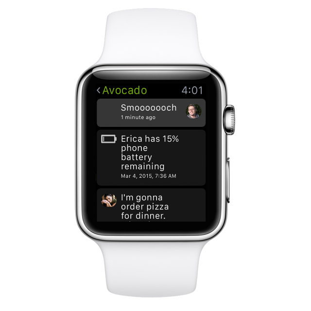
As a service, Avocado allows two people in a relationship to send each other messages, work on shared lists, keep a joint calendar, and quickly send each other photos. These features are what Avocado founder Chris Wetherell refers to as Avocado's vegetables, the boring, commonplace features any couples software should have. Avocado has been working on an Apple Watch app for months now, and will tap into some of these features: for example, the ability to quickly send pre-written messages is uniquely suited for the Apple Watch, Wetherell says.

In fact, the Avocado app icon makes a brief appearance in the official Apple Watch launch video, which suggests that even Cupertino knows that apps specializing in romance or interpersonal interactions are better on a watch than on an iPhone. But why is that?

The key issue is that wearables seem to solve the intimacy problem for apps like Avocado, making two people feel close together when they're really far apart.

For example, in the Avocado app for iPhone, you can send your partner a virtual hug, a feature that seems simple but is actually profound. To send a hug using Avocado, you actually hold your iPhone up to your chest and feel it buzz against you, like a heart beat. It's a surprisingly effective feature, but it only works for the person giving a hug. At best, the person receiving the hug will only feel their iPhone vibrate in their pocket, which is hardly the same thing.

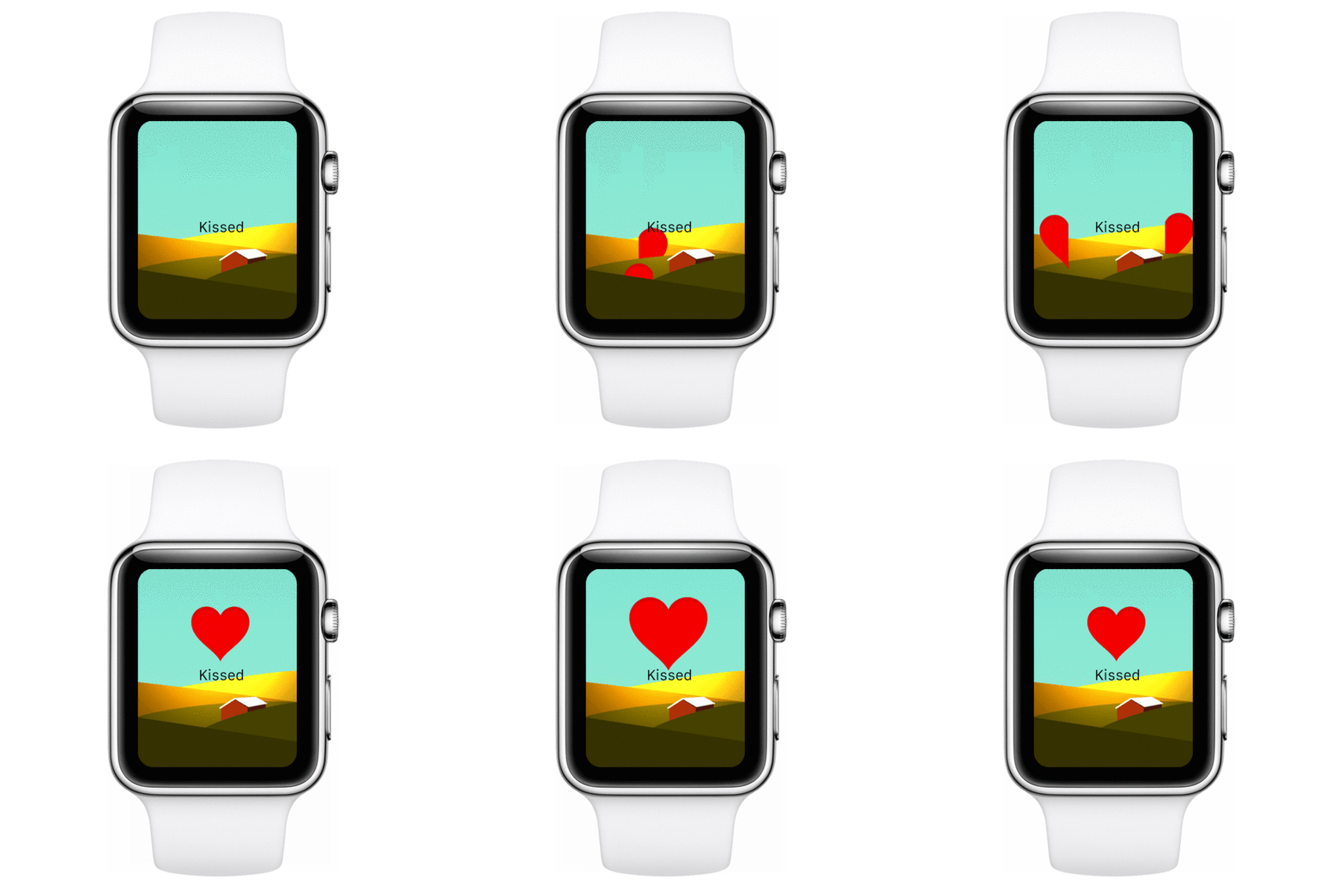
But with a wearable, that all changes. Avocado can take for granted that users of its Apple Watch app will always have their devices snuggled up against their skin. The Apple Watch app doesn't have virtual hugs, but it does have a 'Kiss' feature. Denoted by a heart, an Avocado kiss allows you to send a simple vibration to your partner's wrist with just a tap. It can communicate anything from an expression of affection, to just a reminder that they are being thought of.

That's it for right now, because Apple isn't allowing third-party developers tap into the Watch's accelerometers, the built-in heart rate monitor, or even the Apple Watch's haptic engine. But these early limitations are typical, says Wetherell. Apple also didn't allow developers to tap into the iPhone 5s's Touch ID fingerprint sensor when it launched, but a year later, any app could use Touch ID.

If Apple ever opens up the Apple Watch the same way, the sky's the limit. The Apple Watch can already let you send messages to a partner by sending them a Digital Touch, but Avocado wants to expand that into serendipitous messaging, in which partners can communicate with each other just by making slight gestures that are picked up by the Apple Watch, then sent to each other as vibrations. Avocado also envisions allowing couples to exercise together, by matching up heart rates. In Avocado's hands, it's possible the service could build an experience around it that takes it from curious novelty to something more meaningful.

None of this is here yet but "it feels inevitable," according to Wetherell. "Wearables can't help but improve relationships in an increasingly virtualized world." With the physical gulf between real-world friends and lovers feeling broader than ever in an age of ubiquitous sharing and social media, maybe wearables are the gadgets that finally bring us all back together?

Avocado for Apple Watch will be available for download on April 24, the first day of Apple Watch sales. You will be able to download it here.

Behind The Redesign Of The THX Deep Note, The World's Most Iconic Audio Logo

$
0
0

So famous that it has been sampled by Dre and parodied on The Simpsons, the THX Deep Note is one of the most recognizable pieces of computer-generated music in the world. Although it contains only one note spread across a variety of pitches and modulations, this 30-channel glissando of discordant sounds builds upon itself to go from loud, to louder, to extremely loud and incredibly close. Now, the iconic audio logo is getting its first redesign ever by the same man who gave the world the Deep Note in the first place. And it's even more dramatic than before.


A "Biblical" Story
First created in 1983, the Deep Note was originally designed as an audio logo for the then-nascent THX Sound System, a high-fidelity audio standard which LucasFilm introduced with Return of the Jedi. It was originally created by Dr. James "Andy" Moorer, an employee for Lucasfilm's Computer Division. Moorer's boss tasked him to create a singular sound that would let people know they were about to hear the ultimate in audio fidelity.

As Moorer tells it, inspiration for the original Deep Note came to him in a flash. He imagined a sound that told an almost Biblical story about the creation of order from chaos, all in a single note. "That story of triumph over chaos is a fundamental human story, and I wanted to tap into it," he tells me by phone. After all, what better way to signal the ultimate in audio quality than by trying to capture the voice of God?

Using digital audio equipment thousands of times less powerful than your average laptop, Moorer created the Deep Note using an algorithm that generated a 30-second sound from a random hexadecimal number, called a seed. In theory, then, you could recreate any sound generated by Moorer's program as long as you had the original seed. The only problem? Moorer, the accidental author of a sound that was heard at the height of its popularity by movie theater audiences around the world every 20 seconds, not only lost the seed, he never even bothered to write it down in the first place.

"It always bothered me," Moorer says. "I just wasn't happy where we'd left it." Although the Deep Note was recorded for posterity, it was only recorded for four tracks, corresponding to front, back, left, and right channels in a theater. That was fine for 1983, but as surround sound technology expanded to 5.1, 7.1, and even 16.2 channels (the number before the decimal points stands for speakers, the numbers after stand for subwoofers), the Deep Note couldn't keep up. It just wasn't calibrated for more than four speakers, making it sound off on newer systems. Since it couldn't be updated, the Deep Note needed to be recreated from scratch.

Bryan Neilon for Fast Company

A More Distinctive Sound
To create the new Deep Note, Moorer says he used yellowed, dot matrix print-outs of the code he originally wrote at LucasFilm way back in 1983, and got it up and running on modern day computers ("Not a trivial task at all," he says). Once he'd done that, he updated the program to encompass more channels, and add even more distinct voices to the note, to give it even more of a sense of power than it had before. Whereas the original Deep Note only has 30 voices, the new Deep Note has anywhere from 40 to 80, depending on what version you hear (5.1, 7.1, or Dolby Atmos). There are even as many as four new subsonic voices in the Deep Note that reverberate right through your coccyx, there just to keep the subwoofers happy.

The 1983 Deep Note was chosen over the other randomized sounds that Moorer's program spat out because it had a singular feature he really liked. "In that original glissando, there was just this one bass note that stuck out, because it goes right down into the basement," Moorer says. He tells me that the new THX Deep Note was chosen because it had that same quality: a bass note that went into the basement. It's not identical, but it's close. "I'm an engineer," Moorer tells me. "I know from experience when to accept good enough."

A Design For The Ages
Although your average Joe will have a hard time telling the difference, the new THX Deep Note, which is now playing at THX-certified theaters globally, is richer, deeper, and crisper than the old note, especially on modern systems. Moorer has also ensured that it's future-proof. If technology changes again, or if THX needs a version that takes more speakers or channels into account, Moorer can easily update the THX Deep Note without recreating it from scratch. This time, you see, Moorer wrote down the seed—but since he has a history of losing these things, we'll put it out there, just in case: 53ECC300. You're welcome, posterity.

You can listen to the new THX Deep Note here, although be warned: the streaming version is only available in stereo. To get the full effect, you'll need to check it out in a theater.

A Giant Funhouse Wind Turbine: Your New Apartment?

$
0
0

Only in the Netherlands would someone want to turn a wind turbine into a futuristic tourist attraction. Proposed for Rotterdam, the Windwheel is part amusement ride, part residential space, part green energy source, part educational facility, and 100% spectacle. Here's the thing: The idea is not as crazy as it sounds.

The Windwheel is a concept from South African architect Duzan Doepel, and it is made up of two reflective, kaleidoscopic wheels that coil around each other in an almost gyroscopic embrace. One of the wheels would contain 28,000 square meters (about 300,000 square feet) of residential property, including 160 hotel rooms, 72 apartments, a restaurant, a panorama deck, and more. Meanwhile, the outer section of the Windwheel would be dedicated to educating visitors about the Netherlands' social, political, and technological relationship with water, both in the past and heading into the future. The inner center of the Windwheel would be a silent, motionless turbine, which would use technology created by TU Delft and Wageningen University to convert wind energy into electricity with no moving parts.

Why use the space to educate visitors about water management? An eighth of the Netherlands is below sea level, and half of the country barely rises a few feet above sea level. The country has long depended upon an elaborate system of dams, dykes, and pumps to prevent itself from drowning. With rising sea levels threatening to make the Netherlands a new Atlantis, the Dutch will have to be more proactive in embracing new technologies than ever before just to survive.

The Windwheel is designed to exemplify the sort of technologically savvy thinking that the country will need to practice in years to come. Visitors would take a loop around the Windwheel in special cars, each of which can hold around 30 people. As they would ascend the Windwheel, the glass of the cabin's windows would give guests an augmented-reality overlay of the panoramic Rotterdam skyline, while a hologram projected in the cabin would serve as a virtual tour guide.

Of course, none of this is built yet, which is reason enough to be skeptical: concept drawings, sci-fi technology, and far-flung ambition do not a building make. But Lennart Graff of the Dutch Windwheel Group says that the city of Rotterdam is fully on board with the project as a sort of Dutch equivalent of the London Eye. The biggest challenge, he says, is not finding a site for the Windwheel or funding its construction, but figuring out how to design a building as a platform for future technological improvements. "We want the Windwheel to be upgradeable, like a Tesla," he tells me by phone. "Every night, my Tesla downloads a software update, and the next day, it's a little better than it was before. That's how the Windwheel should be: never dated, and always heading into the future."

To try to nail that aspect of the project down, the group is currently working with universities, tech companies, and software groups at home and abroad to try to come up with a spec that would allow the finished Windwheel to serve as a dynamic platform for future technological innovation. According to Graff, those details should be ironed out in the next few months, and he believes the Windwheel could be an iconic aspect of the Rotterdam city skyline within the next five years. Even if it never gets built in Rotterdam, the Windwheel may make its way to a city near you. Graff tells me that the Dutch Windwheel Group has fielded requests from San Francisco, Las Vegas, and Macao to build a Windwheel—or something like it—in their respective cities.

You can read more about the Dutch Windwheel here.

Gorgeous App Lets Kids Build Their Own Robots

$
0
0

Kids love robots, from R2-D2 to Optimus Prime. Now there's an app that lets kids build the wildest robots of their imagination from scratch, then send them out into an alien world to explore. It's called Robot Factory, and it's the latest app from Tinybop, the Brooklyn-based developer behind some of the App Store's most beautifullydesignedkids' apps. But Robot Factory isn't just another iPad robot game. It's a digital toybox designed specifically to encourage kids to practice imaginative play.

In Robot Factory, kids can create pretty much any robot they want, and as many of them as they want. For my first robot, I created a pink bulbous spider bot with seven legs, a flaming gasket for a butt, and a googly-eyed brain in a jar for a head. The interface is simple, just drag different parts onto a body. Your robot can have no eyes, or 200; one leg, or 53. There are practically no limitations. You can even give your robot a voice: my robot, for example, says "Ay yai yai!" when it's happy, and makes farting sounds when it's distressed.

Once you finish your bot, you set him loose to run, fly, and jump through an alien world, which is a sort of physics-based obstacle course. Your robot has a certain amount of health before it needs to be repaired in the lab, so if you run into a thorny alien tree, trip over a rock, or fall a huge distance, you might have to start over again, but it's all low stress—just hard enough to make the environment interesting for kids.

Robot Factory is the first in what Tinybop is calling the Digital Toys series. While Tinybop's Explorer Library series of apps is designed almost as interactive, 21st-century children's books exploring subjects like plants and the human body, the Digital Toys series will be based around the idea of stretching kids' imaginations and engaging in open-ended play. They'll only be games in the loosest sense of the world, and that's the point according Tinybop founder Raul Gutierrez, who says Robot Factory was inspired by the Lego of yesteryear.

"When I was a kid, Legos were basically just sold as a big box of blocks," he remembers. "But these days, Legos are sold as disassembled toys: kids get a set, they follow the instructions, and it all leads to a single end point. Lego is no longer encouraging the same spirit of open-ended play that was once the hallmark of the company. We see that as a problem. Kids shouldn't be buying into a brand narrative. They should be creating the narratives themselves."

To design Robot Factory, Gutierrez said that the most important consideration was making sure that kids felt they could build the wildest robot they could dream up. To that end, Tinybop put together a mood board of all the robots they loved over the years, like Doctor Who's Cybermen, Star Wars' universe of droids, obscure Japanese robots, and even old wind-up robot toys from the 1950s they found at the flea market. They then worked with U.K. artist Owen Davey to create a library of as many cool, weird robot parts as they could imagine.

Sandwiched between a foster care social services office and a karate dojo, Tinybop has spent a lot of time bringing kids into the office to play test Robot Factory. According to Gutierrez, no two kids play it the same way. Some kids are really achievement based, and want to design the robot that can run the farthest. Other kids don't care, they just want to see how their robots run and move. No matter who they are, though, kids inevitably come up with stories about the robots they designed, Gutierrez says. "We'd ask kids: what's your robot's name, and what does he do?" Gutierrez recalls. "One kid would say, 'Oh, mine's a robot butler, he helps a rich alien get dressed.' Then another might say, 'Oh, mine's a robot doctor, he's trying to save the world.' That's the kind of play pattern we were really striving to create."

You can buy Robot Factory for iPhone and iPad for $2.99 on the iOS App Store.

Viewing all 2876 articles
Browse latest View live