Quantcast
Channel: Fast Company
Viewing all 2823 articles
Browse latest View live

Fun, Colorful Tableware Designed For Alzheimer's Patients

$
0
0

From malnutrition due to dementia to the inability to eat with dignity, patients with neurodegenerative have a lot of problems at meal times, difficulties Taiwanese designer Sha Yao saw first hand when her grandmother came down with Alzheimer's. So she invented Eatwell, a new tableware set that uses bright colors, innovative ergonomics, and clever design to help Alzheimer's patients through mealtime.

The Eatwell tableware set is colorful. Made up of balloon-like shades of colorful plastic in the three primary colors, Eatwell almost looks like a Playskool dinner set. But Eatwell isn't designed for children—it's scaled for adult hands—and the colors weren't chosen to be playful. Yao says that she chose her shades of red, yellow, and blue because of a study conducted by researchers at Boston University who discovered that individuals with cognitive impairment consumed 24% more food and 84% more liquid when they were served in brightly colored vessels.

But there's more to Eatwell's design than just color. Every piece has been custom designed to address the needs of cognitive, motor, and physical impairments. The bowls and cups have a slanted base, to allow liquids and semi-solid foods to naturally collect on one side, making it easier for Alzheimer's patients to scoop and sip from them. Meanwhile, the curvature of the spoon head is designed to precisely match the contours at the bottom and sides of the bowls, allowing the latter to act like a natural guide for scooping. The spoon handle was ergonomically designed to make gripping more comfortable, while the mug handles have been designed so that they prevent tipping. The Eatwell even comes with a serving tray with two special multi-sectional flaps that allows a user or caretaker to fasten a bib, tablecloth, or napkin to the tray to prevent clothing or carpet stains.

In all, Yao says the Eatwell has over 20 unique features, designed especially to meet the special needs of people with Alzheimer's and other motor or mental impairments, features which helped Yao easily fund Eatwell on Indiegogo last year. "The response and the feedback that we have been getting from early testers, caretakers, and specialists in the aging care and elderly communities have been overwhelmingly and universally positive," she says.

Even if you don't have someone with Alzheimer's in your life, Yao says that designing for special needs is something all designers should think about. "People are living longer on average, and populations are aging all around the world," she argues. "The number of people that will experience Alzheimer's or other forms of dementias is expected to increase dramatically over the next few decades, and providing sufficient nourishment and nutrition for these and other impairments will become a critical concern."

"Raising awareness and addressing the needs of people with impairments will allow them to maintain their dignity, retain as much independence as possible, and reduce the burden on their caretakers," she continues. "That's what made designing the Eatwell tableware set so rewarding."
Sign up to learn more about Fast Company's Innovation Festival in November

'); $form.parent('div').removeClass('error'); }; function _formFail ($form, error) { if (!$form) { return; } // Use message from server response var message = JSON.parse(error.responseText); if (message.response && message.response.message) { message = message.response.message; // Error message not provided } else { message = 'Please enter a valid email address.'; } var $parent = $form.parent('div'); // Remove other errors first var $errors = $parent.find('.alert-box'); if ($errors) { $errors.fadeOut(300, function() { $(this).remove(); }); } if (message && (message.code === -100)||(message.code === 220)) { message = 'Please enter a valid email address.'; } // Append new errors $form.parent('div').prepend('
' + message + '
'); $form.find('input').prop('disabled', false); }; }); })

The Talon Is Like A Wii For Your Ring Finger

$
0
0

Almost a decade ago, Nintendo unveiled the next big thing in game controllers: the Wiimote, a gyroscopic Bluetooth wand about the size of a ruler that allowed you to control video games across the room, just by waving your arm. It seemed cutting edge at the time, but now, a new company called Titanium Falcon thinks it can make a Wii-like motion controller small enough to wear as a ring.

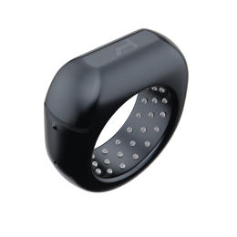
It's called the Talon. Created by Juan Gao, a former game designer who previously worked at Gameloft on mobile series like Asphalt and Dungeon Hunter, the Talon is a nine-axis motion sensor you wear on your ring finger. When paired over Bluetooth with a video game console, computer, or mobile device, the Talon would allow you to control games just by waving your arms.

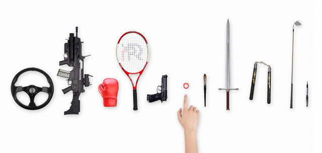
You could steer in a racing game by twisting an invisible wheel in front of you, or return a serve in tennis by making an invisible backstroke. Two action buttons on the side of the ring can also be pressed, allowing you to do things like perform in-game jumps, fire weapons, and so on. But gaming is just the beginning. The Talon's SDK will be open source, and available for developers to integrate into their apps in any way they choose: to control a TV, skipping a track on a phone, or switching slides in a presentation, to name just a few possibilities.

This isn't the first smart ring we've seen, but Talon is the first smart ring we've seen aimed at a gaming audience. "Other smart rings have focused more on notifications or the Internet of things, but we're focusing on mobile gaming with the Talon," Gao tells me. "It's a mature market, and almost everybody plays games in real life." Titanium Falcon is betting that gamers will be quicker to adopt a smart ring than other consumers, because they've already been introduced to motion controls on consoles like the Wii, PlayStation 4, or Xbox One. Why wouldn't they want to be able to play those kinds of games on your iPhone or iPad as well?

Nevertheless, the previous smart rings that we've seen have all had difficulty reaching the market. The reason's obvious: it sounds great on paper, but it's hard cramming enough battery, Bluetooth, and circuitry into a chassis as small as a ring. But Gao says that the Talon is using newer technology than past smart rings, which allow it to fit into a smaller form factor. In fact, Gao claims that the Talon's technology is "future proof," at least as far as further miniaturization is concerned. "It may not be possible for the sensors that are used in the Talon to get any smaller," he says. And even if it is, Gao claims that Titanium Falcon can adopt such technology into the current design, or future iterations of the Talon. And battery life looks good too: Gao says the current prototype lasts around 12 hours of active use between charges.

Although the Talon is in active development, it is not yet available for preorder. Titanium Falcon hopes to raise $300,000 to fund manufacturing on Indiegogo, starting September 16. When the crowdfunding campaign launches, expect a Talon preorder to cost less than $100, although exact price is still to be determined.

Sign up to learn more about Fast Company's Innovation Festival in November

'); $form.parent('div').removeClass('error'); }; function _formFail ($form, error) { if (!$form) { return; } // Use message from server response var message = JSON.parse(error.responseText); if (message.response && message.response.message) { message = message.response.message; // Error message not provided } else { message = 'Please enter a valid email address.'; } var $parent = $form.parent('div'); // Remove other errors first var $errors = $parent.find('.alert-box'); if ($errors) { $errors.fadeOut(300, function() { $(this).remove(); }); } if (message && (message.code === -100)||(message.code === 220)) { message = 'Please enter a valid email address.'; } // Append new errors $form.parent('div').prepend('
' + message + '
'); $form.find('input').prop('disabled', false); }; }); })

Apple's Marc Newson Designs A Space-Age Fountain Pen

$
0
0

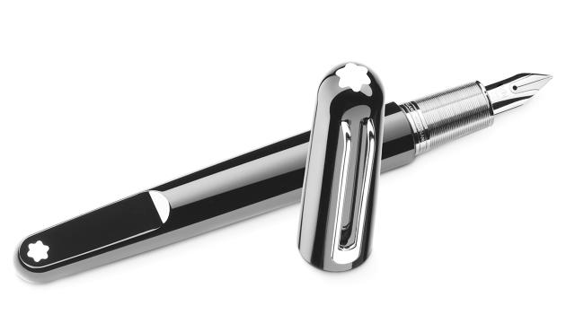
Now that he's joined Apple, famed industrial designer Marc Newson seems like he'd be more likely to design an iPad stylus at this point than a pen. But there's no rubber tip to be found on Marc Newson's latest creation, the Montblanc M fountain pen; it looks designed to write a love letter to the flowing ink nibs that the computer age is leaving behind.

Fountain pens are to people who still write with their hands what Swiss-made mechanical watches are to people who still tell time without looking at their phones. They're for customers who care about precision, craftsmanship, artistry, and luxury. Consequently, most high-end fountain pens have a throwback feel, as if they'd just been plucked from Jay Gatsby's breast pocket.

When Newson set out to design the Montblanc M, he wanted it to be the Apple Watch of fountain pens: as much a tribute to the past as an evolutionary step forward. "There had to be a certain character, something about the pen to make it different, to appeal to a new audience," says Newson. "Whilst respecting the DNA of the brand, I wanted to inject a sense of playfulness which I feel is important."

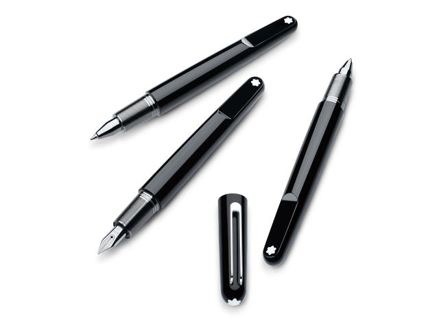
Part of that sense of playfulness comes from the Montblanc M's space age shape; it looks like the sort of fountain pen that an astronaut in Stanley Kubrick's 2001: A Space Odyssey might use. Created out of Montblanc's signature precious black resin, the M was shaped using a diamond tool, which gives it its sleek, fluid lines.

Besides aesthetics, the major innovation of the Montblanc M is that it introduces something a little bit like the MagSafe of Fountain pens: a magnet that ensures when you snap the cap back over the nip, the clip will be perfectly in line with the Montblanc logo.

"It added a certain level of mechanical complexity to the manufacturing of the pen," says Marc Newson. "But the end result is both intuitive and practical, giving it a certain playful character. There's something quite magical about a magnet. Fundamentally, it is a force that you cannot see. It's seductive, a kind of alchemy."

The Montblanc M will be available starting September 1, for an Apple Watch-level price: $565. That might seem like a lot, but it's a bargain for a high-quality pen that will last a lifetime, provided you don't accidentally lose it first. There's a cheaper rollerball or ballpoint version for $400.

Sign up to learn more about Fast Company's Innovation Festival in November

'); $form.parent('div').removeClass('error'); }; function _formFail ($form, error) { if (!$form) { return; } // Use message from server response var message = JSON.parse(error.responseText); if (message.response && message.response.message) { message = message.response.message; // Error message not provided } else { message = 'Please enter a valid email address.'; } var $parent = $form.parent('div'); // Remove other errors first var $errors = $parent.find('.alert-box'); if ($errors) { $errors.fadeOut(300, function() { $(this).remove(); }); } if (message && (message.code === -100)||(message.code === 220)) { message = 'Please enter a valid email address.'; } // Append new errors $form.parent('div').prepend('
' + message + '
'); $form.find('input').prop('disabled', false); }; }); })

This Snatch Of Code Can Give Any Website Better Typography

$
0
0

Good typography on the web is pretty rare, because it's hard. Consider quotes. Books use smart quotes, or quotation marks that mirror each other both horizontally and vertically on either side of the term being quoted. They just look nicer, but we don't really use them on the web, because they require you to memorize obscure keyboard commands to insert. Or how about the em-dash? Online, we substitute double dashes (- -), but properly, they look like this (—). A proper em-dash looks better, so why don't we use them?

Here's a good tool for anyone who cares about good typography on the web. Typeset is a new typographic pre-processor which you can easily install on your web page to automatically convert your ugly, dumbed down text into more sophisticated typography. For example, by automatically replacing the double dashes with em-dashes, or converting your dumb quotes into smart quotes.

Typeset does a lot more than just that, though. For example, most typesetters would replace an all-caps acronym like HTML with small caps. You can do this on the web by specifying small caps as a CSS variable around the word in question, but Typeset will enter them automatically. Typeset can detect the difference between smart quotes and double diacritics. It can even do hanging punctuation, pushing punctuation marks, hyphens, and bullet points to the outside of the margin, like in the Gutenberg Bible. That's something that usually requires a designer to use sophisticated typesetting tools, but Typeset can do it automatically.

Typeset is a free download on Github. Best of all, it won't slow things down much for your users: Typeset uses zero client-side Javascript to make your typography prettier. While many content management systems have some of these features built-in, Typeset is powerful and lightweight—handy to have in any web designer's toolkit.

[via Sidebar]

Sign up to learn more about Fast Company's Innovation Festival in November

'); $form.parent('div').removeClass('error'); }; function _formFail ($form, error) { if (!$form) { return; } // Use message from server response var message = JSON.parse(error.responseText); if (message.response && message.response.message) { message = message.response.message; // Error message not provided } else { message = 'Please enter a valid email address.'; } var $parent = $form.parent('div'); // Remove other errors first var $errors = $parent.find('.alert-box'); if ($errors) { $errors.fadeOut(300, function() { $(this).remove(); }); } if (message && (message.code === -100)||(message.code === 220)) { message = 'Please enter a valid email address.'; } // Append new errors $form.parent('div').prepend('
' + message + '
'); $form.find('input').prop('disabled', false); }; }); })

Floating Above London, This Invisible Pool Lets You Swim Laps In The Sky

$
0
0

Infinity pools are lame. Sky pools that stretch between buildings like transparent overpasses of water? Infinitely cooler.

The developers at the Embassy Gardens, a new luxury apartment complex opening in London, have just announced what they claim is the world's first sky pool. It's 82 feet long, and its killer feature is that it stretches between the complex's two towers, allowing residents to swim between the rooftop bar, spa, and orangery. Meanwhile, pedestrians below will actually be able to look up through the bottom of the pool to see people swimming above them.

"My vision for the sky pool stemmed from a desire to push the boundaries in the capability of construction and engineering. I wanted to do something that had never been done before," Sean Mulryan, chairman and CEO of the Ballymore Group, the project's developers, told the Verge. "The experience of the pool will be truly unique, it will feel like floating through the air in central London."

To make a sky pool like this, some resilient engineering is needed. The sky pool was created with the help of aquarium designers. The sky pool is around 10 feet deep, about four feet of which is made up of swimmable water. The water is held in the air by 8-inch thick aquarium glass.

Living in a building with a sky pool won't come cheap. Embassy Gardens is part of a $23 billion development project for in south-east London which has been highly criticized for turning the city's Battersea district into a "mini Manhattan" for wealthy foreigners from Asia and the Middle East. Consequently, if you want to move into the Embassy Gardens, it'll cost you: apartments in the complex start at around $950,000.

If you've got a cool million burning a hole in your pocket and an itching desire to do laps in the sky, you can learn more about Embassy Gardens here. If you get in, maybe get me a day pass, huh?

Sign up to learn more about Fast Company's Innovation Festival in November

'); $form.parent('div').removeClass('error'); }; function _formFail ($form, error) { if (!$form) { return; } // Use message from server response var message = JSON.parse(error.responseText); if (message.response && message.response.message) { message = message.response.message; // Error message not provided } else { message = 'Please enter a valid email address.'; } var $parent = $form.parent('div'); // Remove other errors first var $errors = $parent.find('.alert-box'); if ($errors) { $errors.fadeOut(300, function() { $(this).remove(); }); } if (message && (message.code === -100)||(message.code === 220)) { message = 'Please enter a valid email address.'; } // Append new errors $form.parent('div').prepend('
' + message + '
'); $form.find('input').prop('disabled', false); }; }); })

Half Ive, Half Rorschach, Behold The Ferromagnetic Lava Lamp!

$
0
0

If you're obsessed with ferromagnetic fluid—and hey, who wouldn't be?—it's a good time to be alive.

The Ferroflow is an interactive desktop sculpture by designer Matt Robinson, who describes it as a modern-day, high-tech lava lamp. Like a lava lamp, it's filled with a suspended liquid, which bubbles up in response to electromagnetic currents. That liquid is ferromagnetic fluid, a magnetic liquid invented by NASA in the 1960s. When you touch the Ferroflow, the ferromagnetic fluid starts bubbling around; touch it again to shut it off. A dial on the front, meanwhile, allows you to adjust and manipulate the liquid.

We've seen some designs that leverage ferromagnetism in their designs before, but they've always been expensive. The Ferroflow, however, manages to achieve its effect on a budget, by eschewing traditional electrromagnets for grade n52 rare earth magnets. Although significantly cheaper, these rare earth magnets are still strong enough to create the necessary magnetic field to move the ferrofluid blobs inside the sculpture.

Crafted out of anodized aluminum, the Ferroflow isn't some one-off sculpture. It's actually going to be available for sale. Robinson plans on launching the Ferroflow on Kickstarter next Tuesday. If you've always wanted a lava lamp that looks like the result of a collaboration between Hermann Rorschach and Jony Ive, the Ferroflow will be right up your alley.

[via io9]

Sign up to learn more about Fast Company's Innovation Festival in November

'); $form.parent('div').removeClass('error'); }; function _formFail ($form, error) { if (!$form) { return; } // Use message from server response var message = JSON.parse(error.responseText); if (message.response && message.response.message) { message = message.response.message; // Error message not provided } else { message = 'Please enter a valid email address.'; } var $parent = $form.parent('div'); // Remove other errors first var $errors = $parent.find('.alert-box'); if ($errors) { $errors.fadeOut(300, function() { $(this).remove(); }); } if (message && (message.code === -100)||(message.code === 220)) { message = 'Please enter a valid email address.'; } // Append new errors $form.parent('div').prepend('
' + message + '
'); $form.find('input').prop('disabled', false); }; }); })

Viridi, A Game About Succulents

$
0
0

Most video games are based upon stress: the stress of timing a jump, solving a puzzle, or beating an enemy. Viridi by Seattle-based developer Ice Water Games is different. It's designed to melt the stress away. Game might not even be the right word for it: it's all about the pursuit of gently tending to the needs of a succulent plant, spraying it as needed, while a lazy snail creeps along the edge of your pot.

"Tamagotchi is probably our closest point of reference," says Kevin Maxon, technical lead on Viridi, referencing the keychain digital pets that were popular in the 90's. Zoe Vartanian, the creative lead on Viridi, puts her finger on what Ice Water Games were trying to achieve more definitely.

"I asked myself, what is my ideal happy place game?" she tells me. "And I realized I wanted to make some beautiful little world where everything's pleasant, and you can just hang out there, and tend to things," she says.

Viridi was designed to be half gentle simulation, half art game. One inspiration Mountain, a algorithmically-generated simulator by 3-D animation artist David O'Reilly (who also designed the video game sequence in Spike Jonez's Her). Just like the chilled out Mountain, there's little gameplay to speak of in Viridi. You pick a pot, and a plant, spraying it with water and tending it over the course of a week, until it grows to fruition.

It has a gentle, ambient soundtrack, so you can leave the window open all day and keep tabs in on your plants. There are three default succulents to choose from, although other varieties of succulents can be purchased for a few cents each, a price point which was a very conscious decision.

Since the game is free to play, Ice Water Games spent a great deal of soul searching on how to monetize it. "For a long time, we didn't like the idea of microtransactions," Maxon tells me. "So we thought about the best way for people to unlock the plants. We eventually realized, though, that people would play just to unlock the next plant, which was antithetical to the spirit of the game: we want people to love the plant they have." So Ice Water Games decided to make buying new plants as cheap as buying real-life seeds.

"It's not much, but it makes a statement: 'This plant is valuable in and of itself,'" Maxon says.

But why succulents? "In real life, I have quite a few house plants, and try my best not to kill them, so it was natural I'd pick succulents," Vartanian says. "And it turns out people are excited by succulents, and really like them, even if they don't know what they're called."

Viridi is a primer, a simulation, and a love letter to this branch of botany, all rolled into one. It's available to play on PC and Mac for free, with Android and iOS versions coming within the year.

Sign up to learn more about Fast Company's Innovation Festival in November

'); $form.parent('div').removeClass('error'); }; function _formFail ($form, error) { if (!$form) { return; } // Use message from server response var message = JSON.parse(error.responseText); if (message.response && message.response.message) { message = message.response.message; // Error message not provided } else { message = 'Please enter a valid email address.'; } var $parent = $form.parent('div'); // Remove other errors first var $errors = $parent.find('.alert-box'); if ($errors) { $errors.fadeOut(300, function() { $(this).remove(); }); } if (message && (message.code === -100)||(message.code === 220)) { message = 'Please enter a valid email address.'; } // Append new errors $form.parent('div').prepend('
' + message + '
'); $form.find('input').prop('disabled', false); }; }); })

Enter The Matrix! This iPad App Lets You "See" Wi-Fi Signals

$
0
0

The invisible world around us pulses with radio waves, an electromagnetic tide that washes over everything. If you could see it, everything around us would ripple with information, like dropping a tab of acid after watching The Matrix.

The next best thing to that? The Architecture of Radio, a new exhibition by Dutch designer Richard Vijgen that uses an augmented reality iPad app to visualize the network of radio waves that surrounds us, revealing the invisible traffic of smartphones, GPS units, Wi-Fi routers, cell towers, overhead satellites, and more.

"As an information designer, I'm interested in visualizing things we cannot see," says Vijgen over email. "Most of the information we consume is delivered to us over the air via radio waves . . . We are connected 24/7 through devices that communicate wirelessly over Wi-Fi or cellular networks, yet contrary to the radio towers and transmission stations of the early days of radio, the infrastructure that underpins our information society is barely visible. Wi-Fi routers are hidden behind bookshelves and cell towers are mounted to existing buildings or disguised as trees."

The aim of Vijgen's app is to reveal this invisible architecture around us. On display at ZKM in Karlsruhe, Germany, Vijgen's exhibition invites visitors to use an iPad to view the data webs around them. The app uses GPS to get the user's location, then finds cell towers within reach using OpenCellID and any satellites passing overhead from NASA's [JPL](http://pds.jpl.nasa.gov/) data. Within ZKM, the app also has been programmed to "see" the wired communication infrastructure around you: for example, the data pulsing off of Wi-Fi routers and ethernet cables embedded in the exhibition space. It then animates all of this information on the iPad's screen, simulating the "infosphere" that surrounds us all and allowing us to see its patterns.

It is this infosphere that Vijgen hopes visitors to the Architecture of Radio will think about long after they leave the exhibition. "We cannot see the very thing that is defining our time, and that concerns me," says Vijgen. "As technology is becoming more and more transparent, I think data visualization can help us to relate to things that are invisible, yet play an important role in our lives." It will be on display at ZKM until April 2016.

[via Creative Applications]

Sign up to learn more about Fast Company's Innovation Festival in November

'); $form.parent('div').removeClass('error'); }; function _formFail ($form, error) { if (!$form) { return; } // Use message from server response var message = JSON.parse(error.responseText); if (message.response && message.response.message) { message = message.response.message; // Error message not provided } else { message = 'Please enter a valid email address.'; } var $parent = $form.parent('div'); // Remove other errors first var $errors = $parent.find('.alert-box'); if ($errors) { $errors.fadeOut(300, function() { $(this).remove(); }); } if (message && (message.code === -100)||(message.code === 220)) { message = 'Please enter a valid email address.'; } // Append new errors $form.parent('div').prepend('
' + message + '
'); $form.find('input').prop('disabled', false); }; }); })

This App For Kids Makes iPhone App Programming As Easy As Lego

$
0
0

Tinybop founder Raul Gutierrez was frustrated. Compared to the Apple II computers he grew up programming on, the iPhones in his kids' hands were unknowable black boxes: silicon sandwiches of wafer-thin components that may as well work by magic, for all a kid can play with them.

Tinybop's latest app, The Everything Machine, aims to change all that. The second part in their Diguital Toys series of apps, The Everything Machine turns all the components and sensors in an iPhone or iPad into Lego-like bricks of programming logic, allowing kids to program anything they can imagine: from a simple flash light app to a face-detecting fart machine.

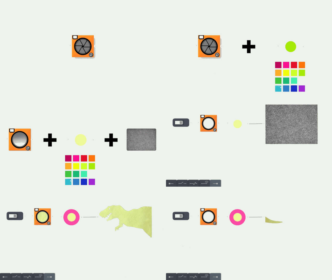
Here's how it works. When you load up The Everything Machine, you are presented with a drawer of components and a simple workspace. Every "program" starts by connecting components to a battery, giving them power. The components can be almost anything: your iPhone's camera, its microphone, a color-detection algorithm, your iPhone's vibration motor, and even some snippets of simple computer logic, like if/and modifiers. By dragging these components from the component drawer and attaching them to one another you can create simple apps, called machines.

For example, by dragging a toggle switch component onto the battery, then attaching your iPhone's flash, a kid can create a simple flashlight machine. Other, more "sophisticated" machines, can also be created. For example, I created a machine that could automatically detect when a face was in range of the camera, at which point, it would have Siri shout: "YOU SMELL LIKE FARTS!" (My wife did not care for my machine.)

According to Gutierrez, The Everything Machine was born out of a desire to teach his kids how computers actually work in the mobile age.

"A year or two ago, my son started asking questions about software and how iPhones are made," he says. "I realized just how hard it is to deconstruct the idea of a handheld supercomputer for an elementary school kid. I used physical circuits, introduced him to coding with Scratch and Hopscotch, and started showing him how sensors work. Little by little he started to get it, but I realized how hard it was to take the understanding of digital devices out of the realm of magic."

[i]The Everything Machine's[/i] design was heavily inspired by the science kits of yesteryear, including the Braun Lectron and the Gilbert Chemistry Experiment Lab. But even with these models at the front of Tinybop's mind, designing the app was still difficult. There was tension within Tinybop on exactly how streamlined The Everything Machine could be without undermining the goal of the app: evolving a child's understanding of digital devices out of the realm of magic.

For example, let's say a kid wants to make an app that can detect faces, which requires access to a camera. Some of the more engineer-minded in Tinybop thought face detection shouldn't work at all unless a kid remembers to drag the camera module into the workspace first. Ultimately, Tinybop decided to automatically chain in the camera module in that scenario. But how much does such streamlining dumb down a child's understanding of how digital devices actually work?

At the end of the day, Gutierrez says he thinks Tinybop struck the right balance. The kids who have been testing [i]The Everything Machine[/i] have created apps even Tinybop didn't think was possible. During testing, one child asked Gutierrez if it was possible to make a rainbow detector. Gutierrez told him that while it was possible to use The Everything Machine to detect one color at a time, he didn't think you could detect a whole rainbow. Fifteen minutes later, that kid delighted him by proving him wrong.

"I believe one of the most important ideas we can spark in kids is that everything non-natural is made by people, is the product of people's work, and is an expression of an accumulation of ideas: someone invented that milk carton; that mirror is the product of hundreds of years of history; the letters in that text on the screen were drawn by someone," says Gutierrez.

The Everything Machine is Tinybop's attempt to do just that for the iPhone age. You can purchase it for iPhone, iPad, and Apple Watch for $2.99 here.

Sign up to learn more about Fast Company's Innovation Festival in November

'); $form.parent('div').removeClass('error'); }; function _formFail ($form, error) { if (!$form) { return; } // Use message from server response var message = JSON.parse(error.responseText); if (message.response && message.response.message) { message = message.response.message; // Error message not provided } else { message = 'Please enter a valid email address.'; } var $parent = $form.parent('div'); // Remove other errors first var $errors = $parent.find('.alert-box'); if ($errors) { $errors.fadeOut(300, function() { $(this).remove(); }); } if (message && (message.code === -100)||(message.code === 220)) { message = 'Please enter a valid email address.'; } // Append new errors $form.parent('div').prepend('
' + message + '
'); $form.find('input').prop('disabled', false); }; }); })

These Totemic Sculptures Are The Ultimate Bookends For Your Lustig Library

$
0
0

Even if you don't recognize his name, Alvin Lustig was one of the great graphic designers of the 20th century. Although he died of diabetes before he was 40, Lustig created dozens of abstract, modernist covers for books by Thomas Mann, Joseph Campbell, Nathaniel West, D.H. Lawrence, and more. Paul Rand was a super fan, and used a couple of Lustig's New Directions covers as examples of great design in Thoughts On Design.

The Psychopathology of TIME & LIFE (Neurotica 5), 2015. Brass, wood, oil paint, steel and magazine ("Neurotica 5", Neurotica Publishing Co., Inc., Conn., 1949). 33 x 39 x 32.

Another fan of Lustig's design chops is Edgar Orlaineta, a Mexican artist who has created a series of sculptures specifically designed to enhance Lustig's cover designs. He calls it New Direction, and his sculptures have been created out of brass, walnut, and other materials to be paired with A Handful of Dust by Evelyn Waugh, Day of the Locust by Nathaniel West, Three Lives by Gertrude Stein, and more.

"I've always found Lustig's design appealing and intriguing," Orlaineta says by email about why he started the project. "He never felt as rigid as Bauhaus or other European graphic designers: he seemed more experimental and adventurous to me. His designs were closer to art, and his covers were not too literal. There was something enigmatic, something modern, and also very American, about his work."

According to Orlaineta, he was inspired to create his sculptures as a tribute to Lustig after learning of his tragic end. "He died very young, at 40, and he was blind in his last days, but still designing," Orlaineta says. "The fact that he was still designing while blind made me think about our body and the way we relate to the world with it. I started developing my work around that: not about blindness, but all the senses that are involved when we create, and the relationship between the eye, the hand, and the brain."

Orlaineta says that each of his sculptures was designed to incorporate a specific Lustig cover from the beginning. "I don't just add the book at the end," he says. "The sculptures always work together, formally and conceptually . . . To me, the covers of Alvin Lustig feel primitive, archetypical, symbolic, and pure. They are not sophisticated or extremely elaborate, but still very strong and beautiful." The New Direction sculptures are Orlaineta's attempt to create physical totems to these designs.

Sign up to learn more about Fast Company's Innovation Festival in November

'); $form.parent('div').removeClass('error'); }; function _formFail ($form, error) { if (!$form) { return; } // Use message from server response var message = JSON.parse(error.responseText); if (message.response && message.response.message) { message = message.response.message; // Error message not provided } else { message = 'Please enter a valid email address.'; } var $parent = $form.parent('div'); // Remove other errors first var $errors = $parent.find('.alert-box'); if ($errors) { $errors.fadeOut(300, function() { $(this).remove(); }); } if (message && (message.code === -100)||(message.code === 220)) { message = 'Please enter a valid email address.'; } // Append new errors $form.parent('div').prepend('
' + message + '
'); $form.find('input').prop('disabled', false); }; }); })

What Makes Vintage Video Game Art Great

$
0
0

Cool Box Art is a Twitter feed that dedicates itself to classic video game box art: the timeless, the surreal, and the sometimes woefully misrepresentative designs that have been used for decades to sell games. It's curated by Si Cole, James Purvis, and Ross Foubister, three gamers with a penchant for game art: mostly vintage, but sometimes newer art too.

On today's computers and consoles, we take cutting-edge graphics pretty much for granted, but yester year's game designers had to get by with a lot less. So in the golden age of gaming, a box had to do more than just get people to want to buy your game: it had to evoke the world, the graphics, and atmosphere, because the hardware of the time couldn't.

For example, it's hard to imagine a game with the box art of Rainbow Islands: The Story of Bubble Bobble 2. Produced for the vintage NES in 1988, the cover doesn't feature a single screenshot of the actual game itself: instead, it's like a claymation diorama evoking the rainbow worlds trapped inside the box. Or consider the art to Electronic Arts' classic post-apocalyptic RPG, Wasteland. Though it inspired the Fallout series of games, Wasteland's box art is painterly and atmospheric, almost like the cover to some heavy metal album.

"I wouldn't say vintage box art is, as a rule, the best," says Cole. "You'll find the good, the bad, and the downright ugly in any era!" Foubister agrees, but still says it's harder to be daring with modern game art. "I think today, there's a lot of issues with video game publishing that limits what people are willing to do with box art," he tells me. "Publishers want to guarantee a return on investment, and that can lead to conservative, realistic imagery. American and European publishers now often use box art to reflect the game's visuals, which can lead to a lot of bland images of CGI soldiers, instead of something more memorable."

Regardless of what era of box art you're talking about, though, Cole says that the Japanese still do box art best. "Not necessarily from an aesthetic point of view, as that's always going to be subjective," he says. "I think they do it best because they tend not to patronize their audience in the way Western publishers do. Everything is so literal with Western box-art. There's an 'It does what it says on the tin' ethos to its design. Japanese box art tends to be less afraid of asking questions of its audience. It's more expressive and metaphorical."

You can follow Cool Box Art on Twitter here.

Sign up to learn more about Fast Company's Innovation Festival in November

'); $form.parent('div').removeClass('error'); }; function _formFail ($form, error) { if (!$form) { return; } // Use message from server response var message = JSON.parse(error.responseText); if (message.response && message.response.message) { message = message.response.message; // Error message not provided } else { message = 'Please enter a valid email address.'; } var $parent = $form.parent('div'); // Remove other errors first var $errors = $parent.find('.alert-box'); if ($errors) { $errors.fadeOut(300, function() { $(this).remove(); }); } if (message && (message.code === -100)||(message.code === 220)) { message = 'Please enter a valid email address.'; } // Append new errors $form.parent('div').prepend('
' + message + '
'); $form.find('input').prop('disabled', false); }; }); })

Squeeze This Stress Ball Tourism Map To Zoom In

$
0
0

Navigating through a strange city can be stressful. It can also be dangerous, especially if you don't know where you're going: nothing makes you look more like a tourist than wandering around squinting at street signs with a map—or even smartphone—in your hands.

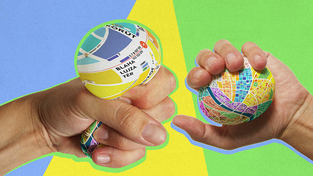
The Egg Map by Budapest-based designer Dénes Sátor is a design I'd love to see in every tourism gift shop: a stress ball with a map of the city printed on its sides, allowing tourists to find their way through strange streets without drawing attention to themselves. And when they get stressed out, they can just squeeze.

The map printed on the Egg Map colors each quarter of a city differently, so it's easy to tell where you are with just a glance. In the case of the prototype, the Egg Map shows off the topography of Budapest, but it could be Paris, Rome, London, New York, and so on. The killer touch on the Egg Map, though, is the unique affordance its form factor allows. By just squeezing the Egg Map, you can "zoom in" on a section of the map, as the displaced air inflates part of the ball. This allows you to read street names more clearly, as well as see local sights like metro stations, tourist attractions, nearby restaurants, and more.

I actually love this idea. I've traveled quite a bit, and I long ago made a habit of writing out street directions to places I was trying to go to on a palm-sized notepad. A smartphone in your palm makes you a mugging target in strange cities, as does a larger, fold-out map. The Egg Map has all the advantages of that approach, but with a lot more functionality. I hope this goes from concept to reality: I can easily see this on sale at every museum and airport gift shop.

[via Designboom]

Sign up to learn more about Fast Company's Innovation Festival in November

'); $form.parent('div').removeClass('error'); }; function _formFail ($form, error) { if (!$form) { return; } // Use message from server response var message = JSON.parse(error.responseText); if (message.response && message.response.message) { message = message.response.message; // Error message not provided } else { message = 'Please enter a valid email address.'; } var $parent = $form.parent('div'); // Remove other errors first var $errors = $parent.find('.alert-box'); if ($errors) { $errors.fadeOut(300, function() { $(this).remove(); }); } if (message && (message.code === -100)||(message.code === 220)) { message = 'Please enter a valid email address.'; } // Append new errors $form.parent('div').prepend('
' + message + '
'); $form.find('input').prop('disabled', false); }; }); })

Waste Your Day Away With This Gold Mine Of Games Made Specifically For Designers

$
0
0

We love video games for designers and design lovers. Like this one. And this one. Or this one.

That's why Games for Designers is like an early Christmas gift. It's a treasure trove featuring games about fonts, kerning, Photoshop, color, bezier curves, logo design, and more.

Hex Invaders

Created by Geoffrey Dorne, a French designer and founder of Design & Human, Games for Designers features a couple dozen games right now, and still counting.

"My life revolves around design, which is my job, my passion, and my burden," he says by email. "I like to play with fonts, colors, shapes, and logos. I can spend hours adjusting the kerning of a word, or finding the right color or font. I created Games for Designers for people like me."

Asked about what criteria he uses to select his games, Dorne says that every game he chooses must be "rigorous, fun, and totally immersed in the world of design."

KernType

Some of these games we've featured in the past, like KernType, a game in which you compete with typographers to perfectly space letters for readability. But there are loads here I've never heard of, such as 2048 for Photoshop, a version of the popular tile-matching game that slots as a plugin right into Adobe's photo-editing suite. Or Shoot The Serif, a web-based SHMUP in which you have to shoot all the serifed fonts as accurately and quickly as possible.

The site isn't just an excellent resource, it's an excellent way to slack off. There are tons of good games here, all of which will teach you new aspects of design. If you've got some time, check it out. You can always bill it to a client later.

Sign up to learn more about Fast Company's Innovation Festival in November

'); $form.parent('div').removeClass('error'); }; function _formFail ($form, error) { if (!$form) { return; } // Use message from server response var message = JSON.parse(error.responseText); if (message.response && message.response.message) { message = message.response.message; // Error message not provided } else { message = 'Please enter a valid email address.'; } var $parent = $form.parent('div'); // Remove other errors first var $errors = $parent.find('.alert-box'); if ($errors) { $errors.fadeOut(300, function() { $(this).remove(); }); } if (message && (message.code === -100)||(message.code === 220)) { message = 'Please enter a valid email address.'; } // Append new errors $form.parent('div').prepend('
' + message + '
'); $form.find('input').prop('disabled', false); }; }); })

How Ammunition And Apple's Ex-CEO Plan To Disrupt The "Design Center" Of The Smartphone World

$
0
0

Both John Sculley and Ammunition Group's Robert Brunner left Apple before the iPhone era. Sculley, the former CEO of Apple from 1983 to 1993, is perhaps best known as the man who pushed out Steve Jobs; as for Brunner, as the former director of industrial design at Apple, he's the guy who hired Jony Ive.

Now, the former Apple alums are launching their own line of smartphones, called Obi. But although Obi's Android handsets boast a beautiful industrial design worthy of Apple, Obi isn't trying to pick a fight with Cupertino for the high-end of the market. Instead, it's trying to bring Silicon Valley's sleek, agile design philosophies to the fastest growing segment of the international smartphone market: the sub-$200 price point traditionally dominated by OEMs in Asia, Africa, and the Middle East.

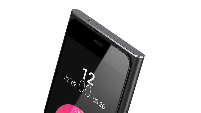
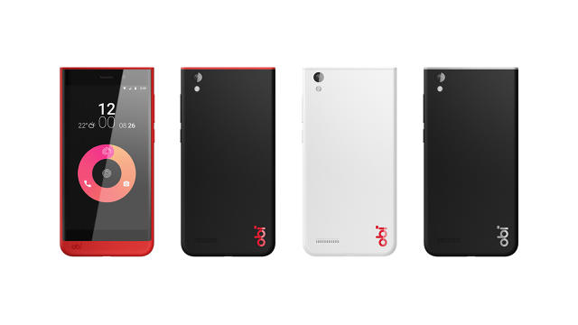
Obi's flagship 4G/LTE device is the Worldphone SF1. Its specs are solid: it features a 5-inch display, a 64-bit Qualcomm Snapdragon 615 processor, 2GB of RAM, 16GB of expandable storage, a high-end Sony 13MP processor, Dolby stereo speakers, and support for dual SIMs. The body is made of reinforced fiberglass with metal accents at the top and bottom of the phone; the back has a refined matte finish. On the face of the SF1, the glass screen is elevated, creating a unique, almost dew-drop profile. This also allows the device to slide into sheathe-like protective cases that lie completely flush with the screen. Available in white or black, the SF1 looks and feels luxe, but the price is just $199, unlocked.

Costing just $129, the more affordable Obi Worldphone SJ1.5 is aimed primarily at 3G markets. Like the SF1, it boasts a quad-core processor, this time from Mediatek, as well as a 5-inch display, dual SIM slots, front and rear cameras, and 16GB of expandable internal storage. The design loses the elevated screen of the SF1, taking a more expressive, colorful approach, with unique color and accent options. The design is asymmetrical, with a squared off top and a curved bottom; meanwhile, the curved glass screen cascades off the edges of the device, giving the SJ1.5 a seamless feel in the hand.

Regardless of which Obi phone you get, you still get a device that runs a custom-skinned version of Android Lollipop, and looks, feels, performs, and is packaged like a device that should cost twice as much. They both also feature some extremely clever touches that any luxury phone could proudly sport. According to Sculley, it's all part of a concerted plan to "shift the design center" of the international smartphone market from revolving around $600+ high-end, to a sub-$200 price point that represents the fastest growing segment of the market.

That said, the Obi line of smartphones isn't aimed at an American audience. Rather, it's squarely aimed at high-growth markets with rapidly growing youth populations, many of whom have literally never owned a smartphone, PC, or tablet before. It will go on sale in October in countries like Vietnam, Indonesia, Thailand, the UAE, Saudi Arabia, Kenya, Nigeria, Tanzania, South Africa, Pakistan, Turkey and India. These are countries where smartphones are sold in local shops, where you can't try out the device before hand. That's why both Obi Worldphones feature a beautiful, transparent retail box, designed by Ammunition to look premium and enticing, even behind the counter.

"Here's an industry where many international brands are just hemorrhaging losses," says Sculley. "HTC has gone from over 10% of the market in 2011 to just 2% this year, and the value of the company is just about the value on the balance sheet. Microsoft, meanwhile, has already written off the whole Nokia acquisition. The problem is that everyone keeps focusing on the premium end of the market: they think that's where the money is."

The thesis behind Obi is that a combination of Silicon Valley start-up gumption, the nimbleness that comes from being a relatively small company, and deep integration of design with every aspect of the business could "change the entire cost model" of being successful in the international smartphone market. It's an approach that is already being successfully taken by Chinese companies like Xiaomi and OnePlus, both of whom have leveraged supply chain contacts to deliver extremely well-designed, high-performance smartphones at a fraction of the price of an iPhone. But even their handsets cost more than Obi's.

"There's this common misconception that high quality, high level design is expensive," says Brunner. That's a result of what happens when design is just an "event" that happens in the process of making a product, as opposed to an integral part of every decision, from concept to manufacturing. "From our perspective, we wanted to blow apart this idea that beautiful, high-quality design comes at a high cost. I don't think that's true. If design drives a product from the beginning, you can make a no compromise device."

From The Creator Of "Spelltower," A Version Of Solitaire That Actually Works On The iPhone

$
0
0

Most mobile games are shame-plays. Angry Birds and Clash of Clans might be your favorite time wasters, but only when no one's watching. They're not "fit for life," says iOS developer Zachary Gage, developer of successful iOS games like Spelltower and the ballistic fishing sim Ridiculous Fishing.

Gage's latest game, Sage Solitaire, aims to be a game you're not afraid to be seen playing: the kind of game you pull out to play with the same cultural ease as checking your email or your Facebook. But this isn't granny's Klondike. It's a version of solitaire that owes as much to Atlantic City as it does to the mobile smash hit Threes!: a fast, beautiful game that bulldozes through the inherent design problems—the pace, the predictability—of poker-based solitaire games while perfecting the genre for the mobile age.

The problem with translating any of the myriad flavors of solitaire to mobile is that it's an inherently landscape game, the kind of thing you need a whole table (or computer desktop to enjoy). But that's not how we like using our phones, says Gage. "A big part of the design of Sage Solitaire is about trying to build something for phones, not tables," says Gage. To do so, he needed to create a new flavor of solitaire: something designed from the get-go to fit in the palm of a player's hand.

In the simplest mode of Sage Solitaire, the player is dealt nine piles of cards in a 3x3 grid: from top to bottom, in each respective pile, there are 8, 8, 8, 7, 6, 5, 4, 3, and 2 cards per pile. The top card in each pile is turned over by default. The idea is to make traditional poker hands—think pairs, full houses, straights, and flushes—out of the upturned cards, but unlike Texas Hold'Em, these 'hands' can be anywhere from 2 to 5 cards, as long as they span two rows. Creating these hands come with allotted point values, and bonus points are given for eliminating a pile of cards: +50 points per pile for the first row of cards, then +100 and +150 points per pile, respectively. You "win" by clearing all the cards, or by beating your previous high score.

According to Gage, the whole approach was inspired by Three Card Poker, an "insanely deeply random" variation of poker he encountered in Atlantic City. It helped him solve something Gage calls the 'future memory' design problem of poker-based solitaire games: essentially, they're not as random as they seem. If you get a five-card straight in the first 10-card hand of a poker-based solitaire, for example, and if the next five cards are redrawn from the same deck, you're likely to get a straight in the next hand too. And the next. And the next. That's why Sage Solitaire lets players move through the deck at variable speeds. It helps smash through the "future memory" problem.

"The hope is that I've made something that's both highly functional, and deeply comfortable," Gage says. "Like the game design itself, it feels like something you know, but secretly, it's better."

Even if nothing about its outward presentation screams Design! in all caps, it still helps Sage Solitaire fall into the sweet spot between 'addictive to learn' and 'addictive to master.' Cognitively, it also just feels good: everything clicks. The art has a clipart aesthetic; the sounds are a mix of soothing tones, cards fluttering, and the 8-bit symphonic cascade of a video poker arcade.

"Ultimately, games fit for life are a lot like good apps," he says. "I want to especially make more games that fit in players lives the same way Instagram or Facebook fits into users lives . . . the important part about Instagram isn't that it created digital connections, it's that it created a real community. Instagram is a thing people do in life, not just a thing people do on their phones. I want games to be more like that."

Sage Solitaire is free on the iOS App Store. You can get it here.

Sign up to learn more about Fast Company's Innovation Festival in November

'); $form.parent('div').removeClass('error'); }; function _formFail ($form, error) { if (!$form) { return; } // Use message from server response var message = JSON.parse(error.responseText); if (message.response && message.response.message) { message = message.response.message; // Error message not provided } else { message = 'Please enter a valid email address.'; } var $parent = $form.parent('div'); // Remove other errors first var $errors = $parent.find('.alert-box'); if ($errors) { $errors.fadeOut(300, function() { $(this).remove(); }); } if (message && (message.code === -100)||(message.code === 220)) { message = 'Please enter a valid email address.'; } // Append new errors $form.parent('div').prepend('
' + message + '
'); $form.find('input').prop('disabled', false); }; }); })

6 Tips For Designing An Awesome Rube Goldberg Machine

$
0
0

If nothing else, 3M is an impressive company for the sheer breadth of products it offers. According to Wikipedia, it makes more than 55,000 products, "including adhesives, abrasives, laminates, passive fire protection, dental and orthodontic products, electronic materials, medical products, car-care products, electronic circuits, and optical films."

What binds all of those products together? Science.

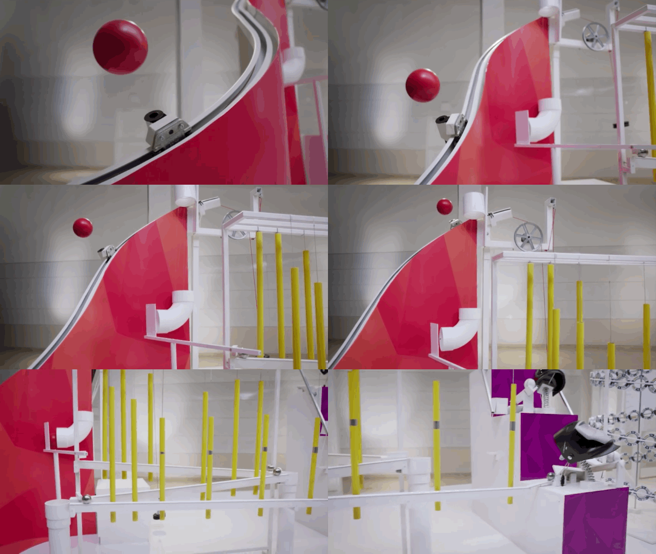
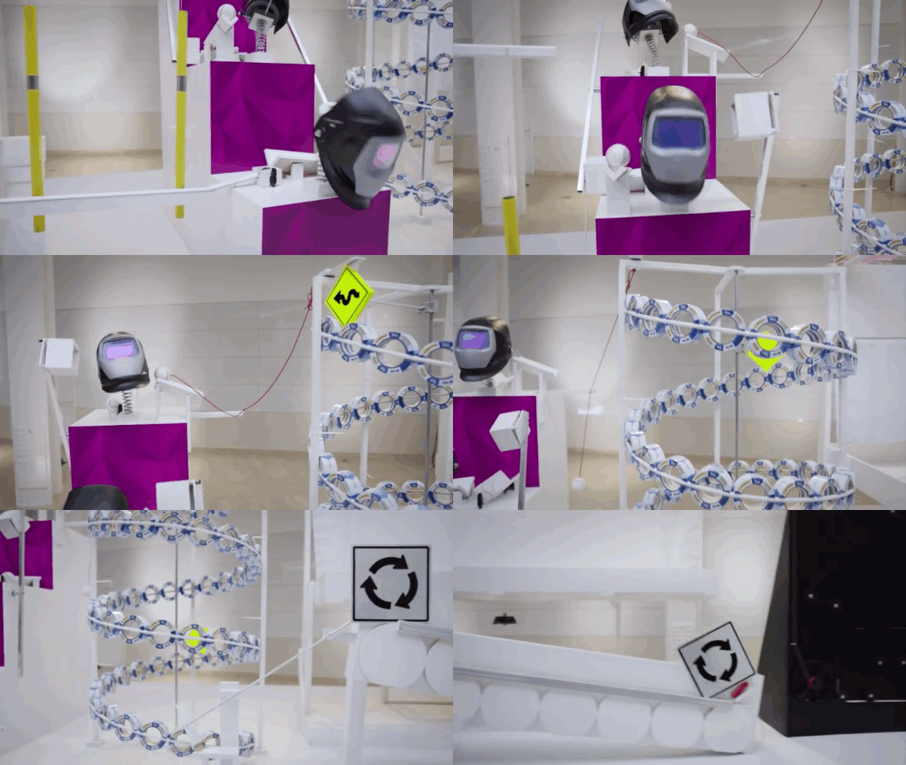
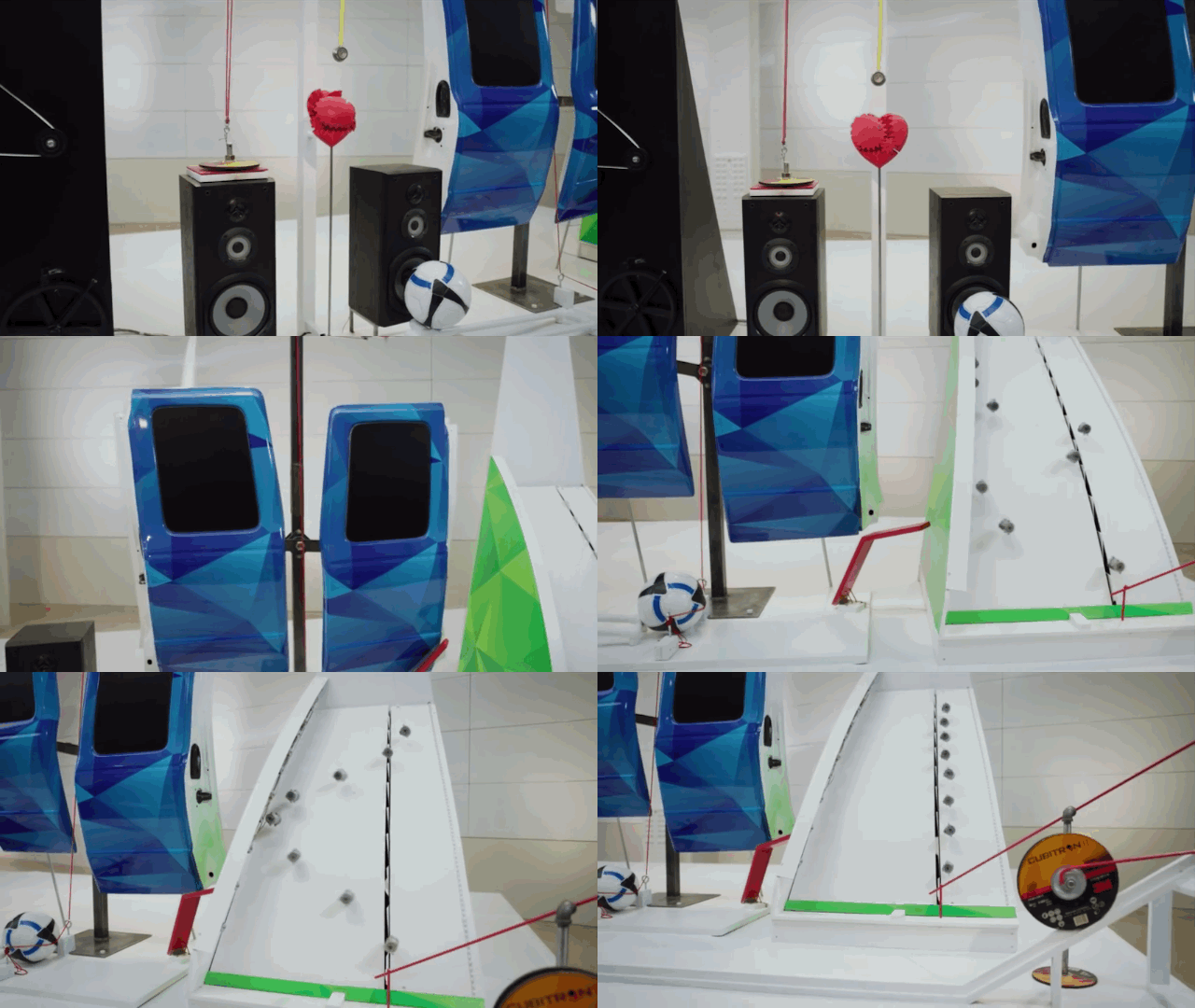
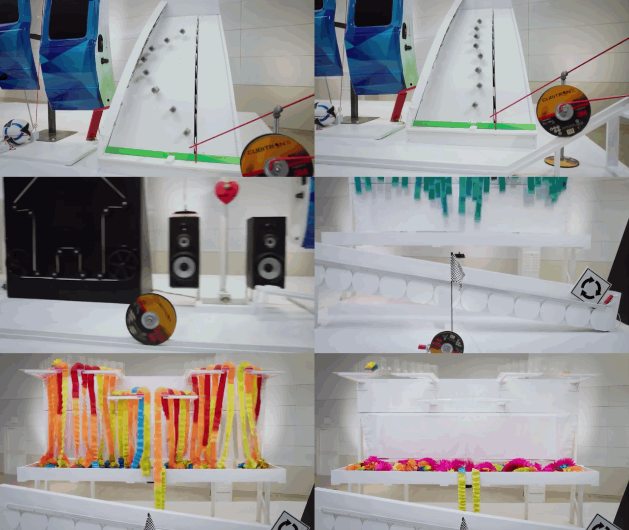
As part of a new marketing campaign, 3M decided to highlight some of its products while composing a sort of visual love letter to the science that inspires them. What they came up with was The Brand Machine, a wonderful contraption that uses 10 different 3M products as gears in an insanely convoluted Rube Goldberg machine.

The Brand Machine was designed by Hamster Wheel, a company founded by Jason Engbrecht, an associate professor of physics at St. Olaf College in Minnesota. At St. Olaf, Engbrecht has spent the past four years leading teams of college students in Rube Goldberg competitions, winning first place twice.

We asked Engbrecht if he could give us some tips on the key to designing a good Rube Goldberg machine. Here's what he told us.

Take Stock

A Rube Goldberg machine is only as good as the sum of its parts, so its important that those parts be interesting and wacky, says Engbrecht. In the case of the 3M Rube Goldberg, Hamster Wheel was given around 16 products to chose from, including audio tape, microscopic glass spheres, protective face masks, and rolls of packing tape.

All of these products were ones 3M was already trying to highlight as part of their "3M Science. Applied to Life" marketing camapign. At the end of the day, Hamster Wheel pared this list of products down to around 10 good ones to construct their Rube Goldberg machine, selecting only the products that could be used in visually compelling ways.

Timing's Everything

A good Rube Goldberg is all about timing. "It has to process slow enough that people can follow what's happening, but quick enough so that people don't get bored," Engbrecht says. In Hamster Wheel's experience, that means each stage's sweet spot is between five to ten seconds. A Rube Goldberg also can't be too cramped, because it makes it too hard to follow what's going on.

"You need to make it obvious for the eye to follow what's going on," says Engbrecht. "It's important to remember that it can be very difficult for people who don't already know these machines to see the next step coming."

Make Sure It Works In One Take

A true Rube Goldberg purist will insist that a machine has to work all in one go. If you're filming it, you can't splice together two takes: it has to work flawlessly at least once. According to Engbrecht, even getting a Rube Goldberg to work once can be a challenge: some of the machines Hamster Wheel has made took 40 tries to get one workable take from. If the Rube Goldberg keeps on keeling over, though, you need to simplify.

If You Can, Make It Repeatable

Even so, the best Rube Goldberg's don't just work well enough to be filmed once. They're resettable and repeatable: machines reliable enough that they always work flawlessly, no matter how convoluted their mechanisms. What makes the 3M Rube Goldberg so special, Engbrecht says, is that it was reliable enough to operate live. Hamster Wheel took their Rube Goldberg to 3M's headquarters, showing it off to audiences of up to 100 employees at a time. They did 20 shows in all, and each one went off without a hitch,

Get Outside Feedback

One thing Engbrecht says is that when you're working on a Rube Goldberg over a period of several months, you can get too close to it. You lose sight of what's exciting about it, what's boring, what's badly paced, and what's confusing. "It's always tough to gauge the reaction of a Rube Goldberg ahead of time, he says. "The fun thing about showing it live is you get immediate feedback, and it becomes very obvious what's surprising, and where your problems are."

Go Out With A Bang

In the case of the 3M Rube Goldberg, Hamster Wheel wanted to finish with a fluorescent cascade of Post-it Notes. The only problem? Post-it Notes weren't part of the original inventory of 3M products Hamster Wheel was given to work with. "We decided: Post-it Notes are the most iconic 3M product," Engbrecht remembers. "So we went to them and asked, can we use Post-it Notes anyway? They thought it sounded like fun, and so we chose the Post-it cascade for the end, because it's big and spectacular." After all, it just isn't a Rube Goldberg without a big finish.

'); $form.parent('div').removeClass('error'); }; function _formFail ($form, error) { if (!$form) { return; } // Use message from server response var message = JSON.parse(error.responseText); if (message.response && message.response.message) { message = message.response.message; // Error message not provided } else { message = 'Please enter a valid email address.'; } var $parent = $form.parent('div'); // Remove other errors first var $errors = $parent.find('.alert-box'); if ($errors) { $errors.fadeOut(300, function() { $(this).remove(); }); } if (message && (message.code === -100)||(message.code === 220)) { message = 'Please enter a valid email address.'; } // Append new errors $form.parent('div').prepend('
' + message + '
'); $form.find('input').prop('disabled', false); }; }); })

Ballantine's Space Glass Lets You Drink Whiskey In Microgravity

$
0
0

It sounds like the ultimate way for an astronaut to kick back after a space walk, but whiskey in space is weird. If you make it in space, it tastes funny; and if you ship it from Earth, astronauts have to sip it through straws from little sacks, like Capri Sun. Because while gravity might be a harsh mistress, at least it's not going to toss a tumbler full of Laguvulin in your face like microgravity will.

Ballantine, producer of blended Scotch whiskeys, knows that drinking whiskey in space is going to be an increasing humanitarian concern. So they commissioned the Open Space Agency's James Parr to design a whiskey glass that allows you to sip a fine single malt in style just like you would on Earth, even when gravity is a distant memory. The finished design is a 3-D printed, magnetically-weighted sippie cup orb that looks something like the ice sphere you might drink in your scotch.

Before we go into the details of the design, some background: a fundamental part of enjoying whiskey comes from swirling it around in the glass, allowing the heat of your palm to slightly warm the precious 80-proof amber inside, which in turn releases its taste-enhancing aroma. All of this is super difficult to manage in space, for one obvious reason: liquids blob up and float around when you don't have gravity.

"The way that liquids behave and are controlled in space is one of the fundamental challenges of space exploration," writes Parr on Medium. "It's one of the fundamental things on which rocket scientists have worked so hard. As soon as you get out of Earth's gravity, liquids don't behave as liquids should. So whether you are designing a rocket with its pumps and the way fuels move inside its tanks or a space glass, it's all focused around how we can best control liquids in microgravity to make them do what we need them to do."

In Parr's design, the "glass" is an enclosed orb made of medical-grade PLA plastic. Using a customized whiskey bottle nozzle, you pour some liquid into the glass, along with an optional ice cube. A spiral of capillaries flow around the inside of the glass, drawing liquid up to the rim of the glass through surface tension, just by twirling the glass. You can even put the space glass down like a regular tumbler, thanks to a magnet in the base which allows it to stick to metal surfaces.

It's an incredible design, as beautiful as it is space age. Just don't try to drink from Ballantine's space glass on Earth: although a baby could lift it in space, on Earth, the 22-pound space glass would give you quite the workout to drink from. And Heinlein help you if you dropped it on your big toe.

[via Engadget]

Pendleton's Wool "Star Wars" Blankets Are Perfect For Geeky Lumbersexuals

$
0
0

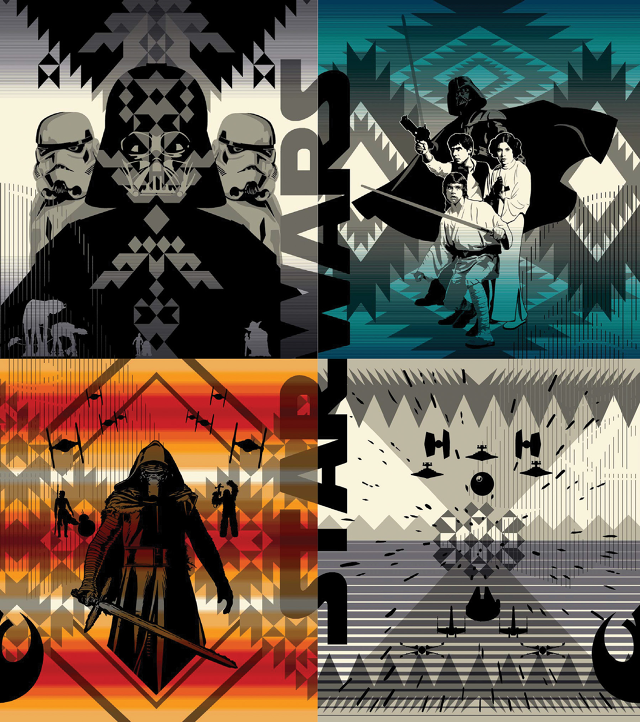
Since 1863, the Pendleton Woolen Mills in Portland, Oregon, have been producing high quality wool blankets, warm enough to keep you as toasty as a tauntaun's tummy even in the frigid wastes of Hoth. Now, in perhaps the most genius marketing cross-promotion ever, Pendleton is taking their Indian blankets to a galaxy far, far away, with four limited edition Star Wars blankets.

Spun from virgin wool and cotton, these blankets feature beautifully geometric designs, which land somewhere in feel between Ralph McQuarrie's classic designs and the traditional native-inspired patterns Pendleton has been selling on their blankets for 150 years. In other words, they're classy: this isn't the smelly Droids comforter you wrapped around you as a four year old. When folded on the foot of your bed, no one would ever mistake these blankets for being Star Wars themed, but hang them on your geek den wall, and all of a sudden, it's Lucas art.

There's four designs to choose from: one with the heroes of the original trilogy, one with Darth Vader and a squad of storm troopers, one with tie fighters, Star Destroyers, and the Death Star, and one with A Force Awakens' new big bad, Kylo Ren. (Where's the Jar Jar blanket?) Each is available as a limited run of 1,977 blankets, a nod to the original film's 1977 release date, and costs $249, which is normal for a Pendleton blanket.

This is a devious cross-promotion. I, as frequent readers well know, am a Star Wars nerd; my wife, meanwhile, is a Pendleton die-hard. Just as she has long since accepted that living with me means dealing with constant references to Dash Rendar and Chewbacca's heroic death on Sernpidal, I have come to accept that the rest of my life will be spent co-habitating a space with countless scratchy, too-warm wool blankets. With these blankets, Pendleton is making a Kessel run, right at my wallet.

You can buy your own Pendleton Star Wars blanket here

#Smilegate! Adobe Demos How To "Fix" Resting Bitch Face During iPad Pro Event

$
0
0

At today's Apple Event, Apple brought a couple of conquered tech enemies on stage to pay tribute to the new iPad Pro, including Microsoft and Adobe. But it was Adobe who made the biggest splash on Twitter, cluelessly demonstrating how the new iPad Pro could be used to "fix" a female model's lackluster smile. (Or, as the New York Timesmight put it, her "resting bitch face.")

It was a particularly tone deaf, arguably sexist note, especially for an event in which Apple seemingly took pains to bring more women on stage. Twitter immediately reacted, pointing out the problematic nature of the demo:

Considering how vocal Apple has been about their need to improve diversity within their workforce, this seems like a particularly bone-headed move. Women being told they need to smile more to be pretty is a particularly sensitive subject, even without Apple and Adobe making a tool that "fixes" ladies' smiles a focus point of their iPad Pro demo.

Apple's Big Plan To Transform Your Photos Into Videos

$
0
0

One of the singular features of the new iPhone 6s and iPhone 6s Plus is Live Photos. The new default way to take a picture on next-gen iPhones, Live Photos brings every photo to life when you hard tap them, seamlessly transforming them into a short live video. It's one of the best ideas Apple has had in years.

It's simplistic to think of Live Photos as just Apple's answer to GIFs. They're really movies: a single frame of a short video, shot in the blink of an eye, squished between two live-action digital bookends. When you tap a LivePhoto, it shows you about a second of video on the side, bringing the photo to life under your fingertip, almost like something out of Harry Potter.

This isn't exactly a new idea. Instagram, for example, displays videos almost as if they are still photos. They spring to life when they're under your finger, or if you linger on them too long. Both approaches extrapolate a still image from a video stream, but Apple's seems more magical, because it's happening invisibly.

All of this takes some nimble tech to get right. It's likely that Apple is making this happen thanks to their acquisition of SnappyLabs in 2014, the maker of SnappyCam, an app that allowed you to take full-resolution photos at 30 frames per second on your iPhone. (SnappyLab's technology was also incorporated into the iPhone 5s's Burst Mode camera functionality.) Older iPhones won't be able to take Live Photos either, because it requires a camera sensor that's just as good at video as it is at stills. That's rare, but thanks to 4K video support, the iPhone 6s's new 12MP sensor finally seems up to the task.

It's a lovely design detail, one that could easily get lost in the shuffle of an otherwise crowded event. Apple will be releasing a Live Photos API to developers, so this is even something that could be integrated into third-party apps. Imagine if every Instagram photo could be tapped to bring it to life, just like videos.

At the same time, it does introduce some interesting privacy connotations: If I'm taking a selfie, one second on either side of things is all I need to accidentally reveal I'm not wearing any pants. Sharing the perfect still shot is one thing, but accidentally sharing the couple of seconds of blurry ambient chaos that surrounded it is something else entirely.

Viewing all 2823 articles
Browse latest View live