Quantcast
Channel: Fast Company
Viewing all 2811 articles
Browse latest View live

Made Of Recycled E-Waste, A Wearable To Save The Earth

$
0
0

Wearables are designed to help inner thinking: to track how your choices and environment shape your health. But what about a wearable to promote outer thinking? Can a gadget help you learn to keep track of how your choices impact the health of the environment? Benjamin Hubert of London-based experience design agency Layer thinks so. In cooperation with the Carbon Trust, Layer has created the Worldbeing, a wearable device designed to help you track your carbon usage

According to Hubert, the Worldbeing was designed with the belief that with sea levels on the rise, and even the Pope calling for the world to take climate change seriously, the future will be one of accountability. If we're going to reduce the world's carbon emissions, everyone will need to be more keenly aware of how their everyday choices impact the environment: not just by doing obvious things like taking a road trip in your diesel-fueled Jetta, but things most people would never dream would impact their carbon footprint, like where they choose to buy groceries.

Featuring a low-power e-ink display, the Worldbeing aims to be a visible "call to action" to more responsible carbon usage. By pairing to a smartphone app over Bluetooth, it can tap into the Carbon Trust's advanced algorithms to make what Hubert calls an "accurate estimation" of how much carbon you're spending, either in total or against your daily carbon budget. In combination with the app and a built-in ECG sensor, the Worldbeing can actually be used as a wireless payment system, like Apple Pay.

When you buy things with the Worldbeing, it plugs real-time information on what you've purchased and from where into the app. Some companies and products are better about their carbon emissions than others, so Worldbeing takes that all into account, encouraging users to buy from more environmentally friendly stores. In addition to payments, Worldbeing can track other carbon metrics, like where you're traveling, and how. It then plugs all of this date into the Carbon Trust's algorithm, and comes up with an estimate on how much carbon you're personally responsible for each day.

But considering how much the mass production of electronics is contributing to the world's carbon emissions, isn't designing another gadget just adding to the problem? "The biggest design challenge wasn't making the Worldbeing smart in technology, but smart in responsibility," Hubert says. In other words, the wearable's industrial design needed to give more back to the environment than it took away.
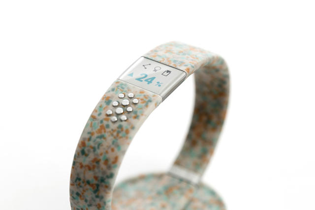
Several smart design choices help keep the Worldbeing philosophically honest. For one, the wristband is made of recycled e-waste: discarded plastics and circuit boards that have been shred into confetti, then injection-molded into an agglomerate material. It's from this material that the Worldbeing gets its eccentric, speckled look. Other design choices were made to lower the Worldbeing's carbon footprint: The e-ink display is far more energy efficient than the OLED display sported by the Apple Watch, for example.

Ultimately, Hubert hopes that the Worldbeing will help promote a more open understanding about how individual action can help fight climate change. But the Worldbeing isn't for sale yet: Although Hubert tells me the prototype has been designed, and the wearable is currently in beta testing, they are currently gauging interest in a wider release through social media. If the Worldbeing sounds like something you'd wear, you can help spread the word here.

'); window.ga('send', 'event', 'User' , 'Interaction' , this.key + ':ArticleView:newsletter:fail'); window.ga('rollup.send', 'event', 'User' , 'Interaction' , this.key + ':ArticleView:newsletter:fail'); if (index === data.response.errors.length - 1 ) { var successfulSubscribes = newsletters.diff(failedSubscribes); $(successfulSubscribes).each(function(index) { $form.parent('div').prepend('
Thank you! Please check your inbox to confirm you subscription to '+ (this.charAt(0).toUpperCase() + this.slice(1)).replace('Fastcompany', 'Fast Company')+ '!
'); window.ga('send', 'event', 'User' , 'Interaction' , this + ':ArticleView:newsletter:success'); window.ga('rollup.send', 'event', 'User' , 'Interaction' , this +':ArticleView:newsletter:success'); }); } }); } else { $form.parent('div').html('
Thank you! Please check your inbox to confirm!
'); $form.parent('div').removeClass('error'); window.ga('send', 'event', 'User' , 'Interaction' , 'fastcompany:ArticleView:newsletter:success'); window.ga('rollup.send', 'event', 'User' , 'Interaction' , 'fastcompany:ArticleView:newsletter:success'); window.ga('send', 'event', 'User' , 'Interaction' , 'events:ArticleView:newsletter:success'); window.ga('rollup.send', 'event', 'User' , 'Interaction' , 'events:ArticleView:newsletter:success'); } }; function _formFail ($form, error) { if (!$form) { return; } console.warn('error: ', error); // Use message from server response var message = JSON.parse(error.responseText); if (message.response && message.response.message) { message = message.response.message; // Error message not provided } else { message = 'Please enter a valid email address.'; } var $parent = $form.parent('div'); // Remove other errors first var $errors = $parent.find('.alert-box'); if ($errors) { $errors.fadeOut(300, function() { $(this).remove(); }); } if (message && (message.code === -100)||(message.code === 220)) { message = 'Please enter a valid email address.'; } // Append new errors $form.parent('div').prepend('
' + message + '
'); $form.find('input').prop('disabled', false); }; }); })

How Code+Theory Is Redesigning The "Huffington Post" To Withstand The Next Decade

$
0
0

Yesterday, Huffington Post CEO Jared Grusd announced at Advertising Week that the Post, the 10-year-old news aggregator and publishing empire founded by Arianna Huffington in 2005, was working with Code and Theory on a massive network redesign. But while site redesigns generally revolve around page layouts, new logos, font choices, and color schemes, the Huffington Post is taking a broader view. More than just a redesign, it's a reconception of a blogging behemoth that racks up over 240 million page views every month.

The goal of the Huffington Post redesign, says Code and Theory managing partner Mike Treff, isn't about a single new feature, element, or page: It's about building a holistic system that is agile and flexible enough to adapt to the next 10 years of web evolution.

As a platform, the new Huffington Post will aim to be more than a Lego set of different modules that the site's writers and editors can endlessly recombine to tell new stories. It aims to be a Lego system that's future-compatible, as opposed to future-proof. The idea is to allow pieces that no one has even imagined yet to effortlessly slot in.

"We're trying to build an annuity into the platform so it doesn't need to be redesigned every few years," Treff says. "Everything in media is changing, so the challenge is, how can we leapfrog the advances in content and storytelling before they actually happen?"

But that doesn't mean there won't be quantifiable differences in the new Huffington Post design, which Treff calls "tactical improvements." In thinking about the redesign, Treff says Code and Theory started by recognizing that there are two broadly different groups of HuffPo readers. Some are topical. They might come in once a day to read, say, the site's entertainment coverage, then leave when they're done. The others are temporal. These are readers who come infrequently, either because they saw a breaking story on social media or they remembered to check what was going on. For both types, the Huffington Post wants readers to stick around and read another story (or 12). But how you go about enticing these two groups of readers to do so is very different.

So a big part of the Huffington Post relaunch is going to be focused on using machine learning to give smart recommendations, based upon what the system knows about them. Treff says Code and Theory is also happy with the way it has worked to vastly simplify the Huffington Post's navigation structure, giving users "true wayfinding, instead of just a visual taxonomy." For a topical, entertainment-focused reader, the Huffington Post might serve up more entertainment recommendations, while a temporal reader might be given more breaking news, contextual articles based upon what they just read, or articles suggested based on what they read on the web last.

The new design will also feature the ability for editors to easily package up coverage in bundles relevant to breaking news stories, and redistribute them elsewhere on the site, while social media sharing will also be more deeply integrated with the content and branding of the site.

I asked Treff if there were any parts of the site's current design that were totally off limits to them. "No, nothing was off limits, but after thinking about it, we decided there were things we didn't want to touch, just because they were part of the brand's DNA."

That means you can expect the same Garamond green logo, and the same signature Splash jumbo headline at the top of each page—or at least versions of them. The challenge, Treff says, was to take this brand DNA and amplify it in the new design.

For now, the new Huffington Post is still a work in progress. Treff says due to all the behind-the-scenes work going into it, it won't be available to the public until sometime in 2016, when it will launch simultaneously on web, smartphones, and tablets.

'); window.ga('send', 'event', 'User' , 'Interaction' , this.key + ':ArticleView:newsletter:fail'); window.ga('rollup.send', 'event', 'User' , 'Interaction' , this.key + ':ArticleView:newsletter:fail'); if (index === data.response.errors.length - 1 ) { var successfulSubscribes = newsletters.diff(failedSubscribes); $(successfulSubscribes).each(function(index) { $form.parent('div').prepend('
Thank you! Please check your inbox to confirm you subscription to '+ (this.charAt(0).toUpperCase() + this.slice(1)).replace('Fastcompany', 'Fast Company')+ '!
'); window.ga('send', 'event', 'User' , 'Interaction' , this + ':ArticleView:newsletter:success'); window.ga('rollup.send', 'event', 'User' , 'Interaction' , this +':ArticleView:newsletter:success'); }); } }); } else { $form.parent('div').html('
Thank you! Please check your inbox to confirm!
'); $form.parent('div').removeClass('error'); window.ga('send', 'event', 'User' , 'Interaction' , 'fastcompany:ArticleView:newsletter:success'); window.ga('rollup.send', 'event', 'User' , 'Interaction' , 'fastcompany:ArticleView:newsletter:success'); window.ga('send', 'event', 'User' , 'Interaction' , 'events:ArticleView:newsletter:success'); window.ga('rollup.send', 'event', 'User' , 'Interaction' , 'events:ArticleView:newsletter:success'); } }; function _formFail ($form, error) { if (!$form) { return; } console.warn('error: ', error); // Use message from server response var message = JSON.parse(error.responseText); if (message.response && message.response.message) { message = message.response.message; // Error message not provided } else { message = 'Please enter a valid email address.'; } var $parent = $form.parent('div'); // Remove other errors first var $errors = $parent.find('.alert-box'); if ($errors) { $errors.fadeOut(300, function() { $(this).remove(); }); } if (message && (message.code === -100)||(message.code === 220)) { message = 'Please enter a valid email address.'; } // Append new errors $form.parent('div').prepend('
' + message + '
'); $form.find('input').prop('disabled', false); }; }); })

Better Than The Supermoon, This Lamp Makes An Eclipse From A Rainbow

$
0
0

The next one might not be scheduled until 2033, but if Sunday's supermoon lunar eclipse just whet your appetite, you might consider this lamp for your living room (if it is ever produced!). Its clever, simple design overlays seven multicolored eclipses, one over the other, for the ultimate in mood lighting.

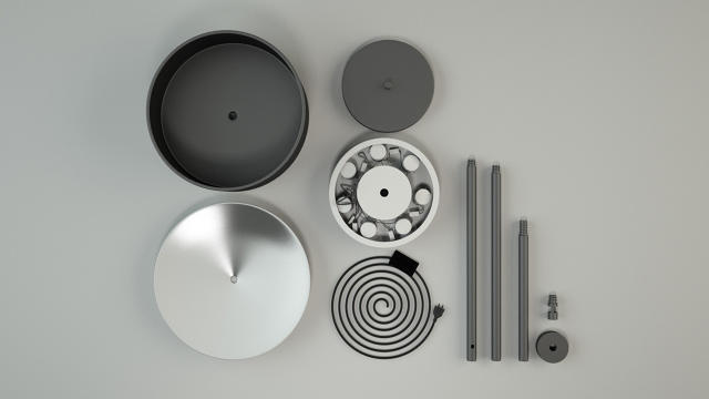
When not in use, the Eclipse of Rainbow lamp looks low key: not so much like an Ikea lamp as the one Ikea knocked off when designing their lamp. There are two main differences: Seven LED bulbs, each positioned at a different angle, make up the lamp's light source. Because these bulbs are shaded with a black steel hood, they emit their light directly to the base of the lamp, where it passes through an opaque plastic disc to create a pan-chromatic constellation of eclipse-like shadows throughout the room.

The Eclipse of Rainbow was designed by Greek designer Eugenia Antoniou, and its name is a fairly straightforward representation of its pedigree. Inspired by eclipses, Antoniou decided to create her lamp to see how well it could be applied to the rainbow. The result is undeniably successful, so much so that Antoniou's lamp received an honorable mention in the Red Dot Awards this year, as well as first prize at the Ideas Design Competition at Luminaire 2014. Sadly, though, it remains a one-off, at least for now.

(Via: Yanko Design)

'); window.ga('send', 'event', 'User' , 'Interaction' , this.key + ':ArticleView:newsletter:fail'); window.ga('rollup.send', 'event', 'User' , 'Interaction' , this.key + ':ArticleView:newsletter:fail'); if (index === data.response.errors.length - 1 ) { var successfulSubscribes = newsletters.diff(failedSubscribes); $(successfulSubscribes).each(function(index) { $form.parent('div').prepend('
Thank you! Please check your inbox to confirm you subscription to '+ (this.charAt(0).toUpperCase() + this.slice(1)).replace('Fastcompany', 'Fast Company')+ '!
'); window.ga('send', 'event', 'User' , 'Interaction' , this + ':ArticleView:newsletter:success'); window.ga('rollup.send', 'event', 'User' , 'Interaction' , this +':ArticleView:newsletter:success'); }); } }); } else { $form.parent('div').html('
Thank you! Please check your inbox to confirm!
'); $form.parent('div').removeClass('error'); window.ga('send', 'event', 'User' , 'Interaction' , 'fastcompany:ArticleView:newsletter:success'); window.ga('rollup.send', 'event', 'User' , 'Interaction' , 'fastcompany:ArticleView:newsletter:success'); window.ga('send', 'event', 'User' , 'Interaction' , 'events:ArticleView:newsletter:success'); window.ga('rollup.send', 'event', 'User' , 'Interaction' , 'events:ArticleView:newsletter:success'); } }; function _formFail ($form, error) { if (!$form) { return; } console.warn('error: ', error); // Use message from server response var message = JSON.parse(error.responseText); if (message.response && message.response.message) { message = message.response.message; // Error message not provided } else { message = 'Please enter a valid email address.'; } var $parent = $form.parent('div'); // Remove other errors first var $errors = $parent.find('.alert-box'); if ($errors) { $errors.fadeOut(300, function() { $(this).remove(); }); } if (message && (message.code === -100)||(message.code === 220)) { message = 'Please enter a valid email address.'; } // Append new errors $form.parent('div').prepend('
' + message + '
'); $form.find('input').prop('disabled', false); }; }); })

This Minimalist Paint Set Teaches Kids Color Theory

$
0
0

The first lesson in color theory most of us have is mixing paints and seeing what new colors we can come up with. Nameless Paints takes this one step further. Instead of labeling each tube of paint with a name or a Pantone reference number, the Nameless Paint Set identifies each color using multicolored bullets, revealing exactly how that color would be created in a CMY printing process.

As you might be aware, the subtractive color model is often used in printing to create a much broader spectrum of colors by mixing just three pigments (cyan, magenta, and yellow, or CMY). So if you mix yellow and cyan, you get green, while magenta and yellow will get you red. Nameless Paints uses this model as a labeling system for 10 tubes of paint. Although each tube is uniformly white, you can tell what color is inside by mentally translating the CMY code printed on the side into a blended color. The Nameless Paints system even uses proportion to create shades of orange, green, and blue by using a little less pigment here or there (denoted by a slightly smaller CMY bullet) to create a broader palette.

The system is meant to encourage people to gain a better understanding of the mechanics of color theory. Nameless Paints was designed by Yusuke Imai and Ayemi Moteki, of the Japanese design duo Ima Moteki. "By not assigning names to the colors, we want to expand the definition of what a color can be, and the various shades they can create by mixing them,"explains Imai.

As a concept, Nameless Paints won a Kokuyo Design Award back in 2012; it's only now that the paint set is becoming commercially available. The Japanese stationery brand Campus will begin selling Nameless Paints in Japan for around $15 a set starting in October.

(Via: This Is Colossal)

'); window.ga('send', 'event', 'User' , 'Interaction' , this.key + ':ArticleView:newsletter:fail'); window.ga('rollup.send', 'event', 'User' , 'Interaction' , this.key + ':ArticleView:newsletter:fail'); if (index === data.response.errors.length - 1 ) { var successfulSubscribes = newsletters.diff(failedSubscribes); $(successfulSubscribes).each(function(index) { $form.parent('div').prepend('
Thank you! Please check your inbox to confirm you subscription to '+ (this.charAt(0).toUpperCase() + this.slice(1)).replace('Fastcompany', 'Fast Company')+ '!
'); window.ga('send', 'event', 'User' , 'Interaction' , this + ':ArticleView:newsletter:success'); window.ga('rollup.send', 'event', 'User' , 'Interaction' , this +':ArticleView:newsletter:success'); }); } }); } else { $form.parent('div').html('
Thank you! Please check your inbox to confirm!
'); $form.parent('div').removeClass('error'); window.ga('send', 'event', 'User' , 'Interaction' , 'fastcompany:ArticleView:newsletter:success'); window.ga('rollup.send', 'event', 'User' , 'Interaction' , 'fastcompany:ArticleView:newsletter:success'); window.ga('send', 'event', 'User' , 'Interaction' , 'events:ArticleView:newsletter:success'); window.ga('rollup.send', 'event', 'User' , 'Interaction' , 'events:ArticleView:newsletter:success'); } }; function _formFail ($form, error) { if (!$form) { return; } console.warn('error: ', error); // Use message from server response var message = JSON.parse(error.responseText); if (message.response && message.response.message) { message = message.response.message; // Error message not provided } else { message = 'Please enter a valid email address.'; } var $parent = $form.parent('div'); // Remove other errors first var $errors = $parent.find('.alert-box'); if ($errors) { $errors.fadeOut(300, function() { $(this).remove(); }); } if (message && (message.code === -100)||(message.code === 220)) { message = 'Please enter a valid email address.'; } // Append new errors $form.parent('div').prepend('
' + message + '
'); $form.find('input').prop('disabled', false); }; }); })

Explore The Terrifying Scale Of Mount Everest In This 3.2 Billion Pixel Interactive

$
0
0

Even as yet another eponymous movie) opens in theaters, Nepalese officials are making access to Mount Everest harder than ever to attain. If you're wondering why, look no further than this 3.2 billion pixel interactive tour of Mount Everest by photographer David Breashears of GlacierWorks. Not only is it the next best thing to climbing Everest yourself, it puts in perspective how massive and deadly the Himalayan mega-mountain really is.

Cobbled together from over 400 individual photos, Mount Everest doesn't look like such a big deal when you first load the Franken-image . In fact, focuses on a small icy footpath leading between two crystalline hillocks, leading up to a more massive mountain in the horizon. A few green squares represent clickable hot spots, but they stop far below the summit.

It's only when you click on one of these hotspots that the true scale of Everest becomes clear. At the bottom of the footpath, I clicked on a hotspot, expecting to zoom in on maybe some trash that a hiker had left behind, until the image fully resolved itself. What I thought was just a piece of trash at the beginning of the trail turned out to be Everest's massive base camp, filled with tents, vehicles, and more.

And that's just the beginning of the ascent. Next, you have to climb the Khumbu Icefall, a perilous section of the route to the summit marked by its unstable boulders of ice and deadly crevices, some of which contain corpses. (You can discover these caves for yourself.) And once you've gotten over that, you're still only half way to the top.

First created in 2012, Breashears' interactive panorama is a little clunky since it was coded with Flash instead of HTML5. And if you want to learn about Mount Everest, there are other interactives out there that perhaps do a more educational job. But as far as giving you a sense of the terrifying scale of the world's tallest mountain, without climbing it yourself? This is still the interactive to beat.

Sagmeister & Walsh Bring Roy Lichtenstein To Life

$
0
0

Although the last time we heard from them, they were naked and covered in cockroaches, Stefan Sagmeister and Jessica Walsh of Sagmeister & Walsh aren't always rolling around in squalor. In fact, their latest campaign for Middle East department store Aizone is about as far from grimy as you can get: to promote the store's items, they've taken fun and frantic pop art sensibilities and brought it to 3-D life.

According to Walsh, the idea for the campaign came from the idea of taking an art style that is usually trapped on paper and applying it to the real world.

"The idea started when we were thinking of the concept of a painting or illustration and how oftentimes illustrators try to imitate reality in a 2-D form," explains Walsh. "So we wondered, what if we flipped the script, and actually made a three-dimensional environment look like an illustration."

Inspired by the art of Roy Lichtenstein, Sagmeister & Walsh's Aizone campaign uses bright fluorescents, bold geometrical forms, and lots and lots of cross-hatches and polka dots. Although many of the products in the shots are ones that Aizone actually sells, they are contrasted by brightly colored papercraft props of plants, lemonade pitchers, vases, and more.

The result is something like a comic strip sprung to life. In addition to a number of promotional shots, Sagmeister & Walsh also did a cute series of stop-motion ads, featuring Aizone products animated in a pop-art style. You can check them out here.

Studio KCA Designs A Comet For NASA

$
0
0

To celebrate the Rosetta landing, NASA wanted to put a comet on display, but despite its plans to someday tow a comet into orbit, the only way to get one to land on Earth is via a chance collision. It goes without saying that it's not exactly the best way to keep a specimen intact. As an alternative, they asked Studio KCA, a Brooklyn-based architecture and design firm, to make one.

Commissioned by the World Science Festival, NASA's Jet Propulsion Lab, and the European Space Agency, the comet commemorates the successful landing of the Rosetta spacecraft on comet 67P in November of 2014. Although the Rosetta spacecraft's Philae lander blundered into a dark spot on 67P's surface, preventing its solar panels from working, the mission is widely considered to have been a success.

As such, the number 67 plays a central role in Studio KCA's design. Crafted out of 67 folded steel plates dimpled through out craters and copper tubing, Studio KCA's Comet looks like a perfectly intact meteorite just smashed into the skin of the Earth. Over 9 feet tall and twelve feet wide, the effect is amplified by the fact that Comet emanates a steam-like mist, as if the meteor was still molten from plunging through the upper atmosphere. It even glows, thanks to 600 watts of LED lights.

The 1:1000 scale model of Comet 67P's nucleus has been touring the world. It's ultimate destination is NASA's Jet Propulsion Laboratory in Pasadena, California, where it will make its final landing in December 2015.

[via Designboom]

Casio's Latest Calculator Is The Best-Looking Number Cruncher Since Dieter Rams

$
0
0

Along with every other gadget it has killed off (cameras, radios, GPS units, etc.), the smartphone hasn't been very friendly to our good friend, the calculator. But Casio's hoping that design will make you want to buy a calculator again: their new S100 flagship calculator puts a premium on materials and craftsmanship to try to get you to forget that your iPhone comes with a calculator app for free.

Calling it an artisanal calculator, Casio says the S100 is being released to celebrate the 50-year anniversary of Casio's first calculator with built-in memory, the '001', first released this month in 1965. And, from a pure functionality perspective, the S100 isn't going to be all that much more powerful than the 001: you'll find no graphing functions, apps, Wi-Fi, or built-in games here.

So what does it have going for it? Craftsmanship. Crafted from high-quality aluminum alloy, the S100 features V-shaped isolation keys that prevent the unit from shaking when you're hammering out a calculation, as well as a high-quality, non-reflective display for reading numbers. It can also fit more numbers on the display than most calculators: up to 12 at once. Which I guess isn't that impressive, but seems like a lot more than I could fit on a calculator screen when I was a kid. It also has a solar-powered battery that will last seven years on a single charge, perfect for calculating tips when the sun dies out.

In short, Casio's new S100 calculator is probably the best looking calculator since Dieter Rams designed the Braun ET-66. A calculator, by the way, which only costs $49 to buy brand new today. The Casio S100, on the other hand, will cost $220, slightly more than the on-contract iPhone that made it obsolete. That ET-66 is looking pretty tempting right now, don't you think?

[via the Wall Street Journal]


Disney's Crazy New Tech Brings Coloring Books To Life

$
0
0

In the age of iPads and apps, coloring books are evolving from the go-to distraction for kids into a hobby for mindful adults. But Disney Research's latest invention—bringing coloring books to life through augmented reality—might make the children's version cool again.

As Disney's team—based in Zurich—notes, coloring books provide children one of their earliest opportunities to be creative. Unfortunately, they also look boring and unexciting compared to the myriad screens and gadgets competing for a child's attention. They believe the key to getting kids coloring again is to leverage augmented reality (AR). By give coloring books the allure of electronics, this analog/digital partnership encourages children to express their creative side.

As a child fills in a cartoon character on the page, the app—making use of the camera on a smartphone or tablet—scans the colors and patterns they create to fill in a 3-D animated model of that same character within the app. Since a drawing is 2-D, the algorithm can also intelligently extrapolate patterns and color to parts of the 3-D model otherwise unrepresented in the drawing—for example, by coloring an elephant's back the same color as its front.

Presented at the IEEE International Symposium on Mixed and Augmented Reality last month, Disney's AR coloring book is just a research project for now, but it's easy to see how this could be marketed to children. Just imagine a coloring book for a Pixar movie that lets you color the characters any way you want, then use this technology to insert those new designs into the film!

You can read Disney's paper on its AR coloring book technology here.

'); window.ga('send', 'event', 'User' , 'Interaction' , this.key + ':ArticleView:newsletter:fail'); window.ga('rollup.send', 'event', 'User' , 'Interaction' , this.key + ':ArticleView:newsletter:fail'); if (index === data.response.errors.length - 1 ) { var successfulSubscribes = newsletters.diff(failedSubscribes); $(successfulSubscribes).each(function(index) { $form.parent('div').prepend('
Thank you! Please check your inbox to confirm you subscription to '+ (this.charAt(0).toUpperCase() + this.slice(1)).replace('Fastcompany', 'Fast Company')+ '!
'); window.ga('send', 'event', 'User' , 'Interaction' , this + ':ArticleView:newsletter:success'); window.ga('rollup.send', 'event', 'User' , 'Interaction' , this +':ArticleView:newsletter:success'); }); } }); } else { $form.parent('div').html('
Thank you! Please check your inbox to confirm!
'); $form.parent('div').removeClass('error'); window.ga('send', 'event', 'User' , 'Interaction' , 'fastcompany:ArticleView:newsletter:success'); window.ga('rollup.send', 'event', 'User' , 'Interaction' , 'fastcompany:ArticleView:newsletter:success'); window.ga('send', 'event', 'User' , 'Interaction' , 'events:ArticleView:newsletter:success'); window.ga('rollup.send', 'event', 'User' , 'Interaction' , 'events:ArticleView:newsletter:success'); } }; function _formFail ($form, error) { if (!$form) { return; } console.warn('error: ', error); // Use message from server response var message = JSON.parse(error.responseText); if (message.response && message.response.message) { message = message.response.message; // Error message not provided } else { message = 'Please enter a valid email address.'; } var $parent = $form.parent('div'); // Remove other errors first var $errors = $parent.find('.alert-box'); if ($errors) { $errors.fadeOut(300, function() { $(this).remove(); }); } if (message && (message.code === -100)||(message.code === 220)) { message = 'Please enter a valid email address.'; } // Append new errors $form.parent('div').prepend('
' + message + '
'); $form.find('input').prop('disabled', false); }; }); })

The Strange Second Life Of Vintage Pizza Huts

$
0
0

These days, you'll find Pizza Huts everywhere, from shopping mall food courts to nondescript retail storefronts. But in their glory days, Pizza Hut locations were every bit as iconic for their odd, hut-shaped structures as McDonald's is for its golden arches. And over the years, the rule that every Pizza Hut franchise should be shaped like a hut has lapsed. The old huts still live on, however, passing into a second life where they've been repurposed into everything from grocery stores to funeral homes.

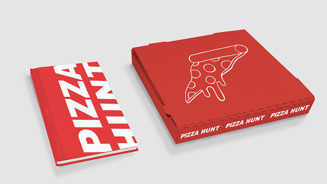
Photographer Ho Hai Tran is obsessed with Pizza Hut second lives. He's on a quest to find and photograph every reincarnated Pizza Hut as part of Pizza Hunt, a new book project he's funding on Kickstarter.

According to Tran, no one knows how many vintage Pizza Hut buildings still exist. They were all largely built in the '70s, '80s, and '90s, modeled after the shape of "Pizza Hut Number One," the first franchise location in Wichita, Kansas. These locations all have a two-tiered, shingled red roof and trapezoidal windows, which makes their silhouette still clearly identifiable, even after the Pizza Hut branding has been stripped away.

The goal of Pizza Hunt is to find as many of these old buildings as possible, photographing them and mapping them for posterity. According to Tran, the hut's iconic shape possesses a allure that is unique to the Pizza Hut franchise. While a hut's shape makes its pedigree as an ex-Pizza Hut immediately obvious, it's also strangely adaptable to other contexts.

"The weirdest ones are the funeral homes and mortuaries," he says. "It's just such a juxtaposition." Even so, Tran says he's seen ex-Pizza Huts serve as everything from "churches, mosques, pool shops, and pawn shops—the list goes one. No matter what they become, they still always hint at their past."

But why should we be fascinated by the repurposing of old corporate architecture? To that question, Tran quotes author Philip Langdon, author of the book Orange Roofs, Golden Arches: "The chain restaurant is something of a strange object—considered outside the realm of significant architecture, yet swiftly reflecting shifts in popular taste and unquestionably making an impact on daily life."

If these huts could go from mainstream to forgotten so quickly, it really makes you wonder how quickly today's architecture could be swept away . . . and what strange second lives it will have.

'); window.ga('send', 'event', 'User' , 'Interaction' , this.key + ':ArticleView:newsletter:fail'); window.ga('rollup.send', 'event', 'User' , 'Interaction' , this.key + ':ArticleView:newsletter:fail'); if (index === data.response.errors.length - 1 ) { var successfulSubscribes = newsletters.diff(failedSubscribes); $(successfulSubscribes).each(function(index) { $form.parent('div').prepend('
Thank you! Please check your inbox to confirm you subscription to '+ (this.charAt(0).toUpperCase() + this.slice(1)).replace('Fastcompany', 'Fast Company')+ '!
'); window.ga('send', 'event', 'User' , 'Interaction' , this + ':ArticleView:newsletter:success'); window.ga('rollup.send', 'event', 'User' , 'Interaction' , this +':ArticleView:newsletter:success'); }); } }); } else { $form.parent('div').html('
Thank you! Please check your inbox to confirm!
'); $form.parent('div').removeClass('error'); window.ga('send', 'event', 'User' , 'Interaction' , 'fastcompany:ArticleView:newsletter:success'); window.ga('rollup.send', 'event', 'User' , 'Interaction' , 'fastcompany:ArticleView:newsletter:success'); window.ga('send', 'event', 'User' , 'Interaction' , 'events:ArticleView:newsletter:success'); window.ga('rollup.send', 'event', 'User' , 'Interaction' , 'events:ArticleView:newsletter:success'); } }; function _formFail ($form, error) { if (!$form) { return; } console.warn('error: ', error); // Use message from server response var message = JSON.parse(error.responseText); if (message.response && message.response.message) { message = message.response.message; // Error message not provided } else { message = 'Please enter a valid email address.'; } var $parent = $form.parent('div'); // Remove other errors first var $errors = $parent.find('.alert-box'); if ($errors) { $errors.fadeOut(300, function() { $(this).remove(); }); } if (message && (message.code === -100)||(message.code === 220)) { message = 'Please enter a valid email address.'; } // Append new errors $form.parent('div').prepend('
' + message + '
'); $form.find('input').prop('disabled', false); }; }); })

Adobe's New App Turns 2-D Selfies Into 3-D Magic

$
0
0

If you've got a spare selfie around, you can now 3-D-print a scale model of your head thanks to a new technology by Adobe that converts 2-D photographs into 3-D models.

To be presented tonight at Adobe MAX Sneaks, the Photoshop maker's annual peek inside their development labs, 3-D Portraits smartly recognizes faces, eyes, mouths, and hair, and then efficiently turns them into a usable 3-D model. This is actually already possible in Photoshop, but it requires a number of tedious manual steps, and the results can range in quality. Thanks to research by Menglei Chai, a PhD student from Zhejiang University, and a team of Adobe Research scientists, though, they've now figured out how to largely automate the process.

It might seem like a novelty, but it's easy to see how this would be useful to the design process. Adobe themselves note that this technology could be used to bootstrap the complicated 3-D modeling process. Game developers or CGI designers, for example, could start their development process by converting still photographs into 3-D models.

There are also applications for standard photo editing. Adobe points out that being able to calculate a 3-D model of a still photograph allows you to correctly model changes to lighting, dramatically and accurately altering the appearance of a photograph in ways you'd usually need a depth sensor to accomplish.

For right now, this remains a tech concept, which may (or may not) be baked into a future Adobe product. It will be presented at ACM Siggraph Asia in November.

'); window.ga('send', 'event', 'User' , 'Interaction' , this.key + ':ArticleView:newsletter:fail'); window.ga('rollup.send', 'event', 'User' , 'Interaction' , this.key + ':ArticleView:newsletter:fail'); if (index === data.response.errors.length - 1 ) { var successfulSubscribes = newsletters.diff(failedSubscribes); $(successfulSubscribes).each(function(index) { $form.parent('div').prepend('
Thank you! Please check your inbox to confirm you subscription to '+ (this.charAt(0).toUpperCase() + this.slice(1)).replace('Fastcompany', 'Fast Company')+ '!
'); window.ga('send', 'event', 'User' , 'Interaction' , this + ':ArticleView:newsletter:success'); window.ga('rollup.send', 'event', 'User' , 'Interaction' , this +':ArticleView:newsletter:success'); }); } }); } else { $form.parent('div').html('
Thank you! Please check your inbox to confirm!
'); $form.parent('div').removeClass('error'); window.ga('send', 'event', 'User' , 'Interaction' , 'fastcompany:ArticleView:newsletter:success'); window.ga('rollup.send', 'event', 'User' , 'Interaction' , 'fastcompany:ArticleView:newsletter:success'); window.ga('send', 'event', 'User' , 'Interaction' , 'events:ArticleView:newsletter:success'); window.ga('rollup.send', 'event', 'User' , 'Interaction' , 'events:ArticleView:newsletter:success'); } }; function _formFail ($form, error) { if (!$form) { return; } console.warn('error: ', error); // Use message from server response var message = JSON.parse(error.responseText); if (message.response && message.response.message) { message = message.response.message; // Error message not provided } else { message = 'Please enter a valid email address.'; } var $parent = $form.parent('div'); // Remove other errors first var $errors = $parent.find('.alert-box'); if ($errors) { $errors.fadeOut(300, function() { $(this).remove(); }); } if (message && (message.code === -100)||(message.code === 220)) { message = 'Please enter a valid email address.'; } // Append new errors $form.parent('div').prepend('
' + message + '
'); $form.find('input').prop('disabled', false); }; }); })

4 Lessons On Great Logo Design From Siegel+Gale

$
0
0

What makes a logo successful? Ask a dozen different designers, and you'll get a dozen different answers. But how do you quantify a logo's excellence, or lack thereof? If you're Siegel+Gale, you organize a study of 3,000 respondents in the U.S. and U.K. to try to put some actual stats on the problem.

We spoke with Siegel+Gale's global director of research insights, Brian Rafferty, to find out what makes logos memorable, and why logo backlash is often not as big a deal as it first appears.

Simple Logos Are Best

The best logos, says Rafferty, are the simplest ones. "Simplicity is what sticks in people's minds now," he says. Globally, participants in Siegel+Gale's study said the most memorable logos belonged to Nike, Apple, McDonald's, and Coca-Cola. All of these logos are fairly simple: either an unadorned geometric symbol, or a straightforward, font-based wordmark.

All of these are huge brands, but Rafferty says that even if participants didn't recognize a brand, the simpler logos proved most memorable. Participants of the study were shown an assortment of about 100 logos, and asked if they recognized them. Then, at the end of the test, they were asked to identify the logos they had seen earlier from a pool of ones they hadn't been shown. Across the board, the simplest logos always proved the most memorable.

Memorable Logos Make Consumers Curious

While a designer might be inclined to make a logo more complicated to try to communicate as much about a brand as possible, Siegel+Gale found that consumers were 13% more interested in simple, memorable logos than they were by more complicated ones.

They were also 7% more likely to make consumers curious about the brand, and 6% more likely to suggest a company was unique compared to its competitors.

Trustworthiness Isn't Necessarily Communicated By A Logo

According to Siegel+Gale's study, sans serif and font-based wordmarks were more likely to be deemed "trusted" and "reliable" by participants than other kinds of logos.

Despite this, though, Rafferty says that trustworthiness and reliability isn't something that you can "design" into a logo: rather, it's a larger issue of brand perception that is not transmitted by logo. If you want your brand to be perceived as trustworthy, a sans serif logo might be able to temporarily borrow some of the goodwill consumers have for other brands with sans serif logos, but that trust goes away if your brand doesn't earn it for itself.

You Can Quantify New-Logo Backlash

One of the big takeaways from the study, Rafferty says, is that despite conventional wisdom, familiarity does not breed contempt when it comes to logos.

In fact, the more familiar a logo is, the more people associate it with positive traits like trustworthiness, respect, reliability, innovation, and friendliness. If a logo is unfamiliar, though, people tend to use negative words to describe it, like pretentious, tacky, or boring.

What does this mean? If you're considering redesigning your logo, expect backlash. But Rafferty also says you can quantify this backlash. For example, if you're worried that 10% of people who respond to your new logo call it "boring," that's actually pretty good: No matter what the logo, consumers are 14.69% more likely to call it boring if they don't recognize it, according to Siegel+Gale's findings.

"We hope this gives an argument to companies who launch a new brand and get some backlash," Rafferty says. "Our research says that's often just a reaction to the new."

Conclusion

Although this is just a small assortment of Siegel+Gale's findings, Rafferty hopes the study will serve as a useful series of benchmarks that allow them to better talk to clients about logo design.

"Every designer on staff would be lining up to shoot me if I said this study could be programmed into an algorithm for perfect logo design," he says. "But we do hope that these findings will allow us to have more rational, fact-based conversations around logo design."

You can read the full results of Siegel+Gale's "Logos Now" study here.

'); window.ga('send', 'event', 'User' , 'Interaction' , this.key + ':ArticleView:newsletter:fail'); window.ga('rollup.send', 'event', 'User' , 'Interaction' , this.key + ':ArticleView:newsletter:fail'); if (index === data.response.errors.length - 1 ) { var successfulSubscribes = newsletters.diff(failedSubscribes); $(successfulSubscribes).each(function(index) { $form.parent('div').prepend('
Thank you! Please check your inbox to confirm you subscription to '+ (this.charAt(0).toUpperCase() + this.slice(1)).replace('Fastcompany', 'Fast Company')+ '!
'); window.ga('send', 'event', 'User' , 'Interaction' , this + ':ArticleView:newsletter:success'); window.ga('rollup.send', 'event', 'User' , 'Interaction' , this +':ArticleView:newsletter:success'); }); } }); } else { $form.parent('div').html('
Thank you! Please check your inbox to confirm!
'); $form.parent('div').removeClass('error'); window.ga('send', 'event', 'User' , 'Interaction' , 'fastcompany:ArticleView:newsletter:success'); window.ga('rollup.send', 'event', 'User' , 'Interaction' , 'fastcompany:ArticleView:newsletter:success'); window.ga('send', 'event', 'User' , 'Interaction' , 'events:ArticleView:newsletter:success'); window.ga('rollup.send', 'event', 'User' , 'Interaction' , 'events:ArticleView:newsletter:success'); } }; function _formFail ($form, error) { if (!$form) { return; } console.warn('error: ', error); // Use message from server response var message = JSON.parse(error.responseText); if (message.response && message.response.message) { message = message.response.message; // Error message not provided } else { message = 'Please enter a valid email address.'; } var $parent = $form.parent('div'); // Remove other errors first var $errors = $parent.find('.alert-box'); if ($errors) { $errors.fadeOut(300, function() { $(this).remove(); }); } if (message && (message.code === -100)||(message.code === 220)) { message = 'Please enter a valid email address.'; } // Append new errors $form.parent('div').prepend('
' + message + '
'); $form.find('input').prop('disabled', false); }; }); })

Can Design Save Comments From The Trolls?

$
0
0

Internet comments are broken. A small population of abusive trolls have ruined Internet commenting for everyone. On this, pretty much everyone can agree. What people can't agree on is what to do about it. Some sites nuke their comment sections from orbit. Others hire teams of moderators to try to police the trolls. And still others just shrug and are content to see the conversation shift off-site to Facebook and Twitter.

There's no reason Internet comments have to be this way, say Christa Mrgan and Aja Bogdanoff of Civil Comments. "Everyone throws their hands up and is like, well, this is just the way the Internet works," says Mrgan. "But trolls are a small percentage of the population." And design, she argues, can make a difference.

Civil Comments is a new drop-in commenting module that posits that the missing feature in comments is the sort of social feedback that happens organically when someone acts like an unreasonable, obscenity-screaming asshole in public: Namely, people don't want to have anything to do with you. So we watch what we say, and if we're angry, think twice before we open our mouths. If Internet comments could be designed to simulate these natural social mechanisms, maybe trolls wouldn't ruin every forum they touch?

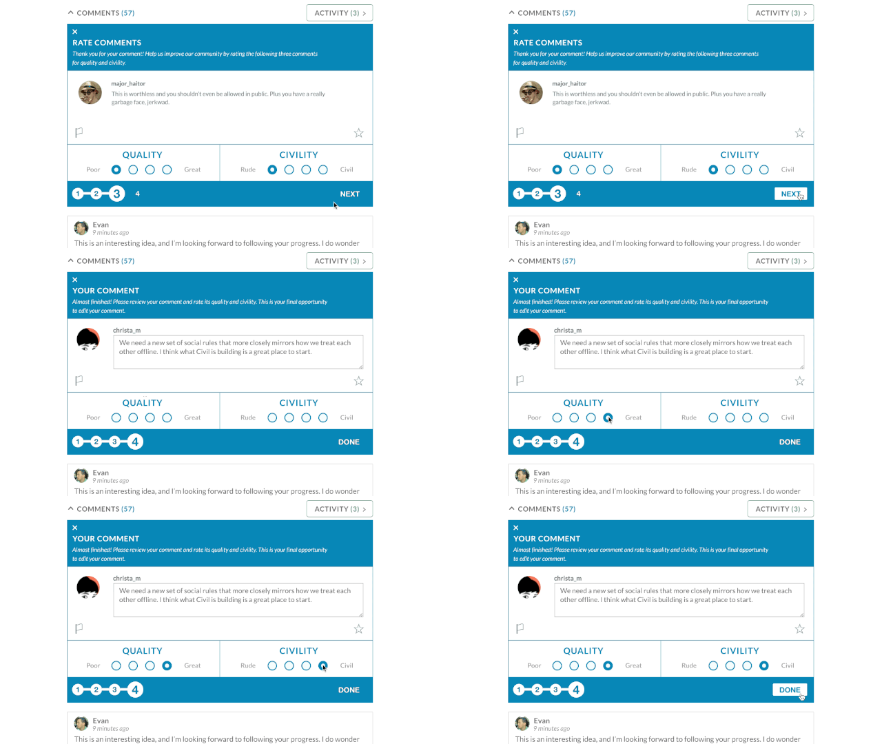
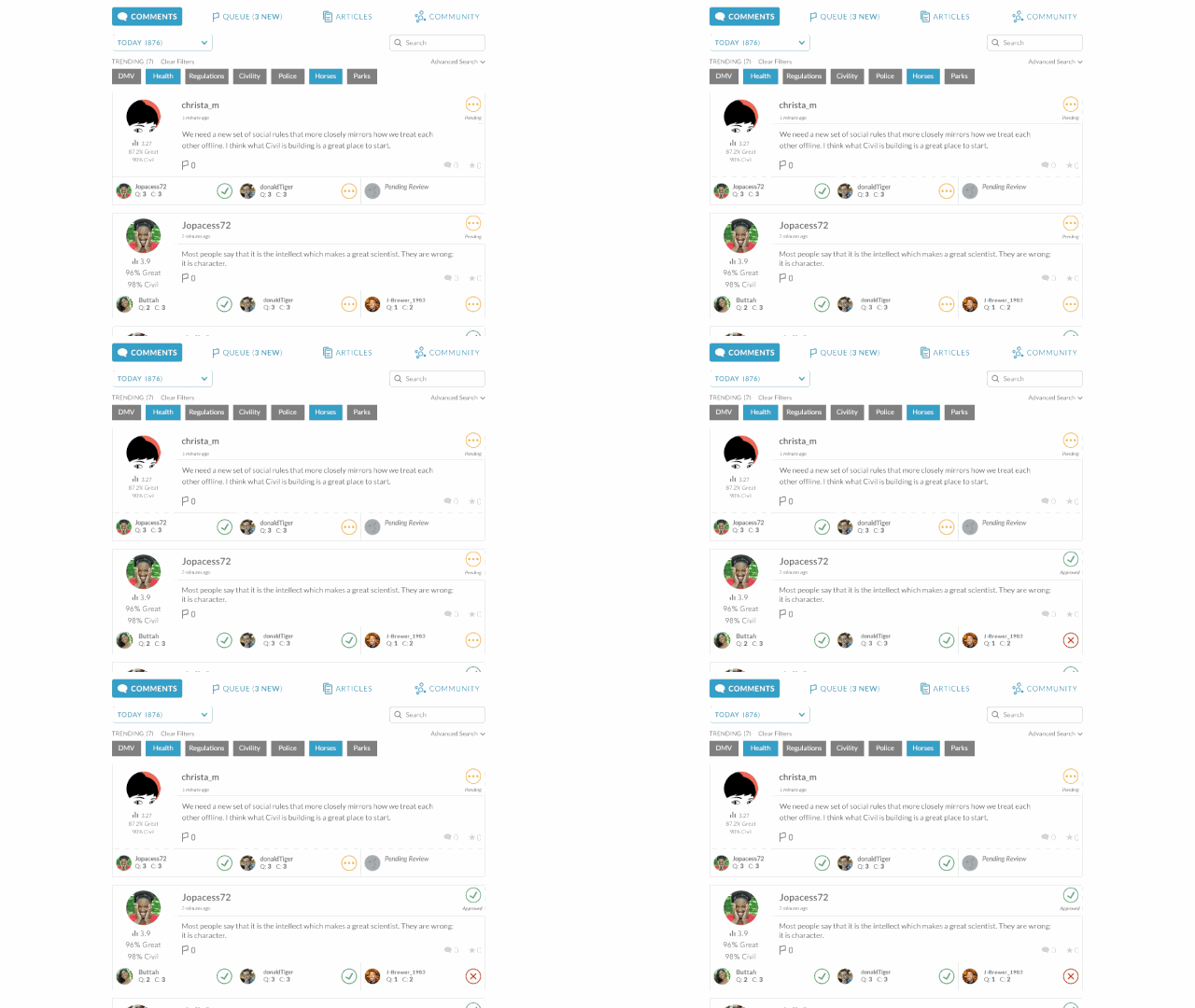
"Right now, most commenters are presented with an empty box, and then it's published, with no filter," says Mrgan. And that's a problem, because it gives no incentive to be reasonable, and no time for reflection. It's just a blank box for your rampaging inner id. So when you make a comment on Civil Comments, the first thing that happens is you're asked to rate two other comments on the site for quality and civility. Then before you can post, you are asked to rate your own comment under the same criteria. It's only then that you can post your comment to the site.

There's more to Civil Comments than that, including an algorithm (weighted by the way the rest of a community rates the content of comments) that will automatically reject comments that seem abusive despite how a user rates them. But according to Bogdanoff, the very step of asking commenters to rate their own comment is enough to get many people to be nicer. On a troll-bait test post made to Civil Comments' own site on how Star Wars is better than Star Trek, Bogdanoff says, on the backend, they could actually see trolls pause when they were asked to rate their comment, then change what they wrote. "It's hard for people to write something bad, then say, 'Yes, this is high quality,'" she explains.

Okay, so maybe Internet comments can be fixed. But why should publishers bother? "It's testament to how bad commenting has gotten that we get asked this so much," says Bogdanoff. "But fundamentally, the people who are commenting on your site is your most engaged audience. And as a content creator, the conversation is going to happen no matter what. If you can keep commenting reasonably respectful and civil, why would you want to farm that engagement on to another company's platform?"

Right now, Civil Comments is still under development. Mrgan and Bogdanoff say they're currently exploring partnerships with larger publishers. If they get their way, and Civil Comments takes off, 2016 might be the year that your favorite site's comment section stops being a festering hellhole, and starts being a place where you want to spend time again.

'); window.ga('send', 'event', 'User' , 'Interaction' , this.key + ':ArticleView:newsletter:fail'); window.ga('rollup.send', 'event', 'User' , 'Interaction' , this.key + ':ArticleView:newsletter:fail'); if (index === data.response.errors.length - 1 ) { var successfulSubscribes = newsletters.diff(failedSubscribes); $(successfulSubscribes).each(function(index) { $form.parent('div').prepend('
Thank you! Please check your inbox to confirm you subscription to '+ (this.charAt(0).toUpperCase() + this.slice(1)).replace('Fastcompany', 'Fast Company')+ '!
'); window.ga('send', 'event', 'User' , 'Interaction' , this + ':ArticleView:newsletter:success'); window.ga('rollup.send', 'event', 'User' , 'Interaction' , this +':ArticleView:newsletter:success'); }); } }); } else { $form.parent('div').html('
Thank you! Please check your inbox to confirm!
'); $form.parent('div').removeClass('error'); window.ga('send', 'event', 'User' , 'Interaction' , 'fastcompany:ArticleView:newsletter:success'); window.ga('rollup.send', 'event', 'User' , 'Interaction' , 'fastcompany:ArticleView:newsletter:success'); window.ga('send', 'event', 'User' , 'Interaction' , 'events:ArticleView:newsletter:success'); window.ga('rollup.send', 'event', 'User' , 'Interaction' , 'events:ArticleView:newsletter:success'); } }; function _formFail ($form, error) { if (!$form) { return; } console.warn('error: ', error); // Use message from server response var message = JSON.parse(error.responseText); if (message.response && message.response.message) { message = message.response.message; // Error message not provided } else { message = 'Please enter a valid email address.'; } var $parent = $form.parent('div'); // Remove other errors first var $errors = $parent.find('.alert-box'); if ($errors) { $errors.fadeOut(300, function() { $(this).remove(); }); } if (message && (message.code === -100)||(message.code === 220)) { message = 'Please enter a valid email address.'; } // Append new errors $form.parent('div').prepend('
' + message + '
'); $form.find('input').prop('disabled', false); }; }); })

Swirl Down An Infinite Vortex Of Letters With This Fractal Font

$
0
0

Created by Standard Deviation, the Fractalism HTML5 web toy takes a 5-pixel font popularized on the Commodore 64, and turns it into an infinitely recursive alphabet, where every letter is made up of pixels created by the letter that preceded it. Just check it out.

13 Glorious Vertical Panoramas Of New York City Cathedrals

$
0
0

New Yorkers quite famously never look up. Photographer Richard Silver wanted to give them a reason to, so he started taking pictures of ceilings. But not just any pictures, and not just any ceilings: Silver's specialty is taking glorious, vertical panoramas of the architecturally magnificent ceilings of New York cathedrals.

A full time photographer living in New York, most of Silver's work is commercial, and for the last four years, he's been a full-time travel photographer. This has allowed him to take photos of what he calls his 'Vertical Churches' in over 25 cities, from America to India. But the project started right in the Big Apple.

"One day I was walking around the city and walked into a church to see if I was able to take photos," he tells me. "Once inside I was marveled at the beauty of the ceiling and the complete surroundings around me. I figured out that I could do a panorama of the church while capturing the ceiling along with the pew and all the way through to the back of the church. It did take me a few times working in Photoshop to figure out how to get the final result just right, but now I think I have it mastered."

Church of St Stephen

Taking these detailed shots of cathedral ceilings is more challenging than setting your iPhone to panorama mode and pointing it up. Silver says that lighting is the biggest challenge. Most church interiors are extremely dark, except for stained glass windows that let in a tremendous amount of light. That makes striking the proper light balance difficult: to get around it, Silver sometimes has to blend two different panoramas together, taken with different exposure settings. Church hangings and chandeliers also pose a problem, because they tend to be distorted by the panoramic process. Silver often chooses just to leave them out.

Asked what his favorite New York church to shoot in was, Silver says it's the Serbian Orthodox Church on West 26th Street, which has a seldom photographed interior. "The priest opened up the church for me to take photos, turning on the lights and everything," he remembers. "The payment was a printed image for him, which was nice."

Ultimately, Silver hopes to have a book printed of his Vertical Churches. For now, though, he just hopes that his online panoramas inspire New Yorkers, and people everywhere, to take a closer look at the churches around them, regardless of their religious affiliation. "Churches are amazingly beautiful treasures that should not only be appreciated for what their theological intentions were, but as works of pure architectural wonder," he says.


Don't You Dare Cut A Piece Out Of This Chocolate Zoetrope Cake

$
0
0

Most cakes you just eat. This cake you spin. When you do, its tiers and decorations come alive, melting together into a chocolate layer zoetrope, covered in licking flames, gobbling Pac-Men, and cartoon mouths sucking up popping popcorn.

It's called Melting Pop, and its the latest piece of art from French special effects artist turned food designer Alexandre Dubosc. It uses the pre-film concept of the zoetrope (and its successor, the praxinoscope) to animate a cleverly arrayed series of decorations on the cake's sides when it is spun fast enough.

"I'm a lover of pre-cinematic techniques like the zoetrope," explains Dubosc. "In my first career, I worked for a special effects studio, but in recent years, I have taken great pleasure in giving my creations volume." Namely: animations that people can touch, and even eat. "In my opinion, the best food art reflects the vital reality of food that allows us all to live," he explains. Melting Pop makes this obsession with both food and eating its subject.

Sadly, Melting Pop is not edible itself, for the perhaps understandable reason that without glues or other fixatives, its animated characters would go flying off when the cake started to spin. But Dubosc does make edible food art, including his Strobeaux Gateau, a simpler series of 10 zoetropic cakes which were displayed at the Salon du Chocolat de Paris earlier this year.

Melting Pop will be on display as part of an exhibition of Dubosc's work at Saint Herblain's Maison des Arts in November. Don't lick off any frosting.

[via The Creators Project]

Android's New Material Design Wallpapers Visualize Data About Your Phone

$
0
0

Wallpapers for your smartphone or tablet might help personalize your device, but they're also functionally a little bit useless. On OLED-displays like the ones most Android smartphones have, where pixels only turn on if they aren't black, they can also take up valuable battery life. So if you're going to have a wallpaper, wouldn't you rather it actually do something?

One of Google's latest Android experiments is looking to make wallpaper serve a purpose. They've basically created a dynamic set of geometric wallpapers for Android devices that actually visualize key information about your device, like battery life, signal strength, and notifications.

It's called Meter. You install it just like any other wallpaper on your Android smartphone, with one key difference: Meter asks for permissions to access some of your device's self-monitoring abilities. It then cycles through three wallpapers, each of which visualizes a different stat. The battery wallpaper is a circle, which shrinks as your charge goes down, the triangle demonstrates your Wi-Fi strength, and the gradient bars visualize how many app notifications you have. Each visualization is also animated using ambient data from your device's accelerometer data, causing the shapes to twist and transform as you tilt your smartphone.

Meter was designed by Mikkel Kosser, and coded by Joanas Jogejan and Kyle Philips. For right now, it's a separate download, although I wonder if eventually we'll see this come default as part of a future update to Android. Android N, Code Name: Nutella, perhaps? You can grab it here.

How The Internet's Most Prolific Map Designer Creates His Viral Worlds

$
0
0

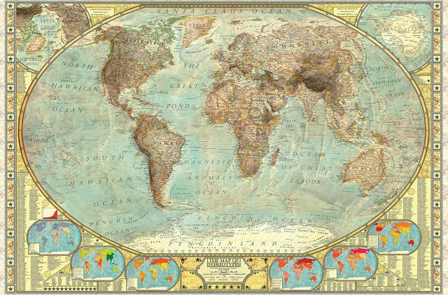
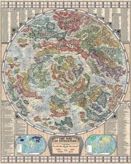
Where once they were done under the quill of cartographers, maps today are made by satellite. But Slovakian designer Martin Vargic's maps are different. Although they herald back to the glory days of map making in an era of romanticism and enlightenment, Vargic's exquisitely detailed maps deals with purely imaginary worlds: ones in which landmasses are made up of tectonic plates of literature, or what the Internet would look like as a planet.

According to the prolific 17-year-old (!) designer—he says he creates at least one map or infographic a week—his alternate reality maps are inspired by the look and feel of old National Geographic maps. Vargic tells me he's always been fascinated by maps, and he got his first taste for creating them when he decided to visualize what the British islands would look like in the year 2100, with water levels up to 80 meters higher thanks to melting ice caps. That one was simple, but over time, his maps have become increasingly ornate and complex.

To create his maps, Vargic first needs to decide on a subject. His maps tend to take him wherever his interests lie at the moment: in the past, Vargic has mapped racial stereotypes, the planet during the ice age, what Europe would look like if all its rebels formed separate countries, and all the world's music sub-genres. He even sometimes maps the real world, applying traditional cartography methods to a more modern, satellite-mapped setting. Maps not based on the real world are the most challenging to design, though.

"If I am not making a map based on the real world, I first need to choose the shape and layout of the map; I usually use either circular or rectangular shape for most fictional maps," explains Vargic. "Then I start the actual mapmaking process. First, I draw the brief, preliminary outlines of the various continents and landmasses, based on my general knowledge about a subject such as music, literature or sports. The layout of various landmasses is based on their relations with each other. After that, I start the actual research." Then he fills them in. For Vargic's extensive map of literature, for example, Vargic started by identifying genres with countries and continents, then filled them in with the most important authors, and their most iconic works.

Besides just enjoying the work, Vargic says he hopes his maps will make people as curious about the world as he is. "I would say the main goal of every map I do is to inform and educate more people about the subject it is based on and make them more interested in it," he says. "From an aesthetic standpoint, I also just want to make them pleasurable to look at."

After his Map of the Internet went viral last year when he was just 16, Vargic landed a book deal. His first book, Vargic's Miscellany of Curious Maps will go on sale in December. You can also buy his prints online from Halcyon Maps.

This Trippy Credenza Is An Optical Illusion For Your Living Room

$
0
0

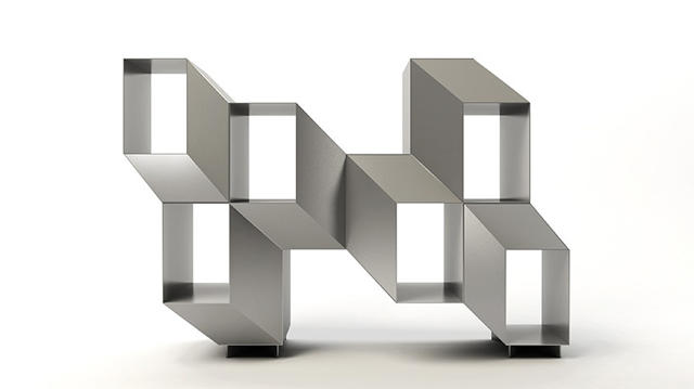
Many shelves aren't deep enough. These shelves are both deeper and shallower than they look, thanks to a clever optical illusion that gives each nook its own separate, misleading depth.

Rocky is a credenza by Lebanese designer Charles Kalpakian that from the side looks like any other shelving unit. From the front, though, it gets trippy. Each nook seemingly sinks in or springs out of the facade, creating a geometrical illusion that bends your mind the more you look at it.

Made out of 100% stainless steel, the Rocky comes in two finishes: the aluminum colored Jekyll, and the blue steel Hyde. It would be a hell of an accent piece for a modern designer home. Just don't get drunk in front of it.

You can see more of Kalpakian's designs here.

Like A Flatulence-Fueled Tesla, This Pooping Car Has An Engine Made Of Cow Guts

$
0
0

Globally, there are two huge, unculled herds that contribute significantly to climate change. First, the world's 1.2 billion cars. And second? The world's 1.5 billion cows, whose collective burping, farting, and pooping generates more greenhouse gas emissions than global transport.

The Digestive Car is a half-cow, half-car chimera created by critical product designer Yi-Wen Tseng. It humorously imagines a world in which a cow's methane-producing digestive system is leveraged by the automobile industry as a potential solution to the impact automobiles are having on the environment. And while it's not meant to be taken seriously, the Cronenberg-style concept at least aims to shock people into thinking more deeply about their addiction to burgers and gas-guzzlers.

In the Digestive Car, the traditional automobile engine is instead replaced by four bio-engineered stomachs, modeled after a cow's digestive system. Instead of putting gas in the digestive car, you would 'feed' it gas blocks, which are then converted into methane by the Digestive Car's ruman, reticulum, omasum, and abomasum. The methane is then converted into electricity, which then powers the car. And yes, anything not digested would then be excreted from the car's tailpipe in the form of manure. It's gross, but in theory, the design would negate the CO2 impact of both a cow and a car at once.

Tseng admits she doesn't know if the Digestive Car is practical to make, but that's not the point. "In this project, I am more concerned in waking people up [to the environmental impact of cows and transport], rather than practicality." Even so, Tseng's taken great pains to think the practical aspects of the project through, even going so far as to calculate what type of grass would be needed to power the car, and how that, in itself, might inspire green-consciousness.

"Imagine if you had this car which needed to be fed by grass, how important it would be to make our Earth greener." In a world of Digestive Cars, prairies and grasslands would be even more valuable than oil fields. The only drawback would be cars that poop everywhere. Worth it?

Viewing all 2811 articles
Browse latest View live