Quantcast
Channel: Fast Company
Viewing all 2811 articles
Browse latest View live

This Watch For Would-Be Gatsbys Comes In Wood, Marble, And Gold

$
0
0

For their first few watches, Pennsylvania's Analog Watch Co. wasn't afraid to be weird, crafting experimental watches made out of wood, marble, and even ant hives. For their latest watch collection, though, Analog's going Classic. Now on Kickstarter, the Classic Collection is a thin elegant watch inspired by the timeless profile of early 20th-century timepieces, with a neat swappable strap system and dials backed in natural materials like wood, marble, and gold.
Boasting an extraordinarily thin body made out of gold-plated stainless steel, the Classic is about as streamlined as a modern watch gets. Like all of Analog's watches, the Classic aims to be as much time piece as show piece. Its design emphasizes the beauty of natural materials by putting a little 38mm wafer of marble (black or white), wood (makore or silverheart), or gold behind the watch hands. Otherwise, the Classic's design is totally no nonsense: no lighting, no date hands, no built-in smart functions. It's a watch for people who find elegance in the understated.

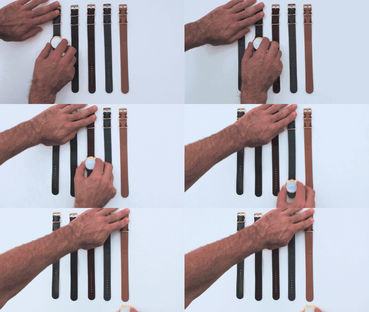
That's not to say there isn't room for customization in the Classic's design, though. One cool feature of the Classic comes through its use of NATO-style leather straps, crafted for Analog through a partnership with a local Amish leather workshops. These one-piece straps can be easily swapped without any tools just by sliding them through the Classic's body. Although this style of strap was settled on for reasons of pure economy (most straps come in two sections, which makes them more expensive to make), it does mean you can change straps on your Classic watch as easily as changing your belt.

According to Analog Watch Co. founder Lorenzo Buffa says the Classic Collection is based upon customer feedback. "People liked our earlier pieces but they wanted a thinner watch, something with an everyday look that wasn't too flashy or strange," Buffa tells me. "They loved the sentiment, but they thought our other watches were too chunky, so we went the whole other direction: we went hyperthin." As for its look, Buffa says he was inspired by a no-brand watch he had once seen on a friend's wrist, passed down to him by his grandfather. "We really try not to look at what other watch companies are doing," he says. "We feel like if we keep looking at the market, we'll just regurgitate what they're doing."

Now on Kickstarter, the Analog Classic can be preordered starting at just $59. If you're looking for a Christmas gift for a design lover in your life, don't get them an Apple Watch: get them one of these instead.


Biophilia, A Line Of Nesting Vases Inspired By Plant Science

$
0
0

Most vases and pots don't have much in common with the plants we put inside them. Biophilia is a new line by Swedish design studio Stoft that uses the life cycles of flora and fungi as design inspiration for four beautiful pots, so they almost form their own ceramic biome.

The collection consists of four organically shaped ceramic vessels, each of which symbolizes a step in a plant's growing process. The first is a chamotte stoneware bowl called the Capsula, which is meant to symbolize "the protective seedpod from which everything begins." Next, there is the Petalis, a crenulated vase which aims to represent the sprouting of a plant or flower. Truncus is a pitcher which looks like what happens when a sprout begins to branch. And finally, there's Spore, a tiny vase that was designed to look like it's resting, waiting to take root elsewhere while also functioning as a small vase for seedlings.

Best of all? All these vases are designed so that they can nest, matryoshka-like, inside one another, symbolizing the way a seed or spore is really a hidden promise of all the stages of life it will become.

Biophilia was designed in collaboration with Swedish ceramic manufacturer Zol Art, as part of the "New Map" design exhibition. All of the Biophilia collection is available for purchase, with prices ranging from just $18 for the individual Spore vase (this would make a cute Christmas gift for a plant lover in your life), to $550 for all four.

[via MoCoLoCo]

Ammunition Designs Ember, The Perfect Travel Mug

$
0
0

All travel mugs are pretty much the same. You dump some tea and coffee in it, you slap the cover on, and it slows down the process through which your hot drink becomes room temperature. Ember is different. It's an intelligent, high-tech travel mug, immaculately designed by Ammunition, which not only keeps your drink at a specific temperature for hours, but will even actively cool your scalding coffee down to a more drinkable temperature.

A smart, Bluetooth-connected travel mug sounds like parody—the Internet of Things gone mad. But if you saw the Ember in someone's hands, you'd never know. The Ember looks a little sleeker and more sophisticated than an ordinary travel mug, true, but it's most definitely of the same species. Yet unlike a regular travel mug, the Ember contains insulated walls filled with a proprietary phase-shifted material, which allows the mug to both warm and cool liquid precisely. It also pairs with a smartphone app over Bluetooth, allowing you to quickly dial in preset temperatures: brewed coffee at 140˚F, lattes at 134˚F, green tea at 148˚F, and so on.

The most critical aspect of the Ember's design, though, was that all of these high aspects are hidden away. Though the Ember contains a built-in screen which shows the temperature of your drink, this display seamlessly blends in with the surface of the mug, so that it's invisible when off. Nor does the Ember have any buttons: to adjust your drink's temperature, you just thumb the secretly capacitive Ember logo and twist a dial on the bottom of the mug. Even charging the Ember seems analog: you just rest it on a special coaster at your desk when you need to recharge the internal battery.

Keeping all of this sophisticated technology stealthy in the final design was integral, says Clayton Alexander, the founder of Ember. "I wanted it to have a very human interface," he tells me. "My earliest prototypes had a lot of buttons, switches, and screens, but I knew that if wanted it to be adapted by the masses, we'd have to do what Apple does: take that great technology and cover it in a beautiful, human design. That's why we went to Ammunition."

"The idea that every object in our life should be a richly featured piece of computing is absurd," agrees Ammunition partner Matt Rolandson. "We're all for designing a mug and adding technology to that, but only to augment what people expect. Mugs, cups, glasses: these sorts of objects don't have buttons, and we don't think they should. They should feel familiar, meet consumers where they already are, then help lead them somewhere new. That's our prime principle: we want to help design everyday things, without messing up everyday things."

But even without all of its secret technology, it was important for the Ember to just be a great mug. One design innovation Ammunition is particularly pleased with is the Ember's cover. Most travel mugs have covers, but they suck. They are usually small little slits you have to twist open, and which press up against your nose while you're drinking. Ammunition's industrial designer Martin Gschwandtl says that it was important for the Ember's cover to be designed so that it has the mouthfeel of drinking out of your favorite ceramic mug. So instead of twisting the cover on the Ember, you push down on a vacuum seal button in the middle of a deep well. Not only does this design have the perk of being easier to open and close than your standard twist cover, but it feels like a normal mug, with no nose touch.

Now available for preorder starting at $109, Alexander says temperature adjustable mugs are just the beginning for Ember. "Ember is a platform," he tells me. "Anything in your kitchen you can imagine benefiting from being temperature adjustable? We want to do." Today, Ember might be keeping your coffee warm: tomorrow, it might be in your soup bowl or dinner plate.

The Eora 3D Is The Missing Piece Of Your Star Trek Replicator

$
0
0

Thanks to companies like MakerBot and FormLabs, consumer 3-D printing has taken off in a big way. But while everyone dreams of owning a Star Trek replicator, there's a big piece of tech missing from the equation: a consumer 3-D scanner, capable of cheaply and efficiently digitizing physical objects to be distributed over the Internet and recreated in the home. That's about to change, however. Eora 3D is a new scanner that uses your smartphone to create 3-D models of anything you put in front of it, while matching the quality of industrial 3-D scanners that cost 100 times as much.

Before the Eora 3D even existed, the guys at Eora 3D had a problem. Mechanical engineers by background, Rahul Koduri, Asfand Khan, and Rich Boers were trying to design a device that could reflect the sun's rays into a powerful single point, with the intent of generating electricity. So they designed a parabolic dish, and then sent it off to Singapore to be manufactured. When it came back, the dish didn't work.

"That left two options: either the parabolic dish hadn't been manufactured properly, or our software was wrong," says Eora 3D's head of execution and strategy, Rich Boers. There was only one tool out there that could tell them what had happened: a 3-D scanner. But when Boers and his partners, Asfand Khan and Rahul Koduri, went to try to buy a 3-D scanner, they got sticker shocked: it would cost their tiny startup $20,000 to buy the 3-D scanner they needed to diagnose the problem.

As engineers, Koduri, Khan, and Boers decided to try to cobble a 3-D scanner together, using random parts, their smartphones, and some open-source libraries. The trio were surprised when their Frankenstein prototype produced results pretty close to what a $20,000 3-D scanner were going to do, allowing them to diagnose the problem with the parabolic dish. (Singapore had screwed up.)

"We asked ourselves: what would happen if we tried to design a 3-D scanner properly?" says Khan.

The Eora 3D is the result. Don't confuse what the Eora 3D does to something like iPad-mounted scanner though. The latter is a low-fi, camera-based scanner, good for augmented reality and motion tracking, but little else. The Eora 3D is a lot more sophisticated.

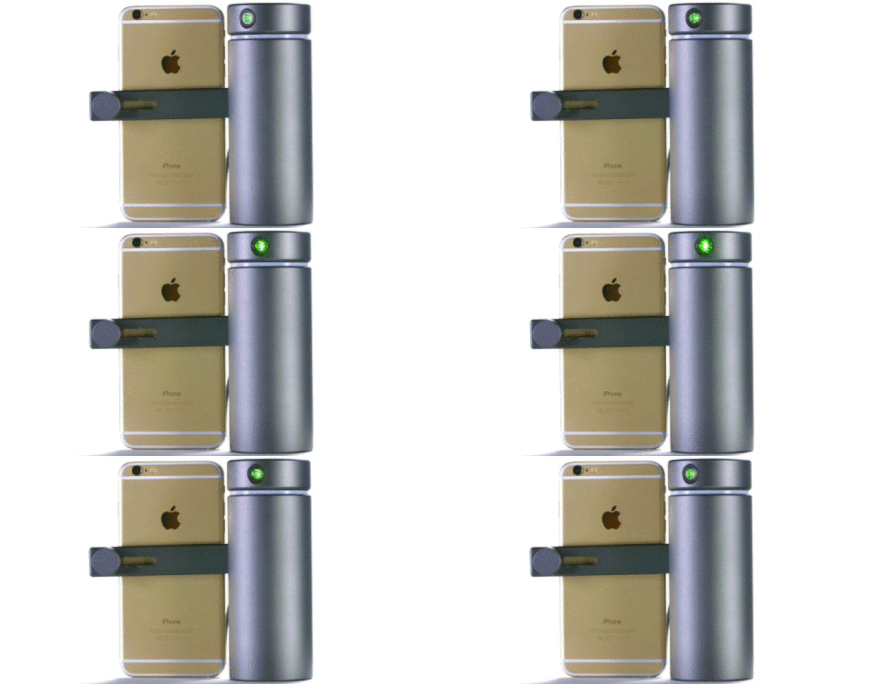
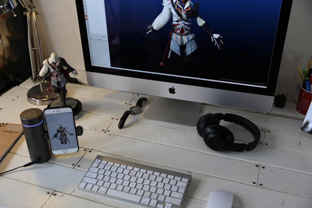
A sleek cylinder of anodized aluminum, topped by a cycloptic green eye, the Eora 3D works by bouncing a highly accurate laser off the surface of an object, while your smartphone measures the way the beam refracts. Together, this approach can capture a digital model of a physical object precise down to 100 microns, or about the size of a grain of sand. An optional, Bluetooth-controlled turntable rotates the object for you while the Eora 3D scans, but it's not mandatory: you can also just move the Eora 3D around the object you're trying to scan, a process Khan describes as being similar to taking a panorama.

But how can a sub-$300 3-D scanner like the Eora 3D possibly stack up to a $20,000 scanner? "In the same way 3-D printing has existed for decades but has only become a consumer concern in the last few years, 3-D scanning has been around for a while, but there's been no focus on the mass market," explains Khan. "The companies making them relied on a lot of legacy components to focus on a low-volume, high-margin business model. We decided to go the other way."

A lot of those "legacy components" were things like dedicated computers and industrial cameras, but in the last few years, smartphones have become powerful enough to do all the photography and processing needed for 3-D scanning without dedicated equipment. This allowed Eora 3D to put all of their money and focus on software and that green laser—the one piece of hardware your iPhone doesn't have.

3-D printers have an obvious Star Trek allure: the ability to replicate physical objects on demand. But is 3-D scanning really ready for the mainstream? Khan thinks so. Unless you have technical skills, creating a new design for 3-D printing is a sophisticated process that requires the mastery of some pretty hardcore software. An affordable, consumer 3-D scanner opens the door for making 3-D printed objects as easy to replicate as placing them in front of your smartphone; creating new designs as intuitive as taking out some clay and scanning the results. And Eora 3D says that it's not just makers who are interested in their device. They've been getting a lot of interest from museums who want to digitize their collections. VR is taking off in a big way right now, and many museums are interested in digitizing their collections, to recreate the museum-going experience on platforms like Google Cardboard and the Oculus Rift. Eora 3D gives them an affordable way to do so.

Eora 3D's solar energy project might be on hold for now, but the scanner they spun out of it is doing extremely well: in less than 24 hours, it blew through its crowdfunding goal, and is currently sitting at $250,000 worth of pledges with 28 days to go. You can order one on Kickstarter starting at just under $230.

A 3-D Printed Chess Set Based On Milan's Unforgettable Skyline

$
0
0

Chess pieces have long been a venue for set designers to explore their love of architecture in microcosm, but usually, the pieces all possess the same style. For his Milan chess set, designer Davide Chiesa used 500 years of Milanese architecture as inspiration and distilled it down to something you can 3-D print for yourself.

More specifically, six buildings from Milan have been adapted for the set. There's the sleek, modern Unicredit tower, designed by César Pelli, as king, and the 140-meter tall Diamant Tower as queen. The 1950s era Torre Velasca plays bishop, the iconic Milan Cathedral as knight, and the famous Sforza Castle, previously home to the Duke of Milan, as rook. Finally, all the pawns have been modeled after Porta Sempione's Arco della Pace, the entry point to Milan, and a remnant of the city's old Roman walls.

"The idea for this project came out from my personal experience as interior designer in Milan and my personal history," Chiesa says. "You have to know that the skyline of this city has dramatically changed in the last five years and finally a skyscraper silhouette appeared in a central part of the city. Where my father once brought me when I was a child—to an old Luna Park—we have a totally new area full of new buildings. Melting the concept of the square part of the city where I live and the memory of my father teaching me to play chess, I decided to put all the buildings on a chess board."

If you want to own the Milan Chess set, you have a couple options. You can purchase the 3-D print files for around $11 from Cults3D and do the job on your own. But if you'd rather have something more polished, you can purchase the entire set directly from Ideafactory for around $270 dollars. For chess lovers heading to Milan Design Week next year, this might be a way to brush up on both your openings, and your architecture.

These Wii-Like Nunchucks Help Teach Machines To Weave "Handmade" Textiles

$
0
0

Textiles used to be created by hand, in an intimate physical relationship between fabric and weaver. But now, our textiles are programmed by computer, woven by machines. How do we reclaim the artist's physical relationship with textiles in the age of the industrial loom? And in the process can we learn to automate some of the distinct and wonderful qualities of handmade textiles?

American textile designer Jessica Smarsch thinks she has the answer. A RISD graduate recently graduated from the masters program at Design Academy Eindhoven, she has figured out a way to create "handmade" textiles on an industrial loom. How? By recording the muscle movements of a person, and then incorporating their unique rhythms into the finished fabric.

One thing that makes handmade textiles so much more interesting that machine-made textiles is their variability. Even in a simple pattern, a weaver's mental state becomes recorded in the textile, almost like a phonograph scratching a recording of a person's voice into hot wax. If someone is listening to music, or someone is thinking of something sad, their muscles move differently, all of which is recorded in the fabric. You might not know how to read it, but it's there. The result is that even with the same pattern, every handmade textile looks and feels unique.

For Constructing Connectivity, Smarsch set out to translate a designer's emotional state, as recorded through the varying ways in which they move their muscles, to a mechanically woven textile. So in her system, a "weaver" wears an armband that measures the electrical pulses coursing through their arm as they "weave" in the air with a nunchaku-like device. The nunchucks are mostly just a prop, but they influence the way your body moves, and consequently, the data Smarsch's sensors record.

Weave is in quotes because they don't actually need to be weaving: your body movements could be recorded as part of a workout, for example. These unique muscle movements movements are then automatically adapted to a textile pattern, which is woven on a machine-controlled industrial loom. At first, it looks identical to any other textile printed from the same pattern, but after the fabric is washed and dried, the weaving patterns activate, taking on a unique texture.

According to Smarsch, her project was inspired by the perceived soullessness of mass-produced textiles. "Right now, the individual is not welcome to engage in the industrial textile system," she tells me. "It is a system regulated by efficiency and mass production." The goal of Constructing Connectivity is to figure out a way to insert humanity back into what should be the most human of industries: the clothing we wear, and the fabrics we press up against our skin.

Editor's Note: Since it was published, this article has been corrected to clarify the role of the nunchucks in the headline, and also to correct an error about Smarsch's education.

This Designer Turned A Year's Worth Of Emotions Into Colorful Spectrums

$
0
0

Even after years of therapy and mindfulness, many of us have difficulties mastering the full spectrum of our emotions. Portuguese designer Giestas decided to turn it into a data visualization problem, He recorded his emotions every hour for 300 days, then turned them into a trilogy of color-coded diaries, each page of which represents his emotional spectrum for a 24-hour period.

The key to Giestas's visualization, called Soft Cover Emotions, is the emotional matrix, which he compiled himself from a combination of psychological models. With a black pit of sleep at its center, the matrix contains dozens of emotions, from bright pink loathing to pale green bewilderment. Generally speaking, the emotions are organized so that different degrees of the same emotion (e.g. terror, fear, apprehension, and uneasiness) all share a color and a line with each other, with less intense feelings represented as less saturated hues.

Printing himself out a sheath of these matrixes, Giestas proceeded to take a marker to them. For every hour he was awake the first 100 days, Giestas checked off the block that best described how he was feeling. The resulting charts make up the first volume of Soft Cover Emotions. Each page of this volume shows 24 rainbow-hued bands arrayed chronologically, a simple representation of Giestas's emotional spectrum for the day.

But it's in the second and third volumes of Soft Cover Emotions where this concept gets really interesting. For the second 100 days of his experiment, Giestas recorded not only what emotion he was feeling, but what emotion he was expressing every hour of the day. For example, if Giestas was at the office, and he was feeling angry, he might have to put a smile on his face anyway. So the second volume of Soft Cover Emotions shows two rainbows per spread, putting into sharp relief the often profound differences between his inner and outer emotional life.

The third volume adds another dimension. Instead of just recording his emotions, Giestas tried to remember how he was feeling 24 hours previously, as well as predict how he would feel 24 hours later, with anything he couldn't predict or recall captured in white.

According to Giestas, the Soft Cover Emotions project started as an exercise for dealing with the designer's own problems with anxiety. Over time, though, the concept expanded to cover all his other emotions. "The exhaustive and repetitive process of recording [my emotions] ended up inspiring other issues," he says.

If the rest of us are anything like Giestas, the expression of our feelings, how we are constantly surprised about what we expect to feel, or our capacity to remember our feelings after they happened, our emotional spectrums are more profoundly in flux than we're probably aware.

Is Nuzzle The iPod Of Pet Insurance? Ammunition Thinks So.

$
0
0

In America, as much as 47% of all households have a dog, and up to 37% have a cat. Despite this, only 2% of all Americans have any form of pet insurance. Not because they don't love their pet. Not because their pet doesn't get sick. Not even because they can't afford it: on average, pet insurance costs $32 a month for a dog, and $22 a month for a cat. It's because most people don't even know pet insurance exists, and if they do, the options confuse them.

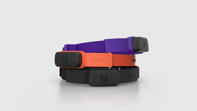
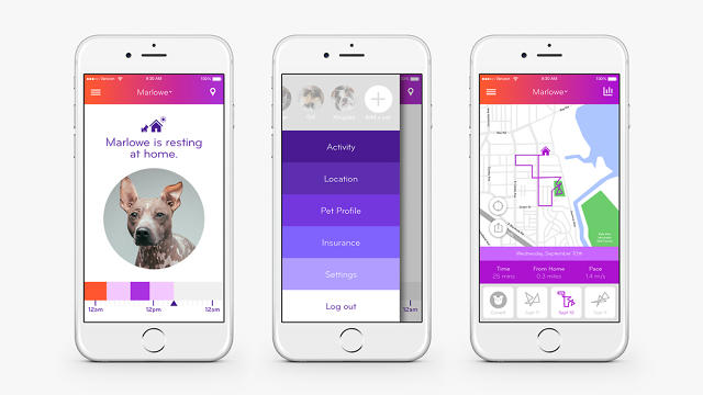
Anthony Dubbaneh, the CEO of Nuzzle (not Nuzzel), has come up a Trojan Horse to get pet owners signed up for pet insurance. He has created a smart collar tag for dogs and cats that let owners keep track of their pet's location and activity levels through an accompanying smartphone app. Which, as it happens, also makes it easy to sign up for pet insurance with just a tap. And his design collaborators at Ammunition liken it to the iPod of pet insurance.

The Nuzzle is a water-resistant collar tag containing a cellular GPS radio and some simple sensors, which allow you to keep tabs on your pet through the day. By setting up a geofence perimeter around your house, Nuzzle will alert you if your dog jumps your fence or your cat gets out of the house. In addition, Nuzzle will record your pet's activity levels, so if your dog or cat's energy levels dip, you can be aware of it, and consider taking your pet to the vet.

The Nuzzle even contains temperature monitoring (useful if your pet is overheating) or impact detection (if, god forbid, your dog or cat gets hit by a car). While the Nuzzle unit itself is rather nondescript, it was designed with some smart considerations, like easily-swappable batteries, and the ability to be attached to any pet collar, not just the one it ships with.

All of the Nuzzle's core functionality is available for just $149, and unlike other pet tracking devices, there's no monthly fees... unless you sign up for pet insurance through the accompanying app. Which Nuzzle hopes you will, choosing a monthly plan starting at $15 a month for cats, and $25 a month for dogs. But why try to sell pet insurance through a wearable? Isn't that counterintuitive?

Dubbaneh doesn't think so. "The biggest reason why so few people have pet insurance is awareness," he says. "Fundamentally, pet insurance is marketed through direct mail, so it looks like just another piece of junk mail when it shows up in people's lives." What is needed is a way to market pet insurance in a way that's unique and compelling. Nuzzle is an attempt to use a beautiful, useful product as a way to start a conversation about pet insurance with consumers.

There's also a good business reason for using a wearable as an insurance selling point, which Ammunition partner Matt Rolandson admits is part of the reason his design firm was so interested in working on the Nuzzle. "There's plenty of wearables, trackers, and IoT devices out there searching for a recurring revenue relationship, without a lot of success," he says. Weirdly enough, what appealed to Ammunition about the Nuzzle was its similarity to the original iPod and its umbilical link to the iTunes music store ecosystem. "It's just absolutely genius to use a beautiful physical object as a way to attract people to an ongoing customer relationship," he tells me.

Nuzzle, then, doesn't just aspire to be a wearable for felines and pooches. It wants to be the iPod to the iTunes of pet insurance. And, while it's at it, it wants to save some pet's lives. "At the end of the day, the relationship between a person and their pet is one of the strongest ones they have in life," says Dubbaneh. "It breaks my heart that so many people feel they can't afford to preserve that relationship in an emergency, just because they don't have enough money in their bank account."

You can pre-order a Nuzzle on Indiegogo, starting at just $149.


Backyard Playhouses Inspired By Ito, Le Corbusier, Van der Rohe, And More

$
0
0

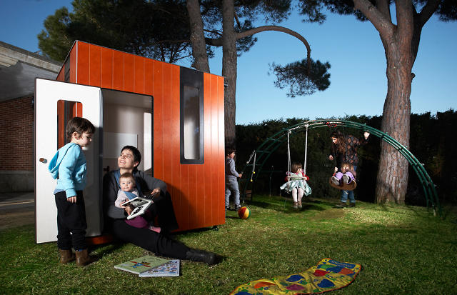
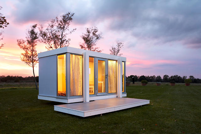
What's a good way to nurture a life-long love of good design and architecture in your kids? Buy them a backyard playhouse inspired by the real-world buildings of Le Corbusier, Toyo Ito, Mies van der Rohe, and more.

Since 2009, Barcelonan master architect David Lamolla has been designing garden playhouses for kids, using best architectural practices and some of the world's most beautiful buildings as models. Although he boasts that his playhouses are as easy to assemble as Ikea furniture, his designs span modern architectural styles across many countries, including Denmark, Japan, and the United States. Architects whose works have inspired him include Toyo Ito, Mies van der Rohe, Herzog & De Meuron, Alvar Aalto, and Le Corbusier. Some of his designs include multiple stories, and even rooftop rock gardens.

By email, Lamolla tells me that he was inspired to build his first playhouse a couple years after his daughter was born. He started looking for a playhouse to put in their garden, only to despair at the options available. "All the options in the market were just very old-fashioned," he says. So he decided to design one himself, inspired by his memories of the homes he saw his parents restore in Denmark during summer holidays as a boy.

Although his playhouses are just as much a sculpture for your backyard as a place for a toddler to have a tea-party with his or her stuffed animals, Lamolla seems most proud of the practicality of his designs, not their mere aesthetic. The playhouses are waterproof, elevated from the ground, and features special security features, such as cushioning around the door jams to prevent children from pinching their fingers. As for the interiors, Lamolla says that's up for a child or their parents to decorate, although some of his playhouses come with advanced features like carpeting, designer curtains, and even track lighting.

As a design lover, it's hard not to look at Lamolla's playhouses and despair about the crappy, mass-produced plywood hut you had in your backyard as a kid. But Lamolla's modest about his work. "I don't think our playhouses are better designed, they're just different from other options," he says. "They are resistant, secure, and made with passion."

If you'd like to purchase one of Lamolla's Playhouses, you can order one from his Etsy shop here, although expect to pay for his craftsmanship: prices range between $3,400 to $11,000 for a made-to-order playhouse.

Infographic: See How Your Work-Life Balance Compares To Other Americans

$
0
0

Whether it's Paul Ryan's outspoken remarks, or the Swedish shifting to a 30-hour workweek, there's a lot of talk in the news lately about work-life balance. But how does your work-life balance compare to other Americans, taking into consideration factors such as education and your commute? Nathan Yau's latest visualization calculator from FlowingData helps you figure it out.

Plucking his data set from the American Community Survey—and inspired by a New York Times data viz that showed household counts with various family makeups—Yau's calculator allows you to drag sliders to determine your level of education, annual income, weekly work hours, and commute time to work. It then tells you roughly how many Americans share your work-life-salary-commute balance.

For example, Yau's tools show there are only 39,764 Americans who never went to college, have an annual income of $100,000 or more, and work from home. Those guys must feel pretty lucky! But if you've got a bachelor's degree, an annual salary between $50,000 and $75,000, a 40-hour work week, and up to a 30-minute commute every day, you're one of nearly 1.5 million Americans.

Since his calculator only allows you to check out one permutation at a time, Yau also put together a handy interactive chart that allows you to compare the data about a whole spectrum of different demographics. Comparing education against Income, for example, the largest demographic of people in the country is people who never went to college making less than $10,000 a year, which is just depressing. But you can also compare commute against work hours, income against commute, or any other combo.

Playing with this visualization, I ended up feeling pretty lucky in my life. On the other end of the spectrum, you may well have the opposite reaction. But if so, at least you can quantify exactly how life is screwing you over compared to your peers. That's gotta be worth something.

Find Your Inspiration With The Swiss Style Color Picker

$
0
0

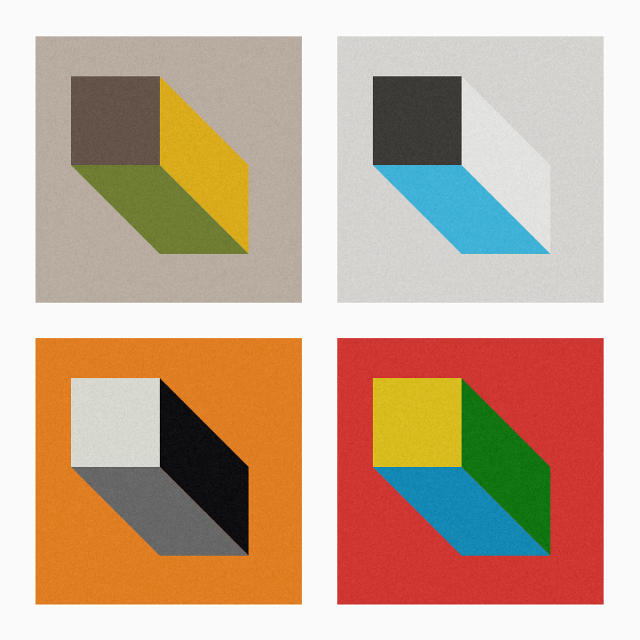
Swiss style graphic design focuses on abstract geometric patterns and uncommon color combinations. It makes for some great inspiration.

German designer Fabian Burghardt has created the Swiss Style Color Picker as an online tool to help designers find inspiring color combos. Just load the site, and the Swiss Color Picker will give you a wide range of interesting color combos, arrayed in an abstract geometric pattern of multicolored cubes. If you see a color you like, just click to copy its hexadecimal color value. Refresh for more color combos. Easy peasy.

Check it out here.

This Astonishing Puzzle Table Has More Secrets Than Surfaces

$
0
0

In the Hellraiser series of movies, there's a devilish puzzle box called the Lament Configuration, also known as Lemarchand's box, that contains numerous secret tricks and compartments. When fully opened, it looses deformed, sadomasochistic demons upon whoever opened it.

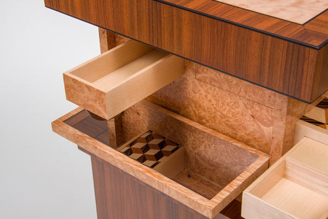
The Automaton Table by custom furniture maker Craig Thibodeau is like a Lament Configuration for your living room—and we mean that in the best possible way. It doesn't contain any S&M Pinheads, but it's a puzzle box of exquisite craftsmanship and beauty, containing so many secret compartments it could take a lifetime to master.

Inspired by the famous 18th-century German cabinet maker, David Roentgen, Thibodeau built the Automaton Table not as a piece of furniture in its own right, but as a way to show his customers all the different ways he can hide compartments in the pieces he makes. And it turns out that's a lot.

When fully closed, the Automaton Table looks something like a bar cart. When you push down on the top, though, the table unfolds and spills open to reveal several hidden shelves and drawers. Even these compartments, though, seem designed to keep strangers from discovering the Table's true secrets: a magnetic key is used to pull open several invisible drawers hidden all over the Automaton Table, but you have to find the keyhole in the first place!

There's only one area where the Automaton Table disappoints. A key element of the table is slide-out puzzle with five concentric rotating parquetry panels. When aligned correctly, the panels form a beautiful Louis Cube mosaic. But here's where Thibodeau unfortunately missed an opportunity to go full-on Lament Configuration: it seems a shame that solving this puzzle doesn't unlock anything.

Still, just an incredible design. Just imagine if Thibodeau made a game table out of this.

These Ferrofluid Desk Toys Might Be The Perfect Christmas Gift For Your Boss

$
0
0

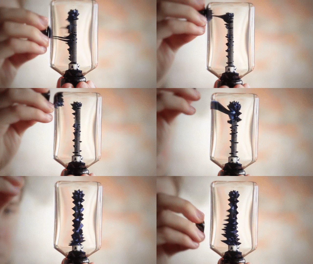
What blobs of heated wax bubbling in a glass cylinder was to the '70s, ferromagnetic fluid is to 2015. Kyle Haines, founder of Inspired Designs, says this is natural: ferrofluid and lava lamps are a natural fit. "It's actually a very common response when people see ferrofluid for the first time to compare the two." His ferrofluid lava lamp, the Installation, might be one of the coolest we've seen yet (although we've seen its kind before) but the Inspiration's sister products might be even cooler: a couple of tiny, Edisonian ferrofluid toys that let you play with ferrofluid in different ways. We could easily see them being next year's most popular desk toy.

About the size of a lightbulb, the Thinker is a ferrofluid sculpture that makes a toy out of the popular ferromagnetic bolt experiment. It contains a permanently magnetized bolt and a tiny amount of ferrofluid floating in about 120 milliliters of water. The ferrofluid normally wants to hug the bolt, but by using magnets, you can cause the Thinker's ink to create all sorts of amazing patterns and shapes.

It costs just $50 from Haines's online store, although it can be upgraded with blue or gold ferrofluid for a bit more. If that's more than you want to spend, though, the Nano is an even smaller version of the Thinker tiny enough to carry around in your pocket, available for $20.

Although he's only 27, Haines says that he's always been fascinated with ferrofluid; he started his experiments as a kid after converting his grandfather's bungalow into a ferrofluid lab. Those experiments continue to this day. Haines says that designing with ferrofluid presents unique challenges, since the liquid is notoriously sticky, and stains everything it touches. When he started, he says he "completely underestimated" the difficulty of working with ferrofluid, but he kept at it, resulting in a "Pandora's box of ideas that I'm just begging to explore in more depth."

In the meantime, if you love ferrofluid, you can check out Haines's other creations through his online store, where you can also pick up Haines's own spin on the ferrofluid lava lamp.

How UI/UX Design Will Map The Future Of Self-Driving Cars

$
0
0

When Tesla released a software update earlier this month that gave its Model S electric cars a new self-driving AutoPilot mode, Elon Musk cautioned that drivers "should keep their hands on the wheel just in case." With good reason. Just a few days later, Model S owners began posting videos to YouTube, showing their Tesla's veering dangerously and making other strange decisions when using the beta software.

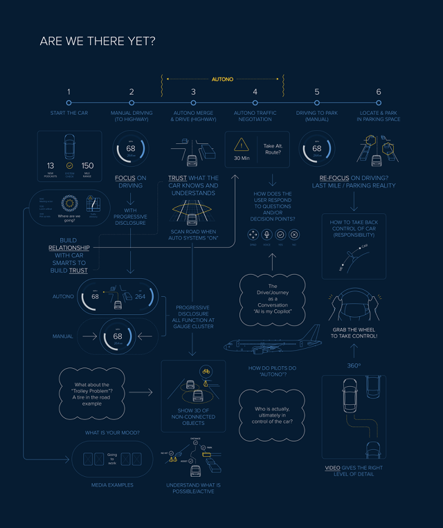
For Artefact, the incident proved three things. One: cars aren't ready to totally drive themselves. Two: even if they were, humans aren't ready to trust them yet. And three: before drivers are ready to totally cede control to their autonomous cars, the automobile industry will need to think long and hard on how design can be used to establish a trusting relationship between people and their cars. So Artefact partnered with Hyundai to come up with a UX roadmap of the near-future of semiautonomous vehicles.

Although the media likes to fantasize about a tech company like Google or Apple just dropping a completely self-driving car on the market in the next few years, Artefact thinks that's unlikely to happen. They see fully autonomous vehicles as being 20 to 35 years away from mainstream acceptance. In the meantime, we will have what Artefact calls semiautonomous vehicles: increasingly intelligent cars with limited autonomous modes that can handle some things, but which will still require the user to take the wheel occasionally.

What makes the next couple decades so pivotal to auto manufacturers is that this is the crucial time period to convince consumers that their cars can make good driving decisions, and keep passengers alive. Establishing that trust will hinge upon new interfaces, new affordances, and new systems designed to transparently communicate when a semiautonomous vehicle does something unexpected (and why).

Playing along with the guidelines of its UX Roadmap, Artefact imagined a new Hyundai flagship semiautonomous vehicle, the Genesis, which would have the ability to drive itself. To turn on the Genesis's autonomous mode, a driver would push the wheel in, literally "handing the wheel" to the car. When this happens, the entire interface adapts, exposing only the information that is needed.

A key aspect of the Genesis concept is once the vehicle is in self-driving mode, the dashboard interface adapts to show a wireframe view of what the car sees as it is driving, with potential hazards marked in red. And if, for example, the car needs to suddenly swerve in response to a reckless cyclist, the dashboard would also clearly show the reason why the Genesis made this decision. Similarly, if the Genesis needs to reroute for any reason—say, to avoid a traffic accident on the highway—a message would be pushed to the dash, explaining why and forecasting a new arrival time.

Such transparency is important, because as the Tesla Autopilot beta shows, one of the challenges facing semiautonomous vehicles is the algorithms by which they make decisions is largely invisible to the driver. And in an era where VW is falsifying performance metrics, invisibility is not fashionable right now. If something unexpected occurs, the driver can only speculate what happened. That inscrutability is antithetical to developing trust, Artefact says. That's why an autonomous vehicle needs to be transparent about what it sees, what it intends to do, and why. But it's also important not to burden a driver with too much information, making the idea of turning over the wheel to the car intimidating.

Another key element to establishing trust is feedback. It's important for drivers to be able to influence their car's decision-making process, in case it behaves in autonomous mode in way that makes them uncomfortable. For example, perhaps your car knows traffic is bad on the highway you want to take, so it reroutes you down a quicker, but much bumpier and less scenic road. In an instance like that, the driver must be able to give feedback to the car, asking it to never take that diversion again, or ask for confirmation of future route changes.

In other words, before the cars of the future can become our pilots, they need to prove themselves as our co-pilots. According to Artefact, that's why the next few years are going to be huge for the automotive industry, as they slowly test and perfect the design principles that will define a future of cars where human drivers are optional.

You can read more about Artefact's case study here.

To Get Better Wi-Fi On Google's New Router, Just Wave

$
0
0

When Google released the first OnHub back in August, it did so with the mission of not only making the most human-centric, easy-to-use Wi-Fi router ever, but to design a router you wouldn't want to hide away in a corner, where its signal might degrade. For its second OnHub, Google wants you to do something even more interesting: physically interact with your router through a fun and playful affordance. To get better Wi-Fi speed when bandwidth is at a premium, all you need to do is wave.

By passing your hand over the router, you can automatically tell your OnHub to give a pre-determined device in your home priority over all other connections for the next few hours. Wave your hand over it again, and priority mode shuts off. That way, if you're watching Netflix on your tablet while your roommate is torrenting something on their laptop, you can make sure your OnHub keeps the video buffering to a minimum.

The original OnHub always had the ability to manage priority devices through its app—and still does—but by giving the Asus OnHub motion controls, Google has taken another small step towards establishing a more intuitive relationship between the user and the router. A router you can have a meaningful physical interaction with is just another reason not to hide it away somewhere that prevents it from doing its job well.

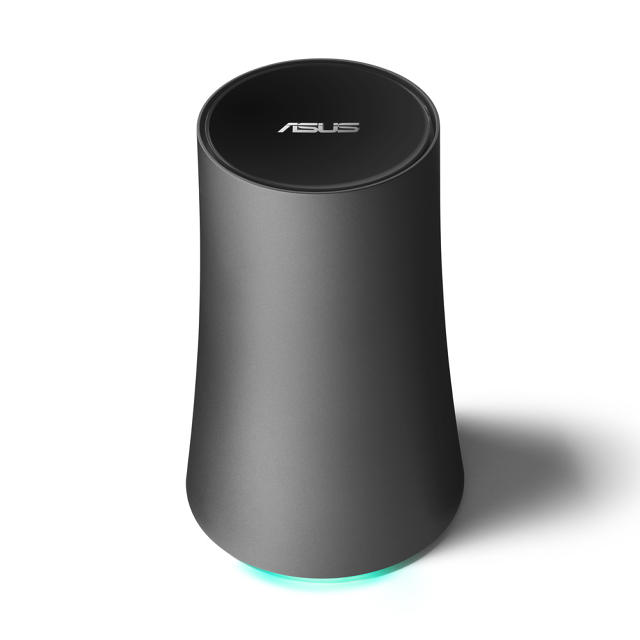
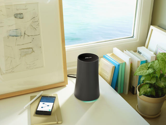
Physically, the new Asus OnHub isn't all that different from the first model, which was built by T-Link. Like its predecessor, it's a an array of 13 high performance Wi-Fi antennas, arranged in a cylinder. Whereas the previous OnHub looked a little like a combination between a Bluetooth speaker and a Muji-designed trashcan, Asus's OnHub has more of an organic, hourglass shape which seems more sculptural and vase-like.

According to product manager Ben Brown, there are good reasons why Google is teaming up with multiple OEMs. While the OnHub wants to be a router for the rest of us, people still have a lot of brand loyalty to companies like T-Link, and Asus. But it's also about letting different companies play and adapt with the OnHub's form factor. Since these routers are designed to sit out in the open, they don't want OnHub to be a one-design-fits-all product: it's important that people be able to pick one that matches their own personal aesthetic and decor, which means letting many designers have a go at it. "We wanted to have a selection of design choices, something that makes picking a router not just a necessity, but something customers have agency in choosing," he says.

What does unite both the T-Link and Asus OnHubs is their distinctive cylindrical shapes, a far-cry from the blinking plastic boxes that most of us have tethered to our broadband connection. Part of that shape is form following function: the OnHub's array of antennas are able to give superior Wi-Fi coverage to a house because of their circular arrangement. But Brown says that the cylinder is also a concerted effort to break the black box paradigm in router design that results in so many routers being shoved into a stack of gadgets, or inside a closet or entertainment center. The more you hide a router from view, the worse your Wi-Fi signal is. "We wanted to change the conversation a bit," Brown says. "It was important they look and feel different to bring them out of the closet."

The Asus OnHub goes on pre-sale today, starting at $220. You can order one here.


Nendo's New Slippers Look Like They Were Stolen From Garden Gnomes

$
0
0

Throughout Asia, it's common to take off your shoes and put on slippers provided by the host when you enter a private dwelling. That conceivably means they have as many slippers lying around their home as they have guests, leading to sprawling, cluttered slipper racks in otherwise orderly Japanese homes.

It was only a matter of time before Nendo turned its collective design mind to the problem, developing a stackable, cone-shaped slipper, designed to tame overflowing Japanese slipper racks across the country.

The shape is undeniably a bit odd. Looking like something straight off a garden gnome's head, they resemble a triangle from the side, from which these slippers get their name: Triangle Roomshoes. The shape allows the slippers to not just be as stackable as a sleeve of ice cream cones, but also form a natural crease on the in-step portion to be one-size-fits-all.

Nendo's triangle slippers are available in both polyester and synthetic leather. The materials were chosen not just for comfort, and to keep the cost of the slippers down, but also to prevent people from sliding across super-polished Japanese floors.

Available in four colors, you can purchase Nendo's Triangle Roomshoes here, starting at around $35 a pair. Sadly, though, they're a Japan-only offering. (At least for now.)

The Best Triangle House Since The Pyramids

$
0
0

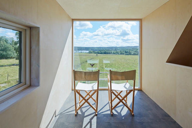
Triangles, and the sloping ceilings they create, don't make a natural fit for human habitation. But for his idyllic wooden house in rural Sweden, architect Leo Qvarsebo embraced the triangle, creating for himself a sloping isosceles of a summer home.

Positioned between a patch of woodland and a green pastures, the Qvarsebo Summerhouse was designed like a triangle to give stunning, unobstructed views of an idyllic vista in Dalarna. Large windows frame the landscape on three separate floors, while the front of the building opens up to a gorgeous terrace, including a swing set for Qvarsebo's children.

Qvarsebo says that despite the fact it isn't very close to any trees, he thinks of it as a treehouse for adults. As such, there's a rope connected to the peak of the roof, so he and his kids can scale the facade. Even inside, though, climbing the home's central staircase is meant to feel like a treehouse. "The climb to the top is via several levels and offers both views and privacy," he says. "From each level of the house you can see up to the next, creating a curiosity to continue to climb and once you're up, the view is breathtaking."

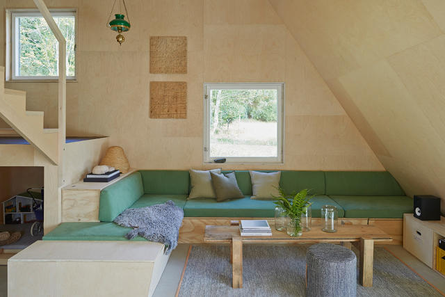
Inside, the Qvarsebo Summerhouse needs to be smart about the way it arranges rooms so they fit into the triangular profile. There are three floors. Being closest to the base, the bottom floor is the largest, containing a spacious living room as well as a kitchen. The next two stories contain bedrooms, which are designed to be both compact and intimate.

The walls and ceilings of the home are lined with birch plywood, which the architect sourced from, of all things, a puzzle factory. Meanwhile, the doors and windows are all-second hand. It's a clever sourcing and resourcing of raw materials that doesn't stop the house from looking pristine.

8 Roman Rotundas That Every Graphic Designer Should Study

$
0
0

It's natural when you're in a house of God to stare at the ceiling. After all, they're designed to make you feel like you're looking right at the skies heaven. And they're never more beautiful than in Rome.

Berlin-based photographer and designer Jakob Straub has spent the last ten years, staring at the ceilings of Roman rotundas and taking photos of what he sees. What he has captured is a rare view of the circular ceilings in one of the world's oldest cities, which all aim to resemble the eye of God. (...or the pre-Christian gods which preceded him, her, or them.)

According to Straub, he's always been obsessed with the circular. "I once created a memory-game about car rims, so I think I have a crush on round things," he says. His book, Roma Rotunda, presents 36 sacred rotundas, all filligreed in gold and outlined with stained glass windows, all contained within a 50-foot accordion fold.

His series of rotunda photographs started in 2005, upon one of his first visits to Rome. But rotunda domes are too massive to photograph in a single exposure usually. "I started [taking] the pictures with an analog camera, so I had to use techniques to do several exposures of the same spot and then puzzle them together," he says.

Straub says his obsession with rotundas isn't religious—it's all about the graphic design. "What I really love about the project is that the iconography on the rotundas switches between the banal decoration of functional tiles, to turbo-charged Christian iconography."

According to Straub, every graphic designer could learn something from going to Rome and looking up a little bit. You can order his book here.

Memphis Style Meets The Jetsons In Gibson's New Retrofuturistic Microphones

$
0
0

Most consumer mics look like refugees from the desk of Christian Slater in Pump Up The Volume. But the Neat Microphone line-up from Gibson is different. Unlike the usual faux-college radio station look of most desktop consumer mics, Gibson's designs are colorful and retrofuturistic looking, something like Memphis style meets The Jetsons.

Dubbed the Widgets, Gibson's Neat mics come in three sculptural designs that aren't afraid to play with the boring old microphone form factor. Called Widget A, B, and C (the green, red, and blue model, respectively), all of the Neat mics are USB-compatible, and have adjustable height shock mounts and a pop filter to help keep audio recording smooth.

I really like them. Generally speaking, consumer microphones either look like standard condenser mics, crappy VoIP plastic sticks, or are totally invisible because they're embedded in your smartphone, tablet, or computer. That there's even one company out there experimenting with bold, vivid industrial design in the microphone space makes me happy.

The three Widget mics are due to hit stores such as Best Buy, Walmart, and Amazon on November 15th, after being initially teased earlier this year. Although they look different, all three models allegedly sound the same, and they all cost a hundred bucks, so which one you pick ultimately comes down to which one you think looks coolest.

[via Gizmodo]

Infographic: 730 North American Birds In A Single Chart

$
0
0

Whether they're fat pigeons waddling on the subway platforms or a raven crying "nevermore" on your mantel, America is filled with birds: over 730 distinct species, all flapping, squawking, and strutting across this great country of ours. So leave Brooklyn's Pop Chart Labs to put all of them into a single chart, worthy of John James Audubon himself.

Sized to scale, Pop Chart's Birds of North America contains all of the country's birds on a single 39-inch by 27-inch chart. They're separated into groups and subgroups, including perching birds, owls, shorebirds, gulls, auks, cuckoos, and allies—plus the terrifying-sounding "Diurnal Birds of Prey."

According to Pop Chart, the infographic covers all of the continent's avi-faunas, from common sparrows, jays, and owls to rarer birds such as the Greater Sage-Grouse, the California Condor, and the Whooping Crane. So until we discover some new North American bird species—or more likely lose some—this chart will remain the last word on the nation's ornithological wonders.

Like all Pop Chart prints, the Birds of North America poster is printed on 100 lb. archival stock. It can be purchased here starting at $38.

Viewing all 2811 articles
Browse latest View live