Quantcast
Channel: Fast Company
Viewing all 2795 articles
Browse latest View live

How An MIT Data Viz Guru Is Exposing Cryptic Government Data

$
0
0

The U.S. government has access to the kind of data that makes guys like Cesar Hidalgo drool. The director of MIT Media Lab's MacroConnections Group, Hidalgo's passion is turning data into stories. Having previously helped visualize the biggest industries in Brazil, and the world's international trade data, Hidalgo knows there are enough stories buried in the U.S. census data alone to keep him busy for the rest of his life.

But the data are hard to access, and even harder to Google. At best, they are only discoverable if you already know where they live; at worst, you have to download them through massive zip files. So Hidalgo created Data USA, a new resource that not only beautifully visualizes seven different data sets from the U.S. Census Bureau, Chamber of Commerce, and more, but also explicitly makes that data indexable by Google.

From a user perspective, Data USA is an easy-to-search resource that aims to surface the stories in public data. Search for your hometown, and Data USA will present you with everything it knows about where you were born in a series of dynamically generated charts and graphs. That doesn't just include obvious metrics like population, wage distribution, or racial breakdown, but also more obscure ones such as your hometown's most specialized jobs, the most common non-English languages, and what industries are thriving (or declining) there. In addition to searching by city, you can also view data visualizations across whole industries, occupations, and educational backgrounds. Hovering on any Data USA chart or graph breaks down what is being visualized, while readable modern fonts and colorful Creative Commons images make every page beautiful.

Data USA already features a number of great stories visualized this way, from an exploration of the Gender Wage Gap in Connecticut to who works in the arts and entertainment industry. But making U.S. census data beautiful was only part of what Hidalgo set out to do with Data USA. The other part was pulling government data out of the deep web—that dimly lit basement of the Internet that isn't searchable by Google's web crawlers.

Public data often falls into the deep web because it doesn't encourage linking. "Many government sites require you to navigate through an excessive amount of UI elements, such as drop-downs and search entry fields, before you can access the data you want," explains Hidalgo. "The analogy we're using is they're like shopping in a supermarket where all the boxes are the same, and you need to open every box to see what's inside." These sites aren't accessible to web crawlers, which search engines like Google depend on to index the Internet. Continuing Hidalgo's supermarket analogy, there's no way on these sites for Google to just look at a data "box" and know what's inside.

That's why Data USA has been designed from the ground up to be Google-friendly. From individual charts to hometown profiles, everything is fully linkable. In fact, you can embed Data USA charts and graphs in blog posts, in news stories, or on Facebook—functionality that Hidalgo hopes more journalists (both citizen and professional) take advantage of. All of the charts and graphs are also backed up by text, which allows Google to index the data in a visualization, not just an image file. Hidalgo says he wants Data USA to be so open, you never have to even go to the website to access the data it contains, because Google already knows everything that's there, and can answer a question about census data as easily as it does local movie showtimes.

Hidalgo says he hopes that the example of Data USA will ultimately inspire the U.S. government and other agencies to rethink the way they are presenting their data on the Internet. It's time, he says, for government agencies like the U.S. Census Bureau to learn the same lessons about the Internet that publishers have: You can't just "throw up" something on the web and expect people to go to your site. Traffic needs to come to it organically, through search or social media. "It's time for these groups to take responsibility to making their data open," Hidalgo says. It's time for them to label the boxes in their supermarket.

Cover Photo: Biddiboo/Getty Images


From Two Ex-Nokia Designers, The Ultimate Analog Bike Accessory

$
0
0

People who ride bikes tend to appreciate the beauty of the analog machines they ride—untouched by electricity or gasoline, this mere assemblage of gears gives them the freedom to outpace digital life. So, while speedometers are often a necessary part of a cyclist's kit, they break the bicycling idiom. You just can't lose yourself in analog super-speed when there's a series of blinking LEDs on your handlebars.

With the Omata One, Julian Bleecker and Rhys Newman are looking to give cyclists a beautiful bike computer that looks and feels just as analog as the bike they are riding.

On the outside, the Omata looks like a Swiss-made assortment of nested analog dials inside a milled aluminum frame. The white hand points to distance. The orange hand, meanwhile, points to speed, centering on 18 miles per hour because it's anecdotally a "lovely speed to just roll," says Bleecker. The dial on the lower-left measures feet climbed, and the dial on the lower-right displays either duration or time of day, configurable through a smartphone app.

Despite its analog dials, though, the Omata One still has a digital brain. All of its functionality is powered by a GPS-equipped computer running behind the dials, which Bleecker admits is a little "devious," since it could be considered a cheat by analog die-hards. Yet Bleecker says the attempt with the Omata One isn't to create a pastiche of the analog. The dials serve an important purpose.

"Bicycles are supremely mechanical objects," Bleecker says. "Everything about them is legs moving gears moving wheels." A traditional electronic display not only introduces the cognitive dissonance of the digital into this "supremely mechanical" experience, it's simply as not as legible as a good old mechanical dial. How many times have you had a hard time seeing a digital screen in the sun? No one wants to have the same problem when trying to figure out how fast they're going.

Bleecker says that the Omata One's mechanical nature also allowed them to avoid the design pitfalls of having a display. "The problem with displays is that because they're so malleable, they become a honeypot for extraneous information," says Bleecker, who along with Newman knows a thing or two about busy LCD UIs: the two met working at Nokia. "Eventually, if you're not careful, all the noise and chatter of the Internet starts appearing on your bike's display. But that's why people ride bikes: to move away from that noise." Staying analog in appearance (if not entirely functionality) allowed Bleecker and Newman to keep focused on designing the Omata One to convey only the data cyclists need, as beautifully and legibly as possible.

The Omata One is available for pre-order on Kickstarter today, starting at $499. That's a bit expensive, considering that the Omata One isn't doing anything your smartphone couldn't do, but Bleecker says that he doesn't think cyclists will balk at the price.

"It's a premium product," Bleecker admits, but if there's one thing he's learned over the years, "cyclists don't compromise on their bikes."

MIT Invents A Way To 3-D Print Liquid Robots

$
0
0

Daniela Rus and Robert MacCurdy, two roboticists at MIT's Computer Science and Artificial Intelligence Lab, have a dream. One day, they want you to be able to download a robot, 3-D print it at home, and have it walk right off the print bed when it's done.

That dream is still a little ways off, but Rus and MacCurdy have just taken a big step toward making it happen. Working with Ph.D. candidate Robert Katzchmann and Harvard undergraduate Youbin Kim, the pair have developed a new method of 3-D printing that makes it possible to create half-solid, half-liquid robots. Throw a battery in, and they're ready to walk, because they've been printed with fully functioning hydraulics—the same technology you'll find in your car.

Admittedly, "half-solid, half-liquid robots" sounds like MIT's figured out how to 3-D print Terminator 2's T-1000s. What we're actually talking about is a little more mundane: A method for 3-D printing robots with working hydraulic systems like gear pumps, bellows, rotating crankshafts, and more. With this technique, you can 3-D print a six-legged walking robot in a single print job—the only thing you'd need to do to make it work is add a circuit board and power source at the very end. Otherwise, the robot comes out totally preassembled.

Like many 3-D printing technologies, MIT's technique works by depositing individual droplets of photopolymer on a print bed, layer by layer. Each layer of this material is then cured by blasting it with high-intensity UV light, which hardens it. What makes MIT's approach different than similar printers, though, is that it mixes in droplets of non-curing material—which never hardens—as it prints. By switching between the two materials within a print job, the printer can create functional hydraulic systems: For example, a crankshaft that pumps fluid to move a robot's legs. Using this technique, CSAIL already 3-D printed a working hexapodal robot in just 22 hours, a duration that should come down over time.

Rus and MacCurdy hope that their discovery will dramatically reduce the headache of designing new kinds of robots. "Right now, robots are very time-consuming and expensive to make and require a great deal of skill to assemble," says MacCurdy. "So roboticists make all sorts of decisions throughout the design process to minimize the complexity of the finished robot." If you can 3-D print a robot with working hydraulics, though, you don't have to make the same kind of trade-offs due to complexity.

Roboticists can design incredibly intricate robots and then rapidly prototype them without having to worry about actually assembling the damn things. "Because the cost of making a robot with 2 legs or 20 legs is pretty much the same [with our technique], we hope printable hydraulics will allow the proliferation of totally new robot designs," he says.

Eventually, MacCurdy says that he thinks printable hydraulics could open the door to the automated design and fabrication of robots. So instead of humans designing robots to solve a problem, humans will just tell an algorithm what problem they want to solve—and a few hours later, a custom robot walks off the 3-D printer, ready to get to work.

All CSAIL needs to figure out to get there is how to 3-D print circuit boards and power sources, something Rus says they're already working on. The future of robotics, she says, is going to be a lot like the App Store: For any given task you want to accomplish, there's a bot for that.

This Swedish Scientist's Transparent Wood Could Transform Architecture

$
0
0

You don't have to shop at Ikea to see that Sweden is obsessed with wood. Over 57% of the country is covered in upwards of 51 billion trees, and lumber and paper products are one of the country's biggest exports.

So leave it to Swedish researchers to figure out a whole new use for all that wood: they've made it transparent. In the future, this emerging material could be used as a stronger, more environmentally sustainable replacement for plastic or glass—in everything from wooden windows to wooden Coca-Cola bottles.

Lars Berglund is a researcher at Sweden's KTH Royal Institute of Technology. With a background in creating strong, light-weight carbon fiber composites for the aerospace industry, Berglund has a history of tweaking materials to exhibit new properties. A few years ago, though, he set his mind to the task of trying to do the same thing for Swedish lumber as he had for the aerospace industry, by figuring out how to give wood totally new properties. Ultimately, he created what he calls a transparent wood composite.

More specifically, Berglund created a technique that begins with thin strips of wood veneer. Using a process similar to chemical pulping, he strips the lignin—which gives wood its brownish color—from the veneer pieces. Once the lignin has been stripped from the wood and replaced with a polymer, a one-millimeter strip of Berglund's composite is 85% transparent—a number that Berglund thinks he will be able to increase over time.

The advantage of transparent wood over something like glass is that it has all the strength of opaque lumber—but still lets in light. Berglund's process, then, could be used to create everything from transparent wood structures to load-bearing windows that never crack or shatter. "We're getting a lot of interest from architects, who want to bring more light into their buildings," says Berglund. It's also as biodegradable and environmentally friendly as regular wood. Berglund even imagines that his composite could be used to create entirely new types of sustainable solar panels, made out of wood instead of chemically treated glass.

Right now, Berglund admits he has a lot of work to do before his composite shows up in, say, a new transparent Ikea line. Although suitable for mass-production, he's unsure how affordable it will be to scale his technique. Still, wood is one of the strongest, toughest, hardest materials there is, and Berglund just figured out how to make it practically invisible. Just imagine what architects and designers will do with transparent wood when they finally get their hands on it.

Neural Networks: What Are They, And Why Is The Tech Industry Obsessed With Them?

$
0
0

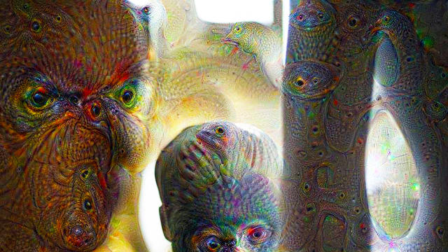
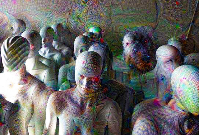
From Deep Dream to Deep Drumpf, everyone's talking about neural networks these days. But what the heck are neural networks and what do they mean for the future of computing and design? Here's your quick primer.

What is a neural network?

This is a sticky issue, because there's no single definition neural network that's universally agreed upon. In essence, a neural network is a computer program that tries to simulate the way a human mind works—more specifically, by simulating neurons themselves.

What's a neuron?

In your brain, there are hundreds of billions of tiny cells called neurons, each of which is connected to maybe tens of thousands of its brethren in complicated, ever-changing webs. This charming interactive story is a great primer on how they work, but put (very) simply, neurons are how we learn. Each neuron represents a different idea, memory, or sensation. When two neurons fire at the same time, they link together, creating a mental association.

How does a neural network simulate our neurons?

It depends on the kind of neural network you're talking about, but let's take Google's Deep Dream for instance. Here, Google's engineers created a stack of artificial neurons (each of which might be a separate CPU, or a core on that CPU), arranged in layers.

These layers work together to figure out what the neural network might be "seeing" in any given image it's shown. Each layer of neurons makes its own set of increasingly specific inferences about the contents of that image, which the next layer builds upon to formulate a better "guess" at what the image shows. After Deep Dream was trained on a significantly large number of previously identified images, it eventually knew enough to recognize what a "banana" or a "parachute" looked like—and it could even draw one itself.

A still from a video produced by Nvidia. See the full video hereNvidia.

How is that different from the way computers usually work?

Again, this is very simplistic, but in a computer processor, the closest analog to neurons are transistors—which are hardwired together in straight lines. They're two-dimensional, not three-dimensional, and unlike human neurons, transistors never rewire themselves; each transistor is connected to just two or three others. That's compared to the 10,000 connections the average neuron in your own brain might have. The result? Computers are really good at thinking logically, moving from one transistor to the next in a straight line. But they'rereally bad at thinking creatively and learning new things, since they're hardwired for linear, logical "thought." Neural networks aim to solve that problem.

Can you give me a big, dumb analogy that makes sense of all of this?

Okay. The way a computer thinks is a little like riding a subway. To get downtown, a computer might need to pass through a dozen stations and change lines two or three times. The way a human thinks is more like teleporting. Once a human brain has made that "subway trip" downtown once—connecting two neurons on a mental map—it can just teleport directly there without making all the in-between stops.

Putting this back into literal terms, neurons can rewire themselves on the fly to work together more efficiently. That's how we learn, and that's how we combine new ideas to be creative. If we can simulate that same effect in a neural network, then, we can teach computers to think like we do.

What tasks would neural networks be better at than regular computers?

Pretty much anything that a human can currently do better than a computer—writing a story, analyzing the meaning of a work of art, even driving a car, or understanding a human being from context and body language. Again, Deep Dream is a good example. Google's neural network doesn't just see pixels when it looks at an image. It can actually tell you what the image contains. It's something humans take for granted, but up until recently, it was something computers couldn't accomplish.

What are some good examples of neural networks?

In addition to Deep Dream, Google's self-driving cars also use neural networks to detect pedestrians. But neural networks aren't exclusive to Google. Facebook uses them to discern faces and identify your friends. Neural networks have also been used to design new fonts, create digital graffiti, and even impersonate Donald Trump on Twitter.

How will neural networks evolve over the next few years?

Neural networks are the key to making computers more like humans, and automating the human brain's problem-solving and creative capabilities. Combine them with conversational interfaces, and neural networks can make true artificial intelligence finally possible—a revolution that would have a knock-on effect in the way we pretty much do everything. Designers in the future won't just use neural networks; neural networks may very well be designers themselves.

A Devastating Bird's Eye View Of Earth's Vanishing Rainforests

$
0
0

Even when there isn't a human being to seen in his photographs, the bloody thumbprint of humanity is everywhere in the work of nature photographer Daniel Beltrá. His series Forests focuses on tropical rainforests around the world, showing the vast scale of the transformation the world is going through, spurred by human-made stresses: from the Amazon engulfed in flame to once-lush forests turned into deserts of deforestation.

As a self-described conservation photographer, Beltrá has taken thousands of photos of subjects ranging from the melting glaciers of Greenland to the nightmarish effects of the 2010 BP Gulf oil spill—a project which is now available as a book on his website.

But Forests may be his most personal work. He's been shooting rainforests around the world since 2001, long enough to see many of them dwindle away before his eyes.

"It's hard to think of a way that human intervention hasn't touched the forests that I've photographed," Beltrá says. Timber harvests, many of them illegal, are a constant threat—as is mining. The rainforests of Brazil, the Democratic Republic of the Congo, and Indonesia are under constant threat of being cleared as grazing land for livestock, like cattle, or for soy and palm oil infrastructure. Forests end up being drowned by the development of hydroelectric dams, or just plowed down to make new roads, which Beltrá says ends up being "the catalyst for everything else."

According to Beltrá, he chooses to shoot the world's forests from the air because it allows him to juxtapose nature with the destruction wrought by unsustainable development. "The unique perspective of aerial photography helps emphasize that the Earth and its resources are finite," he says. "By bringing images from remote locations where human and business interests and nature are at odds, I hope to instill a deeper appreciation for nature and an understanding of the precarious balance our lifestyle has placed on the planet."

You can follow Beltrá on Instagram here.

All Photos: ©Daniel Beltrá courtesy of Catherine Edelman Gallery, Chicago

MVRDV's Latest? Stairs That Let You Climb Up The Side Of A Building

$
0
0

Rotterdam's Central Railway Station, opened in 2014, is a beautiful, modern zig-zag of a building. Next door sits the hulking 1953 Groothandelsgebouw—one of the first buildings constructed after the bombing of the old city during World War II.

It's quite a juxtaposition, and now, the two buildings are finally being connected by dramatic, temporary bridge. To celebrate 75 years of rebuilding Rotterdam, Dutch architecture firm MVRDV will literally bridge the two structures by adding a large staircase from the Centraal Station's entrance that leads all the way up to the top of the Groothandelsgebouw, like a modern Mayan temple.

Designed to look like the scaffolding which has been such a common sight in a city that has been rebuilding itself for the better part of a century, MVRDV's installation—called The Stairs—will stand 95 feet tall and stretch 187 feet across. As visitors climb the stairs, they will be able to see many of Rotterdam's best examples of reconstruction architecture, such as the Euromast, the Hugh Maaskant-designed observation tower which opened in 1960, and the cable cars that run up and down the Coolsingel, one of Rotterdam's best known streets. By the last step, visitors will be deposited on the Grootandsgebouw's observation deck, where they will be able to view all of reconstructed Rotterdam at once.

The Stairs aren't just a climb to a cool panorama of Rotterdam, though. They also lead to the Kriterion, a popular rooftop movie theater from the 1960s. Although the Kriterion has been closed for years, it will be re-opening for the month-long installation. From May 16 to June 12, those who climb The Stairs will be able to see a movie, or listen to a public talk, at the Kriterion when they reach the top. "I used to see Rotterdam from the Kriterion after the films and it gave an fantastic overview of the city"says MVRDV co-founder Winy Maas in a press release, adding that he wants to give this experience to a new generation of Rotterdammers.

Although The Stairs are only scheduled to be open for a little more than a month, MVRDV already seems to be angling to make them a permanent part of the cityscape. "The Stairs aim to animate the rooftop and to imagine a second layer in the next step of Rotterdam's urban planning," Maas says, adding: "It would be good to make it a permanent fixture."

"The Matrix" Meets "Drive" In This Explosive Data Viz For Porsche

$
0
0

Driving a Porsche is incredible. I don't even care about cars, and the one time a friend let me drive his, I felt like I was racing through the streets on the back of a growling tiger. And that was just taking it up to 30 miles an hour.

The newest project from the data art studio Onformative attempts to capture that feeling. The Porsche Blackbox website visualizes the data of real Porsche drivers in a kinetic explosion of neon particles and airstreams streaking past a GTS. Then you hit the space bar, and you can experience a Porsche 911 in bullet-time.

In movie terms? It feels like The Matrix meets Drive. Data-wise, though, what Onformative is visualizing here is real driving data recorded by Porsche owners using the Porsche GTS Routers app. The app lets drivers both create and share cool, winding driving routes that emphasize the "growling tiger" feeling I talked about earlier.

By taking data about direction and acceleration from the Porsche GTS community, Onformative was able to create an "excitement graph" of each course. The designers then used this graph to generate particle effects around a 360-degree 3-D model of a Porsche 911. As the experience becomes more intense, the car's outline becomes clearer. At the same time, the site generates an adaptive soundscape, whose tones fluctuate to reflect the energy and emotion of the route.

According to Onformative cofounder Cedric Kiefer, the Porsche Blackbox's neon-streaked look and bullet-time effects didn't come from pop culture, but from the cinematic language of car commercials. "It plays with light and streams of particles to visualize the shape of the car without actually showing it, as often seen in windtunnel test facilities," he explains.

Check out the full data visualization here.


Finally, The Golden Ratio Gets Its Own Coloring Book

$
0
0

When it comes to design, the golden ratio is mostly bullshit. Though designers sometimes use it, there's just no proof people prefer that precise spatial ratio in their buildings, interfaces, or art. But that's not to say the golden ratio doesn't exist: it's all around us, especially in nature's Fibonacci spirals, which you can find everywhere from the curve of a nautilus to the whorls in a chamomile flower.

For years, Venezuelan artist Rafael Araujo has been the undisputed master of golden-ratio art, meticulously hand-illustrating examples of the Fibonacci spiral—a geometric curlicue based upon a sequence of integers which describes the way things tend to grow in the natural world—without using a computer. His style lies somewhere between da Vinci's Renaissance fascination with nature, and the geometrical patterns of Escher at his best. His work is usually beautifully and vibrantly colored, but for his latest illustrations, Araujo wants you to color the Golden Ratio yourself: like many artists, he's getting in on the adult coloring book craze.

Now on Kickstarter, The Golden Ratio Coloring Book contains over 20 new illustrations of the Fibonacci spiral in nature, as seen in the flight patterns of butterflies, the growth of a seashell, and more. There are also meticulous representations of geometric patterns which don't usually exist outside of a computer, as well as a few drawings of designs informed by the golden ratio: for example, the floor tiles at Spain's Alhambra palace.

According to Araujo, each of the illustrations was designed from scratch for The Golden Ratio Coloring Book, because his existing work was simply too complicated to make for good coloring. Even so, the images are so intricate you'd think a computer must be involved. But Araujo works like the geometricians of old: All of his drawings are made at a drafting table with a compass and protractor. The work is incredibly arduous—Araujo says a single drawing can sometimes take him 100 hours—but the results are undeniably spectacular. And now they're just waiting for you to make a riot out of them with your Crayola.

You can preorder a copy of The Golden Ratio Coloring Book on Kickstarter for $20 here.

The Ultimate Gift Set For Mid-Century Modern Design Lovers

$
0
0

Some people send postcards because they're on vacation. Others, like me, wish they could send a postcard every time they see an expensive piece of mid-century modern design that is otherwise outside their budget: an original Eames chair, perhaps, or one of Dieter Rams's classic side tables.

Thames & Hudson—sellers of some of the most beautifully designed books around—and graphic design studio Here Design have just unveiled Mid-Century Modern, a new postcard-cum-notebook-cum quartet of reference books that pay homage to the titans of 20th-century design: Charles and Ray Eames, George Nelson, Dieter Rams, Eileen Gray, and more.

The Mid-Century Modern series portrays each design as a profile, with a minimalist, Herman Miller-like line drawing. The set favors the pastels of the era, including mustard yellows and pale turquoises, while the illustrations are in black-and-white, revealing the lines and contours of each given piece.

The reference books are split between themes: "Tables and Storage,""Product and Industrial Design,""Lighting," and "Chairs." Each book contains text by Frances Amber, a guest editor at MidCentury Magazine, while the illustrations drill down into details of each piece.

The Mid-Century Modernpostcards, books, and notebooks are all due out in May, and will be available from $14.95 to $24.95.

5 Designers Reinvent The Humble Bathroom Faucet

$
0
0

Every year, the bathroom hardware-maker Axor asks a different group of international designers to envision the future of the bathroom. The project, called WaterDream, has seen its fair share of zany concepts—see last year's entry from Nendo, which designed a floor lamp that also doubled as a portable shower.

This year, though, WaterDream has jettisoned the wackiness, with a series of faucets created by five notable designers and architects, each of whom took their design cues from the natural world.

The first faucet, called Ritual, was designed by British architect David Adjaye. A wedge of bronze, the faucet functions by letting water gush out beneath a black granite inlay, almost like a hidden stream trickling out from beneath a mountain. The second faucet is called The Sea and the Shore, designed by the German furniture-maker Werner Aisslinger. It's a planter-fountain hybrid that allows you to keep a plant alive from the same faucet with which you brush your teeth and wash your hands.

Swedish design duo Front contributed Water Steps, a sculptural metal spout which tumbles water between two tiers of concave metal cones. Another design duo, the Danish-Italian firm GamFratesi, contributed Zen, inspired by shishi-odoshi—the traditional Japanese wood fountains that let water trickle down through the hollowed-out spigot of a bamboo branch. The last faucet is Mimicry, a three-tiered marble faucet that combines a classic material with an abstract, geometric design. It was designed by Jean-Marie Massaud, a previous WaterDream designer who came back for round two.

Debuting today at Milan Design Week 2016, all of the faucets were designed using Axor's U-Base system, which gives industrial designers far more flexibility in their designs than traditional fixtures. According to the company, all the faucets are meant to examine "the meaning and value of water in our living space ... while testing the limits of individualization." The system is designed to make bespoke faucets much easier to create for architects, designers, and anyone else who might not have expertise in bathroom hardware design. If you've got a bathroom redesign in the works, like I do, they make for great eye candy.

All Images: via Axor Design

Designing Beautiful Android Wear Watch Faces Just Got Much Easier

$
0
0

For the past two years, Ustwo—the London-based design company behind projects like the Escher-esque blockbuster iOS game Monument Valley to an app to save London from its parking nightmare—has been dabbling in Android Wear watch faces. Now, the company is releasing Face Maker, a platform that makes rolling your own custom Android Wear watch faces totally foolproof—even if you have abysmal design taste.

Face Maker isn't the first app (or even the 12th) that allows Android Wear owners to design their own watch faces by selecting from different backgrounds, colors, fonts, hands, and complications. But these elements aren't curated with any real design ethos, argues Ustwo product designer Shaun Tollerton. There are few limits on what you can do with them, true—but that means there are even fewer limits on their capacity to create hideous and unusable watch faces.

They also generally require an Android or web app to design your own watch faces, which Ustwo believed flew in the face of their design ethos: Customization of a watch face should live on the watch itself.

"With Face Maker, we set out to make something where it was totally impossible to create a bad looking watch face," Tollerton says. That meant identifying the key areas where other Android Wear watch faces go wrong. According to Ustwo, the worst Android Wear watch faces are overcrowded and feature multiple discordant style elements. They're also not glance-able, meaning you can't identify the information you're looking for in under a second. The design of Face Maker was predicated upon finding a sweet spot between customizability and being true to the best practices in wearable UI/UX.

So Face Maker tries to put limits on our capacity for over-complicated and unusable design. It comes with two watch face templates: Classic, which is an analog-style watch face, and Trio, which has a more modern, digital, Tokyo Flash-like aesthetic. With both watches, users can customize the markers on the face, the types of data being displayed (time, date, and so on), the colors and fonts being used, and more—all from their Android Wear smartwatch. The options for customization are carefully curated by Ustwo to make sure they aren't overstuffed or fail the glance test. All in all, these two watch faces alone have over 2,8000 permutations, and Ustwo says it will be updating Face Maker over time to create more.

But why is Ustwo, a design firm with some pretty serious credentials, so interested in Android Wear watch faces to begin with? It's a pretty small market right now, but Face Maker's project manager Toph Brown says it's all about being prepared for the future. "Google and Apple are making huge plays in the wearable space right now, and where there's smoke, there's fire," he says. "And the watch face is at the center of that experience. If you can figure out how to design a nice face on a smartwatch that everyone wants to use, you've got the keys to the kingdom."

You can download Face Maker on Google Play for free here.

Can't Program? Now There's A WYSIWYG For Designing With Code

$
0
0

Gone are the days when designers did all their UI/UX concepts in Photoshop. Now, they're being called on to code their mockups.

But how do you introduce designers to code if they've never programmed before? You take a page from the early days of the web, and build them a WYSIWYG—also known as a "what you see is what you get" editor, like PowerPoint or Photoshop, that shows them the finished product in real time.

Unveiled today, Autocode is a WYSIWYG from the popular prototyping tool Framer that lets non-coders design interactive prototypes without knowing a lick of JavaScript. And it's useful for coders, too.

First thing's first. Why design in code, over a tool like Photoshop? Framer co-founder Koen Bok says that when it comes to interactive design, using static design tools just leads to miscommunication.

"I can't tell you how many design meetings I've been in where someone presented a Photoshopped mock-up of an app, everyone left the meeting thinking they were on the same page, and a few months later it turned out no one had agreed on how it was supposed to actually work," he says. "Code is the best tool to express interactive design, because it's easier to communicate how a design should feel, not just how it looks."

Framer was created to give designers a coding toolbox for realizing their interactive designs, Bok says. But while code is an undeniably powerful design tool, it's got drawbacks; it has a steep learning curve, and even if you're a coder, there are going to be times when hammering out actual code is overkill. "While we believe code is the best tool for many things, some things are better done with visual design," says Bok. "It's easier to position and reposition an element on screen by dragging-and-dropping it, then typing in x and y coordinates."

That's why AutoCode is so useful. For those who don't know code, AutoCode gives some simple tools to prototype interactive designs, allowing them to create and directly manipulate new layers, boxes, and other on-screen design elements as easily as if they were putting together a PowerPoint presentation. As you work, AutoCode consistently updates the underlying Framer code, giving non-coders a entry point to learning JavaScript just by playing around. But even if you do code, AutoCode constantly scans your Framer designs, looking for snatches of code that would be easier for you to manipulate by clicking and dragging.

The goal of AutoCode, says Bok, was to give Framer a WYSIWYG editor that was useful to both coders and non-coders alike. "You can build design prototypes just using AutoCode's UI alone, but it will also get out of the way when you don't need it," he says. Bok describes AutoCode as an inverted Flash, Adobe's much-maligned animation platform, which is also often used to design interactive prototypes. "In Flash, you use an editor that is all UI-based, and sprinkle in code when you run into problems," Bok explains. "We flipped that model, only adding UI where it makes interactive design easier."

Check out Framer here.

Alphabet's Other Robotics Company

$
0
0

You've heard of Boston Dynamics, the Alphabet-owned company behind America's coolest and weirdest robots. But have you heard of Schaft? As part of X, Alphabet's moonshot division, it's Alphabet's other robotic company—and it's far more secretive than Boston Dynamics.

But last Friday, Schaft made a rare appearance at the New Economic Summit in Japan, showing off a nameless bipedal robot with two piston-like legs, which effortlessly walks up and down stairs and navigates uneven terrain, such as slippery rocks on the beach, even when carrying up to 130 pounds.

We reached out to X about Schaft's appearance at the conference, and the company was quick to downplay the demonstration. "This wasn't a product announcement or indication of a specific product roadmap," an X representative told us in a boilerplate response. "The team was simply delighted to have a chance to show their latest progress."

So what else do we know about Schaft? How does it differ from Boston Dynamics's work? And what's Alphabet's ultimate plan for the company?

The Willy Wonkas Of Robotics

Schaft was founded by Junichi Urata and Yuto Nakanishi, two roboticists who met each other at the University of Tokyo's JSK Robotics Laboratory. After years of working together, Urata and Nakanishi developed powerful new actuators that solved one of the biggest problems facing robots today: Pound for pound, they're fundamentally weaker than humans.

That seems counterintuitive, but it's true. To get around easily, robots need to be both strong and lightweight. But with motors, there's an engineering trade-off between weight and strength. In other words, as they get stronger, they get heavier, slower, and less wieldy. That's why a robot such as Honda's ASIMO can only lift a dozen pounds, where as an adult male might be able to lift 10 times that. The relative weakness and weight of robot actuators makes balance a problem, and also means they tend to overheat.

Urata and Nakanishi solved this problem by replacing standard servos with high-voltage, high-current, liquid-cooled motor drivers. They then spun the technology off from the JSK Robotics Laboratory as Schaft. That's when they started building the robot that would win them the love of Alphabet: the S-One, a robot designed to pass the DARPA Robotics Challenge, or DRC.

The DRC was a prize competition held from 2012 to 2015 to perfect technology that might eventually lead to robot first responders (winners secured DARPA funding to continue development). It tasked roboticists to create a robot that could drive a utility vehicle, walk over rubble, use tools to break through concrete panels, climb ladders, and more.

Using an existing set of robotic legs built by Kawada Industries as a base, Schaft grafted a pair of powerful robot arms onto the S-One, then outfitted the bot with the company's powerful actuators. The result was a design that soundly beat every other contender in the first round of the DRC.

Alphabet—then Google—pounced. That same month, before the S-One could move on to the DRC Finals, Schaft was acquired. With Silicon Valley's billions suddenly behind them, the company pulled out of the competition, opting not to pursue DARPA funding. Schaft went into full secrecy mode, pulling its already austere website.

Up until Friday, that's all anyone had heard of Schaft. In a very real way, the company is the Willy Wonka of the robotic industry, going underground at the height of its success.

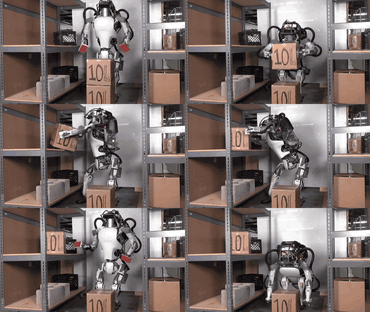
AtlasBoston Dynamics

More Nest Than Stark Industries

Alphabet has been mum about what it sees in Schaft. A spokesperson at Alphabet told me: "As with all of the robotics teams that recently moved from Google to X, we're looking at the great technology work they've done so far, defining some specific real-world problems in which robotics could help, and trying to frame moonshots to address them."

Compared to Boston Dynamics, Alphabet's better known robot company, a couple of differences stand out. First, a lot of Boston Dynamics's best known robots, such as BigDog and Atlas, were designed with the military in mind, long before it was acquired by Alphabet. When Alphabet acquired Schaft, it pointedly withdrew from the DARPA Robotics Challenge finals—perhaps to avoid establishing financial ties between Alphabet and the U.S. military.

CheetahBoston Dynamics

Second, Boston Dynamics tends to specialize in designing robots that move like living creatures, such as humans, dogs, and horses. The robots Schaft showed at the New Economic Summit on Friday, though, don't really move like anything in the natural world. They look almost like capital Ms, lifting piston-like legs up and down without bending them. Meanwhile, a battery pack and motor suspended between the legs give the robot a low center of gravity, helping it stay upright regardless of the terrain.

That could be important. According to recent reports that Alphabet has put Boston Dynamics for sale, the main reason for the move has to do with the fact that the company's bots, as impressive as they are, are at least 10 years away from commercialization.

Though Schaft and Boston Dynamics were both purchased by Alphabet during a robotics acquisition spree in late 2013, Schaft does not appear to be for sale. Schaft may be closer to getting working robots to market than Boston Dynamics. Sure, it may seem intuitive that functional robots behave more like animals and humans, and maybe that's true in the long run. But it may not be true now.

What's more, Schaft's robots seem more comfortable in the home than Boston Dynamics's mule bots. It's something that you can even spot in the leaked footage of Schaft's latest advances. At one point, Schaft cofounder Yuto Nakanishi showed footage of a robot walking up stairs while vacuuming with its legs, pointing out at least one way Schaft could reach consumers: as a product halfway between a next-gen Roomba and Rosie the Robot Maid.

Is that what Schaft is up to? It's hard to say, but Alphabet's other robotics company could be laying the groundwork for the consumer robots of the 21st century. And if that's the case, Schaft could well be Alphabet's next Nest: the ultimate extension of home automation, a rocking, walking bot that does everything from vacuum your stairs to rake your yard.

All Images (unless otherwise noted): Schaft via Youtube

What Happens When You Apply Machine Learning To Logo Design

$
0
0

The rise of neural networks and generative design have created new opportunities for designers. But what if it went the other way, and robots created a Skynet that kills off human designers (or at least their careers) once and for all?

A heady question. Depending on whether you embrace or fear the robo-future of design, Mark Maker (via Sidebar) could be considered either the beginning of the end, or proof that such fears are overstated, because bots are still pretty crap at design. Either way, it's a fun web toy.

In Mark Maker, you type in a word. The system then uses a genetic algorithm—a kind of program that mimics natural selection—to generate an endless succession of logos. When you like a logo, you click a heart, which tells the system to generate more logos like it. By liking enough logos, the idea is that Mark Maker can eventually generate one that suits your needs, without ever employing a human designer.

Mark Maker creates its logos by breaking each design in half, so that it contains both a base design and an accent element. The example Mark Maker's creators use is the Mobil logo, which contains a blue sans serif typeface as the base, and a red "o" as an accent. The typefaces are plucked from Google Fonts' opensource typeface library, while icons come from the Noun Project.

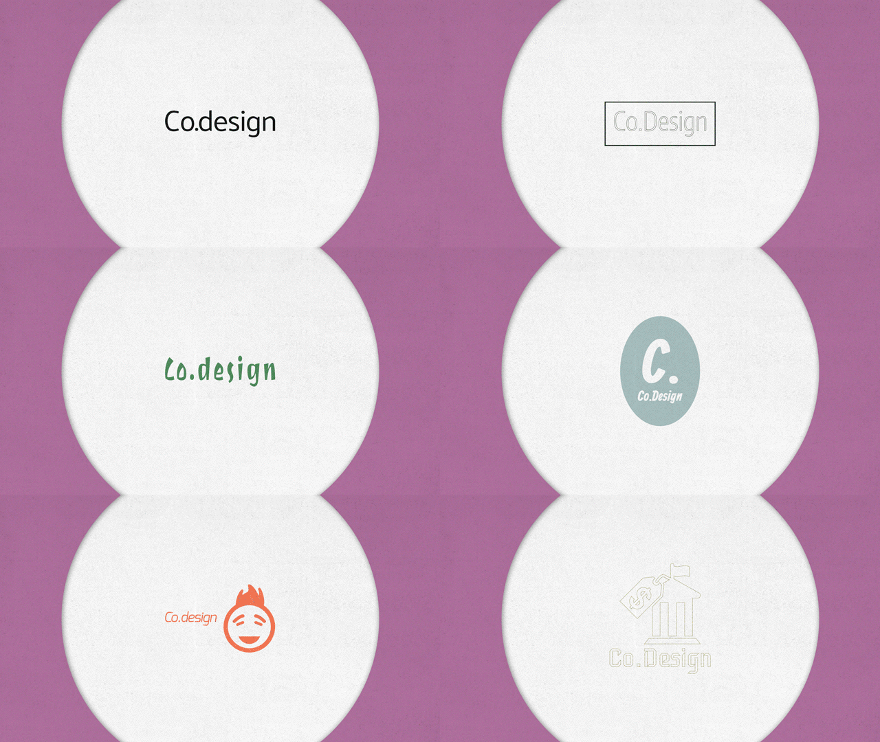
To be honest, I found myself grudgingly impressed by some of the logos Mark Maker produced for us. In fact, when I entered "Co.Design" into Mark Maker, the program generated some marks that looked eerily similar to Co.Design's own logo, which was designed in-house. Or was it?

Try Mark Maker for yourself here.


The Real Reason Microsoft Is Building So Many Computer Vision Apps

$
0
0

For the past few years, Microsoft has been steadily releasing goofy little apps that use neural networks to perform tricks ranging from guessing your age and rating your mustache to describing photographs (often comically) and even telling you what kind of dog you look like.

But why? Entertaining though these apps are, they all seemed a little random—until a couple of weeks ago at Build 2016, when Microsoft revealed that these experiments are more than just a sum of their parts. In fact, they represent stepping stones on the road leading to Seeing AI, an augmented-reality project for the visually impaired that aims to give the blind the next best thing to sight: information.

Built by Microsoft Research, Seeing AI is an app that lives either on smartphones or Pivothead-brand smart glasses. It takes all of the tricks Microsoft developed using those "goofy" machine learning apps and combines them into a digital Swiss Army knife for the blind. By helping the visually impaired user line up and snap a photograph using their device, the app can tell them what they're "looking" at; it can read menus or signs, tell you how old the person you're talking to is, or even describe what's happening right in front of you—say, that you're in a park, watching a golden retriever catch an orange frisbee. Presumably, it has some excellent mustache detection skills, too.

"This isn't the first app for the blind," admits project lead Anirudh Koul. "But those apps are extremely limited." One app might be dedicated just to helping you know what color you're looking at. Another might read menus and signs, or tell you what box you're holding in the grocery store based on the barcode. There are even photography apps for the blind.

But the problem with all these apps is fragmentation. For a blind person, using them seamlessly is like having to screw in a different set of eyes every time you want to read a paper or identify a color. Seeing AI can do all of the above—and more—all within the same app.

Of course, having so much functionality introduces its own design challenges. According to Margaret Mitchell, Seeing AI's vision-to-language guru, context is key when trying to decode visual information to text. "If you're outside, for example, you don't want it to describe the grass as a green carpet anymore than you want it to describe a blue ceiling as a clear sky when you're indoors," she says. It's also challenging to know how much information Seeing AI should give users at any given moment. Sometimes, it might be more useful to list what's around a user, while other times, a scene-description is better, so knowing when to automatically switch between modes becomes important.

These are just some of the problems the Seeing AI team is trying to work out before their software becomes a consumer-facing product. But already, Seeing AI's software is proving indispensable to Microsoft software engineer Saqib Shaikh, who lost his sight at the age of seven. He has helped the Seeing AI team test and tweak its software, as well as identify features that sighted people might not think of as useful, but which the visually impaired really need. For example: finding an empty seat in a restaurant. "His guidance has been amazing," says Mitchell. "He can exactly identify what we should be returning and why."

Although apps that use its machine-learning algorithms are routinely released by Microsoft Garage, neither Koul nor Mitchell could say when Seeing AI would be available for everyone to download. They only say it is a "research project under development." But this isn't just some silly web toy. When released, Seeing AI will be an app that can fundamentally change a person's life, while continuing the grand tradition of accessibility pushing design forward in exciting directions. Sure beats TwinsorNot.net, don't you think?

Visualizing The Cosmic Web That Holds The Universe Together

$
0
0

There's a lot more to the universe than the stars we see in the sky. Invisible to the naked eye, the broader universe is made up of a vast cosmic web: filaments of gas which stretch between galaxies, and which we've only recently been able to see for the first time. Now, you can explore it for yourself.

Although the cosmic web has been proven to exist, there's still a great deal of uncertainty about how it is formed. What determines the web's pattern? Why do galaxies connect to some neighboring galaxies, and not others? At Northwestern University's Barabási Lab, German designer Kim Albrecht created a gorgeous visualization of three possible models to try to understand the network principles that help shape the universe. You can navigate through the interactive's 24,000 galaxies—and the more than 100,000 connections between them—right in your browser.

Albrecht's Cosmic Web model visualizes three separate models by mapping those 24,000 real galaxies as single specks of light, then drawing connections between those galaxies that depend on which structural model you're exploring. One model connects galaxies when they are within a certain radius of each other, the second connects them based upon the size of the galaxy (where the larger the galaxy, the longer the connections it is capable of making), and then the third model simply connects every galaxy to its nearest neighboring galaxy.

Even if you don't have a background in the physics behind each model, it's fun to travel through Albrecht's viz. You can rotate and zoom into each galaxy, traveling millions of light years across silk strands of cosmic gas in just a few seconds, all within your browser tab. Outside of being fun, though, the bigger goal was to help physicists understand which model most closely aligns to the real universe. (Spoiler: the structure of the real cosmic web is closest to the third "neighboring galaxy" model.)

According to Albrecht, one of the most exciting aspects of his work as an in-house data-visualization expert for a group of physicists is the way it help open up science. "Usually, these sorts of theories are negotiated between a very small number of people in a very specific field, but this makes their work understandable to thousands of even millions of people," he says. "Data viz is a big and unique way to get science out there, and while that worries some scientists, I'm excited about how it can help change the field."

All Images: via Kim Albrecht

Empty Porn Sets Reveal The Strange World Of XXX Interior Design

$
0
0

At first, Jo Broughton's photographs look innocent. A teenage girl's bedroom. An empty class after a physics lesson. A room full of pink and blue balloons. But then you start noticing the details. The dildo on the wardrobe. The high heels and panties on the floor. The bottle of lube carefully tucked away out of sight.

They're all empty porn sets—and stripped of their writhing performers, they reveal an aspect of pornography that has since more or less been lost in the Gonzo age: the role of interior design.

Broughton started photographing these sets in 1997. A student at London's Royal College of Art, Broughton was looking for a side job, so she applied for an ad to be a photographer's assistant. When she showed up for her new job, she met Steve Colby, a pornographic photographer with a thick Yorkshire accent whose first words to Broughton were: "Have you ever seen a fanny upfront?" (In Britain, this means something decidedly different than it does in the States.)

Broughton hadn't, but soon she would. For the next two years, Broughton worked for Colby part time, making tea and coffee, painting sets, ironing bed linen, doing the lighting, and cleaning up fluids. She discovered that many porn actresses she met in Colby's studio were introduced to it by their boyfriends—who often sat on the sidelines during a shoot, watching—or their mothers, who also made pornography for the over-forties set. "For a long time I had quite a problem with what was going on there, I was quite conflicted," Broughton recalls. "I was green as grass; I'd never ever walked into something like that before." Over time, though, Broughton came to think of Colby and his fellow pornographers as a sort of oddball family.

Broughton also came to love the space of the studio. She felt comforted by the way sunlight would stream through the windows, illuminating what she calls "echoes of the chaos" that the performers had left behind them that day. "It was very strange in some respects, because I was in this space where I felt safe and accepted, but other people perceived it very differently," she says. In fact, Broughton more often felt threatened by the world outside of the porn studio at that time than the one inside it. She says that people would call Colby's studio every day, screaming obscenities into the line, while one actress she knew—who shot porn to pay her way through school—attended her graduation ball, only to discover that a classmate had posted her "work" all around the venue.

Which is why, when Broughton finally quit as Colby's assistant at 21, she lied about exactly where she had been working. Colby, ever kind to her, gracefully wrote Broughton a letter of recommendation for the Kent Institute of Art & Design, identifying himself only as a portrait photographer. But Broughton stayed loyal in her heart to Colby, living at the studio and even doing work for him as a cleaner for the next 10 years. During this time, she shot the bulk of her Empty Porn Set photos. She only stopped the project when Colby retired in 2007.

His timing was serendipitous. Around the same time, pornography went big on the Internet—and society's whole attitude towards porn seemed to change. "Thanks to the web, porn seemed to become more extreme, but at the same time, more accessible, so the public became desensitized to it," Broughton says.

Which is what makes Broughton's photographs so interesting, and in a way, so sad. They reveal a forgotten era—an era less obsessed with gonzo extremism than recreating what now seem to be relatively quaint sexual fantasies. The design of these sets isn't sophisticated, true, but no one films porn on sets at all anymore. Looking at Broughton's photos, you can't help but feel that something has been lost, and it's not sordid. It's surprisingly innocent.

All Photos: Jo Broughton

Pentagram Sexes Up The Stodgy World Of Finance

$
0
0

The graphic design of the finance world is stodgy, boring, old-fashioned, and marvelously conservative. But money is sexy. So when approached by an influential group of New York security analysts to design a book predicting the future of the stock market, Pentagram partner Eddie Opara aimed to give them a design that was just as exciting and dynamic as money itself.

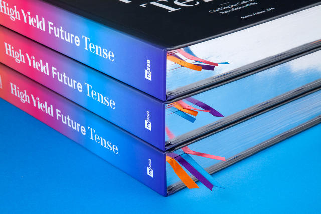
Published by the New York Society of Security Analysts (NYSSA) in celebration of its 50th year, High Yield Future Tense: Cracking the Code of Speculative Debt is a thick bible that presents the outlook for high-yield bonds—riskier bonds with a higher chance of profit than other types of bonds—as a selection of think pieces, infographics, and formulas from some of the all-stars of the futures world. Approached by NYSSA to design the book, Opara at first had his doubts. "I mean, let me put it this way: If you were a designer, and someone approached you with a book with this title, wouldn't you think carefully before taking the job on?" he laughs.

What eventually brought Opara on board was NYSSA's promise that it expected something very different from the usual finance tome. Looking at Amazon's finance section together, Opara showed me the kind of graphic design he was specifically trying to avoid. "Not to get personal, but these designs all have the aspect of DIY books," he says. "They look like they're from the '80s or '90s. And when you open the books up, they look like some exam you have to do for accounting class."

So for High Yield Future Tense, Opara and his team at Pentagram set out to break the mold. The cover has four ultra-modern typefaces (Larish Neue, Domaine Sans Display, Px Grotesk, and Danmark) that vie for readers' attention. Opara says these typefaces weren't picked because they necessarily evoked money, but because they created an effect right from the get-go that this wasn't a book for conservatives, or people living in the past. This was a book for people who aren't afraid to rip open the future of the high-yield bonds market.

Broken into four sections—market dynamics, active management, analytical innovation, and benchmarking—the book continues to use typography and color as organizing elements throughout, with each section getting its own dominant color and typeface. Colored ribbons, meanwhile, make it easy to flip open to the correct section. Perhaps the most "traditional" nod to the world of finance comes by way of the individual contributor portraits, which are done in a style reminiscent of the Wall Street Journal's stipple hedcuts.

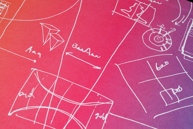
According to Opara, the most time-consuming element in High Yield Future Tense to design were the illustrations, or graphical "exhibits." The volume contains more than 168 such exhibits, including 111 charts and graphs and 57 tables. These were challenging for Opara and his team to get right, often because the book's authors had to explain the financial meaning to the group. When they understood what these charts were about, though, Pentagram realized that these weren't just stuffy bar charts and line graphs. They were stories, predicting the cause and effect of millions or perhaps billions of dollars being made or lost. Designing each exhibit so it told its story properly ended up requiring so much brainstorming that the end papers of High Yield Future Tense are just Pentagram's notes and sketches, trying to work out the problem.

The design element of High Yield Future Tense that Opara is most proud of is how the book handles its 31 math formulas. Regular joes won't make heads or tails of them, but to finance types, the formulas are literally amazing, Opara says: secret equations to die for, published for the first time by some of the greatest minds in the financial world. Opara decided to handle these formulas almost like Playboy centerfolds, pulling them out and turning them on their side so that High Yield Future Tense's readers can appreciate their beauty.

"For a long time, I've wondered why finance books aren't designed to exude the importance of what they're stating," Opara says. "Why are these books so incredibly bland, when it's not bland content, especially for the person who can see the real content behind the words?" Finance books, Opara says, deserve the same graphical design treatment as books about fashion or architecture, because finance is also about design. "Finance is about trying to design a methodology for us all to live better, richer lives," he says. And that makes High Yield Future Tense one of the few finance books that looks the part.

All Images: courtesy Pentagram

This Super-Accurate Lunar Globe Waxes And Wanes On Your Table

$
0
0

As countries crumble, borders shift, and shorelines move, all Earth globes eventually become obsolete. You know what globe will never be out of date? This beautiful globe of the frickin' moon, which not only makes for an amazing design object, but also functions as a lamp that simulates its actual waxing and waning.

Now on Kickstarter, Moon is "the first topographically accurate lunar globe," created by product designer Oscar Lhermi and design studio Kudo. Using data pulled from the NASA Lunar Reconnaissance Orbiter—which is currently in orbit around the moon—by the Institute of Planetary Research, the globe traces all the craters, ridges, and mountains that pucker and dapple the lunar surface, at 1:20 million scale.


But what really makes Moon's design special isn't just the attention to detail that was applied to its surface—it's what went into recreating its phases. Orbiting around the globe is a ring of LED lights. As the LED ring swings around the globe's base, it causes the moon to go through a month's worth of phases in as little as 30 seconds. But you can also set Moon to match the actual lunar phases happening at any given moment, slowing down the LED revolutions to a precise 29 days, 12 hours, 44 minutes and 2.80 seconds. And a cool fun fact: the globe's LED rings are actually controlled by a computer with the same amount of memory—a scant 64kb—as the computers that landed Apollo 11 on the actual moon.

Although it looks epic in images, Moon is relatively small, weighing only three pounds and standing 14 inches high. Now available for pre-order, the globe costs $427 for backers and will allegedly ship in November, 2016. That's a small price to pay for a design this cool, especially considering this is probably the closest any of us will come to touching the actual moon in our lifetimes.

Viewing all 2795 articles
Browse latest View live