Dropbox announced on Monday that it's killing off Mailbox, the email app it bought in 2013 for $100 million. Many are reeling at the announcement. How could Dropbox go from spending $100 million on an app to unceremoniously killing it off in just a few years? Especially one that has been so widely hailed for revolutionizing the way email apps are designed?
Me? I'm not very surprised. I think Mailbox probably reached EOL for a few reasons: it never evolved, it didn't clearly fit in with Dropbox's business, and even if it did, maybe apps can't solve email's main problems.
Mailbox Stagnated
When Mailbox first launched in early 2013, tech writers (including me) cooed that it was the best mobile email app we'd ever used. What Mailbox was the first to recognize was that the point of a mobile email app isn't really about sending or even reading email. It's to prevent yourself from getting buried by email when you're away from a computer, where you can actually do something about it.
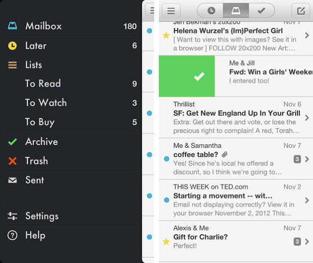
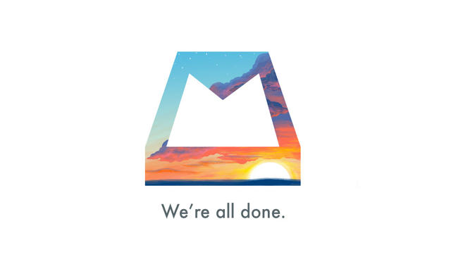
So instead of focusing on sending and replying, Mailbox laser-focused on helping users achieve Inbox Zero through easy deletion, categorization, and controlled procrastination. Without even drilling down into an email from an inbox, you could flick it away to the trash, archive it, move it to another folder, or snooze it, which temporarily moved a message out of your inbox for a given time. All of these interactions were done with a color-coded, candy-lickable swipe of the finger. When you emptied your inbox, Mailbox rewarded you with a big dynamic icon — the Mailbox logo, masked with pretty Creative Commons pictures — congratulating you about reaching Inbox Zero.
It was a deeply compelling app, maybe the first email app that actually made you feel good about yourself for using it. But it never really evolved after launch, let alone after Dropbox bought it, then left it to rot. And that left its competitors to steal all of Mailbox's best features, and put them in their apps.
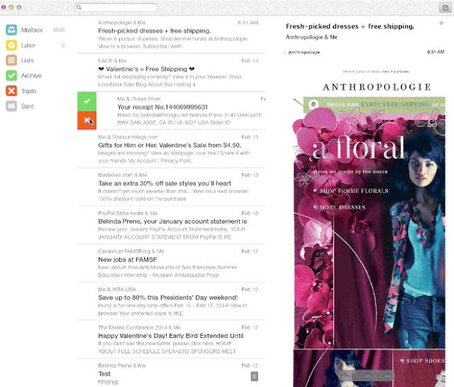
Today, you're hard pressed to find an email app that doesn't use Mailbox's colorful gesture affordances. Apple and Google's default mobile Mail apps both let you manage your mail with a variety of swipes. Worse, many of Mailbox's competitors have long done Mailbox better than Mailbox ever did. Boxer and Spark by Readdle are two email apps that take all of Mailbox's best innovations, and implement them even better, while also constantly adding their own new features to keep interest fresh.
Dropbox & Mailbox Never Made Sense
When Dropbox bought Mailbox for $100 million just a month after it was released, Dropbox CEO Drew Houston was hardpressed to explain the purchase.
Outside of "loving" the app, Dropbox's official announcement about buying Mailbox reads more like free idea association than a coherent plan. "Dropbox doesn't replace your folders or your hard drive: it makes them better," Houston said. "The same is true with Mailbox. It doesn't replace your email: it makes it better."
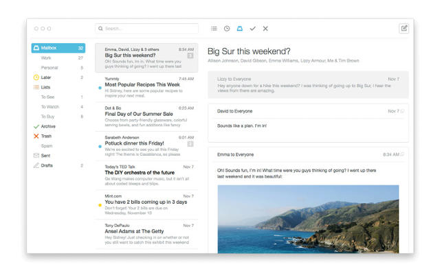
What was notably missing from this announcement was any hint of how Dropbox expected Mailbox, an app (in essence) all about deleting junk from the cloud, to integrate with its core business: getting people to pay to store more of their junk in the cloud. About the best that could be hoped from the acquisition was that it would somehow help Dropbox get more people using its service for email attachments. But when Dropbox already integrates with every good third-party email app, why spend $100 million on this?
Compare this to Carousel, another app Dropbox just killed off. Carousel was a photo syncer that automatically backed up all your images to Dropbox, and made them searchable. It had a clear point, and yet Dropbox killed it off along with Mailbox, ceding victory in the cloud photo library space to the likes of Google. If Carousel never had a chance, why would Mailbox?
Mailbox's Death
When co-founder Gentry Underwood first announced Mailbox to the world, he acknowledged that it had a tough road ahead. "This path... is paved with corpses,"he wrote, saying the idea "scared" his team and "felt like this massive thing that startups don't mess with."
Maybe Gentry, who declined to be interviewed by Co.Design, should have run with that instinct. Because time after time, email apps die. Look at Sparrow, another innovative email app that was bought by Google before it was killed. Molto's another email app that was recently killed off. Even Mozilla is trying to get rid of Thunderbird, its long-time email client, describing it as a "tax" on Firefox development.
All of this hints at what may be a simple truth. Even if Mailbox and Dropbox were a match made in heaven, and even if Mailbox had stayed fresh and innovative, maybe it would have died anyway. Maybe the only way to make email less of a nightmare is through artificial intelligence and infrastructure: the approaches products like Inbox by Gmail and SaneBox are taking through a combination of smart categorization and preventing the vast majority of your email from ever reaching your inbox in the first place. Because maybe the smart bet is that email isn't a problem that UI can actually solve.


