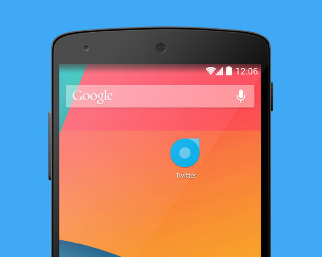
First launched in 2010, Twitter's icon--a cheery blue bird--has become an important part of the micro-blogging service's visual identity. At a time when pretty much every aspect of digital design is shifting toward flatter, more abstract designs, Italian designer Roberto Manzari has released a proposal to vastly simplify the Twitter logo by reducing it to just a few geometric shapes. But is such a vastly simplified logo really right for Twitter's brand?
"The main idea of this logo is simplicity," says Manzari on his Behance page. "As Twitter simplifies our ways of communicating, this logo reflects the value of Twitter giving it a recognizable and strong identity."
It's certainly a simpler design, so from that perspective, Manzari's effort is a success. In addition, the way that Manzari reduces the Twitter logo to just three shapes--two concentric circles, overlaid by a square--and yet still manages to evoke the look of a bird with its head slightly cocked is clever. But maybe it's too clever.
Generally speaking, the instinct to simplify a logo down to its core elements is a good thing. Good design, after all, is primarily an exercise in reducing an idea to its simplest, most elegant form. The problem with Manzari's Twitter redesign, though, is that it overlooks two of the core elements of Twitter's brand: whimsy and a sense of approachableness. Twitter isn't branded the way it is for nothing. The name is meant to evoke the feeling of hearing a flock of sparrows peeping outside--this idea that there is a joyful background conversation happening, and that you only need to open a window to be a part of it.

That's what makes Twitter's identification with a bird in both its name and its logo so brilliant. Comparatively, Manzari's logo is only a bird if you know to look for it. It takes the whimsy and approachableness of the original and crushes it into a mathematical abstract of flat geometry. It's not a logo that brings to mind a bird tapping upon your window; at best, it's an icon that brings to mind the staring eye of a bird that has frozen to death.
In his pitch on Behance, Manzari quotes Leonardo Da Vinci as saying, "Simplicity is the ultimate sophistication." Sure, but what does simplicity mean when it is applied to design? Simplicity in design is the purification of intent, not its destruction. Which is what makes Manzari's logo almost genius, but ultimately a failure. Twitter's logo should always be as identifiable and as approachable as a blue baby bird.
You can see more of Manzari's design portfolio here.