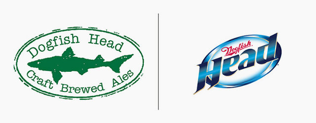
What would the brands most popular among hipsters look like if they were recreated in the style of their corporate counterparts? What if Intelligentsia Coffee's logo looked like Starbucks's, or Best Made's like Home Depot's? These cleverly redesigned logos by Kentucky marketing and design firm Cornett imagine what the branding landscape would look like in an alternate world, where skinny jeans, thick frames, and microbrews are the mainstream.
According to Cornett's Whit Hiler, the project was originally inspired by artist David Rappoccio's illustrations of NFL logos as hipsters, as well as this guide to creating your own hipster logo. Cornett thought it would be a fun exercise to do the opposite: redesign hipster logos in the soulless, mainstream style of the analogous corporations they consider antichrists.

To do that, Cornett's nine designers settled on about 19 logos they thought reflect hipster aesthetics, and reimagined them as the logos of their most obvious mainstream counterpart. The Dollar Shave Club becomes styled after Gillette, Fab takes on the look of the Target logo, bottles of Dogfish Head start looking an awful lot like Miller Lite, and so on. "It was really funny and kind of painful to see them transformed into these corporate giants," Hiler says.
Finding some pairings was more challenging to the team than others. Eyewear house Warby Parker almost got paired with a very different optical company. "With Warby Parker initially one of our designers transformed them into Oakley," Hiler says. In the end, LensCrafters seemed like a much more horrifying (and on-point) pairing.
As an Easter Egg, Cornett also decided to include the Urban Outfitters logo as both a hipster logo and a corporate logo. After all, as a company, Urban Outfitters really is its own schizophrenic doppelganger.

But what makes a logo hipster to begin with? "Most of the "hipsterish" brands are fairly young brands, and their logos reflect current design trends: they are simple, use limited color palettes, flat design, and so on," Hiler says. "On the other hand, most of the 'corporate' brands are a little older and their logos are reflective of design trends that were popular during the time they were created."
Of course, give any of these "hipster brands" 50 years to get entrenched, and they'll become the very brands they currently despise. Just imagine what this list would look like in 2064, when Dogfish Head has crushed the rest of the nation's microbreweries under heel and made 90 Minute IPAs the Bud Light of the 21st century. Hey, it could happen!