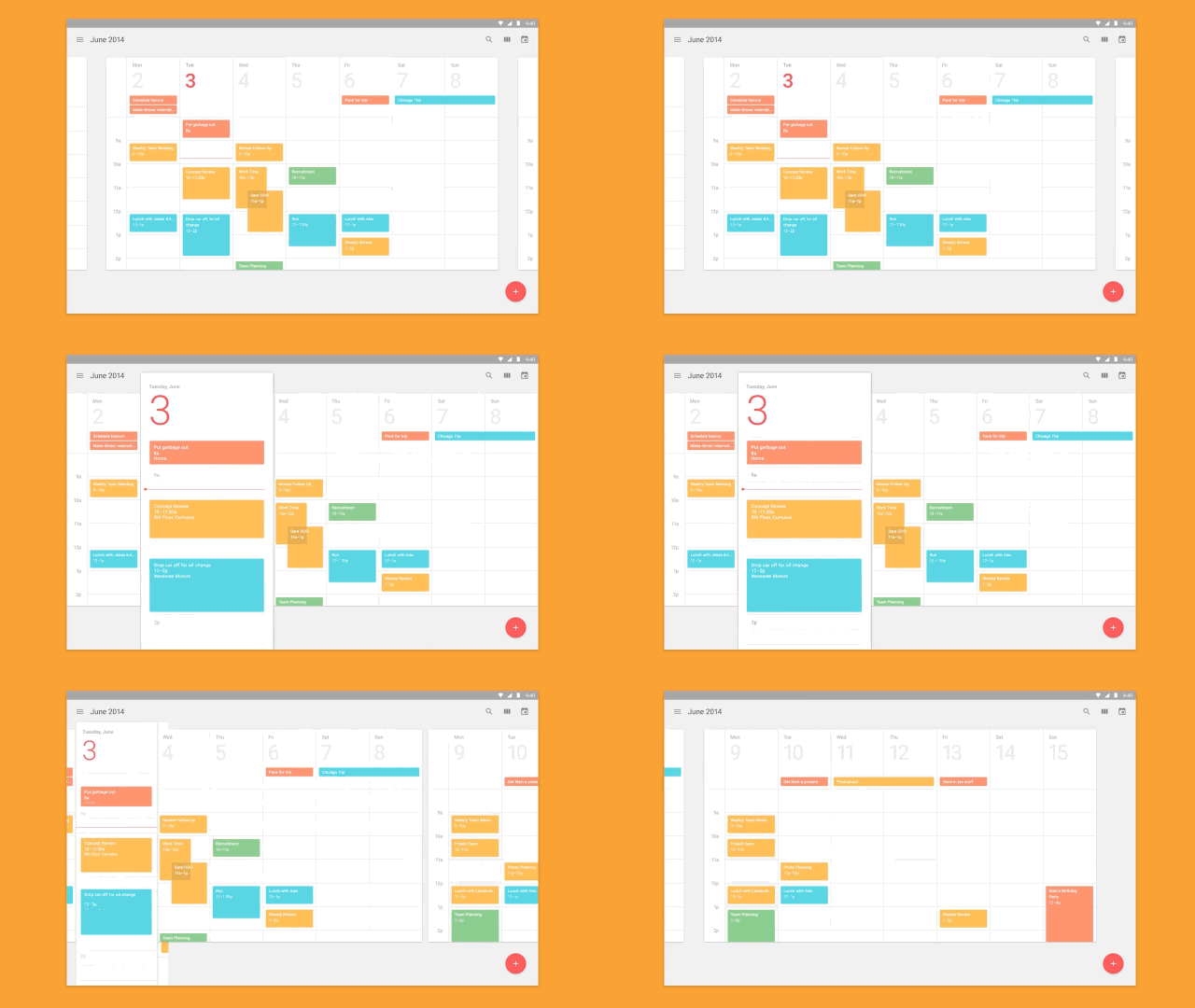
A year ago, Android lead designer Matias Duarte announced Material Design. A system for designing apps graphically beautiful apps across all platforms and screen sizes which used motion and animations as a core design principle, not an afterthought, Material Design was a bold and breathtaking attempt by the search giant to deliver a unified digital design language that was applicable wherever Google's apps and services were.

On Material Design's first birthday, Duarte once again took the stage at Google I/O 2015 to announce the biggest update to Material Design yet. Here are some of the more important updates:
• FAB Expansion — One of the core elements of Material Design is the Floating Action Button (FAB), a universal button viewable on every screen of a Material app. The FAB is not just there as an easy way to access the single most important function in any app, but can morph, slide, and spin along the way as it calls up those actions. Think of it as Google's version of the bouncing ball from an old sing-along cartoon. Material Design's latest update gives the FAB a number of new animations and transitions developers can choose from to make their Material apps seem even more like the quantum paper Google wants Material Design to be: for example, floating action buttons that morph into cards.
• Television, Auto, and VR Support — Material Design was written with the web, smartphones, tablets, and wearables in mind, but Google's ambitions for Android go further than that. The Material Design specs has now been updated to elaborate on how its principles can be applied to new platforms like television, automobile dashboards, and even Google Cardboard. In the new Material Design guidelines, for example, there's sections on how designers can design Material VR apps that avoid making users experience motion sickness, or disorient them in the virtual landscape (PROTIP: render graphics in 3-D space, don't place actions on an automatic timer). The support for such new platforms is rudimentary, but it's Material Designs first big toe-dipping into the UI/UX space of the future, not the past.

• Icons — The Material Design spec has recently expanded to include an icon library, a collection of 750 icons that developers can use in their projects. Here's where things get cool, though. The Material Icon library functions as an embeddable web font, so it can be used on any web page as easily as Futura or Helvetica. Better yet, this web font uses ligatures to automatically convert the typed-out name of an icon into its iconographic form. It's like if you typed in the word "smiley" and a smiley icon automatically popped up instead. "If you're a type geek, you'll think this is the coolest thing," Duarte notes. I'm a type geek, and I do.
• Backwards Compatibility—Android is a super fragmented operating system, with only 10% of all devices running the latest release, Android Lollipop. In theory, Material Design was always backwards compatible, but in practice, it took a lot of work to custom code different Material implementations for various devices. A new library, called the Android Design Library, automatically makes Material Design elements backwards compatible all the way back to Android 2.1, which was released all the way back in January of 2010. No additional coding required.

• A big refresh to Google's official Design site, offering more tutorials, explainer videos, FAQS, behind-the-scenes videos, and more. "We wanted to make a resource that helped you be comfortable designing Material everywhere," explained Duarte.
The new Material Design guidelines also offers a host of less-glamorous-but-still-meaningful changes, like updated sections on how Material apps should use motion in meaningful ways, a resource for Material designers to more easily design apps for more exotic screens and devices, and Duarte says that developers can expect it to continue to be updated from here.
"Design is never done," he noted.
You can access the most recent version of the Material Design guidelines here.