Quantcast
Channel: Fast Company
Viewing all 2895 articles
Browse latest View live

22 Things You Need To Know About Apple's Jonathan Ive

$
0
0

Over the long weekend, The New Yorker published an epic profile of Jonathan Ive. Given unprecedented access to the world's most influential (and, perhaps, world's shyest) industrial designer, it's a treasure trove of new information on subjects ranging from what inspirational posters hang on Ive's wall to what Apple may be working on next.

It's well worth reading, but it's long. More than 17,000 words long. Here are the most interesting details, broken up into discrete, digestible bullet points.

Flickr user Paul Hamilton

Personal

• Designs that Ive hates: Apple co-founder Steve Wozniak's steampunk watch, round smartwatches like the LG Watch R, the Toyota Echo (which he describes as 'insipid'), Google Glass, and Apple senior VP of operations Jeff Williams' old Toyota Camry.

• Although Ive's design style is known mostly for its restraint, his friends and colleagues describe his true style as a lot more blingy.

• Ive hated Walter Isaacson's authorized biography of Steve Jobs, for supposed inaccuracies. "My regard couldn't be any lower," he said.

• What's on Ive's bookshelves? Books such as 100 Superlative Rolex Watches and a biography of designer Joe Columbo, who designed the Kartell storage carts. He is also watching Moon Machines, an old Discovery Channel series about the Apollo Space Program.

via goodfuckingdesignadvice.com

Design Philosophies

• Ive's defining philosophy of industrial design, according to MOMA's Paola Antonelli, is: "Elegance in objects is everybody's right, and it shouldn't cost more than ugliness."

• According to friend Marc Newson, both he and Ive are primarily motivated by the lack of wealth they both experienced growing up. "Neither of us came from particularly privileged backgrounds," Newson says. "A lot of what I've done has been an effort to try to have the things that I didn't own when I was a child."

• Although Apple's design workshop was influential in creating iconic early Apple renaissance projects like the iMac G3 and the original iPod, it wasn't until the iPhone that it became the room where all products began their journey. Ammunition Group's Robert Brunner describes design as a "long horizontal stripe" running through Apple, "where design is part of every conversation."

Flickr user Jason Lawton

History at Apple

• Ive was first hired by Apple in the 90's after designing a proto-iPad concept for them: a tablet Mac called the Macintosh Folio which had a stylus and an adjustable screen.

• Before he designed the "lickable" iMac G3, Ive had played around with a very different concept for an all-in-one Mac: a computer built into a piece of furniture, with a screen hidden behind a set of credenza doors.

• When Steve Jobs returned to Apple as CEO in 1997, he was prepared to replace Ive as Apple's head of design with Richard Sapper, the designer of the IBM Thinkpad, or Harmut Esslinger, Apple's industrial-designer in the 80's who encouraged Jobs to refocus the company on "evolving digital-consumer trends."

• One early iteration of the MacBook featured an Apple icon that glowed on and off twelve times a minute, like a person at sleep breathing. It never made it to market, because it reportedly kept people awake when it was on a bedside table.

Flickr user gflinch

Apple's Design Lab

• In Apple's design lab, the designers keep on hand a box of "interesting" custom parts made of hard white ABS plastic—almost like LEGOs—for inspiration.

• Apple employees three recruiters whose sole task is to identify designers to work for the group. At best, they'll hire a single designer a year to join the team.

• Ive reads Apple criticism on the web. The new sounds in iOS 7 were created by Hugo Verweij, a Dutch sound designer who was hired by Apple after posting a screed on his blog about Apple's "loud and crappy" iOS sounds. Previous to joining Apple, he worked on ringtones.

• When Apple's design team is designing a new iteration of the iPhone, iPad, or Mac, they will often place the prototype alongside an early mock-up of what the next next generation of the device will look like, to make sure it doesn't seem "stodgy" in comparison.

Apple

Apple Watch

• Long fascinated with high-end luxury design, Ive has an inexplicable infatuation with Vertu, the British company that designs ghastly, jewel-encrusted mobile phones priced at tens of thousands of dollars each.

• Ive had to win a fight within Apple to make the Apple Watch a product, because it represents a completely different level of customization than any other Apple product. Apple is in the business of releasing devices that feel "inevitable," yet fashion is all about customization. This also led to many of Apple's recent hires, including Angela Ahrendts of Burberry, Paul Deneves of Yves Saint Laurent, and Patrick Pruniaux from Tag Heuer.

• Why the Apple Watch isn't round: "When a huge part of the function is lists, a circle doesn't make any sense," Ive said.

• Marc Newson worked on the design of the Apple Watch from the start.

Flickr user Kārlis Dambrāns

The Future

• Products Ive may or may not be working on, according to hints scattered through The New Yorker: something involving aerospace, and a future Apple project called the "Airbug."

• Expect Apple products to continue to take on softer, rounder, more organic forms. Ive is fascinated with corners, and finding ways of getting rid of them thanks to materials such as curved glass. According to Jobs' widow Laurene Powell Jobs, Ive is a fan of Josef Frank, the Austrian-Swedish designer of round furniture who proclaimed: "No hard corners: humans are soft and shapes should be, too."

• Ive admits that the protruding camera lens on the iPhone 6 is something of a design kludge. "Ive referred to that decision—without which the phone would be slightly thicker—as "a really very pragmatic optimization." One had to guess at the drama behind the phrase," Parker writes.

But there's so much more to read in this profile, so be sure to check it out over at the New Yorker.


6 Auto Design Visionaries Who Could Make Apple's Titan Car A Reality

$
0
0

Steve Jobs always wanted to make an iCar, at least according to Apple board member Mickey Drexler. Now, years after Jobs's death, Apple's finally setting out to do it, reports the Wall Street Journal. The newspaper claims that Apple currently has up to 1,000 people working on Titan, a project to build a Tesla-like electric vehicle.

What does Apple know about designing cars? A lot more than you might think. Over the past few years, Apple has put together a singular design team. Having worked for companies such as Lamborghini, BMW, Ford, Mercedes-Benz, and Audi, these six visionaries don't just have some truly awesome and futuristic cars designs already under their belt; they've got the ideas and know-how to revolutionize the automobile industry.

Jonathan Ive, Senior Vice President of Design at Apple

Rather uniquely among Apple's rumored auto design team, Ive doesn't have any direct experience designing cars. But creating the Apple Car would allow Ive to finally fulfill the ambition that brought him into the design world to begin with. In an interview with Time in 2014, Ive said that it was his love of cars that made him want to become a designer. He even attended a few London auto design courses, he said, before fellow students, who made "vroom! vroom!" noises as they drew, drove him away.

Flickr user Beech Boy

Ive might not have designed a car before, but he certainly has opinions about them. In a recent profile for the New Yorker, Ive talked at length about cars he loved (an Aston Martin DB4, and the "big old-school square Bentleys") and cars he hated (both Toyotas: the "inspid" Toyota Echo, and the Toyota Camry). Ive also has an extensive collection of vintage cars, including an orange Fiat 500, a Land Rover LR3, and a "Frogeye" Austin-Healey Sprite.

David M. Benett/Getty Images[/credit]

What do these cars tell us about what an Apple Car might look like? Mainly, that Ive loves sportier luxury cars with timeless designs. That would seemingly fly in the face of the Journal's assertion that Titan is minivan-like in appearance. That might be true in the prototype phase, but Ive's taste in cars suggest he'd never bring an iVan to market.


Marc Newson, Apple Designer

Hired last year, Australian designer Marc Newson has only slightly more experience designing cars than Ive. In 1999, Newson was hired by Ford to design a concept car for the Tokyo Motor Show. Like many concept cars, the Ford 021C (named after the Pantone color) was simply a styling exercise, and not a serious attempt at putting together a mainstream vehicle. But looking at the Ford 021C is still informative, because it shows how many seemingly mundane details in our cars Newson is ready to re-examine.

Take, for example, the car trunk. Instead of the hatches you find in automobiles today, the Ford 021C supplemented the hatch with a trunk that pulled out, almost like a big cabinet drawer. It's a genius detail, allowing not just easier access to your trunk's recesses, but also creating a stable platform for oversized items, such as Christmas trees. The Ford 021C was also notable for its well-designed control panel, which was clear, minimalist, and extremely well-labeled. And the seats swung around, perhaps predicting the rise of the self-driving car as the office of the future.

Jacopo Raule/Getty Images

Other Ford 021C innovations, like the single-spoke steering wheel and a ceiling that glowed, were a little further out there, but if there's one lesson to take away from Newson's only car design, it's that a car designed by Apple might look very different from what we expect a car to look like.

Steve Zadesky, Apple Product Design Vice President

According to the Wall Street Journal's report, Zadesky, the product design vice president who worked on the iPhone and iPod, has been appointed head of the Titan team. Although he has been with Apple since 1999, Zadesky has experience at Ford, too, where he worked as an engineer from 1996 to 1999.

via Linkedin

There isn't much information out there about Zadesky's time at Ford, although it could be significant that he and Newson were working at Ford during the same period that the Ford 021C was conceptualized. Why Zadesky? Although he's an Apple executive few have heard of, Zadesky has direct experience not only in designing and manufacturing cars at Ford, but also with getting entire new product categories at Apple off the ground. His LinkedIn profile says that, while at Apple, Zadesky has helped build and lead the teams for the first iPod, first iPhone, and all subsequent iPhones and iPods.

Whatever Titan ends up being, Apple will need to create an entirely new manufacturing process and supply chain to get it off the ground. Who better to do that than the guy who has already done it for you twice before?

Johann Jungwirth, Former President and Chief Executive of Mercedes-Benz Research and Development North America

Last September, Apple hired Johann Jungwirth away from his previous job leading Silicon Valley's Mercedes-Benz R&D facility. Jungwirth was given the dubious title of "Director of Mac Systems Engineering," thought it seems abundantly clear that this is not actually what he's working on at Apple, especially in light of the Wall Street Journal's report.

via Mercedes-Benz

Why? Because Jungwirth's specialty is connected cars. In fact, Jungwirth's last project at Mercedes-Benz was the F105 Luxury in Motion concept vehicle, a futuristic self-driving car that debuted at CES earlier this year. As we wrote in January, it's a much more tempting take on the driverless automobile than Google's own: in particular, one that treated the self-driving car like the sleek conference room of the future.

Julian Hönig, Apple Designer

An Austrian-born surfer turned Apple designer, Julian Hönig is mentioned a number of times in the New Yorker's recent profile of Jonathan Ive. One of the many quiet, demure members of Apple's design team, Hönig also has a strong pedigree in car design: before coming to Cupertino in 2010, he designed Lamborghinis for a year.

Twentieth Century Fox via IMDB

But Hönig's work at Lamborghini isn't as interesting as his work at Audi, where he was employed from 2001 to 2008. There, he designed a handful of different Audi models including an intriguing fictional car. Called the Audi RSQ, Hönig's concept car was developed for use in the 2004 Will Smith film, I, Robot. Despite the distinctive Audi grille on front, the RSQ was meant to look like a car from the year 2035, and featured reverse butterfly doors, and a revolutionary first: rolling spheres that could move on three axes, instead of traditional wheels.

via Linkedin

Hönig is not specifically mentioned by name in the Wall Street Journal's report as being a member of the Project Titan team, but every member of Apple's industrial design team famously has input on every product: there is no design compartmentalization at Apple. If Hönig's influence is felt in Titan, parallel parking into a tight spot might never be a problem again.

Aaron Von Minden, Apple Designer

Like Julian Hönig, Aaron Von Minden is another member of Apple's exclusive industrial design team who designed cars before he joined Apple. In Von Minden's case, they were beamers: he worked for BMW as part of its prestigious Designworks studio for seven years before he made the jump to Cupertino in 2008.

via Linkedin

Like Hönig, Von Minden's name is not specifically mentioned in the Wall Street Journal's report, but it is not a leap to think he might be involved with Titan, along with the rest of Apple's small industrial design team. And if you think Hönig's spherically wheeled Audi was crazy, it has nothing on Von Minden's weirdest BMW concept: the BMW Gina Light Visionary Model, a shapeshifting car with a skin made out of stretchable Spandex. Not only did this allow the Gina to do things like dynamically change its shape on-the-fly to minimize things like wind resistance, but it could also literally peel sections of itself back to expose things like the headlights or the engine.

The New York Times Magazine Redesigns With Web Readers In Mind

$
0
0

Sandwiched inside every Sunday edition, the New York Times Magazine is one of the most widely read print magazines in the U.S. that you'll never see sold by itself on newsstands. According to the Times' own internal figures, more than 90% of Sunday subscribers read the Magazine, making it the single-most widely read section of the Sunday paper by far.

Now, as part of a big design push overseen by editor-in-chief Jake Silverstein and design director Gail Bichler, the New York Times Magazine is getting a new look and feel, in a bid to make the magazine even more indispensable: not just in print, but on the web.

Literary Ambitions
One of the major goals of the redesign, Silverstein tells me, was to make the magazine feel more literary. "We see the magazine as a place where the Times can publish work with more writerly ambition than you usually see in newspapers," Silverstein says. To supplement new columns from the likes of Nigerian-American novelist Teju Cole, British naturalist Helen MacDonald, and former U.S. Poet Laureate Natasha Trethewey, the magazine is now being printed on a heavier paper stock, giving it a heft more like, say, The Paris Review than that of a newspaper insert.

But it's what's on those thicker pages that counts, which is why the magazine is now printed using a library of custom typefaces. "We scrapped everything, all our old fonts," Silverstein says. The typefaces were designed for the New York Times by Henrik Kubel of A2-Type, in collaboration with the magazine's art director, Matt Willey. It includes slab serifs for headlines and block elements, as well as modern-looking sans serifs and elegant-looking serifed fonts. The font family is nameless right now (Silverstein jokes that they almost called their new custom typeface "Really Crappy Font" just so no one else would be tempted to use it if the Times accidentally let its exclusivity lapse), but it makes the magazine feel slightly more book-like, without being overbearingly literary. "We don't want it to feel like some fussy literary journal with only 2,000 readers," Silverstein jokes.

A Cleaner Layout
Also on the page is a new layout. Designed by former GQ art director Anton Ioukhnevets, the magazine's layout has changed to be cleaner, and slightly more stripped down. The key, Silverstein says, is the number of columns that the magazine is now using to arrange its pages: It has dropped to seven columns from 12. What's the difference? Headlines, photos, ads, copy: magazines have all sorts of content to fit onto a page. Each of those elements is like a Tetris block: the more columns you have in your layout grid, the more opportunities you have to slot that next block into place without creating a gap. The old 12-column design didn't have many gaps, but that also made it look dense, busy, and overly symmetrical. By adopting a seven-column layout, Silverstein says, the magazine was able to create "all sorts of interesting pockets" to help let the content breathe.

Design For The Web
Not all of the magazine's design changes will be in print. One problem that the magazine faces, and that the new design is meant to help solve, is that it's an in-betweener. Shipping in the middle of the New York Times's two-pound Sunday edition, it's an in-betweener in print—a magazine literally trapped inside a newspaper—and an in-betweener online, where it exists mostly as a long-form subsite on NYTimes.com. "So much of the magazine's branding is accrued in the print product, but with more and more readers going digital-only, that was becoming a problem," Silverstein tells me. In fact, he says that most visitors who end up reading the magazine's articles online have no idea it's not just regular New York Times content.

The magazine's new paper stock and layout won't be making the transition to the web, but its literary approach to content and typography will. Expect to see the magazine's new typefaces online as a way to distinguish magazine articles on-line from the New York Times's more traditional reporting and features. In addition, the magazine will post articles to the web with a new responsive layout that features full-bleed images, the magazine's new custom typefaces, and Medium-like readability of long-form content that highlights the magazine's logo at the top of the page.

A Bolder Logo
Speaking of the logo: it's been slightly tweaked. As part of the redesign, the New York Times Magazine logo has been oh-so-subtly redrawn to accentuate both the thinnest and thickest parts of the wordmark's distinctive letters, while opening up certain letters. It's still classic, but the logo looks a little more bold than it did before, a little more refined, and—thanks to some subtle changes to certain characters, like the letter "a"—a little more modern. Which makes it a good metaphor for the magazine redesign in total. A little bolder. A little more refined. A little more modern. But still classic.

You can see the New York Times Magazine's new digital look here. The new version of the magazine will launch in print on Sunday.

A Simple Web App That Makes Designing Your Own Font A Cinch

$
0
0

Designing a typeface is an equal mixture of art and science. But what if you take the art out of the equation, and just leave the (computer) science? Metaflop is a new online playground for font creation that lets you create your own custom fonts just by playing with a few sliders.

Created by Swiss designers Marco Müller and Alexis Reigel, Metaflop isn't just an easy online tool for creating simple typefaces, it's also a great tutorial on a lot of the terminology of type design. If you've ever read about typeface terms like ascenders, cap heights, overshoot, descenders, and contrasts, there's no better way to figure out what these terms mean than by using a slider to change their variables and see how it changes a typeface in real time.

Once you've designed a typeface using Metaflop, you can easily download it to your computer as a standard .otf file, which you can use apps (like Photoshop) or on the web. If you don't want to bother with making your own font, you can also just download preset ones from Metaflop's library of so-called Metafonts.

There's some interesting variations that can be created using Metaflop's tool. Some of the fonts look so left field, you'd never think just looking at them that they had both been designed algorithmically from a base font. Never the less, chances are, no matter how you adjust Metaflop's sliders, you'll never end up with something as classic as Helvetica, Futura, or Zapfino: although Metaflop can automate a lot of the drudgery of font creation, it can't emulate the custom ligatures and small, barely expressible human touches that make a typeface truly classic.

On their part, Müller and Reigel seem comfortable with that. "We are aware that it is difficult to produce subtle and refined typographical fonts (in the classical meaning)," the designers told Rob Alderson at It's Nice That. "Nevertheless we believe there is a undeniable quality in parametric font design and we try to bring it closer to the world of the designers."

You can design your own custom flop using Metaflop by clicking here.

[via: It's Nice That]

A Guide Through The Labyrinth Of Literary Fiction

$
0
0

Although Brooklyn-based Pop Chart Labs has been formative in turning trendy infographics into a serious business—and created some of our all-time favorite data visualizations—they've kind of been phoning it in lately. Its last two infographics, A Chronological Compendium of Watches, and the Taxonomical Tea Box, were both so uninspired, I couldn't believe they were from the same designers who once gave us this breathtaking cocktail-mixing chart.

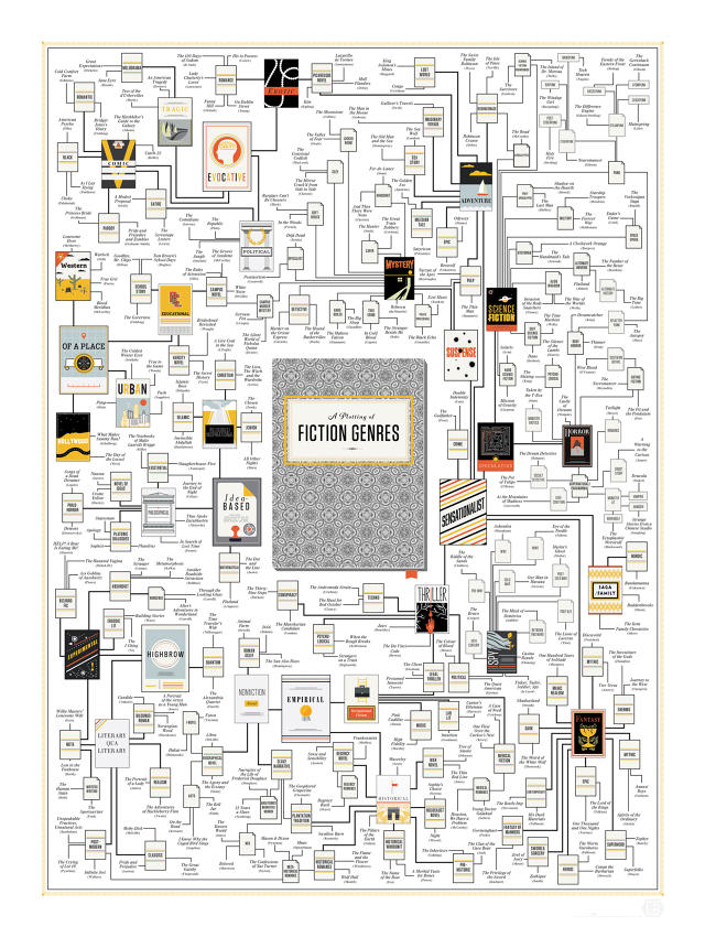
Thankfully, though, Pop Chart seems to have come out of its doldrums with its latest infographic, A Plotting Of Fictional Genres. Perfect for any bibliophile's library, it's an 18-inch-by-24-inch poster that helps guide you through the labyrinth of literary fiction: from the I, Ching to the latest Tom Clancy novel.

via Pop Chart Labs

The infographic is so thorough, you probably didn't even know some of these were literary genres. The Experimental corner, for example, includes strange sub-genres like Ergodic Literature (non-linear books that require a non-trivial amount of effort to read through, like Mark E. Danielewski's House of Leaves), Philo-Horror (philosophical horror like Thomas Ligotti, the author who inspired True Detective) and Bizarro Fiction, which includes works with evocative titles like The Haunted Vagina and HELP! A Bear Is Eating Me!

Don't worry, though. Pop Chart's poster isn't only for people with the taste for the strange. It's just as satisfying tracing the various branches and deviations on more mainstream genres like science-fiction, fantasy, horror, and thrillers. For me, though, the true pleasure in the chart is trying to take the most unlikely pairings you can think of and then seeing how they relate to one another. For example, how many sub-genres you need to traipse through before you can connect David Foster Wallace's Infinite Jest with Cameron Pierce's seminal masterpiece, Ass Goblins of Auschwitz? (The latter of which is available to read for free on Kindle Unlimited! I checked!)

You can purchase a print of A Plotting of Fictional Genres for $30 here.

Bringing Sherlock Holmes Mysteries To Life, One Doorway At A Time

$
0
0

Few addresses call to mind the same imagery as 221B Baker Street in London. Sherlock Holmes's famous address evokes the smell of tobacco, the sound of a violin, and the sight of a meerschaum and a deerstalker cap. Yet the doorstep itself is a thing of fiction: Although it has since been built to capitalize on the fame of the world's greatest detective, Baker Street ended at 85 at the time Arthur Conan Doyle wrote his stories. What the doorstep or the building looked like in Conan Doyle's mind is anyone's guess.

As part of the Museum of London's new Sherlock Holmes exhibition, U.K.-based architecture firm Seán & Stephen collaborated with Neu Architects on the Mind Maze: a series of six vestibules, each one a mystery-filled representation of Sherlock Holmes's doorstep as it might have appeared during a specific case: It's up to visitors to solve the mystery of which 221B Baker Street represents which specific Sherlock Holmes story.

We don't want to ruin the fun, but here's an example. One of the stories that is represented in the Mind Maze is The Adventure of the Musgrave Ritual, perhaps the most unique Sherlock Holmes story in that Holmes himself, not his partner John Watson, narrates the event. In the story, Holmes must solve a riddle in the form of an ancient family ritual to help solve the disappearance of a missing butler, ultimately deducing that it contained measurements referring to a secret cellar, where the corpse of Brunton was eventually found. As part of the Mind Maze, this riddle has been reinterpreted as a graphical map, which can be found printed on the side of one of the vestibules, along with the text of one of the riddles itself.

That's just one of the mysteries, of course. The others are similarly marked by arcane symbols, snatches of text, or mysterious objects. The designers tell me that they chose stories based on Arthur Conan Doyle's list of his own dozen favorite Sherlock Holmes tales, which they then weeded down to just six based on whether or not the stories featured "bold and eye-catching" props and plot elements. They then used these props and plot elements as clues to be dispersed through six multicolored plastic vestibules, each one designed to be easy to move and wheel out of the way by museum staff when not in use. When properly decoded, these clues will help Holmes aficionados figure out exactly which 221B Baker Street from which Sherlock Holmes story they're standing in. Saying more would spoil the surprise.

According to the designers, the commission to design the Mind Maze just sort of fell in their lap. Seán & Stephen and Neu Architects originally got together in January 2014 to jointly submit for a different project being run by the Museum of London. "We weren't successful; not even short-listed," Seán McAlister of Seán & Stephen tells me. "Fast forward four months, though, and an email comes in from the Museum of London, saying that they really liked our folio and thought it was just right for a new design installation project. This turned out to be the Sherlock Holmes installation." In fact, when they won the commission, Stephen and Seán had never even read the Sherlock Holmes stories for themselves. (Although they were, at least, familiar with the BBC TV show.)

The Mind Maze can be experienced at the Museum of London as part of the Sherlock Holmes: The Man Who Never Lived And Will Never Die exhibition, running until April 12. Make sure to bring your magnifying glass.

This Clever Pushpin Won't Damage Your Prints

$
0
0

Framing is expensive, especially if you want to frame a non-standard-sized print. But the alternatives aren't great: you can either scotch tape your print to the wall like a teenager, pin it up with a binder clip like an art student, or be like me, and keep all your prints in storage for the mythical day when you will have the money to properly frame them.

At last, there is a sound alternative. Pon is a cleverly designed push pin that allows you to hang up your prints cheaply without worrying about ruining them with holes. In execution, it's somewhere between a thumb tack and a binder clip. An unobtrusive steel ring holds your print steady without perforating it, while a spike curling around back pierces your home's plaster to keep it secured to the wall. You can even use Pon to hang low-weight, non-paper objects that might usually require a shadow box, like a rare coin or a childhood toy.

Created by Chicago-based designer Mark Weiser, Pon is that rare Kickstarter that is both super-cheap (a $9 pledge will get you 40 Pons), but also a sure thing. With nine days to go on the Kickstarter, Pon has already exceed its pledge goal, and the first boxes of Pons will start shipping in April. You can order a set here.

[via Design Milk]

Bang & Olufsen's New Stereo Can Read Your Mind

$
0
0

Thanks to companies like Spotify, Rdio, and more, a nearly endless succession of music flows from our devices like tap water. So while the design problem of the last 50 years or so has been the best way to get music to people, the design problem of the 21st century is all about how to make sure that, given endless choice, people are always hearing the music they want to hear.

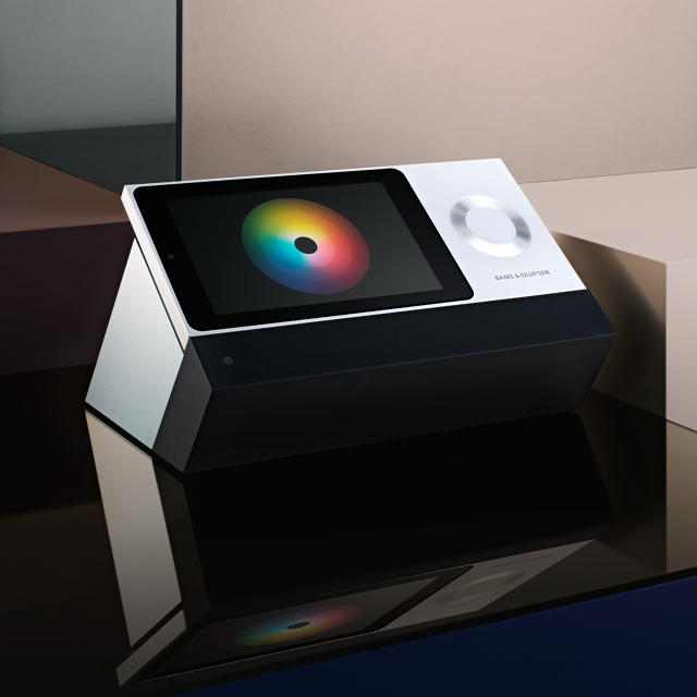
Bang & Olufsen's new stereo, the BeoSound Moment, is an innovative take on that problem. The system itself is all wood and aluminum, with clean lines and a jaunty angle. Flip it over, and you'll find a touch-screen controller.

Designed by Tectonic founder Bill Flora, who also worked on Microsoft's Metro interface, the BeoSound Moment controller features a pinwheel of colors called a Moodwheel, which allows listeners to pick music according to their current emotional state. By touching the lighter inner circle of the wheel, you can select music from your own collection that soots the mood of whatever color your finger has landed on: for example, blue might be EDM, while orange could be jazz and red could be rock.

The further away from the inner circle you move your finger, though, the more unfamiliar the music will get, with the BeoSound Moment plucking in tunes from Deezer, a Spotify-like streaming service with over 35 million songs.

As interesting as the Moodwheel is, though, the wooden back is even more interesting. But the wood isn't just ornamental: it's actually the more analog side of an innovative controller designed for the BeoSound Moment by Seattle-based interactive design firm Tectonic. It's still a controller, but one with only a single button: press it and the BeoSound Moment starts playing music that matches what Bang & Olufsen calls your daily rhythm. How does it know what you want to listen to? Thanks to a technology called PatternPlay, the BeoSound Moment automatically memorizes your musical preferences at specific times and on specific days, effectively learning what kind of music you want at any given moment.

With its innovative two-side controller and intelligent music prediction technology, the BeoSound Moment looks like a slick designer stereo for the 21st century. Expect to pay, though: when it goes on sale in the United States later this year, the BeoSound Moment is predicted to cost as much as $2,700 dollars, if the U.K. price is anything to go by.


Guess Which Country's Companies Profit Most From War?

$
0
0

The United States is at the center of a great colorful pinwheel of death, at least according to the latest infographic from Natalia Bronshtein, a data visualizer who focuses on economic trends and political developments. She has worked to produce an interactive visualization of the world's top 100 arms-producing companies.


Surprising no one, the United States makes more money on war than any other country. Really, it's not even close. Using the 2013 arms production database of the Stockholm International Peace Research Institute (SIPRI) as her data source, Bronshtein shows that 40 of the top 100 arms-producing companies in the world are based in the United States, with Lockheed Martin and Boeing being the biggest of the bunch. The visualization represents each company as a circle within the larger circle of its nationality — the bigger the radius, the more money the company or country made selling arms.

Of course, not all of Lockheed Martin's or Boeing's revenue comes from arms, but Bronshtein has that covered: mouse over any company in her visualization and you can see just how much of that company's profits came from selling arms. In Lockheed Martin's case, it's 78% of total sales, resulting in nearly $3 billion worth of arms profit in 2013 alone. Boeing, comparatively, only made 35% of its money on arms in 2013, but that 35% was big money: Boeing made $4.5 billion in profits in 2013 just from selling arms and weaponry.

After you stop looking at the center of Bronshtein's data viz, you can see which other countries earn significant money from war: the U.K., France, Russia, South Korea, Japan, and Israel. There are some surprise outliers. Saab in Switzerland, for example, didn't just make your granddad's car; it also made 81% of its sales in 2013 from selling arms.

The invisible elephant in Bronshtein's chart ends up being China, which is missing from the SIPRI database, but it's doubtful it would bump America down. According to SIPRI, China spent $188 billion to America's $640 billion on its military in 2013, making it the world's second most expensive military. If China's companies are making as much money on arms as its military is spending on them, China still likely wouldn't be enough to knock America from the top of the list.

Explore Brohstein's visualization for yourself here.

[via Reddit]

This French Creative Agency Counts Everything It Does In Its Office. EVERYTHING.

$
0
0

The future predicted by the Internet of Things is one that is infinitely quantifiable. Once you've slapped sensors on everything, there's virtually no end to the seemingly mundane things you can count: how many cups of coffee get poured in a year, how many times you open a fridge in a week without pulling something out, and how many flushes it takes you every time you go to the toilet.

Sid Lee Paris, a French creative agency co-owned by Cirque du Soleil (seriously), offers a look at what this sublimely mundane future looks like. To celebrate its office's sixth anniversary, it stuck sensors on everything they could think of, and presents the data on a beautiful internet dashboard so you can bask in the extreme enumerability of the office's day-to-day life.

All of these stats and more can be drilled down to on the Sid Lee Dashboard, just by clicking the appropriate box. From there, you can compare today's running statistics with the stats to date, allowing you to see some interesting patterns: for example, the fact that Sid Lee's employees made more mistakes (1,329 of them, to be exact) on February 2nd than any other day in the past month, measured by the number of times employees hit  + Z for 'Undo' that day.

If this is what the infinitely quantifiable future of the internet of things looks like, I have to say, I find it as wondrous as I do terrifying. Check out Sid Lee's awesome dashboard here.

This Game Is Based On The Hacking Scene from 'Jurassic Park'

$
0
0

20 years after its initial release, the special effects in Stephen Spielberg's Jurassic Park have held up remarkably well. There is one effect in Jurassic Park that has held up less kindly in the court of public opinion over the years than the CGI dinosaurs, though: the 3-D computer hacking interface used by precocious child protagonist Lex Murphy in a scene at the end of the movie, during which she breathes these immortal words of wonder: "It's a Unix system! I know this!"

Now it's inspired a video game worthy of InGen that looks and feels a lot like the hacking sequence from Jurassic Park, appropriately called I Know This.

Although the hacking scene in Jurassic Park often garners guffaws from ironic modern audiences who think the interface Lex is using is just another example of Hollywood being clueless as to how computers work, the joke has always been on them. Jurassic Park's hacking scene featured a real Unix interface from the early '90s called FSN (but in real life, FSN was more of a file manager, not a hacking backend). So in I Know This, players are dumped into an FSN-like UI, where an obnoxious Clippy doppelganger named Clicky helps you figure out the game.

Just like Jurassic Park, the goal is to find a file by hacking specific nodes before the system's security clamps down. In a genius touch, gamers hack nodes in the time-honored Hollywood tradition of just randomly smashing your fingers against the keyboard in rapid-fire succession: the developer's say this gameplay element was inspired by Hacker Typer, an online webpage that generates authentic-looking code just by hitting randoms keys on the keyboard as fast as you can. You've successfully hacked a node when your random keyboard smackings generate ten lines of code. If you fail? You're warped back to the beginning.

Granted, there's no velociraptor breathing down your neck, but given the history of terrible, officially-licensed games in the franchise, this might be the best Jurassic Park game to ever come out. It's even more impressive, given the fact that I Know This is both unofficial and the result of a single weekend of development by developers Gavin McCarthy, Adam Axbey, and Matthew Simmonds as part of Global Game Jam 2015.

You can download and play I Know This for Mac and PC at the game's official site.

Here's What Apple's Racially Diverse Emoji Look Like

$
0
0

A couple weeks ago, Apple started laying the groundwork for adding racially-diverse emoji to the Mac. Now, they're making good, adding the ability to select your own appropriately skin-toned emoji to both the latest versions of the iOS 8.3 beta, as well as OS X Yosemite.

In execution, it's all simple enough. Instead of just having an unblinking sea of Caucasian emojis staring at you, both OS X and iOS now give you the option to select the skin tone of your emoji from a dropdown, which gives you a range of differently colored faces to choose from. In iOS, this drop down is accessed by a long-press on any applicable emoji; on OS X, you can select skin tone by clicking an arrow next to the sumbol in OS X's default Emoji & Symbols viewer. Once you change that emoji's skin tone from its default of Simpsons yellow to whatever you'd like, the emoji will default to that skin color until you change it again.

The changes to emoji aren't just limited to faces. Apple has also added LGBT friendly emoji to the betas of iOS 8.3 and OS X Yosemite: emoji showing a family with two dads, for example, or two women exchanging a kiss of affection. It's a small but tender gesture in favor of diversity.

These are all steps in the right direction when it comes to emoji. Apple's already garnering some negative press about the default 'yellow' emoji, which meant to be racially neutral but which people are already saying look either jaundiced or, strangely, racist. It's true, the default "yellow" emoji look weird—stylistically, they're a freaky cross between realistic and cartoonish. This is how the Unicode standard recommends implementing race neutral emoji, but the yellow skin would look less odd on more abstract "smiley" faces than the way it's done here. Hopefully, Apple will tweak them to look a little less oddball before iOS 8.3 and OS X Yosemite 10.10.3 ships out to everyone.

In The Smartwatch Battle Against Apple And Google, Pebble's Secret Weapon Is Color E-Ink

$
0
0

Pebble has just announced their latest smartwatch, the Pebble Time, and after two hours, the next-gen e-ink smartwatch has already been fully funded on Kickstarter. Despite some design improvements—including a slimmer body and a microphone for dictation—Pebble's industrial design has never been its strong suit, and the Pebble Time is no different: it's sufficient, but only just. But one feature that really stands out is the color e-ink screen, if only because color e-ink has spent the better part of a decade struggling to see a mainstream consumer roll-out.

Although Fujitsu debuted color e-ink technology way back in 2006, Jeff Bezos famously dismissed the technology in 2010 for use in a Kindle Color, saying it wasn't ready for prime time yet. Eventually, Amazon went in an entirely different direction for a color Kindle with the Kindle Fire, an Android multimedia tablet. Battery technology had finally reached a sweet spot where more vibrant LCD displays could be used in a tablet form factor and last through 10 hours of active us.

Sure, that's still nothing compared to the months of battery life an e-ink Kindle can give you, but it's good enough, and unless all you want to do with your tablet is read text, that's a trade-off most people are willing to make. That also doesn't factor in price: The jetBook Color 2—the only color e-reader I know of—costs $500. An e-ink Kindle, on the other hand, costs just $80 new.

E-ink may have lost the tablet battle, but Pebble has always thought it made particular sense on a watch, where both battery life and visibility in direct sunlight is a major factor. The Apple Watch may have a more beautiful screen, but it will also have poorer visibility in bright sunlight than an e-ink screen. And the Pebble Time will likely have significantly better battery life. But there'll be trade-offs. Don't expect sophisticated, iOS-like animations in the UI: the refresh rate of an e-ink screen can't handle any of that, which is one of the reasons e-ink gets such greater battery efficiency to begin with.

On the other hand, color e-ink allows Pebble down the road to do some clever things that LCD manufacturers can't. For example, Sony already has a smartwatch that has an e-paper band. Imagine the Pebble Time 2, featuring a band that can change colors, just by tapping on a swatch in settings.

That's forward thinking, but with the Pebble Time, Pebble's betting that even in a post-Apple Watch world, there's going to be a subset of customers who want a simpler smartwatch experience than what Apple and Google have cooked up. Customers who don't want to take off their watch to charge it every night, especially for something as trivial as a postage stamp-sized splash of color on their wrist. And for that, a color e-ink display will do just fine, especially if it comes in at less than half the cost of the cheapest Apple Watch or Android Wear.

You can pre-order a Pebble Time on Kickstarter for just $180, with the first units shipping in May.

Amsterdam Is Planning On Building An Underwater Parking Garage For Bikes

$
0
0

Here's what you might call a good problem, at least from an urban design standpoint: Amsterdam has so many bikes, it's going to build a partially underwater bicycle parking garage to hold them all.

According to Dutch newspaper Parool, the nation's capital plans to build a 7,000-space bike parking garage under Amsterdam's IJ river. It's part of a broader scheme that would see Amsterdam add 21,500 more bike spaces by 2030, the rest of which will be spread out around Central Station, Amsterdam's iconic central meeting point, as well as over two man-made islands, still to be constructed.

Joeppo via Shutterstock

Considering that a stop sign pole is the closest thing Amsterdam has to official bike storage, a committment to build out 21,500 parking spaces seems inconceivable. But Amsterdam needs them—as CityLab points out, 57% of all Amsterdammers bike daily, and 43 percent commute to work using their bikes.

This lack of storage has in turn created a surge of confiscations: in 2013, Amsterdam removed 73,000 bikes from the streets. Worse, it costs the city five times as much to confiscate a bike than they charge to release it from the bike pound. The discrepancy has to do with Amsterdam's out-of-control bike theft rates, and the city fears that if it raises the fine, even more Amsterdammers will abandon their bikes once they've been confiscated.

The lesson to take from this? While having a lot of people commute to work on bikes is a great alternative to automobile gridlock, having too many bikes on the road also leads to unique design and infrastructure challenges. It's a good problem to have, but a problem, none the less.

[via CityLab]

If Thoreau Took LSD, This Is The Cabin He'd Design

$
0
0

From the foot of the snowy, picturesque massif that residents of Bergen, Norway, call the Seven Mountains, the Tubakuba looks like any number of modernly designed rural cabins. It's a small cube of wood and glass, perched semi-precipitously upon a rocky incline: the sort of retreat that any writer would give his eyeteeth to call home. But it's when you approach the Tubakuba from the back that the cabin truly takes your breath away: it's got an entry portal that looks like a hole torn in space-time.

Gunnar Sørås

Designed as part of a workshop at the Bergen School of Architecture led by Espen Folgerø of OPA Form Architects, the Tubakuba's name reflects its shape: It's a tiny, 150-square-foot cube of a cabin accessed through a tuba-like horn. In material, the Tubakuba is mostly made up of larch that has been treated with a 19th-century process called Shou Sugi Ban, which burns the wood to help protect it from weather and decay. The tuba-like entrance is made of curved shavings of pine, and skinned with untreated larch, which will turn gray over time.

Helge Skodvin

According to Folgerø, the Tubakuba was designed to be a fun environment for kids. "The entrance is shaped like the mouth of a tuba to experiment with wood as a material, to give children a place to play even if the hut is closed, and to force adults to crouch to get in, even if kids don't have to," Folgerø tells me. There's also a pleasing spatial element to the design, in which visitors who claustrophobically crawl through a tiny hole emerge on the other side to a tremendous, wide-open alpine view.

An off-the-grid hotel room, the Tubakuba is available to stay at nightly, or for visitors to explore during the day if it isn't otherwise in use. It's free of charge to rent, but it is only for families with small children. You have to meet up personally at the Parks and Recreation office for the municipality of Bergen to ask for the key. For parents and kids alike, it looks to be a beautiful place to spend the night.

(via ArchDaily)


Lunar's First Apple Watch App Is Part Sundial, Part Time Machine

$
0
0

It was the middle of the night, and John Edson's brain was frazzled with jet lag. He couldn't get back to sleep. The president of international design firm Lunar lives in San Francisco, but this was his fifth trip to Beijing in just a few months, and his circadian rhythm was all out of whack. "I woke up in the middle of the night, did some complicated mental math, and decided it was around 2 in the morning," Edson remembers. Plenty of time to get some shut-eye. So Edson popped a melatonin, shut his eyes, and just as he was drifting off, got a call on his hotel phone. "Mr. Edson. It's time for you to wake up."

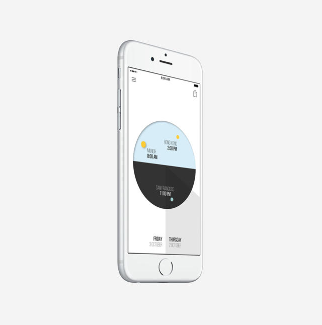
Necessity is the mother of invention, they say. Over the course of the exhausted day that followed, Edson's jetlag nightmare lay the genesis for Lunar's sleek app, Onetime. Available now for iPhone and coming to the Apple Watch as soon as it launches, Onetime is a lovely and innovative app that is one part sun dial, one part world clock, and one part time machine.

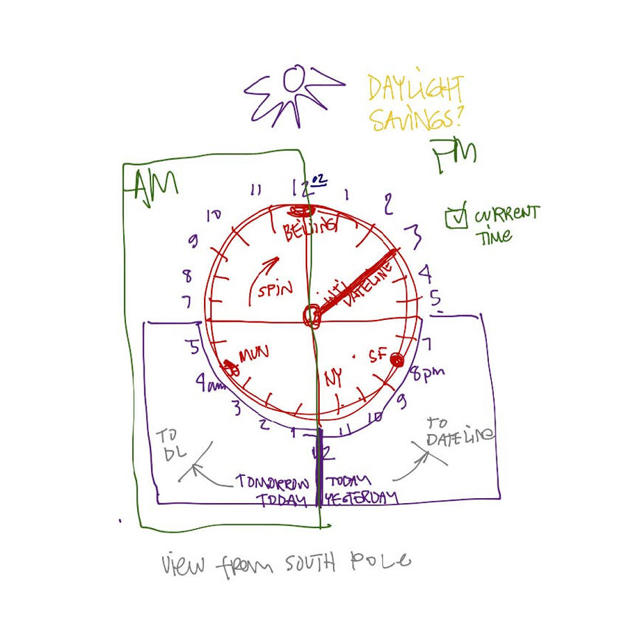
What people think of as time is really just a construct based on one thing: where the sun is in the sky. Onetime uses the sun as a user interface element, allowing you to dial the sun around a half-tone circle (representing day and night) to see what time it will be when it reaches that position in the sky. But in Onetime, there isn't just one sun in the sky: there are as many as you want. You can fill the dial with lesser stars, each displaying the time in a city you want to track. And here's the ingenious part. Tap any sun and drag it around to any time, and it automatically drags the other stars along with it.

For example, let's say you live in Hong Kong, and you need to figure out a time during work hours to speak to a client in San Francisco. By just dragging the sun around the Onetime dial, you can see easily see that the only time you two can speak during regular business hours around 9 a.m. in Hong Kong, and 5 p.m. in San Francisco. (But if you have to tag in your partner in Munich, he's going to have to get up in the middle of the night.) To set an appointment, just hit the "Share" button, and it will email everyone what time they need to be on the call, right from within the app.

Edson and his team have filled the UI with slick little touches. Drag the sun below the dial's day-night horizon, for example, and the spot where the little yellow orb disappears below the surface will suck down, then bounce back, almost like a small ball being pulled underwater. There's even a wedge of shadow around the dial that always follows where the sun is in the sky.

Onetime is beautiful on the iPhone, but where it really seems like it belongs is on your wrist. That's why Lunar intends on making Onetime its first Apple Watch app. "Part of the impulse to get this going was really the Apple Watch," Edson says, admitting that Lunar's design team has been working on Onetime since Apple's smartwatch was just a rumor. "We developed Onetime using [Apple's new programming language] Swift, because we really wanted to test our mettle." With the official launch within sight, Lunar thinks the Onetime app will gain Apple Watch support right around the time they start popping up on Apple Store shelves. Given how well not just time, but a dial interface lends itself to the wrist, the Apple Watch could be the medium where Onetime truly belongs.

You can download Onetime for free on the iTunes App Store.

This Art Installation Turns You Into A Dancing Stick Figure

$
0
0

Klaus Obermaier is an Austrian interactive and video artist currently holding a workshop at Roman's Babes-Bloyai University in Cluj-Napoca. His description of his latest work, Ego is ponderous, talking about "the formation of the Ego via the process of objectification" and "the tension between the real and the symbolic, the Ego and the It, the subject and the object."

I don't know about any of that, but I do know the Ego looks hella fun.

Obermaier hasn't revealed his actual methods for pulling this off, but Ego appears to use a 3-D camera—like the Microsoft Kinect—to translate your body into an animated stick figure on the wall in front of you. As you move, so does your noodle-form doppelganger, slightly accentuating your movements so they feel as cartoonish as a Tex Avery character.

As a child at heart, though, I think my favorite aspect of Ego is the generous cartoon penis and/or wobbly wireframe boobs it arbitrarily assigns participants, regardless of their real gender. Obermaier's statement on Ego might be a smack pretentious, but even he knows that everyone gets a giggle out of a big floppy dong.

[via Prosthetic Knowledge]

Poetic NASA Visualization Shows How Everything Is Connected

$
0
0

On Earth, there couldn't be a bigger difference between the Amazon rainforest and the African Sahara. The latter is a brown streak of wasteland; the former, green and teeming with life. Polar opposites though they may be, the Amazon and the Sahara have a symbiotic relationship: the nutrients of desert dust blow across the Atlantic and feed the rainforest. This process is normally invisible to the eye, but NASA has visualized it in three-dimensions in a beautiful video.

To show how clouds of dust blow across the Atlantic, scientists at the Godard Flight Center tracked dust from the Bodélé Depression in Chad, an ancient lake bed containing rock minerals composed of dead microorganisms. And those dead microorganisms? They're loaded with phosphorous, an essential nutrient for plant growth; the lush Amazon rainforest can't get enough of it. Phosphorous is much rarer in the soils of the Amazon than in the desert, but because winds dump approximately 22,000 tons of phosphorous-rich dust on the Amazon every year, the rainforest's supply is constantly replenished.

The dust visualization was derived from data collected from 2007 through 2013 by NASA's Cloud-Aerosol Lidar and Infrared Pathfinder Satellite Observation satellite, or CALYPSO. CALYPSO sent out constant pulses of light that refracted off dust particles in the atmosphere, then back to the satellite. Twenty-two thousand tons of dust might sound huge, but it's a drop in the bucket compared with how much dust the winds of the Sahara actually actually pick up: an average of 182 million tons, which is the equivalent of nearly 690,000 semi-trucks filled with dust.

If you needed another reminder of how small the world is, here you go. Everything is connected. Read more about NASA's work tracking atmospheric dust here.

[via Notcot]

The Official Nintendo Style Guide From 1993

$
0
0

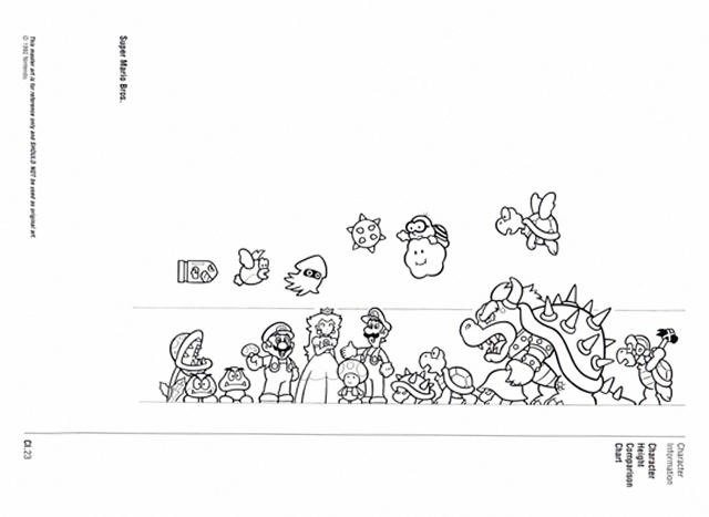
In 1993, buoyed by three years of SNES sales and at the height of its success, Nintendo decided to get its brand in order by creating an official style guide for all of its major characters, from Mario to Samus. Forgotten for years, the 30-year-old Nintendo Character Manual has just popped up online, and it's a wealth of forgotten information about Nintendo's most famous characters, from the particular color of Princess Peach's belt (Pantone 223) to Mario's favorite kinds of music (opera and new-wave Europop).

Discovered by gaming site Press the Buttons, the guide is a curious historical document, with huge portions of it is turned over to how characters like Mario, Luigi, Kirby, Yoshi, and more should be depicted in advertisements, on box covers, and other media.

via Press the Buttons

For example, Nintendo is weirdly adamant that Mario's dinosaur steed Yoshi should never be seen facing to the right (even though the character almost exclusively is seen from that angle in games like Super Mario World). Every character has specific Pantone colors associated with them, so they can be colored consistently across any medium. There's even some interesting charts that depict how each character in the Mario universe relates to each other in terms of size, although 30 years later, Nintendo itself barely sticks to this stuff: depending on the context in which he's used, Mario's enemy Bowser can be anywhere from seven feet tall to the size of Godzilla.

For gamers, though, a lot of the interest in the Nintendo Character Manual will be the weird bio tidbits included inside. For example, Nintendo wants to make sure that no one thinks that Wario, Mario's evil-looking doppelganger, is an evil twin of Mario: they insist they're childhood friends. Yoshi has a mouthful of a real name, T. Yoshisaur Munchakoopas. Mario, also, is apparently not human, but a distinct species all together, according to Nintendo: homo nintendonus. And did you know that Mario's damsel-in-distress, Princess Daisy, has a father who is called the Mushroom King, "a revered moron who has a bad habit of being kidnapped and getting his tie caught in peanut butter jars."

Read more about the Official Nintendo Character guide at Press the Buttons.

A Data Nerd's Guide To Winning Texas Hold 'Em

$
0
0

Do you suck at the mental math of Texas Hold 'Em? Here's an interactive cheat sheet that you might want to play around with before your next game. Chris Beaumont, a former software engineer at Harvard's Center for Astrophysics, has put together a series of matrices, allowing you to better figure out when you should hold 'em and when you should fold 'em, even before the first flop.

According to Beaumont, what makes Texas Hold 'Em such a fascinating game from a probability perspective is that, with over 1.3 trillion possible hands between just two players, the only way to visualize the odds of any given hand winning is as a 4-D hypercube. On his page, Beaumont cuts this hypercube into 2-D matrices that show hand frequencies, average hand strength, weighted strength, and more.

For most players, the part of the visualization they'll be immediately drawn towards will probably be the interactive grid that allows you to see at a glance how strong the first two cards you are dealt are compared to all other possible combos. For example, if the first two cards you are dealt with are a 10 and a 9 of hearts, that's statistically worth seeing the flop, but if that 9 of hearts was a spade instead, you pretty much just have junk and should fold.

Overall, though, the best part of Beaumont's visualization is the last grid, showing weighted hand strength. Although it's not interactive—you'll need to explore the matrix by mousing over different possible hands—it's a more useful tool in the sense that it shows you how likely any given hand is to win in a Texas Hold 'Em showdown, provided that the person you're playing with isn't a total idiot, and has therefore folded if he was dealt complete junk. It's like years of Texas Hold 'Em experience, visualized in a single grid.

Truthfully, this is more Texas Hold 'Em for data nerds than anything else. If you just want to play a better game, there's simpler charts that can help you more. But if you're a viz lover who likes a good hand of poker now and then, this is total porn.

Check out the full interactive visualization here.

Viewing all 2895 articles
Browse latest View live