Quantcast
Channel: Fast Company
Viewing all 2895 articles
Browse latest View live

This Synthesizer Magically Transforms Into Any Musical Instrument

$
0
0

There's no shortage of digital guitars, keyboards, and drum machines you can connect to your iPhone or iPad. If you're a guitarist, a keyboardist, or a drummer, these controllers are great. They let you translate the expressivity of an analog instrument into a digital format that a program like Garage Band can understand. But what if you're a violinist, a xylophonist, a tuba player, a sitar player? What if you don't play a traditional instrument at all? Where's your digital instrument?

It's the Artiphon, hopes creator Mike Butera. Part music philosopher, part technologist, Butera was inspired during his time collaborating with Ideo to design a musical instrument for the future; one which can be played anyway you want. Imagine a tuba played like a violin—yes, your iPhone is a bow—and you've got a good idea of the Artiphon's potential.

The Artiphon has no strings, but you can play it like a bass, guitar, or violin. It has no keys, but you can play it like a keyboard or a drum. There's even a microphone which can let you play it like a wind instrument, if you want.

That flexibility extends to the software, too; by using an app, the Artiphon allows amateurs and pros alike to configure their own unique music instruments.

"When you look at the whole history of music, it's all about playing an instrument in a single way," Butera tells me. "You play a guitar like a guitar; you play a piano like a piano. We wanted to create an instrument that you can play any way you want to. Something that's not about strings to strum, or keys to press, but which can transform to allow musicians to express themselves any way they want."

The Artiphon isn't an Ideo joint, not officially, but it's benefitted from a year of bouncing ideas off of some of the greatest minds in design today.

The industrial design was done by Los Angeles-based design firm Pull Creative, but according to Butera, it was Ideo who helped with the spiritual design of the Artiphon. For the past year, Butera and his team have met with Ideo to brainstorm the future of musical instruments, even going so far as to do a residency in the design firm's San Francisco office.

Prior to his time with Ideo, Butera earned a PhD in sound studies from Virginia Tech, and dedicated himself to observing the way humans produce noise that he defines as equal parts philosophy, technology, sociology, and history. As he pursued his studies, Butera noticed that people express themselves musically with a universal vocabulary of human gestures: they strum, they tap, they slide, they bang, they blow, and so on.

"These are all things that our bodies do, and which we have specifically designed music instruments to translate into sound," he says.

But instruments only translate one or maybe two of these gestures into sound: for example, you strum a guitar, but you don't blow on it. What Butera wanted to do was invent an instrument you could express yourself on any way you want. "I wanted to take musical expressivity from the singular to the plural," he says.

In appearance, the Artiphon looks almost like one of the abstract musical instruments from Star Trek, but with an iPod-white makeover. That's the point. When it comes to its industrial design, the Artiphon is supposed to be a blank canvas of an instrument, evocative of every piece in an orchestra but specific to none of them. The whole point is to let people express themselves musically however they want.

"A violinist will see it as a violin, a DJ a grid controller, a keyboardist a keyboard," explains Butera. "We're trying to make the Swiss Army Knife of musical instruments."

Launching on Kickstarter today, the Artiphon can be pre-ordered starting at $349, with units shipping out in January 2016.


Massive Data Visualization Brings NYC's Busiest Street To Life

$
0
0

What does big data tell us about the character of an iconic street? Created by data viz maestros Moritz Stefaner and Lev Manovich, On Broadway is an unprecedented visualization of social media data, which pulls in millions of updates from Instagram, Twitter, Foursquare, Google Street View, and more as a way of exploring the data that stacks up, almost like vertebrae, to translate the spine of Manhattan into a digital entity.

On Broadway was inspired by Every Building on Sunset Strip, a 1966 book by Edward Ruscha that unfolds to a 25-foot-long panorama of a 1.5-mile section of Sunset Boulevard. On Broadway takes that concept into the 21st century. By loading up the app in your web browser, you can explore the 13-mile section of Broadway that runs through the heart of Manhattan in various ways, from the average colors in the facades of Harlem to the average number of tweets per day in the Financial District.

According to project lead Lev Manovich, On Broadway is the latest in a series of experiments to leverage computers, the web, and massive data to represent our cities in new ways. "We wanted to avoid standard techniques like numbers, graphs, or maps," he tells me, instead opting for "a visually rich image-centric interface with no maps and where numbers only play a secondary role." The site represents Broadway as a vertical stack of image and data layers, as colorful and densely packed as one of the thousands of buildings in New York itself.

What's most impressive about On Broadway is the fact that its interface holds up at all, given the massive data sets being thrown at it. To create On Broadway, the team pulled in 660,000 Instagram photos taken over a five-month period in 2014, as well as more than eight million Foursquare check-ins from 2009 to 2014, 22 million taxi pick-ups and drop-offs in 2013, countless Google Street View images and Twitter posts, and economic data from the U.S. Census Bureau. You explore each section of Broadway by clicking on a box representing its neighborhood at the bottom of the page, and On Broadway will even call out stats about individual buildings as you browse, like Monk's from Seinfeld.

With so much data in play, there's no one big takeaway from On Broadway. You might learn, for example, that Columbia University is comparatively underrepresented on Twitter, or that taxi pickups in Midtown outnumber those in Harlem by almost 30 to 1, or that the average facade colors are tones of brown or blue, but ultimately, Broadway is as vibrant and complicated as the city it streaks through. What you get from it is going to depend on what you're looking for.

On Broadway is currently on display as an interactive touch-screen exhibition at the New York Public Library until January 3, 2016, but you can also explore it online here.

Meet Henri, A Box For Designing The Screenless Interfaces Of Tomorrow

$
0
0

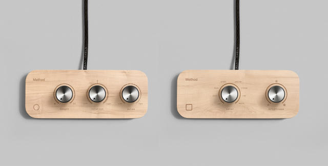
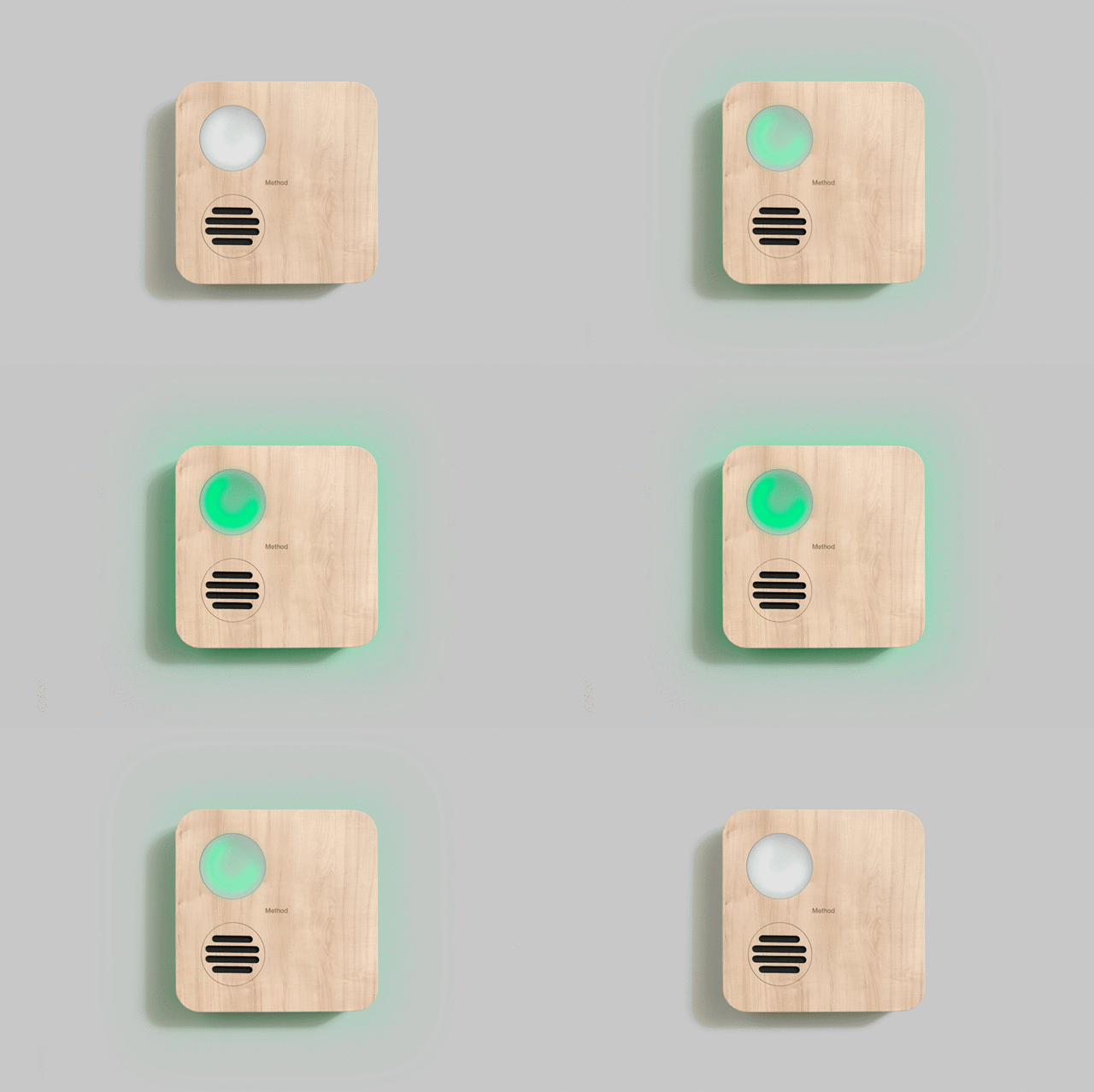
Smart devices have created new problems for designers to solve, not least of which is interface: how does a gadget or appliance communicate to you when it doesn't have a screen? That's a problem that brand and design firm Method has been thinking a lot about lately, so much so that they created the Henri, an interactive gizmo that makes it easier for designers to explore the ambient UIs of future gadgets.

Henri is meant to function as an abstract stand-in for a connected home product like the Nest, the Philips Hue, or the Leeo Smart Alert. Two control panels of brushed steel knobs are connected to Henri, allowing designers to easily experiment with ambient interface elements without needing a ton of technical know-how: for example, what is the best pattern and color for LED lights to pulse in response to certain commands? Or what sounds should play under certain scenarios? Just by twisting these knobs, designers can create all sorts of light, sound, and halo patterns and figure it out.

"For the last 15 years, Method has mostly done screen-based design," says Method's Daniel Nacamuli, who led the Henri design team. "But with the rise of smart objects and the connected home, we've found that products increasingly need to communicate even without a screen, through things like light and sound patterns."

What Method found was there's no easy way to design this ambient language of softly pulsing light and sound. While a designer creating a graphical user interface for an app is perfectly comfortable loading up InDesign, creating bliking patterns for the LED on a Nest still requires a technical know-how that is out of reach for most designers.

Why do designers need a device like the Henri? When it comes to the ambient language of the way smart objects communicate their state to their users, it's total chaos out there. There are no best practices guides or style manuals. It's still a period of trial and error experimentation. If you think about the symbology of other products, the grammar is relatively static: when dealing with any interface dedicated to listening to music, a triangle turned on its side means 'Play.'

But there's no accepted vernacular for what the ambient light and sound signals coming out of smart objects means: if your GoPro starts blinking a red LED at you, does that mean it's recording, or that it's running out of battery? "It's something designers really need to think about: what happens when you have all these connected objects in your house that all communicate with their users differently?" Nacamuli says.


And Henri only represent's one part of Method's efforts to generate interest in the design of ambient interfaces: the firm originally unveiled the Henri box as part of a workshop in December at San Francisco's IxDA conference, where attendees were paired in teams and asked to program light and sound patterns on the Henri to communicate test scenarios, such as conveying how a smart door might tell a user that an annoying solicitor was walking up to the door, or how to reflect a whimsical personality for a brand through patterns of flashing lights.

The exercise yielded some important lessons: for example, increasing the speed of a flashing light or blipping sound to communicate urgency is intuitive to just about everyone; we also have cultural expectations for certain colors to be used to communicate certain states, like red as a warning color. But as far as a universal language for smart objects goes, it's still many years off.

That's okay, says Nacamuli. Traditional GUIs don't all communicate the same rules either, but at the very least they have pop-ups and tooltips associated with them that explain what they do. The challenge facing designers is to figure out how to make the design language of tomorrow's ambient gadgets intuitive without tooltips and pop-ups. The point of the Henri is to let designers get their hands dirty as they figure it out, raising awareness of the challenges that face designers and consumers alike as traditionally 'dumb' gadgets start trying to communicate with us through blips of sound and light. The Henri is like a Rosetta Stone, allowing us to try and decode the ambient interfaces of tomorrow.

You Can Now Massage Your Back Or, Uh, Other Parts, Using Twitter Hashtags

$
0
0

The Internet causes you enough stress. Here's a way it can melt some away. Meet the Internet Sensations Wand, a vibrating massager (with a heaping of teledildonic possibilities on the side) that transforms Twitter hash tags into haptic feedback.

The Internet Sensation Wand was created by Chinese designer Horatio Yuxin Han, who previously designed origami shoes for the developing world, in collaboration with MIT's Robert Learsch and Brown University's Ijeoma Azodo as part of the Rhode Island School of Design's Body + Internet exhibition, which explores our ability as humans to express sentimentality through technology.

Here's how it works. Let's say you had the Internet Sensation Wand during last week's dress mania. By tuning the Internet Sensation Wand to #TheDress, it would generate a single pulse every time someone tweeted with that hashtag. That's not a lot by itself, but during the peak of "I see White and Gold!" mania, #TheDress was generating enough pulses to jackhammer the knots out of even the most tightly wound back.

According to Han, the original idea was to translate hashtags into sound, not vibrations. "The first version was an Internet pulse listening station, where we translated hashtags into heartbeats and listened to it through a stethoscope," Han says. "But we later evolved the concept from sound to haptic feedback, to better emphasize the physicality of the Internet."

Like many of MIT's more progressive projects, the point of the Internet Sensation Wand isn't necessarily to posit an actual tech product, or even a solution to a real problem. Instead, it asks us to think more closely about how we think about our interactions with ephemeral digital phenomenon like hashtags. We might feel figuratively buffeted by them in our online lives, and now, thanks to the Internet Sensation Wand, they can literally bombard us as well.

More information on the Internet Sensations Wand can be found here.

Live From Pentagram, It's Saturday Night Live: The Book!

$
0
0

Pentagram's Emily Oberman is pretty much Saturday Night Live's go-to designer at this point. She's done three separate SNL identities, including this year's 40th-anniversary logo, as well as several opening title sequences, and a smattering of SNL commercial parodies. Generally speaking, though, Oberman's SNL geekdom lives on the screen, not the page, which makes her latest project something of a departure. Teaming up with the art book publisher Taschen, Oberman has designed Saturday Night Live: The Book, a 500-page comedy bible that aims to take readers behind the scenes of what could be the most chaotic, last-minute, fly-by-the-seat-of-your-pants show in television history.

With a boxy cover designed to evoke a rock-and-roll album cover, Saturday Night Live: The Book is roughly divided into three parts. The first part of the book structures itself as a weekly calendar, emulating SNL's own Monday through Saturday production schedule. "We had this idea that the book should be built around this idea of the work week, so that each day is done as a separate chapter," Oberman says. Everyone has a certain era of SNL that immediately comes to mind when they think of the show, but Oberman and Castle wanted readers to explore all eras of the show. The weekday structure allows Saturday Night Live: The Book to tell the history of the show from a non-chronological, but still rigid, structure. If you're reading the Monday chapter, for example, it might tell the history of Saturday Night Live's writing rooms, because the skits start getting written on Monday; a history of SNL musical guests, on the other hand, wouldn't be found until the Saturday chapter.

After the calendar section, Saturday Night Live: The Book dives into a lengthy exclusive interview with Lorne Michaels, then finishes up with an encyclopedic reference guide to the entire series, including a complete list of skits, hosts, musical guests, and more.

Oberman was not involved with the design of the Taschen book from the get-go. While designing SNL's 40th-anniversary identity, Oberman heard through the grapevine that Taschen was working on a companion book. It was a dream project for Oberman, but she had to convince Taschen editor Alison Castle to let her work on it. Luckily, that was easy. "We're both SNL super-fans and comedy geeks, so we hit it off pretty much immediately," Oberman says. "Alison and I just had very similar feelings about what the tone of the book should be: as much of an art book as an encylopedia, and definitely more of a coffee table book than one you'd keep in your bathroom."

Finding a graphic design language that could support that volume of content was uniquely challenging. Over the years, Saturday Night Live has been so many things to so many people, so it was important to avoid evoking any one era of SNL history too strongly. For the weekday calendar section of the book, Oberman settled on typography that calls to mind a typed script, without being too on the nose. "We wanted something that could change weight and feel like a typewriter, but also feel like design at the same time," Oberman says. Another motif was trying to capture the design language of television itself. As you follow the calendar from production to the airing of the show itself, the borders of the pages change to black, like the borders of a television. And since Saturday Night Live: The Book is meant to be the ultimate SNL bible, ribbons have been sewn into the book as chapter markers. Their colors are red, green, and blue, to represent the RGB colors of the television spectrum.

Although Oberman and Castle have been working on Saturday Night Live: The Book for more than a year, it was still a skin-of-the-teeth project to pull together at the end. For example, the weekly calendar format of the book resulted in unique layout challenges. If a picture of Chevy Chase was in the Tuesday section of the book, it had to have been taken on a Tuesday. "We'd layout a page of photographs, only to realize we had to redo the spread, because one or two photographs were taken on a different day of the week, she laughs. But at the end of the day, according to Oberman, the process just gave her a better appreciation of what Saturday Night Live is all about.

"Over the years, I've talked to a lot of people who have worked on SNL, and invariably, they all talk about it as this big rolling machine, like a carnival, where everyone has their job," Oberman says. "When you do an identity for SNL, you're kind of detached from that carnival air, but with this book, I was able to feel a lot more how that machine works and how incredible it is that they get SNL on the air every week at all."

Saturday Night Live: The Book is now available for sale for an MSRP of $49.99. You can purchase it through Amazon here.

A Lamp That Uses Steel Marbles As A Light Switch

$
0
0

Light switches are boring, so we're always on the lookout for a more novel way to turn on our lamps. And the Mercure Lamp certainly has that going for it: the bulb is filled with steel marbles which function as the switch. When you incline the Mercure Lamp, the ball bearings tumble to the base of the lamp and complete the circuit, filling the bulb with light.

Created by French designer Luce Le Guen, the Mercure Lamp was inspired by the mercury tilt switch, a type of switch which is used in cars to turn on the lights in your trunk when you open the lid, or to display a tip-over warning for construction equipment on an angle. Like a mercury switch, the Mercure only turns on when the switch inclines in such a direction that a circuit is bridged by tumbling metal. The only difference is that instead of using toxic mercury, the Mercure Lamp uses steel.

The ball bearings are a clever affordance which give a clear visual clue as to whether or not the lamp is on, while the tinkling of the bearings rolling inside glass are said to give the Mercure pleasing haptic and even aural feedback. But there's more to a lamp than just the way it turns on. Made of blown glass, with an enclosed glass chamber inside the bulbs, the Mercure's glow is designed to resemble moonlight bouncing off of a glass fishing float in the water.

A one-off project—at least for now—the Mercure Lamp will be on display at the Biennale International Design Saint-Etienne as part of the Experiences of Beauty exhibition, running from March 12th to April 12th.

(Via: Design Boom)

For Sale: A Cartoon Guest House Designed By Frank Gehry

$
0
0

An opportunity to buy a building designed by Frank Gehry—whether you like him or horf him—doesn't come around very often. If you've been looking to invest in Gehry's particular brand of starchitecture, here's your opportunity: the University of St. Thomas in Minnesota plans to auction off Frank Gehry's Winton Guest House to the highest bidder. There's just one catch. You can't keep it there.

Originally designed by Gehry in 1987 for Minnesota lumber magnate Mike Winton as a guest house to complement a Philip Johnson-designed home on his family's rolling Lake Minnetonka property, the 2,300-square-foot Winton Guest House was purchased by real estate developer Kirk Woodhouse in 2001. Nine years later, Woodhouse decided to donate the Guest House to the University of St. Thomas; it was then cut up into eight separate pieces and moved 110 miles to the south to Owatonna, Minnesota, where it was reassembled as a university conference center. The ordeal took 18 months, and when it reopened in 2011, Frank Gehry himself wryly noted that the movers had gotten the relocated Guest House "93.6% right."

Since then, though, the University of St. Thomas has decided to sell the land out from under the unusual Winton Guest House. Last year, the University sold the parcel of land the Guest House sat on to Meridian Behavioral Health Services, a company that has since converted the land into an addiction treatment center. At the time of the sale, the University retained the title to the Winton Guest House and originally planned to move it yet again, possibly to downtown Minneapolis.

Ultimately, though, these options proved financially unfeasible, so the Winton Guest House is up for sale yet again. The unusual building, which resembles a child's drawing come to life and contains three small bedrooms as well as a "living tower," will be auctioned off to the highest bidder, who will also have to pay to move it to a new location. That will prove expensive. When the University of St. Thomas moved the Winton Guest House in 2011, the undisclosed price was estimated to cost in the high six-figures.

Still, the opportunity to own a genuine Gehry-designed house doesn't come around often, so something tells me the Winton Guest House will find a bidder. If the Guest House depreciated from 100% to 93.6% during its first move, though, what percentage will Gehry decide its movers have "gotten right" when its cut apart and moved again?

(via The Star Tribune)

Antique Books Turned Into Exquisite Paper Sculptures

$
0
0

South African artist Barbara Wildenboer thinks of books as living things. In her art, she operates on them, cutting apart old books to reveal the sprawling yet delicate central nervous systems trapped within the pages.

Inspired by the delicate fractal patterns of nature, Wildenboer turns old books into elaborate sculptures, in which individual pages have been transformed into wondrous patterns of papercraft filigree. The books she chooses to operate upon are all old hardcovers, but otherwise can be any genre, from old translations of The Odyssey to weathered old atlases and hardcovers.

Psigologica Biologica

What's the point of her work? Wildenboer tells me her sculptures are a reflection of her own fascination with subjects as diverse as fractal geometry, nature, mechanical systems, and — of course — books. The artist views her sculptures as metaphors for the interconnectedness of all beings. A single sculpture can take days to put together.

According to Wildenboer, one of the most challenging aspects of her work is walking the razor's edge between sculpture and vandalism. Her altered books are found in flea markets and old bookstores, and she often picks them for their antiquarian qualities, but transforming them into a sculpture alters these volumes forever. Consequently, Wildenboer tries to work only with books that look rare, but are actually relatively common, sometimes teaming up with a family friend who runs a rare book shop in Cape Town to make sure that the book she's about to dissect is a dime a dozen.

The Cape Town artist has participated in several group exhibitions and art fairs both nationally and internationally, including in South Africa, San Francisco, Dubai and Hong Kong. Her latest body of work was called The Lotus Eaters; it opened at The Reservoir at the Oliewenhuis Art Museum in Bloemfontein in 2014 and subsequently toured South Africa.

You can see more of Wildenboer's work here.


MoMA Recognizes Susan Kare, The Designer Of The Macintosh's Original Icons

$
0
0

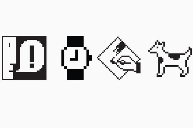
Susan Kare — the pioneering graphic designer whose pixel art icons for the original Macintosh helped define the language of graphical user interfaces (GUIs) — is being recognized by the New York Museum of Modern Art. Her archive of graph paper drawings sketching out her ideas for the original Macintosh interface have been acquired by the MoMA as part of the new exhibition, This is for Everyone: Design Experiments For The Common Good.

This is for Everyone takes its title from a tweet by Tim Berners-Lee, the inventor of the World Wide Web, who started off the 2012 London Summer Olympics' opening ceremony with those four words as a tweet. Nothing better exemplifies the spirit of that message than Kare's designs for the Macintosh's original icons. Many of her designs proved so universal that they have established a sort of universal grammar for computer GUIs. Although the cut-and-paste icon, the save icon, and the volume icon on your devices are probably a lot more colorful and higher resolution than the monochrome, 8-bit icons Kare designed during her time at Apple, they're still probably very similar to what she originally came up with: a pair of scissors, a floppy disc, and a speaker.

Kare designed all of her early icons on graph paper, with one square representing each pixel, and it is this archive of sheets that MoMA has acquired jointly with San Francisco's Museum of Modern Art. Although some of the designs she came up with as a contractor for Apple during the development of the first Mac aren't well remembered (*ahem* Mr. Macintosh), it's amazing how much of her visual iconography did stick manage to stick around.

Kare herself has always been humble about her success as a designer. In an interview with me last year, the vivacious Californian — who has a love of celebrity gossip, Game of Thrones, and surfboarding — told me that when she applied to Apple, she was basically just faking it until she made it. She had never designed a computer icon before, nor had she designed a typeface, so she just sort of winged it, never imagining that the work she did for Apple on computer icons and digital typefaces would become so revolutionary.

That's what makes Kare such a great addition to MoMA's permanent collection. Design is for everyone, and Kare's success proves that not only is great design universal, it often happens in spite of things like credentials and direct experience.

You can read more about the Museum of Modern Art's acquisition of Susan Kare's preliminary icon sketches, as well as the This is for Everyone exhibition, here.

Every Frame Of This Computer Animated Short Was 3-D Printed Into Real LIfe

$
0
0

No matter how realistic a computer animated movie like Toy Story 3 might seem to you, it's still just a bunch of numbers inside a computer. That makes the computer animation process much more ephemeral, leaving behind few tangible relics such as hand-drawn animation cels or articulated stop-motion puppet. But why should that be, when 3-D printers can bring any 3-D computer model to life?

Freeze! might be the first computer animation to live outside of just the hard drive. Created by Dutch animation studio Job, Joris & Marieke, Freeze! shows a pencil-drawn figure leap out of a piece of paper, dance across a table, smash a coffee cup, and then perform a series of acrobatic flips to land in a jar sitting on a shelf.

That series of events doesn't take up a lot of screentime: just 11 seconds, in fact. But what makes Freeze! special is that it's been expanded into an entire exhibition, where every frame of the animation is represented in physical form. There's a separate 3-D printed figure for every one of the 100-odd frames the Freeze's dancing figure moves across the screen. The exhibition space even recreates the setting of the Freeze! cartoon, which is itself a recreation of Job, Joris & Marieke's animation studio, right down to the table, shelves, and portraits on the walls.

The result is a static installation that actually explains the principles of animation, without being animated at all. If you look closely, you can figure out what happened to the table, even if you never saw the Freeze! cartoon at all. Freeze! and its accompanying illustration were made for the Move On exhibition at the Kunsthalkade in Amsterdam, celebrating 100 years of animation, and will be on display until May 10, 2015.

[via The Creator's Project]

How Many Nukes Are There In The World?

$
0
0

Since 1945, when the United States first dropped nuclear weapons on Japan, the Bulletin of the Atomic Scientists has been tracking nuclear arsenals around the world and slowly counting down to Armageddon. Although the group has always made its running tallies available in print as a feature called the Nuclear Notebook, the Notebook is available online, too, and web readers now have an interactive way of visualizing the planet's nuclear stockpiles.

According to the Nuclear Notebook, there are currently 10,144 nuclear warheads stockpiled around the globe. That's marginally good news. At the peak of the Cold War, there were over 60,000 stockpiled nukes. The bad news is that 10,144 nukes is enough to nearly irradiate the total land mass of the planet.

See the interactive graphic here.Bulletin of Atomic Statistics

As for who has the most nukes, it's probably no surprise that the United States and Russia have the vast majority of nuclear weaps, with 4,804 and 4,480 warheads stockpiled respectively. There are approximately 1,861 nukes spread over the rest of the world, between China, Israel, the U.K, Pakistan, and India. France has the largest number of nukes after the U.S. and Russia.

In the Nuclear Notebook interactive, you can click on any bar to get more information about that year's nuclear milestones, as well as where it fell on the Bulletin of Atomic Scientist's Doomsday Clock, which is the organization's ongoing ranking of how close humanity is to snuffing itself in a whirlpool of fire. Considering the fact that we've gotten rid of almost 85% of our nukes since the late 1980s, you'd think we'd be farther away from Armageddon than ever. Alas, when the clock was last updated earlier this year, the hands were moved to just three minutes until midnight due to the modernization of nuclear weapons, as well as environmental factors. We may have fewer nukes than ever, but the ones we have are still plenty deadly.

Check out the Nuclear Notebook interactive visualization here.

MagSafe, We Hardly Knew Ye

$
0
0

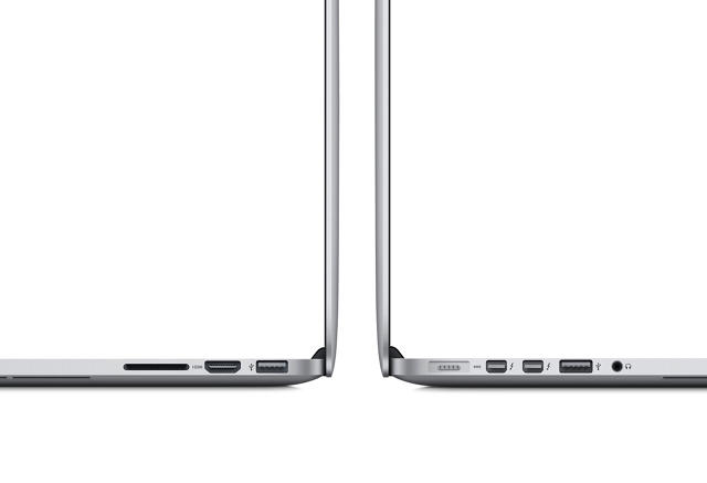
MagSafe, one of Apple's most innovative, brilliant, ruthless, valuable, and, at times, troubling designs has finally died, replaced with something less beautiful and clever to charge the revamped MacBook: a new connector called USB-C.

Since 2006, MagSafe has been one of the many seemingly small innovations that has the path of migration from the PC to Mac so one-sided. Great design fixes real problems, and the MagSafe certainly fixed a doozy. You buy a $2,000 laptop, and plug it into the wall. Later, you trip on the cord, causing your expensive new laptop to meet its demise on the floor. MagSafe solved all that. With a satisfying clack, magnets would guide and hold the MagSafe connector firmly in place while an Apple laptop charged, but not so firmly that if someone tripped over the cord, it took the laptop along with it.

Once you used MagSafe, you couldn't imagine physically plugging something into your laptop. Who would go back once you've experienced MagSafe? It seemed unfathomably gross and behind-the-times, like that scene in Demolition Man where Sandra Bullock recoils at the idea of having greasy, sweaty sex, when you could just slap on a VR headset and beam clean waves of pleasure directly into the nerve clusters of someone's brain.

Flickr user Micah Elizabeth Scott

Naturally, Apple patented the hell out of MagSafe, preventing other companies from releasing their own alternatives to MagSafe without getting sued. It was a hell of a patent. If your magnetic cable could be pulled out of a gadget in any direction besides straight out without damaging what it was connected to, it violated Apple's patent. Even Microsoft's Surface, was forced to utilize a less-sticky and generally inferior magnetic connector. It even went as far as to prevent headphone makers from utilizing a magnet-based connection.

That's not to say that MagSafe was perfect. Early versions of the MagSafe employed a T-shaped design, which brought fraying, overheating, and a class-action lawsuit in 2009. Its replacement, while less prone to hazard, managed to cover up other ports. But by 2012, Apple unveiled a design which finally got it right.

Flick user rok1966

With yesterday's announcement of the next-gen MacBook, Apple's laptops have gotten about as thin as they can possibly get, which means there's literally no room for the MagSafe connector. But there is a silver lining to be had: the new USB-C connector is an open standard, which means: any company out there can build and use USB-C for charging, not just Apple.

MagSafe loyalists may find comfort in rumors that MagSafe will live on as a magnetic connector that lives closer to the wall socket, but it appears to be the end of an era. Soon, other Apple laptops will presumably switch over from MagSafe to USB-C. Maybe, though, if Apple's no longer using MagSafe, they'll finally allow other companies to start innovating with magnets again.

Deceptively Simple Website Lets You Share A Moment With Strangers Around The World

$
0
0

The web looks synchronized, but it isn't. Pages load half-a-second faster on one computer, a few hundred milliseconds slower on another. Even if you loaded up your Facebook page on two computers side-by-side, they'd both show up slightly out of sync with one another.

That means that no matter how connected the Internet makes you feel, we're all still experiencing it at slightly different times. But click here, and you'll see something unique on all the Internet: a cycle of colors, flashing across your screen. Regardless of what screen you're viewing it on, or what your Internet connection speed is like, the color is always the same. It's a shared moment.

Colorsinc was designed by Jared Pace and Joseph Chiocchi (also known as Yølk), who met at Chicago-based design studio Simple.Honest.Work. (They have both since moved on.) The website is dead simple: outside of some text explaining the site, it's just a simple block of color that fills your browser window. The colors change from time to time, seemingly at random, but that's where Colorsinc gets interesting. The colors on screen change when anyone, no matter what device they're on, clicks or taps on his screen.

So load up the site on two separate devices, and click or tap. You'll see the color on the screen change instantly on both devices simultaneously. That's also true if two people are looking at the site from half the world away. "There's a simple universality to colors that strikes us as really powerful," Pace writes in an email. "Whenever you're viewing it, someone else from across the universe could be changing what we're seeing. That ability to synchronously communicate with each other, even as strangers, feels really exciting."

According to Pace, the idea that led to Colorsinc was very different. Pace and Yølk originally wanted to create an art performance illuminated by audience members holding smart phones with a web address that provides a synced light show. That still might happen, but Colorsinc is more of a stress-test for how many participants can interact in synchronized real-time with one another on a single site.

And how many is that? Pace and Yølk admit they're not sure, but they want to find out. "I'm really excited to see how many users this crazy thing can handle at one time," Yølk laughs.

You can help Pace and Yølk stress-test the synchronicity of the web by clicking here.

Apple's Big Plan To Make You Want Things You Don't Need

$
0
0

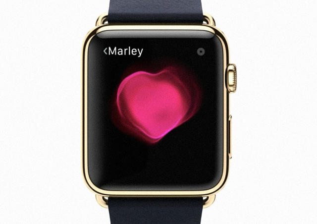
The Apple Watch isn't going to flop. An Apple "flop" right now is probably a multi-billion-dollar industry, after all. Rather, the watch is the first step of the next major shift for a company that has made its money by essentially trend forecasting in the technology space. The future of tech is the future of fashion, and the Apple Watch is just one step towards that future.

Ever since the first Macintosh, Apple has pursued a goal: the borderless intermingling of hardware, software, and connectivity. This isn't necessarily different from what the competition is doing right now (mostly by taking Cupertino's lead), but companies like Samsung, Microsoft, and Google pay most of their attention to just one thing, or two at most: Google and Microsoft are more software-and-service companies than hardware companies, while Samsung's mostly just a hardware company.

The difference is Apple's clarity of vision. The original Macintosh from 1984 is just as much of a part of that vision as the iPhone and iPad are today. It's bigger, clunkier, and technologically less advanced, sure, but it's the same thing Apple is selling today: a magic screen that has been designed to be as frictionless as possible. Over the years Apple has sanded and buffed that magic screen down, eliminating friction with the user where it can (making it thinner, making it faster, making it lighter) and expanding it into a range (iPhone, iPad, MacBook, iMac, and now Apple Watch), and nearly three decades later, Apple has pretty much distilled the magic screen down to its essence. There's a magic screen for everyone. And it's just about as light, thin, and powerful as it's going to be.

But what is the essence of an iPhone? This is some Plato-in-the-Cave shit, but I don't think it's too preposterous to suggest that there are some objects that are truer to their essence than other objects. A spoon, for example, might start out as a shovel, but over thousands of years of iteration and improvement, it eventually reaches a point where it is no longer reducible. People might design spoons past this point, but future iterations will all relate to the craft with which they were made, or their ornamentation. Regardless, the spoon will never become more spoony than it was before.

Apple is fastly on track towards reaching the point where there are no more major technological innovations to be made with its projects. Five years on, iPad sales are already becoming more Mac-like than iPad-like. The iPhone continues to sell in two-year upgrade cycles, but that's largely because iPhones have traditionally been tied to 24 month subsidized cellphone contracts—something that is starting to change. At what point do sales simply stall, because the innovations just aren't big enough to justify upgrading regularly anymore?

It'll eventually happen. There aren't many products that consumers regularly upgrade and replace every two to five years, once their technical innovations have topped out. Moore's Law—which essentially suggests technological innovation doubles every two years—isn't a law of nature, it's just a theory some dude came up with after noticing a pattern. Eventually, the cheapest smartphones and tablets and laptops out there will be good enough for almost everyone; heck, for many people, they already are. Apple wants to distill its gadgets down to their essence, but it still wants people to buy new ones every few years, and make roughly the same amount of profit on each new model

So to adapt, you take your lead from fashion. Fashion defies the upgrade cycle. You do not buy a new pair of pants for their technical innovation, or because your old pants wore out. You buy them for a host of other factors: what they say about you, what they are made out of, the quality with which they are produced, who else wears them, who endorse them, and so on. And you do so despite the fact that you have a closet of perfectly good pants at home.

Someday, magic screens will be as commonplace as pants. Fashion is the key to keeping magic screens exciting, once technical innovation is no longer the prime mover. Fashion is this big, crazy engine of imagination and irrationality that makes people buy a $1,000 shirt just because Kanye once wore one, or to buy a pair of $300 sneakers just because it's got the silhouette of a guy who can jump 10 feet in the air on the side. That's insane, but fashion defies so much conventional wisdom of consumerism precisely because it's so ineffably tied in with the human spirit. Logic and practicality be damned: fashion appeals to the ego and the id, all at once.

Perhaps this is the true importance of the Apple Watch. Watches have always been the bridge between technology and fashion. And it's obvious that Apple is courting the fashion world. It took out ads for the Apple Watch in Vogue. It made a huge splash at Paris Fashion Week. It hired influential fashion executives like ex-Burberry executive Angela Ahrendts. This isn't a dabbling. This is a concerted campaign.

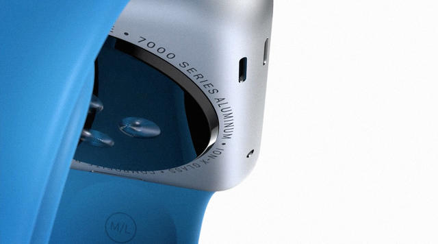
One natural question is, "What does Apple look like as a fashion company?" But truthfully, I don't think it's that different than what Apple looks like now. Apple already has the retail presence equal to, or exceeding, that of most fashion brands. People already buy iPhone cases to express their personalities, or outwardly peacock their status, and Apple is doubling down on that with the Apple Watch, which you can purchase in 18K gold, or accompanied with a $550 chainlink strap. Even the new MacBook comes in three different finishes: black, silver, and gold.

Apple's detractors have been saying for years that the iPhone and the Mac aren't real computers, but fashion accessories. Maybe it was more right than it knew. Slowly but surely, Apple is signalling that it sees its future as being more clearly aligned with fashion and tech. That's not because it's going to stop making tech. It's because we're inevitably going to stop appreciating most gadgets as tech, any more than we think of a spoon or a watch as technology (which they both most certainly are, after their type).

These are all admittedly strange thoughts. But Apple's not just looking a couple years ahead; it's looking 30 years ahead. Today, Apple might dip a toe in fashion with the Apple Watch, Apple's most wearable magic screen yet. But who's to say that, 30 years from now, our very clothes won't be magic screens, the appearance of which we can change by just downloading an app?

The World's Most Overrated Interface Design

$
0
0

What do delightful design, hamburger menus, Spotify, and iPad apps all have in common? They're all finalists on our March Madness bracket for the most overhyped examples of interface design.

Whether you love 'em (Netflix! Heart emoji!), hate 'em (Flat design! Puke!), or don't understand how anyone could claim they're overrated (doesn't everyone hate Spotify's UI?), these were the eight entrants you helped choose as part of our March Madness of overrated design. Check them out in our slide show.

Don't see a design you hate on this list? We've already posted our picks for product design, and you can check back later this week for picks in graphic design, and architecture, before voting in our bracket to name the single most overrated design in all the land.


It's Time For The Minimalist Poster Trend To Die

$
0
0

Let's imagine for a second you go into a restaurant. You order a cheeseburger, and after waiting for a while, someone comes out and serves you a Lunchables version of a cheeseburger: two Ritz Crackers, a patty of Velveeta, and a swollen puck of saline-injected roast beef. You wouldn't say, "What a clever deconstruction!" or "How deliriously evocative of a cheeseburger!" You'd be like, "Where the fuck is my cheeseburger?"

The seemingly inexhaustible trend of reducing everything into series of twee minimalist posters is the design equivalent of the Lunchables cheeseburger. Minimalist posters are a bait-and-switch: a lack of nuance disguising itself as insight. Bad, lazy design retconned into spartanly applied technique. The single olfactory note of a fart masquerading as a seven-course banquet.

No one can deny that the minimalist poster trend has flourished on the Internet. Hell, we're part of the problem. In just the past couple years, Co.Design has published stories about minimalist posters for famous movies, Hollywood architecture, economic principles, philosophical ideas, Bible verses, and mental disorders.

The problem: Minimalist posters are encouraging us to be design idiots. A central tenet of good design is that it shouldn't be any more complicated than it needs to be, but that doesn't mean good design is inherently uncomplicated. Great design should have nuance, not strip it all away until it has been emptied of meaning. Done right, minimalist posters can help us gain new insight into complicated subjects, by bring a single aspect or theme into razor-sharp focus. But they rarely do, because that sort of focus is difficult for any but the most talented designers to attain. And forget about insight. Can you even tell me what these minimalist posters are meant to represent without me telling you?

Of course you can't. If you care, they're "minimalist posters" for Raiders of the Lost Ark, anarchism, gender identity disorder, and Return of the Jedi, and each and every one of them was posted on countless blogs (including Co.Design, facepalm), despite the fact that they are the graphic design equivalents of Rorschach tests: assortments of simple shapes so inherently devoid of content that someone else has to tell you what they see in order for them to make sense.

There's a scene in the The Simpsons where Homer and Lisa are watching a stand-up comic tell a joke. When the comic reaches the punchline, Homer is puzzled, and Lisa tries to explain the joke to him, to no avail. Exasperated, she says: "It's just a joke, Dad" at which point he starts laughing uproariously, saying: "Oh, I get it! I get jokes."

These sorts of minimalist posters, they're the "I get jokes!" of graphic design. They're just empty-headed references to bigger, better, and more challenging things. All too rarely, a good one comes along that makes us think twice, and there are graphic designers out there who consistently do minimalist posters well, like Olly Moss—which is why Hollywood pays him to do them. More often than not, though, minimalist posters are just trivial capsules designed to trigger an automatic stimulus-response mechanism in our brain: "Oh, minimalism! I get minimalism!" Except if you love a lot of these posters? You really don't get the point of minimalism at all. Whether you're talking about the stories of Raymond Carver, the music of Philip Glass, or the art of Donald Judd, minimalism is about breaking something down in order to amplify its essence. But it damn well isn't about removing that essence entirely.

More Essays On Overrated Design
What Champions Of Urban Density Get Wrong by Inga Saffron
The Case Against Open Design Competitions by Kriston Capps
Hate Your Soulless Office Tower? Blame The Seagram Building by Martin C. Pedersen
No, Flat Design Won't Save Your Garbage App by Adrian Covert
You've All Been Had, Keurig Coffee Is The Devil by Mark Wilson
Beats By Dre Isn't Great Design, Just Great Marketing by Devin Liddell
Please Stop Making Stupid Smart Jewelry by Kelsey Campbell-Dollaghan
Delightful Interaction Design Needs To Die by John Pavlus
The Thinkpad Is A Lasting, But Overrated, Design by Mark Wilson

Bet You Can't Guess How These Delicious Deep Space Photos Were Taken

$
0
0

Navid Baraty's "Wander" photographs look like extra-solar images taken by NASA's Dawn Spacecraft. But they're actually something else entirely: food from the Brooklyn photographer's pantry, scanned on an Epson flatbed printer.

"I've had a fascination with space ever since I was a kid camping in the backyard and looking at the stars through my childhood telescope," Baraty tells me. "I thought it would be fun and exciting to frame the project around the idea of this imaginary spacecraft called Wander roaming around the universe taking photos of its encounters." Baraty even came up with a whole story about how NASA handpicked him to be the lead image processor for Wander's photos, but people fell for the joke, so he eventually copped to the fact that the images weren't real.

Instead, they're made with food on a flatbed scanner. It's a simple technique worthy of any sci-fi special effects artist. In Baraty's photography, a swirl of olive oil might reveal a nebula. A glass of milk, water, and food coloring becomes a planet, while a liberal handful of kosher salt stands in for the stars.

"The images are made by placing the objects on an Epson photo scanner and then making a scan with the lid open," Baraty explains. "The planets and moons are made by scanning the bottoms of glasses containing the liquids. The liquids naturally create the shapes and swirls that you see in the images when they mix. The stars and other points of light are made by sprinkling spices and the other ingredients around the scanner glass."

Even though it's just food photography masquerading as satellite imagery, Baraty hopes his photographs will inspire the people who see them with a desire to explore the universe for real. Space, after all, is an unending smorgasbord which we have barely even begun to graze.

You can see more of his photographs here

NESFlix: Netflix Playing 'House Of Cards' On A Vintage Nintendo Console!

$
0
0

Netflix has taken over the world by running on pretty much every platform under the sun, but how would it go about bringing that to its most insane conclusion? Behold! NESflix, a Netflix client for the Nintendo Entertainment System.

Okay, it's not actually called NESFlix. Creators Guy Cirino, Alex Wolfe, and Carenina Motion actually call it DarNES, But regardless of what it's called, Netflix on the original Nintendo Entertainment System manages to somehow be a love letter to both vintage 8-bit gaming and Netflix itself, despite the fact that video running on an old NES looks absolutely dreadful.

Don't believe me? Check out what House of Cards looks like on an NES for yourself:

NESFlix née DarNES was just one project on display at the most recent Netflix Hack Day, in which over 150 engineers and designers from Netflix's product development team get away from regular work and have fun. From the looks of things, NESFlix is more of a gag than a real project, and i'd be surprised if it's much more than a custom NES rom with a glitchy, 8-bit version of the House of Cards intro on it. Even as a non-functional prototype, though, it's a hoot, although let's face it: if the DarNES team cared about video quality, they would have used a Sega Genesis, not an NES. It has blast processing!

[via Gizmodo]

4 Animated GIFs That Reveal The Secret To Great UX Testing

$
0
0

Great designs don't just fall out of a designer's brain. More often than not, they're the result of rigorous testing, using a nebulous mix of scientific and not-so-scientific techniques. But if you're not sure what the difference between a clickmap and a scrollmap is, you're in luck. Courtesy of the San Francisco web design firm, Froont, comes a new round of animations which show the four main types of UX testing that exist (and have been adopted by companies like Facebook, Google, and Netflix).

A/B Testing

A/B testing is when you expose users to two versions of a design to see which one performs better. It's a favorite tool of Google, who first used the method back in 2000 to determine how many search results to put on a page. Since then, it has rigorously A/B tested many a detail, right down to what shade of blue to use in an app design. Google isn't the only company to base design decisions around the results of A/B testing, though: Facebook, for example, tests changes to its news feed by showing users different content, and seeing what performs better.

Heatmaps

A/B testing can tell you if one design is more effective than another, but it can't tell you what specific elements users are focusing on. Enter heatmap testing, which is used to track where a user's eyes are focusing, where they are clicking (clickmaps), or how far they're scrolling down the page (scrollmaps). Last year, design firm Huge, Inc. used scroll maps to finally kill a persistent web design myth: that no one scrolls, and there's such a thing as "above the fold."

User testing

You'd think every company out there would do user testing, which is as simple as watching how a user actually interacts with your app in real life, and adjusting the design accordingly. In practice, though, even companies that ought to know better don't bother doing it. Netflix, in particular, likes to conduct user testing on new subscribers to get a sense of how easy it is to navigate its interface without a prior, intimate knowledge of it.

Surveys

Lastly, we have the survey, which is really just a focused design questionnaire. As Froont notes, the trick to an effective survey is to make sure your questions are precise enough, and you reach enough people that you can overcome your own assumptions as a designer. Surveys don't have to be technical, but we've definitely seen them turned into a cutting-edge design tool: for example, LocalData, an app that leverages surveys to help communities design their shared urban spaces.

You can read Froont's full post on the techniques designers use to test their designs here. And if you liked those, be sure to check out its previous posts on the history of web design in animated GIFs, and its animated primer on responsive web design.

A Revolving Weather Museum Shaped Like A Tornado For Downtown Tulsa

$
0
0

If you're an Oklahoman, there's probably no sight that would fill you with with more dread than a 300-foot-tall twister looming along the city skyline. But ironically, it's a sight that future Tulsans might just take for granted, if the radical Tulsa Tornado Tower by Oklahoma architecture firm Kinslow, Keith, & Todd ever gets off the ground with plans to become the headquarters of the very first Oklahoma Weather Museum. Talk about synergy.

Think of the Tornado Tower as Tulsa's Space Needle, complete with a revolving restaurant at the very apex of the twister. Originally just a thought exercise on a more innovative way to build a revolving restaurant, mock-titled "Dorothy's Bar and Grill," the Tulsa Tornado Tower was designed more as a roadside attraction (complete with artificial cows and pick-up trucks caught up in Dorothy's architectural cyclone). But nothing came of it, other than being a fun exercise.

Earlier this year, though, a local magazine called Tulsa People came calling. They asked three Oklahoma firms to come up with concepts that could revitalize downtown Tulsa. Assigning the agency a decrepit two-story parking garage, Kinslow, Keith, & Todd pulled out their old concept for "Dorothy's Bar & Grill" and repurposed it into a magnificent tower shaped like a tornado, complete with a weather museum, roof deck, and — yep — a revolving restaurant.

After the March issue of Tulsa People hit newsstands, support for the Tulsa Tornado Tower has gained momentum, with more and more Tulsans getting excited about it. Dr. Kerry Joels, a museum consultant who has worked with NASA and the Smithsonian, sees the Tornado Tower as the perfect base for the Oklahoma Weather Museum he's envisioned since 2012. Scores of local weathermen have also approached the architecture firm, asking if they can install weather cameras or even have studios in the building.

The Tulsa Tornado Tower isn't greenlit just yet. The architects behind the building say they want to figure out all of the rotating sections of the tower before applying for construction permits. Even then, the 30-story building would cost as much as $150 million. But there's a lot of interest—and a lot of oil money—behind the idea of making the Tulsa Tornado Tower a reality.

[via Archinect.]

Viewing all 2895 articles
Browse latest View live