Quantcast
Channel: Fast Company
Viewing all 2811 articles
Browse latest View live

In Defense Of Starbucks' Red Holiday Cups

$
0
0

Did you hear? Starbucks'2015 Red Holiday Cups are causing conservatives around the country to lose their frickin' minds. They claim by releasing a holiday cup that doesn't explicitly say "Merry Christmas" on the side, Starbucks is picking sides in the ongoing liberal conspiracy to cross the Christ out of Christmas.

I'd like to offer an opposing perspective, if I may. I love the new Starbucks Red Holiday Cups. I love them because they don't have a cartoon character of an anthropomorphic reindeer with a clear intellectual disability on the side. I love them because they don't say "Merry Christmas" or "Happy Holidays" on them in some tacky novelty font where every ascender or descender is covered in fake snow, and every tittle has been replaced by a bulb ornament. I love them because they make a statement. Christmas doesn't have to be synonymous with godawful design. It can, instead, have a little class, and serve as a quiet analog to the chaos of the season.

Flickr user Simon Schoeters

If you're not familiar with all the controversy, it started when Starbucks unveiled the new design for their annual Red Holiday Cups last week. Unlike past years, which were more "traditional," Starbucks' new design is minimalist: a simple red cup with the Starbucks logo imposed on the side. Although there's not a single snowflake or Christmas bulb on the new design, it manages to look seasonal, because all of its colors — red, white, and green — are so strongly associated with Christmas. Evoking something of the feel of a simply wrapped present from a Charles Dickens Christmas story, the design is simple, classy, and unpresumptuous: a clear analog to the lurid, glitzy designs that are ubiquitous throughout the season.

Of course, the usual suspects hated it. Breitbart called the design"emblematic of western culture cleansing" and "the war on Christmas." In response, the #MerryChristmasStarbucks hashtag sprang up on Twitter, in which people like this reasonable gentleman advocate walking right into their local Starbucks — fully armed, of course — and tell the barista behind the counter their name is "Merry Christmas" so that minimum-wage coffee jerk behind the counter will be forced to write the name of the Messiah on the side of the cup. Even Donald Trump, the feral, apoplectic orangutan who is currently one of the GOP frontrunners, half-heartedly suggested boycotting Starbucks.

I'm not going to belabor the obvious points in response to this lunacy. What the shrill Joshua Feuersteins of the world are actually reacting to is something far more guttural, an ugly little coven in their souls they can't quite bear to recognize for what it is: a deep, abiding love for the Christmas season's shittiest design principles.

Critics can say that Christmas is about Christ, but let's face facts. For a huge portion of Americans, Christmas is an an excuse to slather everything in their lives with the tawdry, glittering gimcrack they not-so-secretly want to buy year round. No wonder they're pissed. In a very real way, Starbucks just cockblocked their rampaging holiday ids.

The new cups are festive without looking like a cup full of GHB that Santa's elves passed around during an orgy at the glitter factory. The design marks the holiday season in the most straightforward way possible and is confident that people will still "get" it, even if Frosty and his eggnog bukkake pals didn't sponge themselves off with it. And let's be honest. That alone makes them unique in the grand scheme of Yuletide design, which all too often looks like the Christmas Tree Shop popped a squat and took a Cody Foster-sized dump all over the month of December's face.

You know what, though? Christmas is supposed to be quiet. It's supposed to be restrained. Not in generosity — that's the point of Christmas, which is why Jesus received gold, frankincense, and myrrh — but in the purposeful showing of excess through precious metals, glitter, and bling. Christmas is about waking up with all of your loved ones before dawn, to huddle under a Christmas tree to show your appreciation for one another. What it is not about is Santa huffing a stocking covered in gold spray paint, stumbling into your house, and then puking all over the presents under the tree.

With the 2015 red holiday cups, Starbucks recognized there are subtler ways to celebrate Christmas than spooging spangles all over everything. Maybe it's the Modern Christmas Tree, a designer alternative to hacking down a living thing to preside over your seasonal living room, or this lovely but subtle Nativity set. Maybe it's just about offering a little bit of quiet amid the consumerist chaos, which is — if we're all being honest — the thing as adults we value about Christmas morning, even above getting gifts.

Now if only Starbucks would stop serving the Gingerbread Boy's diarrhea in those cups and calling it a latte.


MIT's Weird Snake Bot Could Be The Future Of UI

$
0
0

Unless you're a raging Luddite, you probably have electronics pouring out your ears. You have your smartphone, your laptop, your fitness tracker, and God knows what else. But what if one gadget could do it all? That's what MIT's Tangible Media Group thinks the future of interface might just be: a serpentine droid, writhing its way across your tabletop to morph into any gadget you want, whether a telephone, a smartwatch, or even a set of exercise weights.

It's called the LineFORM, a shape-changing interface that they think opens up "new possibilities for display, interaction, and body constraint." Like everything the Tangible Media Group does, it's a thought experiment on the future of UI. And that future, according to MIT, isn't going to be about poking at screens. It's going to be about bending lines.

As an interface, the LineFORM is as nondescript as it comes. It resembles a bike lock, one that bends itself and snakes around you to mimic the affordances of other gadgets. What's an affordance? It's the mechanism through which a dumb object, interacting with a human, is able to accomplish something: for example, the way the steering wheel on your car allows you to drive, or the handle on your teapot allows you to pour.

In essence, what we're talking about is an intelligent cable. For example, imagine a cable attached to your computer that can bend itself into a phone-like handset when you get a Skype call. Or coil around a lightbulb and power it when you need some light. Or a cable you plug into your smartphone that then oscillates to represent data shooting back and forth. Or even a robot snake that wraps around your arm, tensing at points to help you build muscles.

Although it's full of robotic actuators, the LineFORM is all about exploring the idea of string figures as an interface medium. Tangible Media Group student Ken Nakagaki says the initial inspiration comes from the cat's cradle. "What if a cat's cradle could change its figure in our hands?" he asks. If so, it could explore other design states, as well as simulate affordances and ways of interacting with other objects.

Like its predecessor, the shapeshifting 3-D display InFORM, the LineFORM isn't so much a prediction about the future of UI as an exploration of that future. But according to Nakagaki, the current paradigm doesn't make much sense.

"Right now, we have a smartphone that we have to put in an armband when we want to run, which is a different form factor than our smartwatch," he says. A robot line—or, more appropriately, a LineFORM—can change its shape to be a natural fit to all those circumstances.

The future of the LineFORM isn't necessarily a serpent robot bike lock that changes shape. Eventually, Nakagaki imagines the LineFORM to be so thin and fully actuated, it's just a bunch of super strings that we can all weave, wind, and mold things together with.

So right now, the LineFORM might shift from a data cable to a phone shape when you need it to, or transform from a set of weights to an exercise rope. But in the future? You might be able to make CAD models of buildings, or use a heap of LineFORM strands as the medium through which you mix a song. It's all about the future of UI being physical, instead of virtual.

Either way, though, one thing the Tangible Media Group is emphatic about is that this isn't a robot as you know it. "These aren't autonomous agents, like R2-D2 or C-3P0," Nakagaki says. "They're just a tool to manipulate information without agency" like any other display. So that squiggling bike lock shouldn't be thought of as a robot. It's just another display.

'); window.ga('send', 'event', 'User' , 'Interaction' , this.key + ':ArticleView:newsletter:fail'); window.ga('rollup.send', 'event', 'User' , 'Interaction' , this.key + ':ArticleView:newsletter:fail'); if (index === data.response.errors.length - 1 ) { var successfulSubscribes = newsletters.diff(failedSubscribes); $(successfulSubscribes).each(function(index) { $form.parent('div').prepend('
Thank you! Please check your inbox to confirm you subscription to '+ (this.charAt(0).toUpperCase() + this.slice(1)).replace('Fastcompany', 'Fast Company')+ '!
'); window.ga('send', 'event', 'User' , 'Interaction' , this + ':ArticleView:newsletter:success'); window.ga('rollup.send', 'event', 'User' , 'Interaction' , this +':ArticleView:newsletter:success'); }); } }); } else { $form.parent('div').html('
Thank you! Please check your inbox to confirm!
'); $form.parent('div').removeClass('error'); window.ga('send', 'event', 'User' , 'Interaction' , 'fastcompany:ArticleView:newsletter:success'); window.ga('rollup.send', 'event', 'User' , 'Interaction' , 'fastcompany:ArticleView:newsletter:success'); window.ga('send', 'event', 'User' , 'Interaction' , 'events:ArticleView:newsletter:success'); window.ga('rollup.send', 'event', 'User' , 'Interaction' , 'events:ArticleView:newsletter:success'); } }; function _formFail ($form, error) { if (!$form) { return; } console.warn('error: ', error); // Use message from server response var message = JSON.parse(error.responseText); if (message.response && message.response.message) { message = message.response.message; // Error message not provided } else { message = 'Please enter a valid email address.'; } var $parent = $form.parent('div'); // Remove other errors first var $errors = $parent.find('.alert-box'); if ($errors) { $errors.fadeOut(300, function() { $(this).remove(); }); } if (message && (message.code === -100)||(message.code === 220)) { message = 'Please enter a valid email address.'; } // Append new errors $form.parent('div').prepend('
' + message + '
'); $form.find('input').prop('disabled', false); }; }); })

Mix Smoothies To Match Pantone Colors

$
0
0

Pantone Smoothies is a new Tumblr that matches smoothie recipes with their Pantone color. Avocado smoothie? That's a Pantone 5787. Blueberry smoothie? A Pantone 644. Strawberries, raspberries, and beets? A Pantone 200U.

The site was created by Hedwig A. Kushner, with pics by Michael Kushner, who describe it as a "delicious color experiment."

"I make a lot of smoothies and noticed it kinda works like mixing paint," Kushner writes. "Add a strawberry, get a hot-pink hue, add some spinach and get a subtle green. Pantone Smoothies is an artsy little project seeking an answer to the question: Is it possible to create tasty smoothies in any Pantone color?"

Apparently so. Kushner says her process is fairly simple. She starts by buying colored paper from a local art store, matching it to a Pantone swatch, and then experimenting with smoothie recipes until she matches it.

I wonder if she takes requests. I'm curious what would be required to make a smoothie based upon Pantone 18-438, the company's previous color of the year. Wine and raw liver?

'); window.ga('send', 'event', 'User' , 'Interaction' , this.key + ':ArticleView:newsletter:fail'); window.ga('rollup.send', 'event', 'User' , 'Interaction' , this.key + ':ArticleView:newsletter:fail'); if (index === data.response.errors.length - 1 ) { var successfulSubscribes = newsletters.diff(failedSubscribes); $(successfulSubscribes).each(function(index) { $form.parent('div').prepend('
Thank you! Please check your inbox to confirm you subscription to '+ (this.charAt(0).toUpperCase() + this.slice(1)).replace('Fastcompany', 'Fast Company')+ '!
'); window.ga('send', 'event', 'User' , 'Interaction' , this + ':ArticleView:newsletter:success'); window.ga('rollup.send', 'event', 'User' , 'Interaction' , this +':ArticleView:newsletter:success'); }); } }); } else { $form.parent('div').html('
Thank you! Please check your inbox to confirm!
'); $form.parent('div').removeClass('error'); window.ga('send', 'event', 'User' , 'Interaction' , 'fastcompany:ArticleView:newsletter:success'); window.ga('rollup.send', 'event', 'User' , 'Interaction' , 'fastcompany:ArticleView:newsletter:success'); window.ga('send', 'event', 'User' , 'Interaction' , 'events:ArticleView:newsletter:success'); window.ga('rollup.send', 'event', 'User' , 'Interaction' , 'events:ArticleView:newsletter:success'); } }; function _formFail ($form, error) { if (!$form) { return; } console.warn('error: ', error); // Use message from server response var message = JSON.parse(error.responseText); if (message.response && message.response.message) { message = message.response.message; // Error message not provided } else { message = 'Please enter a valid email address.'; } var $parent = $form.parent('div'); // Remove other errors first var $errors = $parent.find('.alert-box'); if ($errors) { $errors.fadeOut(300, function() { $(this).remove(); }); } if (message && (message.code === -100)||(message.code === 220)) { message = 'Please enter a valid email address.'; } // Append new errors $form.parent('div').prepend('
' + message + '
'); $form.find('input').prop('disabled', false); }; }); })

Google Puts Doodles On Its Self-Driving Cars

$
0
0

Google has expended a lot of energy making its self-driving cars look adorable and nonthreatening (as opposed to Christine-like motorized murder machines). Now the fleet of self-driving ladybugs is getting even friendlier, thanks to California artists.

As part of its "Paint the Town" project, Google asked the local art community to submit original works of art that reflected the theme "My community, my neighbors." It then took 10 winners and two honorable mentions and slapped the pieces on the doors of Google's self-driving car prototypes. It's like a Google Doodle for the sides of the company's cars.

The chosen works of art tend to be bright, cheery, and anodyne. They include colorful paintings of birds sitting on a San Francisco power line, the Santa Cruz Beach Boardwalk, Highway 101 at sunset, poppies in bloom, and more.

All of the self-driving cars decorated so far are located in the greater Bay Area, but it looks like the program will expand alongside Google's market testing. Google just wrapped up submissions for paintings for the side of its cars in Austin, so expect to see more of these tattooed vehicles rolling out in the future.

You can read more about Google's self-driving car paint project here.

'); window.ga('send', 'event', 'User' , 'Interaction' , this.key + ':ArticleView:newsletter:fail'); window.ga('rollup.send', 'event', 'User' , 'Interaction' , this.key + ':ArticleView:newsletter:fail'); if (index === data.response.errors.length - 1 ) { var successfulSubscribes = newsletters.diff(failedSubscribes); $(successfulSubscribes).each(function(index) { $form.parent('div').prepend('
Thank you! Please check your inbox to confirm you subscription to '+ (this.charAt(0).toUpperCase() + this.slice(1)).replace('Fastcompany', 'Fast Company')+ '!
'); window.ga('send', 'event', 'User' , 'Interaction' , this + ':ArticleView:newsletter:success'); window.ga('rollup.send', 'event', 'User' , 'Interaction' , this +':ArticleView:newsletter:success'); }); } }); } else { $form.parent('div').html('
Thank you! Please check your inbox to confirm!
'); $form.parent('div').removeClass('error'); window.ga('send', 'event', 'User' , 'Interaction' , 'fastcompany:ArticleView:newsletter:success'); window.ga('rollup.send', 'event', 'User' , 'Interaction' , 'fastcompany:ArticleView:newsletter:success'); window.ga('send', 'event', 'User' , 'Interaction' , 'events:ArticleView:newsletter:success'); window.ga('rollup.send', 'event', 'User' , 'Interaction' , 'events:ArticleView:newsletter:success'); } }; function _formFail ($form, error) { if (!$form) { return; } console.warn('error: ', error); // Use message from server response var message = JSON.parse(error.responseText); if (message.response && message.response.message) { message = message.response.message; // Error message not provided } else { message = 'Please enter a valid email address.'; } var $parent = $form.parent('div'); // Remove other errors first var $errors = $parent.find('.alert-box'); if ($errors) { $errors.fadeOut(300, function() { $(this).remove(); }); } if (message && (message.code === -100)||(message.code === 220)) { message = 'Please enter a valid email address.'; } // Append new errors $form.parent('div').prepend('
' + message + '
'); $form.find('input').prop('disabled', false); }; }); })

The London Underground's New Map Encourages You To Walk Between Stops

$
0
0

Trapped in a steel tube underground, it's hard to gauge how far you actually travel. If you're just going a couple stops, are you better off walking? Transport for London, the government body responsible for most of the Greater London area's transport system, released a clever alternate map to tell you just that.

It's called the Walk the Tube map, and it does what it says on the tin. Though the design is mostly identical to Harry Beck's iconic Tube map, it also includes numbers between each stop that let you see how long it would take to get off at that station and walk.

As you might expect, the closer you are to the center of London, the less time it takes to go between stops. Walking between Covent Garden to Leicester Square, or Mansion House to Cannon Street, are all less than five minutes, especially if you're this guy:

If you're going between Denmark Hill and Clapham High Street, though, it would take you a whopping 45 minutes to walk the same distance.

Of course, you can add all the numbers up between stations to figure out how long it would take to walk between multiple stops on a line. It's a clever little map that might encourage some Londoners to save a few pounds by walking, both financially and physically.

What I'd really like to see, though, is a map that compares the speed of walking between stations to time between stations, especially during rush hour. I'd rather lose 5 or 10 minutes and get a pleasant walk in, if the alternative is packing myself into a busy subway car like an anchovy just to get to my destination a few minutes earlier.

[via Gizmodo]

Snoop Dogg Taps Pentagram To Brand His New Line Of Weed

$
0
0

Snoop Dogg, aka Snoop Lion, aka Snoop Doggy Dog, doesn't make any bones about it. He loves pot. The rap icon has just launched Leafs by Snoop, a brand of cannabis-based products including custom flavors of buds, edibles, and concentrates, and he has tapped Pentagram's Emily Oberman to craft its visual identity.

It's a big opportunity: legalized marijuana is the fastest growing industry in the U.S., and it is believed the industry will be worth $11 billion by 2019, up from $2.5 billion today. Competition is fierce, so to make Leafs stand out, Snoop no doubt realized he needed to lend his product more than his name: he needed to use design as leverage.

For Oberman, the designer behind The Tonight Show Starring Jimmy Fallon and Saturday Night Live, the task was to create a visual identity that eschewed the "rasta, crunchy, hempy, outlaw look" plaguing most marijuana products. "We wanted it to appeal to a broader spectrum of human," Oberman says. "[Marijuana] is a field in which Snoop is a true connoisseur, and with Leafs, he saw an opportunity that was not fake, to create a business that genuinely comes from who he is and what he likes."

During testing, the aesthetic that Snoop ended up gravitating to was one Pentagram is calling "California cool"— patterns plucked from the sights of the Golden State, like palm trees, swimming fish, birds flying, and cloudy skies, dipped in pastels and outlined with gold. "Snoop was naturally attracted to imagery that was more personal to him," Oberman says. The boxes all have patterns that look almost like shirts Snoop would wear pool-side.

One challenge of designing cannabis products is that ever-changing legislation dictates what you can and can't do with the packaging. For example, all buds need to be packaged in resealable, child-proof bottles. The boxes those bottles are stored in can technically come in any shape or size, but a nine-month approval process makes that impractical. In the case of Leafs by Snoop, that meant Pentagram had to figure out how to make industry-standard packaging look unique. It also needed to be versatile enough to handle the legally required language on the side of the packaging (which changes so often it can only be applied as a sticker at point-of-sale) without obscuring the design.

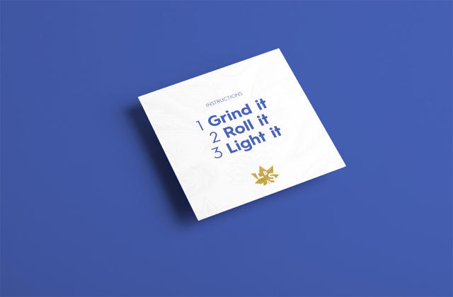
For Leafs by Snoop's Flower product — the buds — Pentagram solved this issue with a white, minimalist lid that drops down over the box. The only thing printed on the outer lid is the gold 'Leafs by Snoop' logo, the name of the flavor, and a few other snippets of text. The lid can handle all of the mandated legalese by way of stickers, while giving a peek beneath the skirts at the colorful, California cool texture of the box underneath. According to Obermann, it was designed so opening a box of Flower had almost the feel of unboxing an Apple product: a luxurious, high-end event unto itself. Inside is a card containing a quote from Snoop Dogg ("Smoke weed everyday!"), some instructions, and a resealable bottle of pot with a child-safe cap.

The edibles — Oberman says they can't call them candies by law — had to be similarly sensitive to the legal requirements of selling cannabis. They're called "Dogg Treats," and they come in a unrippable Tyvek paper—a resealable, child-proof package that carries all the hallmarks of the Leafs by Snoop identity: the faceted logo, the California cool, and text printed in Hurme Geometric No. 1, a versatile sans-serif.

In a project of this kind, the most critical stage of the design process is testing. For Leafs by Snoop, Oberman was put into the position of having to sample round upon round of the product, sometimes with the Dogg himself. "I'm a lightweight," Oberman admits, "so I had to be careful. The hardest product to test was the edibles, because they're so much stronger. So they actually made low dose versions of everything, just for the tasting. I'm a lucky designer that this is part of my job!"

You can can find more info on where to find Leafs by Snoop here.

Infographic: The Color Wheel Of Book And Movie Titles

$
0
0

Dorothy, the British makers of all things infographic, are back with a couple of new prints that explore the vast spectrum of color mentioned in book and film titles.

The first print, The Colour of Books, shows the spine of more than 300 books, color-coded in a pinwheel against a gold background. The conceit is that all these books have colors in the titles: Charles Dickens'David Copperfield, The Grapes of Wrath by John Steinbeck, Blood Meridian by Cormac McCarthy, A Clockwork Orange by Anthony Burgess, and so on. You'll also find Fifty Shades Of Grey by E.L. James on the wheel, even though "no one in the studio is actually admitting to having read it," quips Dorothy.

The Colour of Cinema poster takes a similar approach to Technicolor movie titles. Featuring over 400 films with a color in their title, it includes Black Swan, Silver Linings Playbook, The Man With A Golden Arm, Moulin Rouge, Pretty in Pink, and more.

Dorothy makes other Colour Wheels, exploring the chromatic spectrum of music and song titles. All are available for $45 per print from Dorothy's shop here.

How The New Republic's Redesign Is Chasing Millennials

$
0
0

One hundred and one years old this month, The New Republic is probably America's oldest liberal political magazine. But its readers are younger than ever. While the vast majority of The New Republic's print readers have been historically over 55, 60% of TNR's online audience is between the ages of 18 and 44, and more than half of them visit the site exclusively on smartphones.

Now, TNR is launching a major redesign. Spare, fast, and mobile-first, it is the website's first major redo since Chris Hughes, the co-founder of Facebook, purchased a majority share in the company in 2012, with the aim of transforming the old magazine into a vertically integrated digital media company, a move which saw 10 long-time writers quit in protest.

Given the magazine's demographic shift, it's no surprise that TNR is chasing millennials with this update. "We've historically appealed to a pretty traditional demographic, but we're now making a concerted effort to reach out to a much younger and diverse group of people: insurgent thinkers who are suspicious of the status quo, and care about the way the world works," Hughes says. "And the data says those people are more likely to read our site on mobile phones." But will the new redesign reach them?

Putting Content Front And Center

The old design was fine—pretty typical of politics sites, complete with sidebars, banner ads, and a homepage that was just a grid of stories. That's all gone with the new design. There are no sidebars and almost no ads. There aren't even really any navigation elements: they've all been hidden away in a hamburger menu. (More on that in a second.) Regardless of what device you're reading TNR on, pretty much the only thing you see is content. "Whether the story is a long-form reported piece, or a post about Jeb Bush and his Vines, the goal was to put the content front and center," says editor-in-chief Gabriel Snyder, who helped drive the internal redesign.

The old site was also slow. The new site is much faster. Even on slow connections, the new site opens in just a few seconds. That's important, because on mobile, the longer a page takes to load, the more likely a reader is to move on and not come back. Part of the speed bump comes from abandoning Drupal, TNR's previous content management system, with something custom. "Mobile page article on Drupal was in the realm of 30 seconds," says Elliott Pierce, chief product officer who oversaw the nuts-and-bolts of the redesign. "No one waits that long for content in this day and age."

Fresh Type

With so much of TNR's new look being made up of text, typography is an important aspect of the redesign. TNR decided to bring in a couple of the typefaces the magazine currently uses in print. The headlines and body copy are Lava by Peter Bil'ak, an elegant serif-based typeface that was designed in 2013 to bridge the divide between digital and print publishing. Navigation, subheds, and other text will be handled by Tal Leming's Balto, a contemporary version of a classic American Gothic sans serif that balances Lava nicely.

New Navigation

As for navigation: Hamburger menus are often cited as one of the worst modern UI elements, a "throw up your hands and give up" approach to designing a workable navigation system on mobile. (Here's a good overview on why hamburger menus are falling out of favor.) Pearce says they're aware of the criticism, but thinks most website navigation systems are pretty superfluous. "I think it's like a table of contents in a book: most people just jump in and read," he says. That's why TNR's redesign introduces readers to new content through infinite scroll. When you reach the bottom of an article, it automatically loads the most popular article, then a sponsored content article, and then the rest of TNR's content in reverse chronological order. In other words, it'll work a little more like Facebook's News feed, or other social media streams millennials are familiar with.

Asked what the metrics of success will be for the new TNR, Snyder is blunt. Although TNR reaches about seven million people a month across thenewrepublic.com, Facebook and Twitter, "we're still not doing as well as we'd like in regards to visitors," he says. By focusing on speed and content, in both design and editorial, TNR hopes to catch up with a younger, more tech-savvy readership, Chris Hughes'"insurgent thinkers" armed with smartphones. "In many ways, the kind of issues we have always written about at The New Republic are more in the zeitgeist than ever," he says. "On the other end of this redesign, our hope is that our technology will reflect not only this new demographic, but a new sensibility for TNR as a whole."

That said, the new design isn't going to melt anyone's faces off. In the sake of keeping up with the fastest audience around, mobile-first millennials, it's as streamlined, stripped back, and frankly unadventurous as it can possibly be. Time will have to tell if that kind of strategy can help grow The New Republic's readership.


Eucopia: A Birchbox For European Design

$
0
0

What makes European design so distinctive? "The way it brings beauty to everyday living," Jason Toon founder of Eucopia, says. "European design has beauty, function, and simplicity, all together in a really essential way. It has a tendency to reduce everyday things to their most beautiful essence."

It seems like the crazy opposite of Toon's previous venture, the wacky daily deals site Woot.com, where he was lead writer. But Toon has always loved European design, and he's spreading that love with his next big venture, a Birchbox-like subscription box for monthly deliveries of the best home living the continent has to offer.

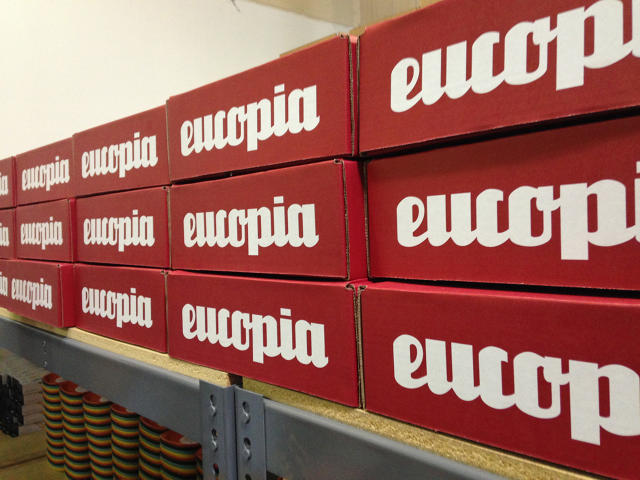
Toon didn't want me to write about his company without receiving the first box, which comes with a giant carrier pigeon wearing a beret printed on it. Here's what was in it. (Toon seems very concerned about "spoilers" for current subscribers who haven't yet received their boxes, so if you're one of those, look away.)

  • The Magisso Cake Server, a slithering cake slicer by Finnish designers Laura Bougdanos and Vesa Jääskö which creates perfectly shaped wedges of cakes and pies in a whimsical and seemingly asymmetrical way. If M.C. Escher made cake cutters, this is what he'd make. It won a 2010 Red Dot Award.
  • Four brightly colored Ekobo's Biobu Gusto plates. It's hard to put into words how nice these sustainable, brightly colored plates feel in your hand, especially considering the fact they're all dishwasher safe. Easily my favorite object in the box.
  • A jar of Rose Hip Jam by Podravaka, a Croatian condiment and spread maker in Croatia. Americans don't really know what rose hips are, which is pretty much why Toon put them in his first Eucopia box. "In Eastern Europe, rose hips are pretty much ubiquitous," he says. He wants to educate Americans on just how widespread this seemingly obscure fruit is.
  • Two Happy Hippos, from Italian confectioner Kinder. They are hippopotamus-shaped vanilla cookies filled with hazelnut cream, from the makers of Kinder Eggs, which have been illegal in this country (because of their embedded toy surprises) since 1938. Happy Hippos might be the next best thing. (And I actually like them more!)

It was a surprisingly decent first haul, but Toon says he hopes to do better. "This box was put together under a little bit of duress," he admits. Future Eucopia boxes will include more handmade and custom-designed items. But the most important thing to Toon was to get Eucopia boxes in the mail as soon as his Indiegogo successfully finished.

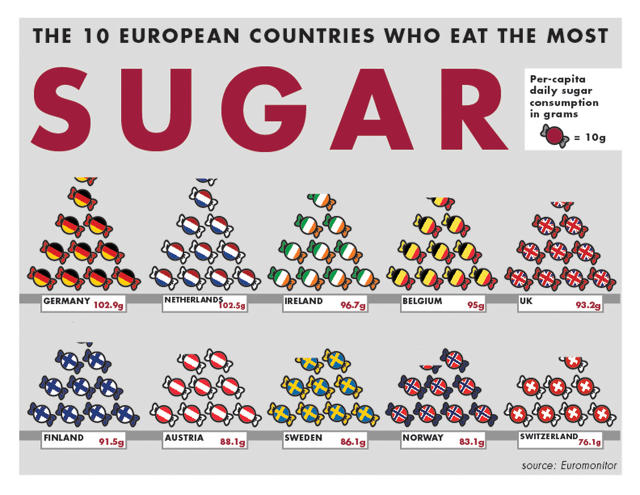
Eucopia isn't all about getting a random box of designer stuff in the mail every month. An equally critical aspect of the company is the pack-in magazine, which is dedicated to the day-to-day loveliness of European living. The first issue has several articles on rose hips, including a crepe recipe; a two-page infographic about European sugar consumption; an interview with a Magisso designer; and an editorial advocating for making the Kinder Surprise Egg legal in the United States.

Toon's business model draws inspiration from Woot.com. "What made Woot work in the early days was this combo of audience, business model, and voice, all perfectly working together," Toon says. "But when Amazon bought them, they just treated it like conventional retail with a wacky voice." That's why he's spending so much time on the narrative and personality of Eucopia. He wants to translate Woot's success to another type of business entirely: the subscription-box service.

Doable? Toon is not entirely sure. Initial feedback has been good, but growth with subscription boxes comes from word-of-mouth. Now that the first box is in the mail, it's a bit of a waiting game. But Toon thinks the market is there. "I'm making Eucopia for people like me: people who are fairly well-traveled, but would travel more if they could," he says. "So if you can't go to Europe several times a year, Europe can come to you, giving you a little whiff of that sense of discovery and style that comes when you visit the continent."

You can sign up for the service at the official site here. $49 will get you a shipment of between three and five design items a month, while Eucopia Mini, a shipment of one item per month, will start at $15.

MIT's 2,000-Pound Megalith Can Be Moved With A Fingertip

$
0
0

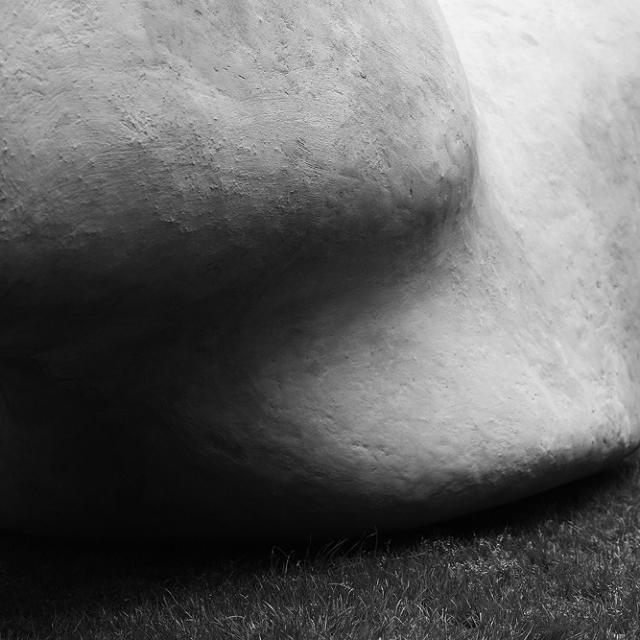
Last spring, MIT teaching assistant Carrie Lee McKnelly lost both her parents to a fire. As a tribute, her design students gathered on the university's front lawn to erect a 2,000-pound concrete sculpture that, astonishingly, can move with the flick of a finger.

The sculpture was called the McKnelly Megalith, and it was both a memorial to McKnelly's parents and an experiment aimed at showing how one of the greatest architectural wonders of the world was constructed: the Moai of Rapa Nui, or Easter Island.

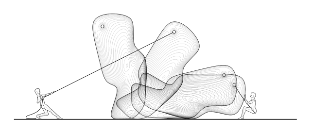
Carved starting around 1100 A.D., the Moai of Easter Island weigh up to 82 tons apiece and are believed to honor ancient ancestors. People have long wondered how the natives of Papa Nui managed to move the massive stone carvings across the island from the volcanic quarry in which they were carved without modern machinery. When asked by the Dutch explorers, who discovered the island, how the statues were moved, the Rapa Nui natives always said the same thing: They don't move the stones. The Moai walk themselves. But for centuries, this explanation was considered superstitious poppycock. It's only now becoming generally accepted that the Rapa Nui were telling the truth: Thanks to an assortment of clever ropes, the Moai truly did "walk" from the quarries to their final positions.

The McKnelly Megalith is MIT's way of exploring the methods and math behind the Moai—built as part of the Megalithic Robotics class taught by Brandon Clifford of Matter Design. Yet Clifford's class never set out to make an actual megalith. They merely set out to understand how they were designed. At the beginning of the semester, students were each tasked with finding a precedent or theory on how megalithic structures were moved, be it human power alone, or a very simple machine. They would then take these principles, and produce their own "miniliths" made out of concrete and no larger than 24 inches.

"Generally speaking, in architecture, we're taught to make things that don't move," Clifford says. With megaliths, though, the goal is to design an object which can be precisely shimmied or rolled through calibrated motions to its final resting place. The trick is to identify the center of mass of the medium you're working with. Think of it like a much bigger version of one of those bird toys that balance on the tip of your fingers. Its center of mass is positioned in just such a way that it can easily be spun with a minimum of force.

Nearing the end of the semester, the class had compiled a pretty extensive compendium of techniques that can be used to create man-movable megaliths. But the class only decided to make a megalith themselves when tragedy struck. The death of McKnelly's parents "struck a chord," Clifford says. "Before that, we had no intention of making a larger megalith." Since megalithic architecture tends to commemorate departed ancestors, the class decided to honor the memory of the McKnellies with a megalith of their own.

Students constructed the McKnelly Megalith over the course of a couple weeks. It's made of fiberglass-reinforced concrete with a soft foam core to help prevent it from sinking into MIT's lush grass. At 2,000 pounds, it's not nearly as heavy as a Moai, but it's still heavy enough to validate the Megalith Robotics class's methods.

So over the course of a May afternoon earlier this year, the McKnelly Megalith was moved into place the same way as the Moai were, wobbled into place by a small team of workers at a rate of about 300 feet per hour, then hoisted upright with a rope. The McKnelly Megalith even looks like a post-modern Moai, although Clifford says this anthropomorphic aspect of the sculpture was accidental: the McKnelly Megalith's eye is really just a convenient place to tie a knot for its ultimate hoisting.

As for Clifford, he says the experience of teaching this class has been a profound one for him as an architect. "Going into it, I had a fair amount of skepticism if we should design multi-ton objects to move. But coming out the other side, I'm positive it will impact the way I think about architecture from now on." Say what you want about the Rapa Nui's belief that stone had life of its own, Clifford says, "but treating stone as alive allows for so many different potentials, whether you believe it's literally true or not."

This App Lets You Control Your Smartphone By Drawing

$
0
0

Long before we started swiping and tapping on touch screens, mouse gestures were touted as the humanist way of interacting with our computers. Simple patterns you traced on screen by holding a mouse button in order to perform a shortcut, companies like Opera spent a lot of effort trying to make mouse gestures happen, but it never did, mostly because clicking a button or swiping on a trackpad is always going to be a quicker way to do something on a PC than memorizing and executing an obscure command glyph.

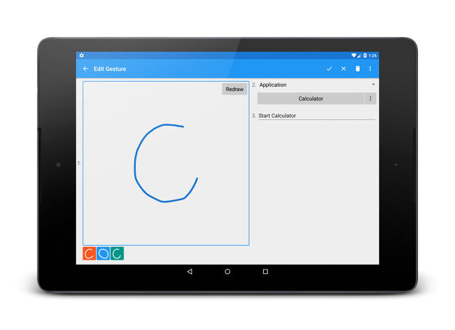
But while mouse gestures make little sense on the PC, it turns out they're a natural fit on touch-screen devices. ClearView Gestures is an Android app that allows you to launch apps and other system shortcuts just by drawing a symbol on the screen. And I've got to admit, it's such a natural way to interact with a touch screen, I'm sort of amazed it isn't built right into more mobile operating systems.

In ClearView Gestures first asks you to create the gestures by drawing the shape with your finger, and then can link that gesture to an app, task, or shortcut. By tapping the overlaid ClearView Gestures icon—or, in the Pro version, dragging from the side—and tracing it on the screen, you can call up these gestures at any time. A couple of examples include launching Netflix by drawing a N, calling your significant other by tracing a heart, shutting Wi-Fi on and off by drawing a circle around a W, and so on.

It's simple, but it really does highlight just how much mouse gestures were a UI innovation ahead of their time. Because it's cumbersome and longer to draw precise shapes with a mouse, you might as well just click a UI button to do the same task. But on mobile operating systems, drawing shapes with your finger is easy. And in a world where designers are always struggling to optimize screen real estate, physical gestures like this could be a suitable way of offloading UI buttons.

On a systems level, too, gestures are just a natural way of multitasking. All mobile operating systems have struggled to find an intuitive way to allow users to move non-linearly between apps, but the truth is, it's still an unsolved problem: whether you're on iOS, Android, or Windows Mobile, the easiest way to move from one app to another is still to go to the home screen first, hunt around for the icon, and tap it. But with gestures, you can just jump between apps directly. It's such an obvious solution that it's a wonder the likes of Google and Apple haven't latched onto it.

Unfortunately, Clearview Gestures is only available on Android. iOS just doesn't give apps the tools necessary to make this work. If you've got an Android device, though, ClearView Gestures is available as a free download here.

The World's Lightest Folding Bike

$
0
0

The weird thing about most foldable bikes is that even though they're designed to collapse, they tend to be pretty heavy. That's because they need to be sturdy enough to handle a rider's weight in an unconventional form factor. So most foldable bikes end up being heavier than normal bikes of the same price, even as they are supposedly more convenient to haul around.

A little silly, right? As urban populations swell and more and more people cycle to work, the need for small, portable bikes is perhaps greater than ever. Just try squeezing a cargo bike onto the subway at rush hour.

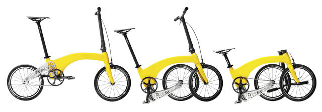
The Hummingbird Bike Company's folding bike weighs only 14.5 pounds, about as light as most light racing bikes (and about what a watermelon weighs). According to the company, it's nearly 7 pounds lighter than even the lightest folding bike on the market—"the world's lightest folding bike."

The frame is composed of carbon fiber, which is much, much, much stronger than steel or even aluminum, and absorbs more vibrations, making for a smoother ride. It is also quite expensive: the Hummingbird starts at around $1,500.

The Hummingbird also solves a second design problem. With many collapsing bikes, the chain loosens upon folding, so you have to re-adjust it when you open the bike again. The Hummingbird gets around that by having the back wheel and handlebars of the bike fold underneath the frame, so the chain stays tense throughout the fold.

The Hummingbird is now available on Kickstarter for pre-sale, in red, yellow, black, and pure carbon fiber here.

A Lethal Weapon Designed By A Computer

$
0
0

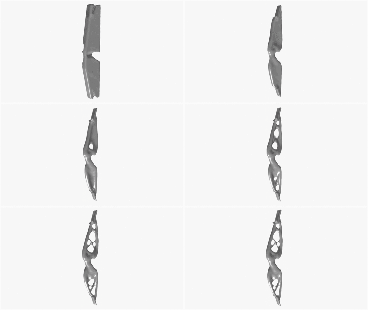
Humans have been building bows for thousands of years—there's some evidence that they go back 70,000 years—but can computers design one? That's the question amateur archer John Briscella of the Brooklyn-based Aminimal Studio recently asked. The result of his exploration is the Optimal Bow, an aluminum arrow shooter designed algorithmically.

Meant as a tribute to archery, art, and technology all at once, the Optimal Bow was created by first scanning an existing bow into a computer. Briscella then taught Autodesk's Dreamcatcher software what the weapon's major points of interest are: where a bow is held, where the arrow sits, how much force the bow needs to be able to withstand, and so on. Dreamcatcher was then told to make the optimal bow out of aluminum, using the inputted design specifications.

This is generative design. Generative design allows software to automate many aspects of the design process, so instead of just entering a bunch of points into a CAD model, you set specifications and limits, and let the computer work out the details. Generative design is relatively a new field for art and design, but Briscella says it fascinates him because he's able to explore challenging concepts. "Can code have creativity?" Briscella says. "How can humans co-design with machines? And what level of robotic craftsmanship can be achieved? It may seem like science fiction, but it is real."

According to Briscella, archery has long been something he turns to in the design process to relax and focus. He never thought about actually designing a bow, though, until he was brought to San Francisco as Autodesk's artist-in-residence. During his time there, he would go to the Golden Gate park's outdoor range to shoot, when one day it hit him that he should make his own bow. Once he teamed up with Dreamcatcher, the project went swiftly. "The software was at an earlier stage so there was a lot of back and forth. The Optimal bow [helped] the team push the software further, and now they have even tried their hands at archery!"

Although the finished product is called the Optimal Bow, it isn't necessarily better than a regular bow, Briscella says. "I can't say it's superior to any bow yet, except maybe the first bow ever made," he says. But he hopes that generative design can eventually have a major impact on the sport. Briscella is currently talking to world champion archers and Olympic-quality bowmakers to leverage generative design to create the next-generation of bow.

This GIF Keyboard Gets Right What The Others Do Oh-So-Wrong

$
0
0

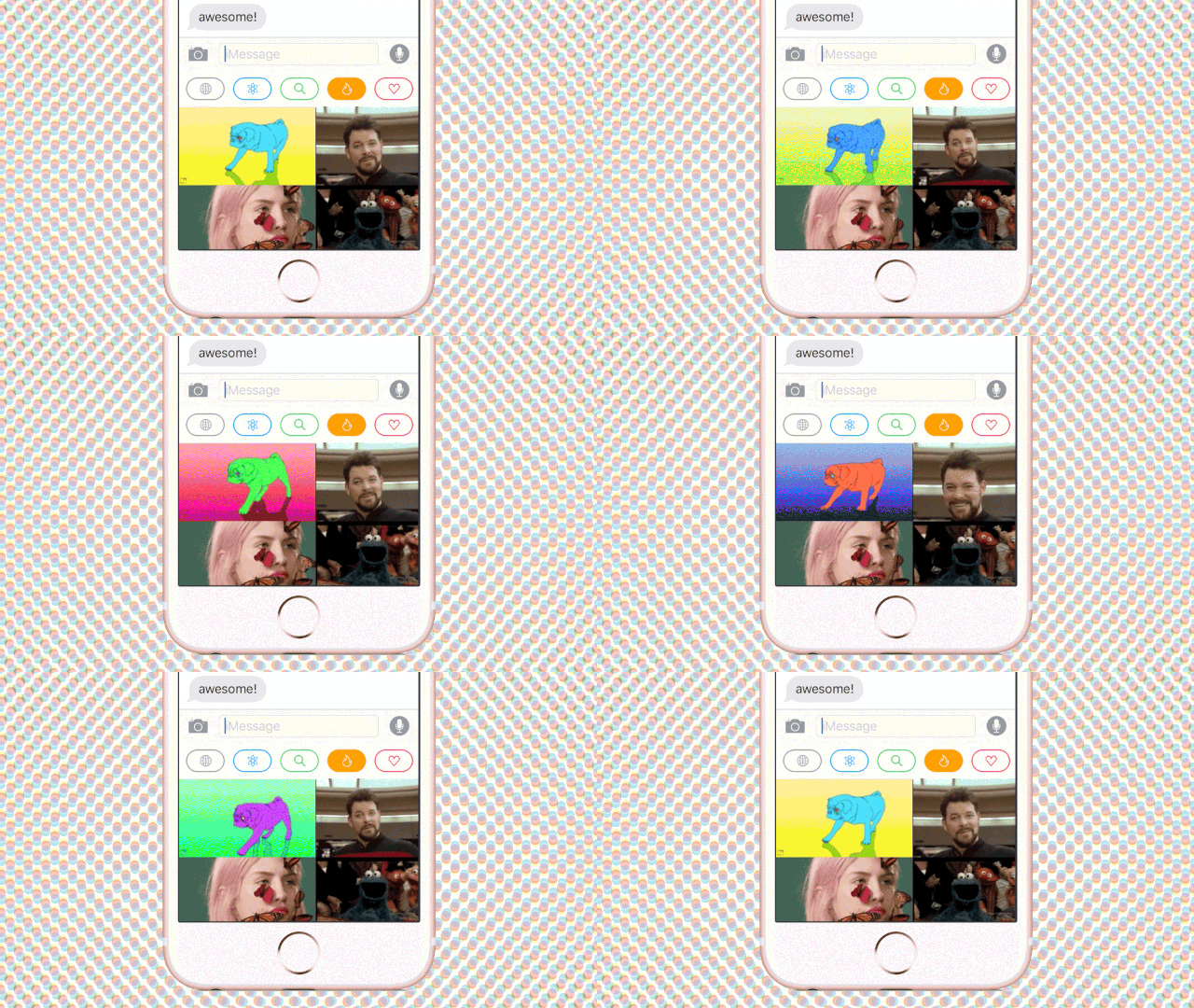
GIF keyboards are a rising force when it comes to App Store popularity. We've written about at least one in the past. So Giffage can't claim to be the first, second, or even twelfth GIF keyboard on iOS. But thanks to an excellent UI, and the pain-free ability to make your own GIFs, Giffage might just be the best.

Like other iOS keyboards, Giffage comes in two parts. First, there's a regular app, which you download from the App Store. Open it up, and all you see is an infinitely scrollable wall of trending GIFs. Swipe down and you bring up a navigation menu, where you can switch between search, GIFs categories, trending GIFs, or hearted GIFs. Tap on a GIF, and three buttons let you copy it to your clipboard, heart it, or send it shooting off to another Facebook app.

But it's the app's keyboard extension that really sets Giffage apart. Most keyboards—especially image-based ones like Giffage— have a lot of problems in iOS because they need to plug into the operating system's existing keyboard infrastructure, which was never really meant to be modular. That means they tend to feel sluggish, because iOS wasn't programmed to play a dozen GIFs at a time in the pane of the default UI dedicated to the keyboard. And because this pane is only about the third of the size of a normal app screen, it tends to be cluttered.

But Giffage manages to side step these normal pitfalls. For one, the infinitely scrolling pane of GIFs in the Giffage keyboard is devoid of lagginess (something which plagues its competitors). Giffage even managed to streamline the entire UI—and not just one aspect—of their app into this small sliver of screen. Within the iOS keyboard, you can do everything you can do in the app proper, except in some cases, it's even easier. The keyboard heavily utilizes tapping shortcuts to make it easy to copy GIFs to the keyboard (single press to copy it, double press to paste it as a link) or favorite them (long press for heart).

One feature which doesn't manage to fit into the keyboard is the GIF maker. But it's great. It's sort of like making a Vine, but for GIFs. Just load up the app, hit the camera button, and tap to record whatever's in front of your iPhone's camera. The app will then record about six seconds worth of GIF, which you can then drop some meme-worthy text on top of. Then it automatically gets saved to your favorites. It's just totally seamless, like a lot of Giffage.

Ultimately, Giffage doesn't offer much that any of the other apps don't. But the truth is it didn't have to. It just had to do everything else really, really well. You can download Giffage for iOS from the App Store here.

The Cuddliest Blanket Ever Has 3-Inch-Thick Stitches

$
0
0

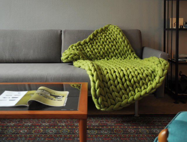
Ukranian designer Anna Marienko has been featured on Co.Design before for her beard growing calendar and visualizations of sound waves. Her latest project, though, is her snuggliest yet: the Ohhio, a blanket made out of soft Merino wool that is so chunky, it needs to be woven by hand, without needles.

The Ohhio is kind of like those wool scarves with fat stitches that are de rigeur right now, except blown up to blanket size. Each stitch is 3 inches thick, and the blankets come in three sizes: a small 32-inch-by-48-inch blanket, a medium measuring 40 inches by 60 inches, and a large blanket that is 55 inches by 70 inches, large enough to wrap up an entire family. Colors include gray, yellow, dark gray, green, blue, white, and pink, while prices from $204 for a small blanket to $420 for a large one.

Maybe it's just the prospect of another cold East Coast winter approaching, but I wish I were buried under one of these blankets right now. Sadly, while the Ohhio is now available for pre-order on Kickstarter, it won't ship until April of next year, meaning those of us in the Northern Hemisphere will have to wait until late 2016 to cuddle up under one in the dead of winter.


Genius System Uses Magnets To Keep Your Clothes Perfectly Folded In Cramped Closets

$
0
0

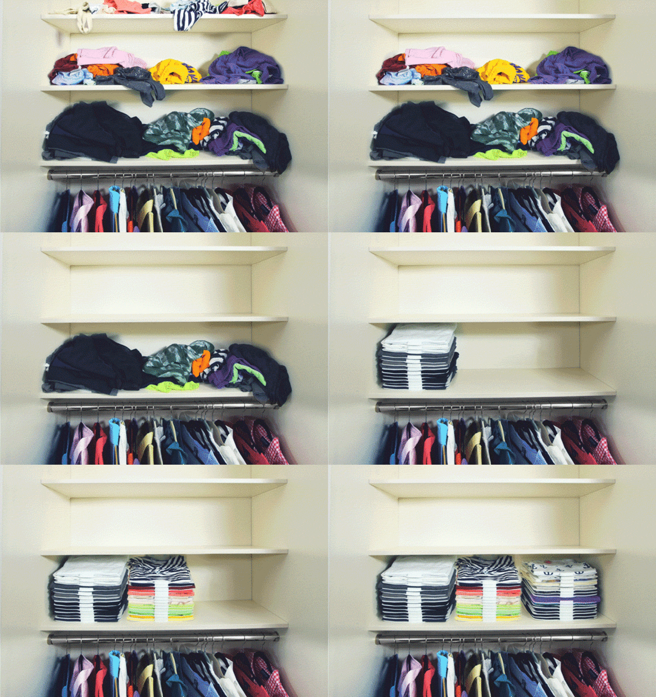
We all like the idea of folding clothes. Maybe we even do it, from time to time. But let's face it: less of us than we want to admit fold clothes properly, and even fewer of us can manage to keep our clothes folded for long. Now on Kickstarter, ThreadStax is a genius system for keeping your clothes properly folded and organized, using magnets of all things. It comes in three distinct parts: a folding board, a series of brackets, and some magnetic slides.

First, the folder. You just put an item of clothing in the center of the folder, then swing its panels closed to fold your duds up to retail standard, complete with properly aligned, straight-edged creases. After your clothes are properly folded, that's where the other parts of the ThreadStax system come in.

The heart of the system is a collection of individual slides which separate your clothes from one another. In combination with an innovative bracketing system, the problem the ThreadStax slides are trying to solve is that thing that happens all too often: you try to pull out just one shirt or pair of pants from the middle of a folded stack, only to unfold the rest of them in the process. The slides keep your clothes separated from each other in the stack, thanks to load bearing spacers, while a magnetic edge lets you easily snap them in and out of a bracket system which uses 3M Command strips to adhere to any surface.

According to inventor Scott Mosmach, the idea for ThreadStax came to him after finding it impossible to keep clothes organized in his tiny condo. "I created ThreadStax to fulfill my own need after purchasing my 500-square-foot condo. It only had a coat closet and a few awkwardly spaced shelves. I needed a solution that would allow me to stack as high as my shelves allowed without my clothes becoming a clumpy wrecked mess after a few days."

After conducting a poll of about 300 people, he found out he wasn't alone: 53% reported having clean clothes cluttering their homes, and 90% stated they felt unmotivated to organize their wardrobe in the first place because clothes never stay organized for long. If that sounds like you—and it definitely sounds like me—you can preorder a ThreadStax system starting at just $30.

The Better Alternative To Google Cardboard Is A VR iPhone Case

$
0
0

Last week, the New York Times sent out approximately one million Google Cardboard units to Sunday subscribers, giving many people their first taste of virtual reality. But while Cardboard is an ingenious solution to turning your smartphone into a VR headset, it's a pretty clunky one too, requiring you to carry around a big foldable box with you whenever you want to slip into digital worlds. Figment is a new case for the iPhone 6/6s/Plus that builds a Google Cardboard style VR viewer right in.

Google Cardboard is essentially just a container for a couple of 45mm focal length lenses a certain distance from a smartphone screen showing dynamic, stereoscopic content. When viewed through those lenses, the smartphone screen appears to be 3-D. Figment does the same thing, but builds those lenses right into the case. When you want to look at some VR content, you just hit a button to pop the lenses out of the case, and swing them around in front of the screen. When you're not using the lenses, just fold them away, or use them as a kickstand.

The best part of Figment VR is it works with all the existing apps that are compatible with Google Cardboard, so it already has a rather extensive library. And while it costs more than Google's box of cardboard, it's surprisingly cheap: early bird supporters of the Figment VR Kickstarter can get one for just $50.

Of course, the debate continues to rage whether or not Google Cardboard's 360-degree videos qualify as VR or not. But until Oculus figures out how to shrink their technology down to your smartphone, Cardboard-style VR is probably the closest thing you'll find on mobile, and Figment could be the most elegant way to experience it.

The Bacteria of NYC's Subway Turned Into Art

$
0
0

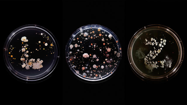
Ever wonder what germs are really growing on those subway poles? Brooklyn-based artist Craig Ward decided to find out. After riding all 22 of New York's subway lines, he collected bacterial samples from each train's handrails and turned them into colorful Petri-dish art.

Last April, Ward started riding New York's subway lines, swabbing away at the seats and chrome poles with a bag of sterile sponges, cut into the shape of the letters and numbers of the train he was on. "As soon as you start taking out scientific equipment and Petri dishes, people did start to look a bit," he says. "But no one really challenged me. You can get away with most things on the subway."

Once back in his studio, Ward used Petri dishes full of triptych soy agar jelly to grow the bacteria into samples. He then photographed the resulting colonies, lighting them according to the color scheme of the line the samples were taken from: the 7 train in violet, the G in green, and so on.

Where did such a strange idea come from? Ward can't remember, precisely. "I feel like recounting the genesis of an idea is a lot like trying to recount a car crash: it all happens very quickly and you can't remember chunks of it," he says. Regardless, it turns out that the MTA is absolutely swarming with some pretty foul micro organisms. In his samples, Ward found E. coli, serratia marcescens (the leading cause of hospital-acquired infections), proteus mirabilis (which causes kidney stones), and salmonella.

But Ward doesn't think anyone should be creeped out. "When you look at your fellow commuters you see all kinds of shapes, sizes, and colors, and when you look at things on a microbial level, you see the same kind of variety," he says. "Some of them even look like little universes, and I think there is a beauty in them, even though they might at first appear a little jarring."

You can pre-order prints of Ward's Subvisual Subway here.

Silly DIY Tools For Urban MacGyvers

$
0
0

Form Us With Love might be our favorite Swedish design house: talented enough to get away with selling $29,000 Nightlights, yet approachable enough to design the perfect all-purpose chair for Ikea. The designers have great sense of humor, too, best exemplified by their latest product: a series of makeshift tools crafted from common household objects and a roll of electrical tape.

Form Us With Love "designed"DIY Tools for the latest issue of the German magazine Süddeutsche Zeitung, which asked a bunch of European firms to come up with makeshift DIY designs for home living. Using tape as a clamp, Form Us With Love responded to the prompt with tongue planted firmly in cheek. The tools include a hammer, a screwdriver, a scoop, a pair of tongs, and a drill, but they all look like they were put together by some lazy amateur MacGyver. The hammer, for example, is just a rock taped to a spoon, while the tongs are a couple of butter knives taped together.

Useful? Well-designed? Probably not. But I'm tempted to put together the spoon hammer, just so when people see it in my toolbox, I can say it was designed by one of Europe's premier design firms. You can download the instructions here.

Do Neural Networks Dream Of Electric Cats? They Do Now.

$
0
0

Google's Deep Dream neural network tends to hallucinate in dog faces, because the database it trained on had a disproportionately high number of dogs pictures in it. But what if that database had been full of cats instead? You'd end up with something like this: a neural network that can dream about an infinite number of imaginary felines.

The Cat Generator is a coding experiment by Alexander Jung, which uses neural network analysis on a data image set to randomly generate images of individual cats from the ditital ether. The resulting cats look a little weird close-up, but as thumbnails, these all look like real kitties of varying breeds, color, and manginess.

An excellent start. Of course, the ultimate goal for a project like this should be to give the computer access to the Impact font and randomly generate LOLCats forever. Make it happen, Mr. Jung!

[via Prosthetic Knowledge]

Viewing all 2811 articles
Browse latest View live