Quantcast
Channel: Fast Company
Viewing all 2811 articles
Browse latest View live

Inside Ikea's Innovation Lab For The Future Of Better Living

$
0
0

Ikea usually keeps a close lid on what it is working on next. But with Space10, an innovation lab recently opened in Copenhagen's hip meatpacking district, Ikea is looking to change all that. The Swedish furniture giant is throwing the doors wide open to progressive thinkers who want to help solve the next couple decades' biggest home design problems, all on Ikea's dime.

Located in a fishery building redeveloped by architecture studio Spacon & X in Scandinavia's arguable design capital, Space10 almost feels like Ikea's answer to the artist-in-residence programs you see at companies like Autodesk and Microsoft, but with a typically Scandinavian twist: it's independent of Ikea. Although Ikea foots the bill for Space10, and gets a first look at all the concepts that come out of it, the day-to-day operations are handled by Rebel Agency, a small Danish design firm founded by Carla Cammilla Hjort. It's not just good marketing, it's a way for Ikea to get an early look at bold new ideas that might eventually disrupt their business—and possibly bring them to market first.

The seeds for Space10 were planted three years ago, when Rebel Agency helped Ikea design the Bråkig furniture collection. The collection sold so well that Ikea's CEO invited Hjort and her colleague Simon Caspersen in for a six-hour meeting to pitch him what they wanted to do next. "Instead of just creating a better future for Ikea, our starting point was asking how Ikea could help create a better future for the world," Caspersen says. "So what we suggested was, let's get rid of the whole client-agency model, have Ikea pay the basic fees and costs of running a space, and then devote ourselves to looking 10 or 20 years down the pipeline, and how Ikea can be relevant in that world."
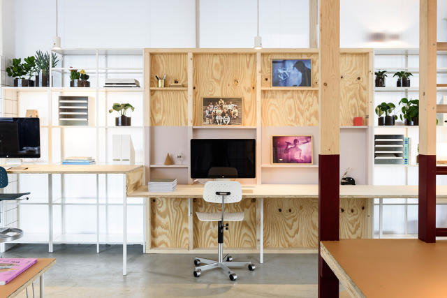
The mission of Space10 is to investigate the future of urban living through a series of labs. Each lab lasts three months, and has a certain theme—the first is Fresh Living, a collection of projects centered around health. During each lab, a dozen or so designers from around the world are invited into Space10 to give talks, explore concepts, and prototype ideas. After two months, the doors of Space10 are thrown open to the public. For the next 30 days, the public can come in and check out the prototypes. Then Space10 rinses and repeats around a new theme, with all new designers.

Space10's first lab resulted in more than 15 prototypes. These include a kitchen table that converts surface heat (say, from a coffee pot or a pan) into electricity; a glowing faucet that encourages you to take shorter showers; a smart chair that is impossible to sit on if you've been too sedentary throughout the day; and an interactive work of art that visualizes your family's health habits.

None of these products are likely to hit Ikea's shelves anytime soon, but that's not the point, says Göran Nilsson, Ikea Concept Innovation Manager. He says that Space10 is a way for Ikea to hedge its bets and ensure that the company can successfully innovate in the future. "There's only so much innovation you can do behind closed doors," Nilssen says. "In the old days, big companies would try to innovate internally forever. But being successful long-term is all about being transparent enough to be challenged by new ideas, and inviting enough to accept them." The idea is to let outside designers work on possibly disruptive new ideas, right under their nose, with the hopes that these fresh voices and visions will help prevent Ikea's vision from going stale. Or, as Space10's Simon Caspersen puts it, "If you try to create every new idea in-house, you will eventually fail, because you can't compete with the entire world forever."


So from Ikea's perspective, Space10 is worth the expense, even if no new products immediately come out of it. Ikea's designers will still be watching, and the ideas that flow through Space10 may eventually inspire the Ikea catalog of tomorrow, if not by spring 2016, than by spring 2026. Even so, Ikea seems bullish on the notion that Space10 may pay for itself, sooner rather than later. "There could easily be more Space10s in the world soon," Nilssen says. "There's no reason to have just one."


The Morbid History Of Victorian Surgery, Beautifully Illustrated

$
0
0

If you're the type of person who gets dizzy at the sight of a little blood, you might want to stay away from Crucial Interventions. A gorgeously designed new book from Thames & Hudson, it's a head-to-toe compendium of some of the strangest, most beautiful, and downright grotesque surgical illustrations to come out of the 19th century.

Author and medical historian Richard Barnett hesitates to call Crucial Interventions a coffee table book. "Perhaps a family of serial killers might keep it on their coffee table," he laughs. Others might want to place it elsewhere, because there's some gnarly stuff in Crucial Interventions, including incredibly detailed illustrations of sliced-open eyeballs, amputated fingers, Caesarian sections, dissected tongues, and more.

Surgical saws, knives and shears for operations on bone© Wellcome Collection

Crucial Interventions tells the story of a formative era in the history of medicine. At the beginning of the century, physicians considered themselves more artists than scientists, surgeons were essentially considered tradesmen, and patients had to endure surgery wide awake—a terrifying, agonizing ordeal. But that all changed by the close of the century. Medicine was now more science than art. Surgeons were widely respected and richly rewarded for their skills. As for surgery, it was no longer a matter of last resort. Anesthesia made it cleaner, safer, and more accessible. The collected illustrations of the era tell the story of that transition better than words alone could.

Surgical anotomy of the large intestine (front view) Right: Surgical anatomy of the large intestine (rear view)© Wellcome Collection

The illustrations come from the Wellcome Collection, a London-based museum devoted to unusual medical artifacts and artwork. They were originally produced for medical textbooks and atlases to disseminate surgical knowledge. "They embody a certain a certain self-consciously rational, scientific way of looking at the human body," Barnett says. And they were made by professional draughtsmen, colorists, and engravers, all practicing their craft at a key moment in the history of publishing, when it suddenly became possible to mass-produce lithographs. "No one ever had books so crisp, colorful, and accurate before," Barnett says. Medical illustrations were the perfect way to show off the technology.

You can order a copy of Crucial Interventions online through Amazon here. Make no mistake, though. Although Crucial Interventions is a fascinating exploration of 19th century surgical techniques, an exploration of lithographic design, and a morbid coffee table book, all at once, it's not meant to be a DIY manual. "I certainly wouldn't advise a modern surgeon to follow these instructions," Barnett says.

7 Whimsical Ways To Redesign The Pencil

$
0
0

It's pretty common for teachers to task their design students with rethinking a ubiquitous object, so designers Luka Or and Keren Tomer weren't exactly going rogue when they asked their third-year industrial design class at Israel's Holon Institute of Technology to redesign the humble pencil. But what their students came up with transcends the usual half-hearted redesigns, spanning pencils that are applied like paint brushes, pencils shapes like paleolithic tools, and more.

After encouraging their students to rethink the pencil from the ground up, Or and Tomer's class presented 18 reinterpreted pencils, each with a new function, shape, or meaning. "We were looking for a short project to be able to give a good beginning to the subject of 'gift products,'" Or says. "The pencil was the best candidate: it's a very classic object with a big historical and cultural value but every student has an intimate knowledge of the object and affection toward it."

The reconceptualized pencils mostly group together in two categories: the functional and the whimsical. Seven really stand out.

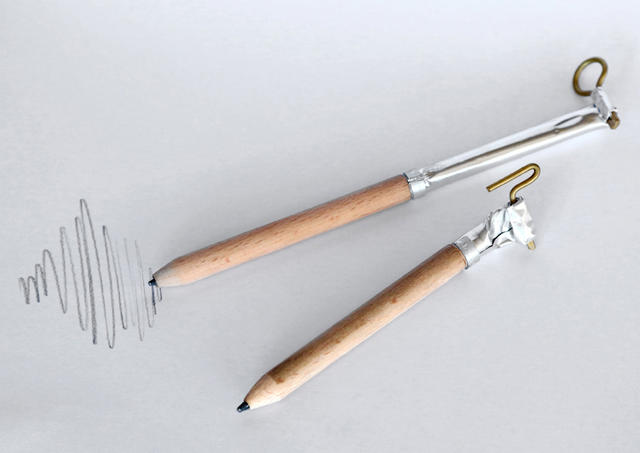
On the functional end of the spectrum, student Ofra Oberman made a series of brush pencils, which allow for a flowing, painterly sketching experience. There's also the Roller Pencil by Noy Meiri, a pencil designed for people working in fashion; it has a toothed wheel at one end that lets you mark fabric. Gal Yacobi's contribution merges a pencil together with a wax seal, allowing you to write and seal your letters with the same device. Student Yael Hasid's +- Pencils, meanwhile, reinterpret the writing and erasing ends of the pencil into separate units: a pencil with two ends that write, and a pencil with two ends that erase.

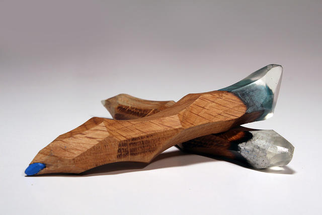
On the whimsical end, the standout is Evgeny Barkov's colorful pencils that resemble prehistoric tools: they look like they were plucked from the floor of the Chauvet Cave in southern France. There's also Yam Amir's Tube-Pencil, a pencil that you "sharpen" by squeezing the end like a tube of toothpaste. Weirdest of all is Eitan Bercovish's Fairy Pencil: a pencil designed for children writing to the Tooth Fairy (is that a thing?) that looks like a tooth snapped off at the gum line.

I want all of these in my pencil case. If only H.I.T. had them for sale in their gift shop. Hint.

This 3-D Printed Haiku Is Invisible Until You Put It In Water

$
0
0

Water striders are a family of insects that are able to transfer their body weight so they can run on top of the water's surface. Upon seeing them for the first time at the Jakkoin Temple near Kyoto, the namesakes of the Swiss design studio Drzach & Suchy were struck by the way the water striders themselves were invisible, except for the shadows cast under the water deformed by the weight of the insects' legs. With this in mind, the duo created a 3-D printed haiku that only appears when each individual word is placed in water.

"We wanted to mimic water striders and achieve a similar deformation of the water surface, yet in a controlled way, to be able to 'paint' on the water," Drzach & Suchy says. "The goal was to create a structure, a kind of net or grid with varying heights, which could float on water surface and deform it at predetermined spots: the dominant parts of the net should be touching the surface causing the shadow spots, while the others should be hanging above the surface, letting the light go through."

After choosing a haiku that fit their theme—"old pond / frog jumps in / sound of water" by Matsuo Bashō, the most famous poet of Japan's Edo period—the designers began experimenting with fishing line to see if their concept was practical. After a few tests with various materials, they produced a series of 3-D printed sheets, each of which reveals the shadow of a word when floating on water.

Although Haiku only uses this technique to spell out words, Drzach & Suchy tell me it can be used to cast any bitmap image in water shadows. The next step for the project, according to the designers? Waiting until 3-D printing techniques advance enough that it's possible to print sheets that are almost invisible to the naked eye, like the legs of a water strider.

Calculate How Fast You're Traveling Through Space Right Now

$
0
0

You might think you're not moving right now, but you couldn't be more wrong. This big blue orb known as Earth is always spinning around the sun, and even when you're sitting perfectly still, you're still hurtling through space at a faster speed than most of us could fathom.

As part of their "Since You've Been Watching" series of television spots, BBC Earth created this peach of a viz (Flash required) that explains just how fast we're careening through the void, all in real-time. Right now, the Earth is moving around the sun at around 66,487 miles per hour.

It's the equivalent of driving around the equator two and a half times in 60 minutes—but Earth is a mere Ford Pinto compared to the Lamborghini of the solar system doing laps around the Milky Way: a blistering 497,096 miles per second.

Altogether? The speed you're moving when you stand still is so fast that every 60 seconds, you're basically covering the same distance as the diameter of the planet. Turns out they call it Spaceship Earth for a reason.

[via Visual News]

Bird Flu: The Furniture Design Material Of Tomorrow?

$
0
0

Chickens give us more than just McNuggets and eggs. Their feathers are in our pillows, clothes, and furniture, while their bones can be incinerated and turned into ash to make fine china. Emilie van Spronsen's H5N8 series of designs highlights the use of chicken byproducts in both a stool and an urn. The twist? The chickens in question had the bird flu when they were killed.

The H5N8 Stool looks like it was stuffed with Big Bird. The cushion is made of infected chicken feathers floating in a transparent pillow case, made up of bio-epoxy. The result is that while the shape looks light and soft, the stool itself is actually rigid.

For the H5N8 Urn, van Spronsen cremated the bones of bird flu-ridden chickens and mixed it with clay to produce a ceramic material that could be used for 3-D printing. She then printed out the Urn, designing its shape to look like a microscopic close-up of the H5N8 virus. Inside the urn is the rest of the chicken's bone ash, which van Spronsen suggests can be used as a soil fertilizer.

According to van Spronsen, the point of her project is to raise awareness of the mass destruction of chickens infected by the H5N8 bird flu, which resulted in 150,000 birds being slaughtered in the most recent outbreak alone.

Van Spronsen says that the process of working with chickens infected by H8N8 was not dangerous, since heating the chicken to 158 degrees Fahrenheit before handling is enough to inactivate the virus. The whole project is a commentary on wastefulness and missed opportunities: even outbreaks of disease can make for good design.

[via Dezeen]

The Perfect Christmas Gift For Retro-Futurists: Ripley's Watch From "Aliens"

$
0
0

James Cameron's Aliens takes place in the year 2179, but the watch Xenomorph-slaying heroine Ellen Ripley wears in it is surprisingly retro: the Seiko Giugiaro 7A28-7000. Designed by Italian car designer Giorgetto Giugiaro in the early 1980s, the chunky timepiece is rare enough that a working model can go for as much as a $1,000 on eBay. Now Seiko is re-releasing its retro-futuristic timepiece, just in time for Aliens' 30th anniversary next year.

Photo: via Gizmodo

The Seiko Giugiaro 7A28-7000 is an odd-looking timepiece. Featuring a blocky panel and some chunky buttons on the right-side of the dial, it was the world's first watch to use an analog quartz chronograph movement, which is a fancy way of saying it's also a stopwatch that has analog hands, even though it's digital. It doesn't particularly look futuristic, but it perfectly suits Aliens military industrial sci-fi aesthetic, which is presumably why the Aliens costumer decided to strap it to Ripley's wrist.

Photo: via Gizmodo

The new Seiko X Giugiaro Spirit Smart isn't totally identical to the 7A28-7000: it's missing a crown or extra button on the left side. But it still looks like the kind of watch you'd wear during a cargo loader duel with a Xenomorph queen, and they're a lot less expensive than the originals. If you can find one. Available in limited quantities of 3,000 pieces each, the gray SCED035 and black SCED037 watches will set you back about $260 and $292, respectively.

[via A Blog To Watch, Gizmodo]

Here Are Some Pantone Bags. They Are Colorful

$
0
0

Since 2009, Pantone has been pushing millions into online marketing to turn the color company into the cult of personality it is today. And maybe now, it's paid off? Because you can now not just find your perfect bag by color. You can find it by Pantone swatch.

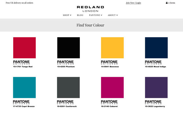
Redland London is now selling a new range of bags that exclusively uses Pantone shades for fabric dyes. You can't get every obscure swatch—let alone Pantone's oft-revolting Color of the Year—but many nice ones are there, including beeswax (14-0941), cabaret (18-2140), capri breeze (17-4735), castlerock (18-0201), loganberry (19-3622), mood indigo (19-4025), phantom (19-4205), and tango red (19-1761).

Each bag is made of a polyester blend. They come in four styles, with varying prices: a hold-all for $85, a large laptop bag for $90, a regular laptop bag for $70, and a mini backpack for $45. Sure, Pantone bags might be a bit of a hipster thing, but let's put it this way: With your Pantone code written right on the label, at least you know for certain whether your bag will clash with your outfit or not. You can order one here.

[via Gizmodo]


Tobias Frere-Jones Returns With His Most Personal Font Yet

$
0
0

Type genius Tobias Frere-Jones today released his first font since splitting with longtime creative partner Jonathan Hoefler. Mallory, an approachable sans serif designed to be used in different contexts from brand identities to packaging to body text, is Frere-Jones's most personal font yet.

The font is nearly two years in the making. Following a nasty, litigious split from Hoefler, Frere-Jones underwent something of an identity crisis last February. He had been in business with Hoefler since the 1990s. The two were the Beatles of the type world, their partnership resulting in a corpus of some 800 fonts, including Gotham, the typeface of Obama's 2008 presidential campaign. After they broke up Frere-Jones started wondering if he could design a typeface that was sort of like him. "My mother is English, and my father is American," he says. "I was interested in creating a design with the same origins as I have. Something that had the austerity and seriousness that runs through a lot of British design, while still retaining the informal quality of American design."

The typeface is called Mallory after one of the designer's two middle names (the other is Edgar). It's not just a nod to the 'tweener nature of the typeface's origins, but shows its personality off when cast in the font: the rigid geometric strokes of the "M," the thick cuffs on the "l," the tall, stout lowercase "o," or the delicate neck joining the loop of the "a" to its ascender. "Ideally, the name of a typeface when set in that typeface should be an eloquent demonstration of what it's about," Frere-Jones says.

Mallory accomplishes its mixture of Frere-Jones's English and American sides a couple ways. The austere British side is represented in the strict geometry of Mallory's capital letters, while the American side is seen mostly in the more humanist lower case characters. Putting it more simply, Mallory almost looks like it was hand-written with a Sharpie using a square and compass for guidance. Its lines feel straight, mathematically precise, except around the edges, where Mallory's personality comes into play.

This combination of forms has a practical benefit, too. "For a project of any complexity, it's common for designers to assemble a palette of typefaces together," Frere-Jones says. "Identities especially need this sort of nuance." Mallory was designed to not just be the main typeface in such identities, but to nimbly support other fonts as backup. (He says Clarendon pairs with Mallory nicely.)

Mallory is one of Frere-Jones's most ambitious typefaces to date. It's made up of 1,200 unique glyphs, and 17 different weights. It also comes in a version called Mallory MicroPlus, a version of the typeface custom-tuned to meet the needs of designers working in low-resolution or small size environments. Think of a font that would look just as good on the Apple Watch as it would in a tiny print footnote: to be more readable, Mallory MicroPlus spreads out the spacing between the letters, widens apertures, and blows up the x-heights.

Ultimately, Frere-Jones says he sees Mallory as being a suitable typeface in almost any context, including identities, packaging, publishing, and more. It's a good thing, too. As the first typeface available from his new company, Frere-Jones Type, Mallory is likely to account for a big portion of the business he drums up over the next year. It is available for license today here.

See The Radio Waves Pulsing Around You With This iPhone App

$
0
0

Architecture of Radio, the experimental app by Richard Vijgen that lets you "see" Wi-Fi signals, satellites, and other radio waves, is now available for anyone to download.

Originally presented at Germany's ZKM in Karlsruhe, Architecture of Radio is an augmented reality app that visualizes the network of radio waves that surrounds us, revealing the invisible traffic of cell towers, overhead satellites, and more as a web of radio waves in which all of us are caught. The original exhibition was hard programmed to allow you to see ZKM's Wi-Fi routers, which is absent from the iOS app version. However, by just tilting your iPhone or iPad around and looking around you, you can still see representations of the data webs that surround you.

The app uses GPS to get the user's location, then finds cell towers within reach using OpenCellID and any satellites passing overhead from NASA's JPL data. It then animates all of this information on your iPhone or iPad's screen, simulating the invisible infosphere that surrounds us all.

When we originally asked Viljegen about what inspired his app back in August, he told us that he was concerned about the fact that humans could not see or touch the networks which they most depend on. ""We cannot see the very thing that is defining our time, and that concerns me," he said "As technology is becoming more and more transparent, I think data visualization can help us to relate to things that are invisible, yet play an important role in our lives."

Architecture of Radio is available for iPhone and iPad for $2.99 here. An Android version is slated to land in early 2016.

Glorious Pop-Up Book Unfolds To Become A Working Camera

$
0
0

In the digital age, we don't usually give much thought to how cameras work. They're just another magic sensor inside of our glass rectangles. In an attempt to help us understand how cameras work, artist Kelli Anderson created This Book Is A Camera, a pop-up book that, when opened, transforms into a working analog black-and-white camera.

If you've ever made a shoebox camera as a kid, you probably already have an understanding of how simple cameras work. Essentially, you take a light-proof box, poke a small hole in the front, and insert a piece of photosensitive paper. The images that are produced aren't pretty—everything in them is equally focused, very low-resolution, and in black-and-white. Still, they give you a good appreciation of the theory of cameras: that a single beam of light contains loads of information that can be focused with a lens and frozen for posterity, as long as you can separate it from the untold trillions of other light beams.

This Book Is A Camera is a streamlined, papercraft version of the pinhole camera. But it's also a sort of infographic about cameras, explaining their physics and their parts.

According to Anderson's extensive blog post about the project, This Book Is A Camera is part of a series of projects aimed at deconstructing technology to make it relatable to lay people. "For the past few years, I've been trying to better understand forces at play in the analog world through a process of subtraction," she writes. "To do this, I've been disassembling everyday tools, stripping off their normal interface, and reducing them down to their functional minimums."

This Book Is A Camera can be purchased online here.

What If Google Glass Had Looked Like This?

$
0
0

Google Glass always looked impossibly dorky, no matter how many Vogue fashion shoots and leading fashion designers Google threw at it. That's part of the reason why the search giant discontinued Glass for consumers in January earlier this year.

What if Google Glass had been released with a different design, though? Would it have been more successful? A new patent published by the U.S. Patent and Trademark Office demonstrates a Google Glass design that could have been—and may still be?—one that is more flexible and (slightly) less intrusive. It probably wouldn't have solved Glass's fashion problem. But perhaps the next iteration of Glass won't need to.

The patent in question was originally filed in September 2012, seven months before Glass's limited launch in April 2013. Instead of the spectacles-like approach of previous models, the patent shows a variation on Glass that resembles something between a flexible head lamp and a Bluetooth earpiece. The device rests around one ear, then snakes its display in front of your eye, without any glass frames to hold it in place. The patent claims the band would be adjustable.

The design is still pretty goofy, at least in pictures. It jettisons the aspect of the design that no one was really complaining about — the glasses — while keeping the weird crystal puck hovering in front of the eye, which is the aspect of the original design that did unnerve people. So it seems unlikely this would solve the problems Google had with the way Glass was perceived outside of the tech gargoyle circuit.

But broad appeal may not be what Google's after. In July, the Wall Street Journalreported that Google had been quietly distributing a new version of Glass "aimed at businesses in industries such as health care, manufacturing and energy." The hardware resembled a wireframe-free "curved rectangle" that can attach to existing glasses, and was tested by surgeons to "get advice from colleagues remotely or to instruct medical students" and field workers "fixing expensive machinery with help from co-workers back at headquarters." There's no way to know if the patent shown here reflects an actual, forthcoming design. (Google has not responded to a request for comment.) But one thing seems certain: Google is owning its dorky DNA.

(via Mashable and WSJ)

Pantone's "Gender-Blurring" Colors Of The Year Are . . . Pink And Blue!?

$
0
0

2015 was as progressive a year for gender and trans politics as we've ever seen. It's the year Caitlyn Jenner made the cover of People, the first openly transgender person was nominated for a primetime Emmy, fashion labels went gender neutral, Will Smith's son wore a dress to his high school prom, and Miley Cyrus described herself as pansexual and gender fluid.

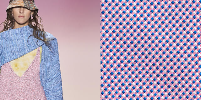
Left: BCBG Max Azria Spring 2016. Right: Thomas Pink

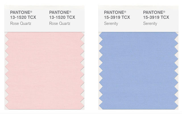
The trend going into 2016 is clear: gender is less binary than ever. So how do the color maestros over at Pantone decide to mark it? By releasing their first totally binary Colors of the Year. Meet Pantone 13-1520 TCX (Rose Quartz) and Pantone 14-3919-TCX (Serenity), which you probably know better by their street names: baby girl pink, and little boy blue. Jesus Christ, Pantone.

It's not like the folks at Pantone don't know what they're doing here. In their press release saying why they picked baby girl pink Rose Quartz and little boy blue Serenity, Leatrice Eiseman, Pantone's executive director, said (emphasis mine):

In many parts of the world we are experiencing a gender blur as it relates to fashion, which has in turn impacted color trends throughout all other areas of design. This more unilateral approach to color is coinciding with societal movements toward gender equality and fluidity, the consumers' increased comfort with using color as a form of expression which includes a generation that has less concern about being typecast or judged...

Because what better way to celebrate the breakdown of oppressive, binary gender norms than dressing everyone in pink and fucking blue, right?

Pantone

I admit, it's a nice pink and blue. They have the sort of ambiguous, desaturated hue of a couple of baby blankets that were run through the same wash with a little too much bleach. The shade of pink looks like it would be just as at home on Karim Rashid's banana hammock as it would on a tube of Strawberry Shortcake brand lip gloss. The blue, meanwhile, is not overbearingly masculine: it would look absolutely bitching on the dusky eye of your daughter's favorite Monster High character.

It's pretty obvious what Pantone's trying to get across here. In their own impossibly milquetoast way, they're trying to say it's okay for boys to wear "girl" colors, and girls to wear "boy" colors: they're all just colors. But come on, Pantone. Jaden Smith—one of the most loathsome humans in the world!—is walking around in dresses, and your big message is it's okay for boys to wear pink, and girls to wear blue? Duh. Not only do we already know that, it wasn't even progressive 100 years ago, when the gender signifying colors of boys and girls were totally reversed.

What's so frustrating about this is it's a real missed opportunity for Pantone to actually influence people's notions about gender through color. Pantone's Color of the Year schtick is influential. Every December for the last 26 years, Pantone "predicts"—and consequently helps influence—the single hue that the design world will go nuts about for the next year. Last year, it was Marsala, a color perhaps best compared to menstrual drippings that fashion editors scrabbled for the better part of a year to make happen regardless. So when Pantone says that "gender blurring" pink and blue are their Colors of the Year, what they're really saying is we're going to have to spend the next 12 months looking at Vogue spreads of women in Boo-Berry colored skirts, and men prancing around in dusty pink Dockers. It's a rote reversal of the gender politics of color that we've already seen a thousand times before.

Silly or not, Pantone picking two Colors of the Year—not just one—is a big deal. It's never been done before. Which is why it's so frustrating to see Pantone break tradition just to reinforce binary gender stereotypes. If Pantone can pick two Colors of the Year, why not more? Why not make a real statement that gender isn't just a choice between two swatches, but a spectrum? Why not make your "gender blurring" Color of the Year something that actually could further diversity: a plaid of every color, where blue and pink are just two small colors among the palette?

The Co.Design Guide To Holiday Shopping

$
0
0

Design lovers can be intimidating to shop for. Surely it'll take a king's ransom to please them. But good design is for everyone, at every price range, which is why we put together this guide. Whether you're shopping for your kid, your girlfriend, or your grandma, you'll find a thoughtfully designed gift for everyone here, priced to accommodate budgets both large and small. Happy shopping!

For the mobile photographer— A proper lens on your iPhone or Android phone can make all the difference when it comes to quality photos. Iris Lens is a series of pro-grade lenses with a clever mounting system that doesn't require custom cases. If you order one now ($109), you can have it in time for Christmas.

For couch potatoes who care about design— Designed by Samsung in collaboration with French designers Ronan and Erwan Bouroullec, the Serif HDTV feels like the television that the Eameses would choose to put in their home. The Serif TV comes in three different colors and starts around $748 for a 24-inch model—perfect for tiny apartments.

For fashionable runners— Inspired by the Northern Lights, Nike's Flash Pack line looks like you're running in a tracksuit designed by Lisa Frank. The collection of multicolored, reflective running gear helps keep runners visible in low-light conditions.

For design-minded travelers— When you're on the road, you want to spend the night in a thoughtfully designed space. Why not gift a night at Virgin's new hotel in downtown Chicago? It has a plethora of delicious design details, from to a bed cushion that doubles as a bucket seat to a built-in shower bench for shaving your legs. About $225 a night

For Italian design lovers— If you've ever wanted your apartment to look like the set of a Fellini film, the MoMA Design Store has you covered, at almost any price range. The Design Store is selling a collection of 32 fun and feisty tabletop pieces by some of Italy's design greats, encompassing everything from reissued design masterpieces to more contemporary works by the current torchbearers of the Italian design world.

For beer drinkers and booze hounds— Pint glasses tend to be uninteresting and disposable, but Sempli's Monti glasses look hewn from geodesic crystals. More of a heavy drinker? Try Areaware's drink rocks. Made from non-porous soapstone and marble, the geometric pieces ensure booze stays cold (and looks sharp while doing so). Keep 'em in the freezer until you're ready to use, and they'll remain cool as you sip away.

For stylish gamblers— Legendary designer Susan Kare created the original icons and fonts for the first Macintosh. Just as famous are her designs for the cards that shipped with Windows solitaire. Those digital designs have now been turned into a real deck of cards, thanks to Areaware. $14 a deck

For pen lovers— If you've got a design-minded writer in your life, you can't do better than Montblanc's M Fountain Pen, a space-age scribbler with a magnetic cap designed by Apple's Marc Newson. If you don't have $400, why not consider the classic Lamy Al-Star, which for $30 is one of the best introductions to the fountain pen you can find? Which you should definitely start using.

For color lovers— Redland London sells a collection of colorful bags, each dyed and branded after a different Pantone swatch. They come in four styles, with varying prices: a hold-all for $85, a large laptop bag for $90, a regular laptop bag for $70, and a mini backpack for $45. Sure, Pantone bags might be a bit of a hipster thing, but let's put it this way: With your Pantone code written right on the label, at least you know for certain whether your bag will clash with your outfit or not.

For your boss— If you're looking to suck up to your employer this year, or just want to give someone a cool executive desk toy, these ferrofluid desk toys by Kyle Haines are hypnotic. Each one contains a tiny magnetized bolt, water, and a small amount of ferrofluid, which can be manipulated using accompanying magnets. Buy it for $20.

For coffee snobs— Once you make pour-over coffee with a gooseneck kettle, you can never go back. The Stagg Pour-Over Kettle is a modern, matte black alternative to the Hario or Bonavita, with a beautiful handle design ($70). If you want something simpler, try the Duo Coffee Steeper, also by Fellow, which makes brewing a perfect pot of coffee idiotically simple, while also being a gorgeous conversation starter when not in use.

For watch lovers— Don't buy an Apple Watch this year. It's not ready for gifting. But that's not to say there aren't other watches that would make a good gift for the design lovers in your life. The Analog Watch Company sells several elegant Classic watches made out of wood, marble, and gold, that all look like they were plucked from the wrist of Jay Gatsby himself. If that's not your speed, try this watch designed by Italian car designer Giorgetto Giugiaro in the 1980s that just so happens to be the watch Ripley wore in the Aliens movies.

For lazy chefs— We don't all have time to cook a full meal on the stove at night. But there's better ways to microwave your food than just throwing in a Lean Cuisine. The M Cuisine Collection is a stackable four-piece set of microwave-safe cooking equipment, including a rice cooker, a pasta cooker, an egg poacher, an omelette bowl, and a cool-touch dish and bowl.

For artsy kids— The first thing most of us learn to do in art class is mix paints and see what new colors we can come up with. Instead of labeling each tube of paint with a name or a Pantone reference number, the Nameless Paint Set identifies each color using multicolored bullets, revealing exactly how that color would be created in a CMY printing process. Not only is it beautiful, it's cheap: $15 for a set.

For type-loving dandies— Erik Spiekermann is a legendary type designer, but did you know he also dabbles in fashion? He created an entire line of scarves and pocket squares designed to look like flamboyant graph paper you actually wear for German concept label Unamono. About $170

For indecisive home decorators— If you can't find that perfect lamp, why not design it yourself? The Alphabeta lamp by Luca Nichetto for Hem allows you to mix and match lamp modules in different shapes and colors to create billions of possible designs. Starting at $370

For jewelry aficionados— Created by MIT graduates, Floraform is a line of jewelry that uses advanced computer algorithms to organically "grow" necklace, ring, and bracelet designs inspired by jellyfish arms and iris flowers. $20 to $395

For bookworms— An insane number of giftable design books have been released this year. Here's a taste: a morbidly beautiful book on Victorian surgery, Michael Bierut's monograph collecting decades of Pentagram design, a visual time machine of 750 years of French architectural history, and a gorgeous coffee table book about graphic design in the jet age.

For audiophiles— Granted, at $6,000, this one is for you guys with trust funds, but if you're looking for the perfect gift for someone with a lot of LPs, this 100-pound cast-iron turntable by Fern & Groby is enough to make any record lover salivate.

Bridge-Building Bots And Rococo Radiators: Inside Designer Joris Laarman's World

$
0
0

Joris Laarman is not afraid of a little decorative flourish. For more than a decade, the Dutch designer has deployed cutting-edge manufacturing techniques to marry the functional and the ornamental, whether you're talking about skeletal chairs that grow themselves or a steel bridge 3-D printed from robot arms in mid-air.

It's a provocative approach at a time when efficiency is design's favored byword, evident in everything from the houses we build to the websites we scroll through. A new exhibition at the Netherlands' Groninger Museum represents Laarman's first major solo show, and puts 12 years of his future-nudging designs in the same room. "The red line that runs through all of my work [is that] everything I do has to have a functional reason for why it looks the way it does," he says.

Organized across seven rooms in roughly chronological order, the exhibition starts with the project that made Laarman's name in the design world: a baroque-style radiator called Heatwave that looks less like the clunky, cast iron thing in your apartment's corner than a bit of Rococo-style wall flair. Laarman says that the piece was an exploration about how ornamentation could actually improve functionality: because radiators need to be as large as possible to give heat to the air, his Rococo radiator is actually better at heating a room than traditional models.

The theme extends to his Bone Chairs, which are in the collection of the Rijksmuseum and MoMA. The project started when he found a professor in Germany who had created a software algorithm that mimics the way bones grow. Eventually, General Motors bought the software and used it to develop car parts. Laarman then contacted GM and asked if he could use it to design the optimal structure for a chair. The result is what Laarman calls a "an unexpectedly beautiful and elegant object" that minimizes materials and as a result is "more efficient" than a normal chair. "The old industrial analog world is merging with the digital world, where we can finally handle more complex, organic, and efficient geometry," he says.

The Bone Chair, which Laarman first designed in 2007, is sort of a bridge piece in his career. That was the first project in which Laarman teamed up with a corporatation, scientists, and engineers to push the boundaries of algorithmic design, something which he has continued to do through the years.

His latest project, represented by a scale model at the Groninger, is the MX3D, a pair of robot arms that, with the help of Autodesk, 3-D print a steel bridge in the historical center of Amsterdam in 2017. 3-D printing allows the bridge to assume an intricate, almost bespoke appearance, because it allows for more granular control of detail than industrial manufacturing.

Laarman's work offers a seductive glimpse of the future, one in which automation allows for designs that look and feel like anything but. Predictably, not everyone's ready for that future. The bridge project was originally meant to be 3-D printed in situ—two robot arms were supposed to 3-D print a bridge in real-time over a canal in mid-air—but it's been moved to a shipyard, where it will be 3-D printed and then dropped into place. Laarman says the issue of printing it in Amsterdam's busy city center was simply one of permits: Officials get antsy when you suggest that a bunch of menacing robot arms be allowed to spray molten metal around a tourist area with up to 80 million visitors a year.

The Joris Laarman exhibition will run at the Netherlands' Groninger Museum until April 2016. A book about the exhibition will also be forthcoming.


MAP Helps Kano Design A DIY Computer Display

$
0
0

Kano's mission is to usher in the next wave of computer knowledge across the globe. "Just as the first PC revolution was about making computers simple for everyone to use, the next revolution is going to be about making them easy to create," says Kano co-founder Alex Klein. "Making your own computers will be a fundamental part of being a human being."

That's why, with the help of London creative consultancy MAP, they designed a $99 DIY kit that walks kids through the computer building process with the help of an illustrated picture book.

But a computer isn't much good without a screen. So now, Kano and MAP are back with the Screen Kit, a high definition, 10.1-inch display that kids can construct, learning about how screens work along the way.

Like the original Kano kit, the strategy's the same. With the help of MAP, Kano has designed a simple box full of parts—plug buttons, boards, cables, and cards—that can be assembled into a working screen just by following the instructions in a picture book. It includes a magnifying glass, so kids (or adults, for that matter) can use to closely inspect the parts, while the book elaborates on their function: for example, scrutinizing an HDMI port while the book explains that the wires inside pulse with billions of invisible 1s and 0s, which eventually become an image.

"The goal is to demystify how pixels, gamma, liquid crystal displays, and so on actually work," Klein says. "We're trying to put together a narrative that weaves the physical and digital together."

MAP design director Jonathon Marshall says that, for the most part, designing the Screen Kit was just an extension of the groundwork they laid with the original Kano Computer Kit. That said, designing the actual case the screen rests in proved challenging. "We opted not to make the screen as thin as possible, but to use the transparent space behind the screen to store the Raspberry Pi and keyboard when not in use," he tells me. "Getting that to work took a lot of finessing."

The most challenging aspect of bringing the screen to market was just sourcing. Marshall says that "the big international brands we all know"—namely, Apple, Samsung, Microsoft, and other companies that buy out entire factories full of LCDs for their gadgets—make it extremely challenging for small companies like Kano to actually source their panels at an affordable cost. It took Kano a while to find the right suppliers, says Klein, but he feels confident that they've now created "the most accessible, low cost HD display" on the planet.

Kano hopes the Screen Kit won't just be an idle curiosity for makers, but be used by professionals too: architects, museums, universities and so on. And Klein says his company has no intention of stopping here: he says they're currently brainstorming extending the Kano concept to smartphones, 3-D printers, and more. "The overall goal is to turn computing into a force of creation, not just consumption," Klein says. "And we intend to do that through great, polished design and story telling."

You can purchase a Kano Screen Kit for $129 here.

Is Shame An Overlooked Design Tool?

$
0
0

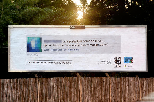
When they aren't hiding behind a cloak of anonymity, racist Internet trolls often count on the fact that their digital and online lives don't overlap. A group in Brazil is trying to show that online comments have real-life consequences by bringing the fight right to the trolls' door: billboards publishing their comments in their own neighborhoods for all to see.

The Racismo Virtual or "Virtual Racism" campaign is the idea of Criola, an advocacy group for Afro-Brazilian women. It was inspired after a beloved black newscaster in Brazil named Maria Julia Coutinho began receiving racist comments online on July 3, Brazil's national day devoted to combating racial discrimination.

Of course, on the Internet, nothing is truly anonymous. Using geotagging tools, Criola was able to easily find out where the hateful comments were coming from—and even if they didn't know who wrote them, they could still slap them up on a billboard in the person's own neighborhood.

"We omitted names and faces of the authors; we had no intention of exposing them," the group writes. "We just wanted to raise awareness and start a discussion, in order to make people think about the consequences before posting this kind of comments on the Internet."

A video posted online of bystander reactions to Criola suggests that the billboards have sparked conversations about race in the neighborhoods (as well as outrage and disgust). That's important, because research shows that shame, and falling afoul of real-world social norms, is a more effective deterrent to changing behavior than pride.

Maybe shame is an underused design tool when it comes to upholding the social good. You could go subtle with it, of course, the way Berlin's Ampelmann pedestrian signal gently rebukes would-be jaywalkers with his stubby, cuddly little body. But you could also go more extreme: theater seats that emit loud farting sounds when someone uses their phone during a movie, bathroom doors that call you out for your lack of cleanliness when you leave without washing your hands, or drinking glasses that tip over into the lap of anyone speaking positively of the political platform of Donald Trump. Food for thought.

[via VisualNews]

A Tourist Map Of London's Brutalism

$
0
0

Over the course of a few decades ending in the mid-'70s, architects such as Erno Goldfinger, Alison and Peter Smithson, and Sir Basil Spence made London a brutalist playground. Forty years later, many of the massive, concrete fortresses erected during this era are obscured in London's busy architectural skyline, if they aren't threatened by demolition. Which makes the Brutalist London Map the best way to explore this playground while you can.

The Brutalist London Map is a foldable, 16.5-by-23.5-inch map by Derek Lamberton of Blue Crow Media and Henrietta Billings of the Twentieth Century Society. It contains more than 50 notable examples of London's Brutalist buildings, and where to find them: Denys Lasdun's Institute of Education, Goldfinger's Trellick Tower, and Robin Hood Gardens designed by Alison and Peter Smithson, among many others.

Not only does the map serve as a guide to where Brutalist architecture can be found and who designed it, it's also a decent explainer on the key tenets of Brutalism and why London embraced it. Brutalism became popular after World War II largely because, in its acceptance of raw unfinished materials like concrete, it was both functional and affordable: an important consideration for a city that had to rebuild after being bombed for years.

Brutalism has since fallen out of favor, and many of the buildings on this map are likely to be destroyed in the next few years. If you're heading to London soon, take the Brutalist London Map along with you and see them before they're gone. (And if you're not? Try playing with some Brutalist paper models instead.)

You can buy the Brutalist London Map for $8 here.

What Happened When A Design Agency Made A Twitter Bot Its Creative Director

$
0
0

It's not uncommon for design agencies to have a creative director barking orders at the design bullpen all day. Edmonton's Paper Leaf has one too, but theirs is unique. Meet Hugo, a 10-inch-tall, soft foam robot who, earlier this month, was set to the task of bossing around Paper Leaf's designers, all day long.

Paper Leaf is an eight-person digital design firm that primarily designs websites, applications, and brands. The company also dabbles in experimental mashups of design and technology on so-called "Build Days"— single days when the designers temporarily jettisons client work to focus on internal projects that tickle their fancy.

The idea for Hugo came out of such a Build Day. "When we were brainstorming for our previous Build Day, we threw around a million ideas—but we kept coming back to one," says Paper Leaf principal Jeff Archibald (also an occasional Co.Design contributor). "We thought it would be fun to work with the Twitter API and try to make something physical that was Internet-powered, just to see if we could. We eventually settled on a tweeting robot."

That means Hugo doesn't have much of a mind of his own. He's not much more than a Raspberry Pi, a WiFi dongle, a battery, and a speaker in a foamcore chassis. But when he's turned on, he can vocalize tweets marked with the #hugorobot hashtag, thanks to a Python script. On December 2, Paper Leaf turned Hugo on, and promoted him to the role of their social creative director for the day. How'd it work out?

"The best and worst part about a social experiment like this is that Hugo is really just a vessel—the Internet decides what he's going to be like," Archibald says. "So it was super interesting to see how people watching the livestream and tweeting #hugorobot started to use the whole campaign. The whole 'social creative direction' thing took a backseat to a million other ideas and tweets." Those ideas include bringing Hugo a scotch, crowdfunding him some arms, and scratching his back. The Twitterverse also told Paper Leaf's designers to dive into their beanbag chairs and take a selfie with him.

"People took it in every direction you could think of," Archibald says. Including the inevitable trolling. It wasn't long before the communities at 4Chan and 9Gag discovered Hugo, and inevitably started blasting out profane, offensive, and racist tweets aimed at the innocuous little robot. Paper Leaf anticipated this, and programmed Hugo to blacklist tweets that included a list of no-no words, but it was tough going, for a while. "Let's just say they really put Hugo's blacklist to the test," Archibald says.

At his peak, Hugo was the No.1 trending term on Twitter Canada, and people were tweeting at him at a rate of 400 tweets per hour. And while Hugo didn't exactly help Paper Leaf get any work done that day, Archibald says he thinks the project was a success. "We got to dive further into the Twitter API; got to do some custom-scripting; got to design actual 3-D elements and work with hardware; and more," he says. "We'd never had the opportunity to do work like this before—we knew we could, but we got to prove it to ourselves. I personally hope Hugo gets people's brains working a bit, too, to generate ideas around how social campaigns can be run, how social can be mashed up with design and technology, and more."

You can read more about Hugo and Paper Leaf's social experiment here.

350 Material Design Icons You Can Download For Free

$
0
0

Last time we wrote about icon designer Vincent Le Moign, it was because he and his company Webalys had released a collection of minimalist icons of boobs, bongs, and poop. Webalys's follow-up is a lot classier: Nova, a collection of 4,000 icons, perfect for use in Material Design apps and websites.

The Nova icons pack follows the official Google Design Material guidelines, so they're all minimalist, clear outlines that ensure consistency, readability, and clarity, even at small sizes. Although there are 4,000 icons, it's actually closer to double that. Each design comes in two different versions: line style for use on light backgrounds, and solid style for use on darker backgrounds.

The Nova icons have been thoughtfully designed to be easy to work with. They're tagged to work with Iconjar, an OS X tool useful to designers for keeping their icon libraries organized. The icons are also available in files appropriate for Sketch, Illustrator, SVG, and PDF, so no matter what you design in, these icons should slot right into your workflow.

According to La Moign—and we have no reason to disbelieve him—Nova is the world's biggest Design Material Icons pack. At its introductory price, it's also very cheap: just $77, or a little less than two cents and icons. But if that's still too rich for your blood, you can download 350 of those icons for free here

A little less amusing than La Moign's last slate of burping, farting, stoner icons? Perhaps. But a lot more useful to working designers.

Viewing all 2811 articles
Browse latest View live