Quantcast
Channel: Fast Company
Viewing all 2811 articles
Browse latest View live

Traditional Homepages Are Obsolete, Says Quartz. Here's What They Built Instead.

$
0
0

When Quartz first launched in September, 2012, the digital-only business publication made a bold gamble. With the future of traffic coming directly to articles from social media streams, they decided they didn't need a homepage. If you went to QZ.com, it just brought you to whatever Quartz's top story of the moment was. It wasn't until August 2014—almost two years after Quartz first launched—that the site got a proper homepage.

Later this morning, Quartz will unveil version 2.0 of that landing page, but it's still not the traditional stream of stories. Rather, Quartz looks at it as the face of their publication: a digital visage that reflects the personality of the brand as a whole, without just being a river of breaking stories and headlines. It features rich typography, slick animations, and a dynamic layout that feels more like a glossy magazine spread than a catch-all WordPress theme.

"The idea of a strictly traditional homepage that people bookmark to find stories is, we think, outdated," says Quartz Executive Editor Zach Seward, explaining the redesign. "But at the same time, we don't want to be defeatist about it. There's still a large number of people coming to the homepage each day. So we've asked ourselves, 'If you start throwing out the old conventions, what can you do instead?'"

This is a question a lot of publications are asking themselves. Look at Bloomberg and The Cut, two publications that have eschewed traditional homepages in favor of rich, typographically complex layouts. The web is slowly becoming more like print. Quartz is just the latest publication to jump on the bandwagon.

The previous version of Quartz's homepage aimed to be an online version of the publication's Daily Brief mailing list: a list of about a half-dozen or so stories, each with a short summary, giving an overview of what's happening in the world. The new QZ.com is radically different, though. While the design of individual stories pages has not changed, the new QZ.com aims to promote all aspects of the Quartz brand, not just the mailing list: the company's Chart of the Moment infographics, its original Quartz Video Content, the editorial team's current Obsessions, and what's happening on its local sites, like Quartz India and Quartz Africa.

For the new homepage, Seward says the goal was to make sure that someone coming to QZ.com got a really strong sense of what Quartz was about, immediately. "In the current environment, [establishing] a publication's reason for being is more important than ever," Seward says. "We think our purpose is to be a guide to the world economy for smart, worldly people. So short of literally writing that out, the new Quartz is designed to convey that."

Although it's not a river of news, the new QZ.com is strictly curated by its team of editors. It relies heavily upon good typography, instead of the full-bleed images so many websites depend on. So at the top of the page, the biggest news story of the moment is represented in Adelle Sans. The article's image is masked inside a big "Q," which, when hovered over, slides away to reveal the beautiful, full-color image. Similar approaches are taken to the other sections of the homepage: masked images can be hovered over to reveal full ones, while promotional sections (like the Daily Brief) can slide on and off the page.

Another big aspect of the design is making room for sponsored content and other advertisements. In 2016, ads will need to be more integrated and easy-to-see than ever, so the new QZ.com builds places for sponsored content into the design. "With this new homepage, we're taking our ad capabilities a level higher," says Jay Lauf, president and publisher of Quartz. "Advertisers will have the opportunity to synchronize their creative within the homepage, which will produce more cohesive, more vivid storytelling. Our creative services team is prepared to help make the most of that opportunity if it makes sense for an advertiser's campaign." Qualcomm will be the first partner to integrate a campaign directly into the new QZ.com homepage.

Only 15 months separates the new QZ.com from the old homepage, so I asked Quartz if the real reason behind the redesign was because the old version wasn't working. Not at all, says Quartz, pointing out that revenue has grown by about 90% in the last year, and they now average about 15 million unique visitors each month. Rather, Seward says, it's part of a concerted strategy to avoid the "behemoth redesign projects" rolled out every three to four years by other websites, in favor of a more iterative design approach.

"Continuous iteration sounds high-falutin, but it's kind of what we're going for," he says. He points out a post on Medium by Melody Joy Kramer, "64 Ways To Think About A Newspage" as an inspiration for them. "Any of those 64 ways seem pretty interesting to us, so this is try No. 2," he says. And if things work out as Quartz wants them to, tries Nos. 3, 4, and 5 will be close behind.


Google Asks 18 Artists To Redesign The Router

$
0
0

Google's OnHub project is all about making Wi-Fi—and therefore, Google itself—better in people's houses. Google hopes to achieve that by making OnHub software simple and powerful, but an equally critical part of the initiative is convincing customers to put their routers in highly visible places in their homes, so their antennas can operate with minimum interference.

It's a potentially hard sell. Routers are traditionally pretty ugly, and while the OnHub routers are much more attractive, they're still visible objects of cold technology. But today, Google is announcing Shells for OnHub, which allows customers to give their TP-Link OnHub router wildly different new looks. And to show off what you can do with Shells, they tasked 18 different artists to create designs that disguise the OnHub as a slinky, a lamp, a fruit bowl, and more—some of which will be available for sale.

The project is a sort of analog to what Google has done with its self-driving cars. For the first round of router concepts, Google asked artists and design studios such as Andrew Bannecker, Andy Gilmore, Doug Johnstone, Brook&Lyn, Bower, Katie Stout, and more to come up with shells for the TP-Link OnHub that would encourage customers to place the router in the center of their homes. The goal was to showcase how utterly customizable the Hub can be: with the proper shell, Google thinks the OnHub can be the design centerpiece of any room.

Brook_lyn

Google clearly hopes to create a cottage industry with its OnHub shells. A few of these shells—Doug Johnston's red, white, and blue mitt, Brook&Lyn's slinky, Bower's little table shell, and more—will go on sale soon. For other makers, Google is releasing a packet of 3-D files, 2-D patterns, and design guidelines, which will encourage anyone to create their own shell. If it takes off, you could be buying clothes for your OnHub router on Etsy.

In addition to showing off its fun and frothy Maker shells, Google is also now selling three official shells. Available in bamboo, black and silver, and white and gold for between $29 and $39, they're all super blah, especially compared to the designer shells. It just goes to show that Google's on to something here: tech companies are certainly good at building routers, but they shouldn't be the ones designing them.

You can read more about OnHub Makers here.

The Ikea Meatball Reimagined 8 Different Ways

$
0
0

In April, Ikea introduced vegan-friendly Veggie Balls alongside its beloved Swedish meatballs, a first step toward offering a wider selection of healthy, sustainable food. But if 2015 is the year of the Veggie Ball, what does the Ikea meatball of 2025, 2035, or even 2045 look like?

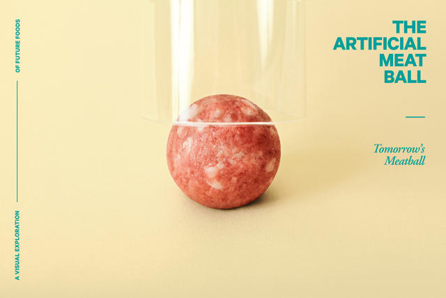
According to Space10, Ikea's independently-run innovation lab in downtown Copenhagen, it could be meatballs made of bugs, trash, artificial flesh, or something else entirely. Those are just some of the delectables on display in Tomorrow's Meatball, a visual exploration of the future of food that uses Ikea's iconic meatball as its mascot.

Space10

Teaming up with chef Simon Perez, Space10 has a smorgasbord of eight different types of meatballs, each of which explores a different source of sustainable food. There's the Artificial Meatball, a meatball grown in a vat, and the Wonderful Waste Ball, made of recycled food stuff. The Urban Farmer's Ball is made up of only locally grown ingredients, while the Mighty Powder Ball is a NASA-style meatball, made of fluffy chemicals. There's also the Lean Green Algae Ball, and the 3-D Printed Ball (both pretty self-explanatory). Finally, there's the legume-heavy Nutty Ball, perfect for triggering anencephalic shock, and the Crispy Bug Ball, a deep-fried orb of processed creepie-crawlies.

Space10's creative director Kaave Pour says the Tomorrow's Meatball project came out of a desire to explore the future of food. The lab wanted to call attention to the various innovations that promise to diversify what we eat, and the toll our existing eating patterns take on the environment. But how to get people thinking about all these far-out ideas — some of which are a little unpalatable, like eating bugs and sucking algae — in a simple, fun, and familiar way? The meatball was the perfect candidate.

Space10

"We always wanted to play around with this little icon," Pour says. "We used the meatball's shape and size as a canvas for future foods scenarios, because... [t]here's hardly any culture that does not cook meatballs: from the Swedish meatball, to Italian/American spaghetti meatballs to spiced up Middle Eastern kofta."

Sadly, you shouldn't expect to see these meatballs at Ikea's café anytime soon: they're more concept exercises than serious recipes. "No one's expecting these will be immediately produced," Pour says. But maybe 20 years down the road, the world will be ready for an Ikea Crispy Bug Ball, which Pour says is quite enjoyable. "It tastes a little like fried chicken," he claims. And if it doesn't, that's what Ikea's lingonberry sauce is for.

Microsoft: 2016 Will Be The Year Of AI

$
0
0

Microsoft recently asked 16 members of its technology and research organization to predict the big trends of 2016. There are some outliers—a researcher here who is really excited about styluses, a researcher there who likes depth-field cameras—but by and large, almost all of them seem to be saying one thing: 2016 is going to be a huge year for artificial intelligence, which has important implications for the design industry.

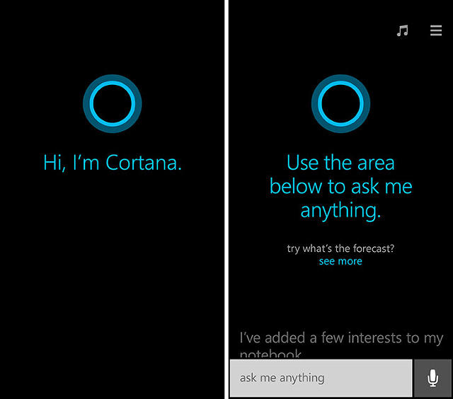
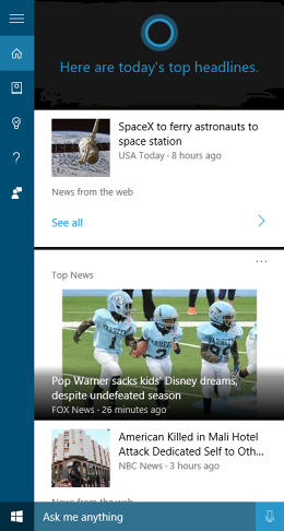
Asked what the key technology breakthroughs in 2016 will be, Chris Bishop, managing director of Microsoft Research, says "The emergence of new silicon architectures that are tuned to the intensive workloads of machine learning." These architectures will result in "more natural and competent" speech interactions with our computers and smartphones that will make virtual personal assistants like Microsoft's Cortana and Apple's Siri "genuinely helpful," says Eric Horvitz, technical fellow and managing director, Microsoft Research Redmond Lab.

How? Horvitz suggests that the AI advances in 2016 will allow virtual assistants to understand the tasks we're working on and help with them—for example, compile research automatically—almost like a real personal assistant. He also says they'll understand the commitments we make to others: for example, by realizing from the context of an email that you're meeting a friend for dinner, and automatically adding it to your calendar.

But that's not where Microsoft thinks the AI improvements of 2016 will stop. Lily Cheng, distinguished engineer and general manager, Microsoft Research NExT, thinks AI won't just help us get work done: it'll help us keep positive. "Our online conversations will increasingly be mediated by conversation assistants who will help us laugh and be more productive," she says. "This will lead us to question and blur the way we think about our computers, phones and our memories and relationships." In other words, the likes of Siri and Cortana won't just be impersonal voices living in our smartphones: they'll be perky companions who keep us upbeat and motivated.

Microsoft's also betting that AI will become partners to real flesh-and-blood humans when we interact with brands online. Hsiao-Wuen Hon, corporate vice president of Microsoft Research Asia, says 2016 will see "significant adoption of artificial intelligence plus optional human-in-the-loop for personal assistant services." That sounds suspiciously like Facebook M, Mark Zuckerberg's attempt to blur the line between artificial and actual intelligences through messaging.

All of these predictions smack of zero UI, a design philosophy that predicts artificial intelligences will allow us to minimize user interfaces in our apps and gadgets until they are almost entirely invisible. If 90% of Microsoft Research is going nuts about zero UI, it's a pretty good guess that the company is planning some big plays there. It shows where the Windows-maker is laying its chips in 2016: out with busy UI, and in with AI.

Related: Can Microsoft Get Its Groove Back? The Evolution Of The Brand In 3 Minutes

War, Peace, And Technology: A History Of The 20th Century Through Color Trends

$
0
0

Pantone's annual Color of the Year stunt may be silly, but it does prove that our taste in color changes almost as quickly as our taste in fashion. And like fashion, color taste comes in cycles, and reflects world events—something on stark display when you look at an entire century's worth of color trends.

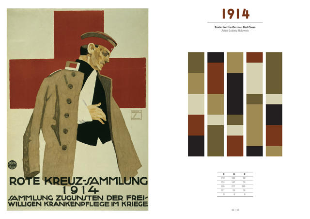
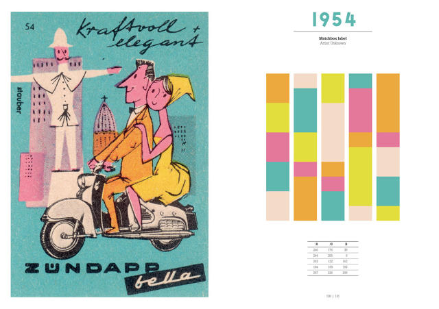
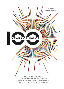
In 100 Years of Color, author Katie Greenwood takes a single example of great graphic design from every year of the 20th century, and breaks it down into its RGB color spectrum.

Generally speaking, war years have subdued colors, and peace years have brighter palettes. For example, a 1903 advertisement for Chocolat Klaus by Leonetto Cappiello largely breaks down into cheery primary colors — red, green, yellow, and blue. By the outbreak of the first World War, though, you're looking at very subdued tones of brick, black, and beige (see the 1914 poster for the Red Cross). Likewise, a furnishing fabric designed in 1946 by Paul Rand called "Abacus" favors a subdued color scheme, filled with pales blues and greens; by 1954, though, you're seeing peppy European matchbox covers, swimming with orange, yellow, blue, and pink pastels.

More recently, technology has influenced the dominant color schemes of the day. For example, shockingly bright colors start being widely used in the 1960s, after the invention of fluorescent ink; similarly, the introduction of the personal computer into the graphics design process in the 1990s led to a broader array of colors.

A freelance picture researcher and photographer based in the U.K., Greenwood says that it was hard to select a single example of graphic design to represent each year. "There are obviously so many amazing images from the 20th century to choose from, so it took a lot of deliberation," she says. "I brainstormed movements, events, and trends for each decade, and made a wish list of people I knew I wanted to include and ideas that might be good to convey through the pictures." In general, she tried to not limit herself to just iconic or well-known images, but also included unknown or forgotten designers and illustrators, as well as items from her own personal collection of prints and ephemera.

Asked what her favorite era of color design is, Greenwood points to the Art Deco movement of the 1920s and 1930s. "Within Deco, you get very different approaches to color, from the unexpectedly bright, exotic, and sometimes clashing, to really very muted, restricted, often smoldering combinations," she says. "But I think there's something inspirational and surprising to be taken from the use of color in every era of design."

You can purchase a copy of 100 Years of Color on Amazon here.

Mailbox's Death Shows Good Design Alone Can't Unbreak Email

$
0
0

Dropbox announced on Monday that it's killing off Mailbox, the email app it bought in 2013 for $100 million. Many are reeling at the announcement. How could Dropbox go from spending $100 million on an app to unceremoniously killing it off in just a few years? Especially one that has been so widely hailed for revolutionizing the way email apps are designed?

Me? I'm not very surprised. I think Mailbox probably reached EOL for a few reasons: it never evolved, it didn't clearly fit in with Dropbox's business, and even if it did, maybe apps can't solve email's main problems.

Mailbox Stagnated

When Mailbox first launched in early 2013, tech writers (including me) cooed that it was the best mobile email app we'd ever used. What Mailbox was the first to recognize was that the point of a mobile email app isn't really about sending or even reading email. It's to prevent yourself from getting buried by email when you're away from a computer, where you can actually do something about it.

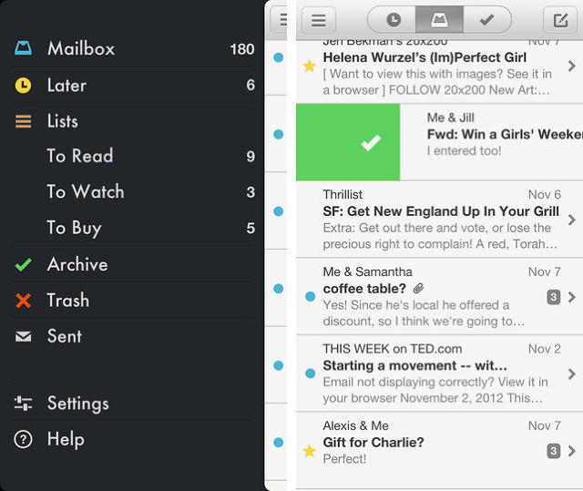
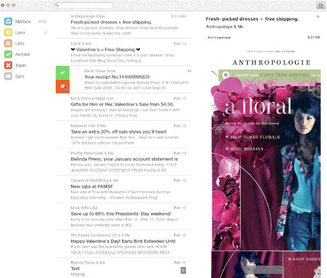
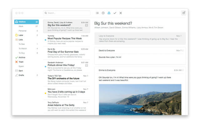
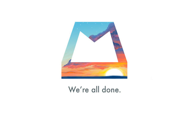
So instead of focusing on sending and replying, Mailbox laser-focused on helping users achieve Inbox Zero through easy deletion, categorization, and controlled procrastination. Without even drilling down into an email from an inbox, you could flick it away to the trash, archive it, move it to another folder, or snooze it, which temporarily moved a message out of your inbox for a given time. All of these interactions were done with a color-coded, candy-lickable swipe of the finger. When you emptied your inbox, Mailbox rewarded you with a big dynamic icon — the Mailbox logo, masked with pretty Creative Commons pictures — congratulating you about reaching Inbox Zero.

It was a deeply compelling app, maybe the first email app that actually made you feel good about yourself for using it. But it never really evolved after launch, let alone after Dropbox bought it, then left it to rot. And that left its competitors to steal all of Mailbox's best features, and put them in their apps.

Today, you're hard pressed to find an email app that doesn't use Mailbox's colorful gesture affordances. Apple and Google's default mobile Mail apps both let you manage your mail with a variety of swipes. Worse, many of Mailbox's competitors have long done Mailbox better than Mailbox ever did. Boxer and Spark by Readdle are two email apps that take all of Mailbox's best innovations, and implement them even better, while also constantly adding their own new features to keep interest fresh.

Dropbox & Mailbox Never Made Sense

When Dropbox bought Mailbox for $100 million just a month after it was released, Dropbox CEO Drew Houston was hardpressed to explain the purchase.

Outside of "loving" the app, Dropbox's official announcement about buying Mailbox reads more like free idea association than a coherent plan. "Dropbox doesn't replace your folders or your hard drive: it makes them better," Houston said. "The same is true with Mailbox. It doesn't replace your email: it makes it better."

What was notably missing from this announcement was any hint of how Dropbox expected Mailbox, an app (in essence) all about deleting junk from the cloud, to integrate with its core business: getting people to pay to store more of their junk in the cloud. About the best that could be hoped from the acquisition was that it would somehow help Dropbox get more people using its service for email attachments. But when Dropbox already integrates with every good third-party email app, why spend $100 million on this?

Compare this to Carousel, another app Dropbox just killed off. Carousel was a photo syncer that automatically backed up all your images to Dropbox, and made them searchable. It had a clear point, and yet Dropbox killed it off along with Mailbox, ceding victory in the cloud photo library space to the likes of Google. If Carousel never had a chance, why would Mailbox?

Mailbox's Death

When co-founder Gentry Underwood first announced Mailbox to the world, he acknowledged that it had a tough road ahead. "This path... is paved with corpses,"he wrote, saying the idea "scared" his team and "felt like this massive thing that startups don't mess with."

Maybe Gentry, who declined to be interviewed by Co.Design, should have run with that instinct. Because time after time, email apps die. Look at Sparrow, another innovative email app that was bought by Google before it was killed. Molto's another email app that was recently killed off. Even Mozilla is trying to get rid of Thunderbird, its long-time email client, describing it as a "tax" on Firefox development.

All of this hints at what may be a simple truth. Even if Mailbox and Dropbox were a match made in heaven, and even if Mailbox had stayed fresh and innovative, maybe it would have died anyway. Maybe the only way to make email less of a nightmare is through artificial intelligence and infrastructure: the approaches products like Inbox by Gmail and SaneBox are taking through a combination of smart categorization and preventing the vast majority of your email from ever reaching your inbox in the first place. Because maybe the smart bet is that email isn't a problem that UI can actually solve.

MIT's Amazing New App Lets You Program Any Object

$
0
0

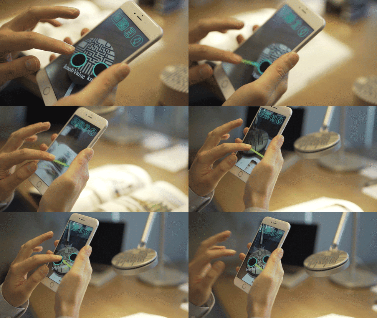
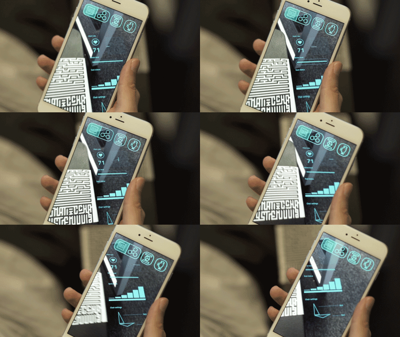
The end goal of the Internet of Things is to make every object in your life programmable. But our smart objects are still pretty dumb. They don't talk to each other, and most are only capable of doing one thing; a smart lightbulb for instance can dim and brighten but it can't tell your TV to change the channel for you. The result of three years of research at MIT's Fluid Interfaces Lab, Valentin Heun's Reality Editor aims to address these problems. It's an augmented reality app that lets you link the smart objects around you together, just by drawing connections with your finger between them.

An example here will be helpful in understanding the concept. Let's imagine you have a smart thermostat, and you want it to raise the heat in your house when you get out of bed in the morning. Provided you also had a smart bed—more on that in a minute—you could just look at your thermostat through the Reality Editor smartphone app. A Minority Report style overlay would then pop up, giving you options. You'd then trace your finger from a virtual circuit that raises the temperature of your thermostat to a circuit on your bed that can detect when you climb in or out.

Of course, there are no smart beds. Yet. But there's no reason there couldn't be, and the Reality Editor is trying to make that, and all sorts of other smart objects, possible.

"Imagine a future where everything around you can be controlled," Heun says. Right now, companies like Amazon and Google, which are designing objects for the smart home, use artificial intelligence and big data to try to anticipate users' needs: in the case of the smart thermostat Nest, what temperature someone likes, for example. But Heun says this is reductive, because the Internet of Things should actually empower users to have more control over the world around them, not take it away.

The Reality Editor (and its free associated developer platform, Open Hybrid) aims to give users this power to fully control the smart objects in their lives. And if one object doesn't have the functionality they want? They can just link it to another one that does: a sort of meatspace IFTTT. Imagine having a lamp that turns down the volume on your TV when you dim the lights, a light switch that also turns off your television, or a car that switches on your home A/C in the summer when you leave the office. The Reality Editor makes all of this possible.

Although it looks futuristic, the Reality Editor isn't one of MIT's usual high-falutin proofs-of-concept. It really works, and you can download it now. It uses fingerprint-like codes that sort of look like Pentagram's new identity for the MIT Media Lab to identify smart objects when viewed within the app. (Soon, Heun tells me even these codes won't be necessary: the app will be able to identify an object based solely upon its color and shape.) It then calls up a literal HTML webpage, representing that object's corresponding functionality, and overlays it on the gadget so you can program it.

Right now, the problem facing the Reality Editor is support. If you have the know-how, you can build adapters for all the major smart objects, like the Philips Hue smart lightbulb and Nest, but no consumer products yet support the Open Hybrid platform out of the box. That's something Heun hopes will change soon, because he thinks people have an almost primal need to tinker with the objects around them: something that, without the Reality Editor, could become increasingly difficult as our homes get more high-tech.

"It goes to the deep origin of humanity: we're tool makers," says Heun. "We build empowering tools, to manipulate the world around us." The Reality Editor sees an IoT future in which humans have their smart homes on autopilot, and aims to give them an alternative: take control.

An Office The Size Of A City: Googleplex Designer's Latest Zany Idea

$
0
0

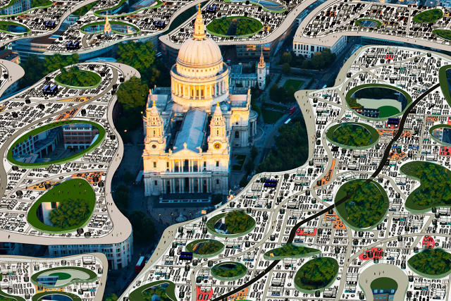
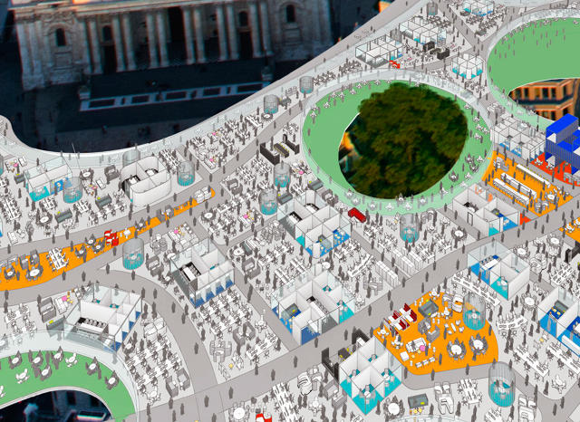
Clive Wilkinson, the designer of the original Googleplex, knows a thing or two about designing offices. And he thinks they're pretty wasteful. His satirical alternative? An endless, single-level workspace in the clouds that hovers above cities, sucking us up from our living rooms via pneumatic tubes and depositing us in an airy, open office right above us. The Endless Workplace proposal might be tongue-in-cheek, but it makes some good points about what's wrong with offices today, and the future of working.

The Endless Workplace was designed for Flaunt Magazine's latest issue. The magazine asked designers to think about what would happen if the cultures of California and the United Kingdom suddenly collided. "They have such different ways of seeing the world," Wilkinson says. As a result, he imagined what it would be like if London, where the average commute is two or more hours a day, embraced Silicon Valley's Slack and Skype-driven, work-from-anywhere mentality.

In Wilkinson's concept, London would effectively gain a second level, devoted entirely to open-plan co-working spaces. "It utilizes the scenographic beauty of London, where this workspace blankets the whole city, but opens up everywhere there's an interesting site or a tourist attraction," Wilkinson says. The concept leverages mobile working and internet connectivity so that people can work no matter where they are, just by traveling up into the clouds above their house or flat.

Although Wilkinson is the first to admit that such an Endless Workplace isn't exactly a serious plan, he does argue it solves some very real problems. The most obvious issue is the endless commutes that most workers face in today's densely packed cities: instead of commuting, they'd just zoom up into the clouds for the work day. Such a solution would also reduce CO2 emissions and the need for physical space that companies have now.

"There's a statistic that has been reliably used for years, that says that at any given time, that 50% of any workspace is just empty desks," Wilkinson says. By creating a single, cloud-like layer of desks above a city, you can get away with fewer desks than the corresponding number you'd find in individual office buildings.

But why conceptualize something like this at all, when working from home similarly cuts commutes? "It gets down to the tribalistic nature of people," Wilkinson says. Like a good co-working space, the Endless Workplace would create entrepreneurial communities in the clouds, where different people working elbow-to-elbow could inspire each other, merge ideas, and create new companies: a cross-pollination culture that could end 9 to 5 drudgery once and for all.


Forget Cubicles. These Acoustic Dampening Honeycombs Are Made Of Hemp

$
0
0

Big open offices are the modern—and perhaps broken—standard, but acoustically, they're nightmares: cavernous concrete bunkers where people are afraid to speak above a whisper. "No one really thinks about the quality of sound in a workplace," says Benjamin Hubert of Layer Design. "Everyone loves these huge concrete open-plan workspaces, because they're visually cool, but the sound is wearing."

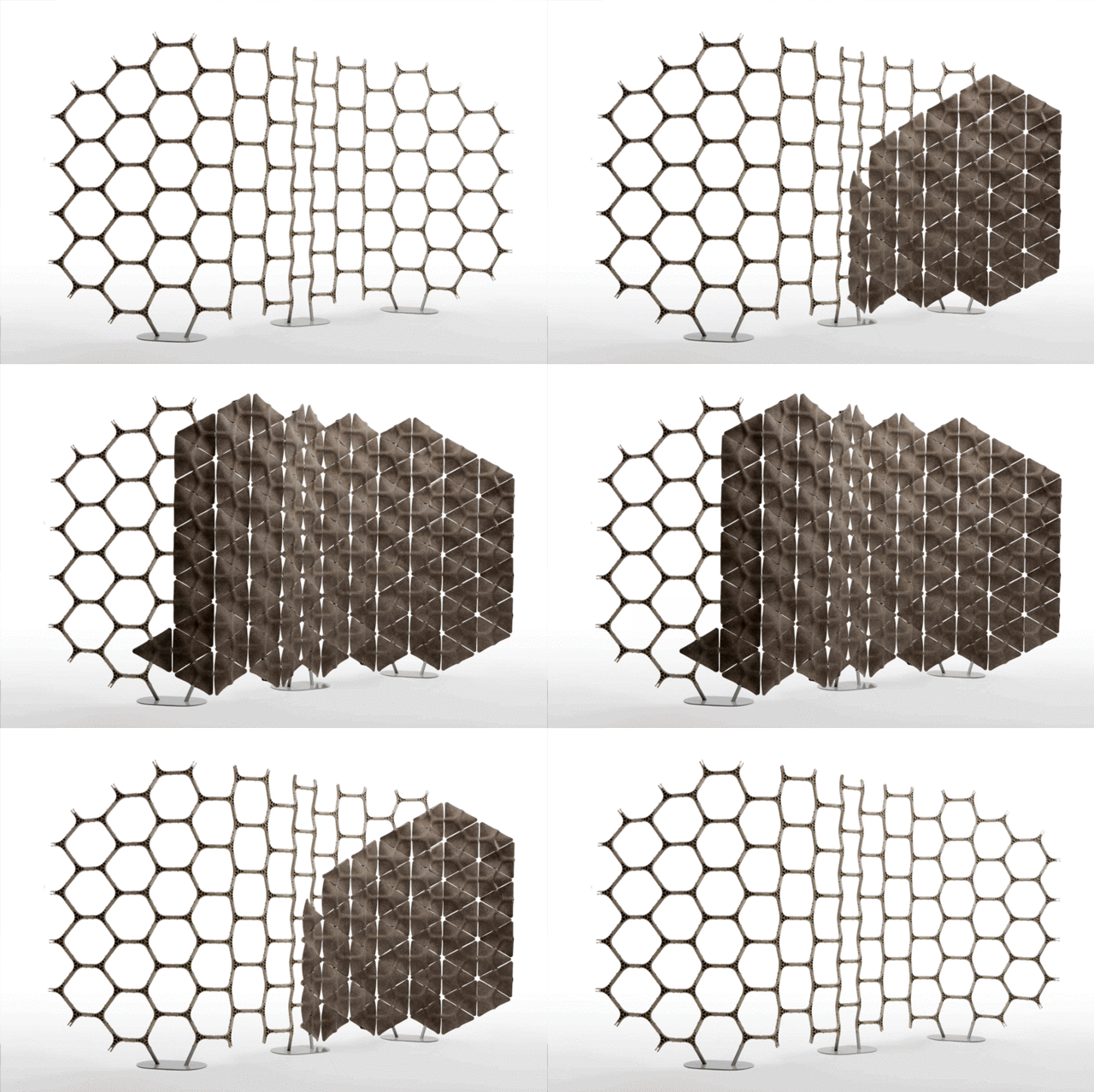
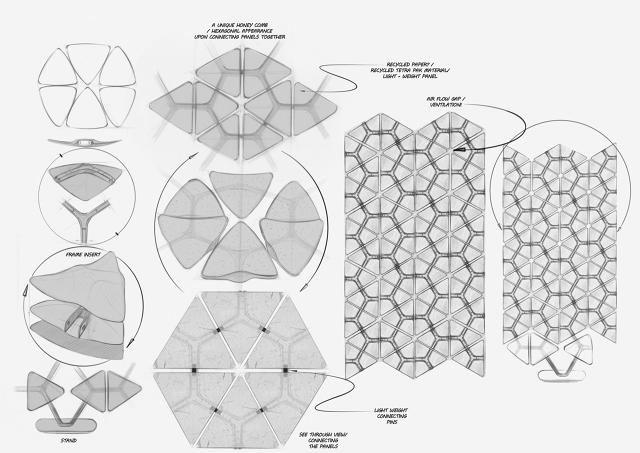
So Hubert came up with an idea. Scale is a new modular divider system that can be erected in any space. A honeycomb of hemp-lined hexagons act as acoustic dampeners to let teams quickly and cheaply divide up big spaces to make them quieter.

Unlike other dividers, Scale is a stand-alone system that doesn't require existing infrastructure to install: all it takes is a coin. To divide a space with Scale, you simply slot together a skeleton made out of three-pronged plastic pieces that look a little bit like Flux Capacitors, then fit the triangular, pressed-hemp tiles into the joints. Not only are these tiles sustainably made, they're also incredibly efficient when it comes to audio absorption. So while Scale's walls might look flimsy, what's spoken inside a Scale room stays inside Scale.

Layer developed the system for Woven Image, the world's largest textile manufacturer. Hubert says the idea came upon realizing that offices were more open than ever before, yet the teams within those offices were constantly combining and recombining. "We realized that what was missing was a standalone product that could divide a space and improve sound quality, that was flexible enough to be constructed and deconstructed as easily as a team," Hubert says.

Outside of offices, Layer envisions Scale being used in commercial spaces, hotels, convention centers, and any other interior space requiring dynamic, sound-dampening partition systems. Scale will go on sale from Woven Image, starting in 2016.

Inside A Robot Eyeball, Science Will Decode Our Body Language

$
0
0

In social situations, words are often secondary: In fact, scientists believe that non-verbal cues represent two-thirds of the way we communicate. Yet this non-verbal language is only dimly understood. In the words of leading American anthropologist Edward Sapir, "an elaborate code that is written nowhere, known to no one, and understood by all."

To help understand the role non-verbal cues have in communication, a team of researchers at Carnegie Mellon's Robotics Institute created the Panoptic Studio: a "massively multiview system for social motion capture" that combines 480 separate video streams into an insanely intricate scan of the way people move when they talk.

Think of it like an infinitely granular Microsoft Kinect. The Panoptic Studio is basically a big, enclosed box—17 feet wide and 15 feet tall—which a group of people can step into to talk. As people communicate with one another, arrays of cameras lining the room record their every movement. Each of these cameras individually is pretty low resolution, just 640x480, but combined, the Panoptic Studio can gather over 24.9 gigabits per second worth of data on how people inside of it are non-verbally communicating with one another.

The resulting data can be analyzed in different ways. The Panoptic Studio can extrapolate a skeletal view of all a conversation's participants, represent them as swarms of multi-colored atoms, or even bring their movement patterns to life as an animated swirl of impressionist brush strokes.

Carnegie Mellon hopes the system will generate insights into the ways humans communicate. But those insights haven't been delivered yet: with the Panoptic Studio successfully built, and the paper published, the research into the secret code of our body movements can now begin in earnest.

[via Prosthetic Knowledge]

Star Wars: The Force Categorized, Tabulated, and Visualized

$
0
0

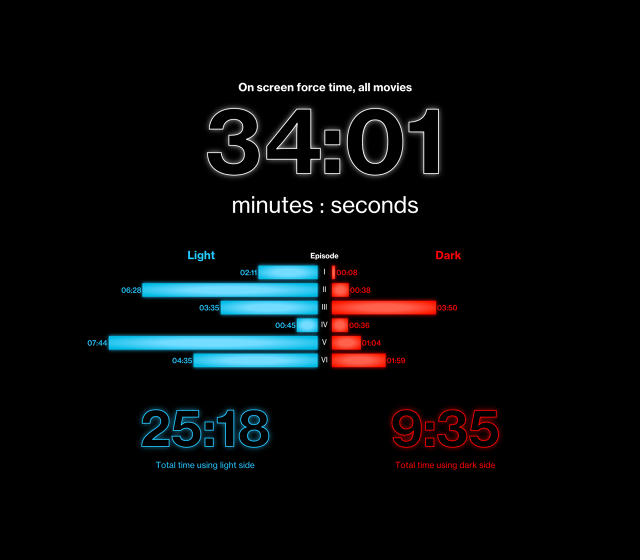
For a series of movies about wizards in space, the Star Wars films feature a lot less overt magic than you probably realized. In fact, as a new infographic from Bloomberg points out, there's only 34 minutes of actual Force use in all 805 minutes of series runtime.

Scroll through the full site hereBloomberg

Star Wars: The Force Accounted does a granular inventory of every appearance, mention, practitioner, or use-case scenario of the Force from the original Star Wars all the way to Revenge of the Sith. And it actually breaks out some surprising facts:

  • Light side force powers (like levitating objects, talking to benevolent ghosts, and Jedi mind tricks) are used almost three times as often in Star Wars than dark side powers, like force choking someone (Darth Vader over multiple occasions, Luke Skywalker in Return of the Jedi), or frying them with bolts of lightning until their eyeballs explode (Emperor Palpatine).
  • Although he's relatively untrained compared to the likes of Obi-Wan Kenobi or Yoda, Luke Skywalker is the most overt Force user in all the films. Of the 34 minutes of Force usage in the Star Wars series, Luke accounts for 11 minutes of them, or almost a third. However, keep in mind that many of those minutes are spent conversing with a dead Alec Guinness.
Scroll through the full site hereBloomberg
  • The most widely used Force power in Star Wars? Jumping really high. The Force Leap ability was used 100 times in the series, mostly by Yoda, who spent a huge chunk of Attack of the Clones bouncing around like a green jumping been.
  • Which Force-sensitive characters used the Force least in the Star Wars films? The first one probably won't surprise you: Princess Leia, who spends 10 seconds of on-screen time across The Empire Strikes Back and Return of the Jedi using the Force to sense the location of Luke. But the second? The biggest bad-ass in all Star Wars, Darth Maul! He might wield a mean lightsaber, but the acrobatic warrior from The Phantom Menace only uses the Force for eight seconds in the entire film!

Ahead of Friday's release of A Force Awakens, this infographic is a great refresher that reveals something that is often overlooked about the Star Wars movies: Jedis, lightsabers, and the Force are actually a very small part of what they're about. Let's hope that's something J.J. Abrams has kept in mind.

Watch: Four Drones Keep Two Nude Dancers SFW In Carefully Choreographed Ad

$
0
0

Full disclosure: even though it's impossible, I'm the guy who's always secretly hoping the censor boxes slip whenever they're employed to obscure prime time nudity. Japanese retailer Buyma has turned such pervy anticipation into a choreographed art form, by censoring two nude ballet dancers in real time with hovering, pre-programmed drones.

Dancing to a remixed Swan Lake by Tchaikovsky, the two ballet dancers move in perfect harmony through their choreographed piece. Their motions are as poetic as they would be pornographic, if not for the drones carrying translucent white sheets, obscuring our view of jiggling genitals, bouncing breasts, and flopping penises. Things get so crazy by the end that four constantly moving drones are needed to keep things PG.

I don't want to spoil the ad for you, but I will say the reveal at the end is very clever, right before the ad's tagline (Buy Clothes) hits the screen. It's amazing to me that, even through selective editing, these four drones never once let as much as a nipple flash, while every time I'm in a room with a drone, they end up spectacularly falling prey to accident within minutes. The drone operators behind the scenes of this ad are better artists than the dancers!

[via Designboom]

How A UI Can Help Treat Anxiety And Depression

$
0
0

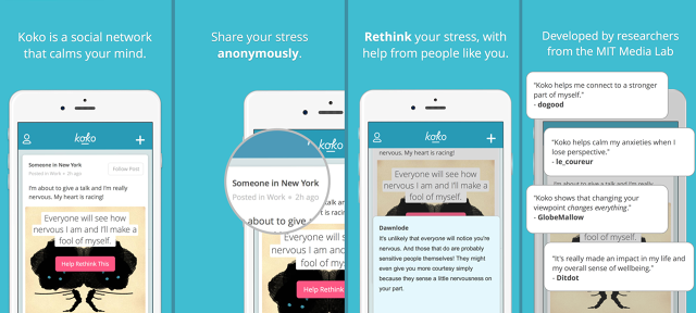
Earlier this year, Robert Morris, an MIT graduate working on making health care accessible to everyone through technology, told us about his dissertation project: Koko, a kind of social network focused on mental health. Now, the so-called "Facebook for depression" is available to everyone.

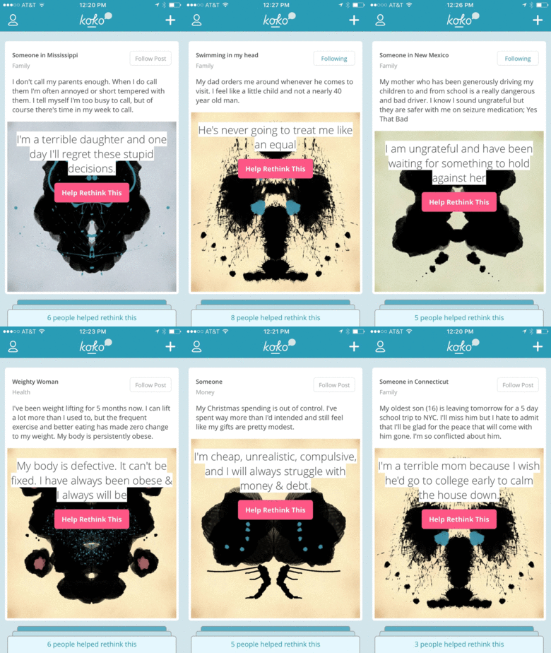
As an app, Koko's like a kinder, gentler Secret. Users are encouraged to post short messages about what is currently making them depressed or anxious, along with what they think the worst case scenario is. Once they've posted their message, other users try to point out what Morris calls the "bugs" in their operating system by suggesting more positive ways to think the problem.

For example, one Koko user recently posted that her sister-in-law, cat, and mother all died within a couple months of each other, and now her father might have terminal cancer. Her worst case scenario was: "What if things get worse?" Koko asks its users to try to reframe the way the person is thinking about the problem: say, by suggesting she try to focus on her positive memories of the departed, or to recognize that all of these tragic events are ultimately unlinked, and therefore, things will eventually get better.

It's easy enough to get people to share their problems anonymously, as many other apps have proven before Koko. But how do you get people to reply to those comments in a positive way? The earliest versions of Koko depended heavily upon tutorials before you could use the app, but it proved to be a significant barrier to entry. "When you're designing for an app, you're dealing with bite-sized windows of attention," Morris says. "The previous tutorial was four or five minutes, which doesn't sound like a long time, but feels glacial in an app."

For Koko, the trick was to try to whittle down its extensive tutorial into UI elements and visual cues. For example, every post is represented by a card with a randomly generated Rorschach blot. Morris says that not all Koko testers understand the historical connotation of the ink blot, but they still intuitively understand it has something to do with perspective, and the different way people can see the same things. Responding to a post is as easy as tapping on an ink blot, popping up a text entry field that cues the user to respond productively with sample microcopy like, "What's a more optimistic take on this situation?" or "Perhaps you're being a little too hard on yourself because . . ."

So far, Koko's users are seem to be getting it. Although the app goes officially public today, it has about 3,000 beta users already, and Morris says that 30% of those users are still coming back and using it a few times a day after a few months. That's a healthy engagement rate for an app whose purpose, on the surface of things, shouldn't be as easily understandable as Twitter's or Facebook's. But good UI design and a conscientious approach to subject matter have helped make Koko just as compelling, by turning the mindless affirmation of other social networks on their head into something just as addictive, and far more productive. When you hit the "like" button in Koko, you can feel confident it's doing some good.

Download Koko from the iTunes App Store here.

What Makes An Image Memorable? This MIT AI Might Hold The Key

$
0
0

Not sure why some photographs just brand themselves deep into your memory, while others make no impact whatsoever? With the help of a new neural network that learns to think like humans, researchers at MIT hope to figure out what makes the best photographs so memorable. The results could not only help up your Instagram likes, they could help graphic designers apply science to their work to make it more memorable.

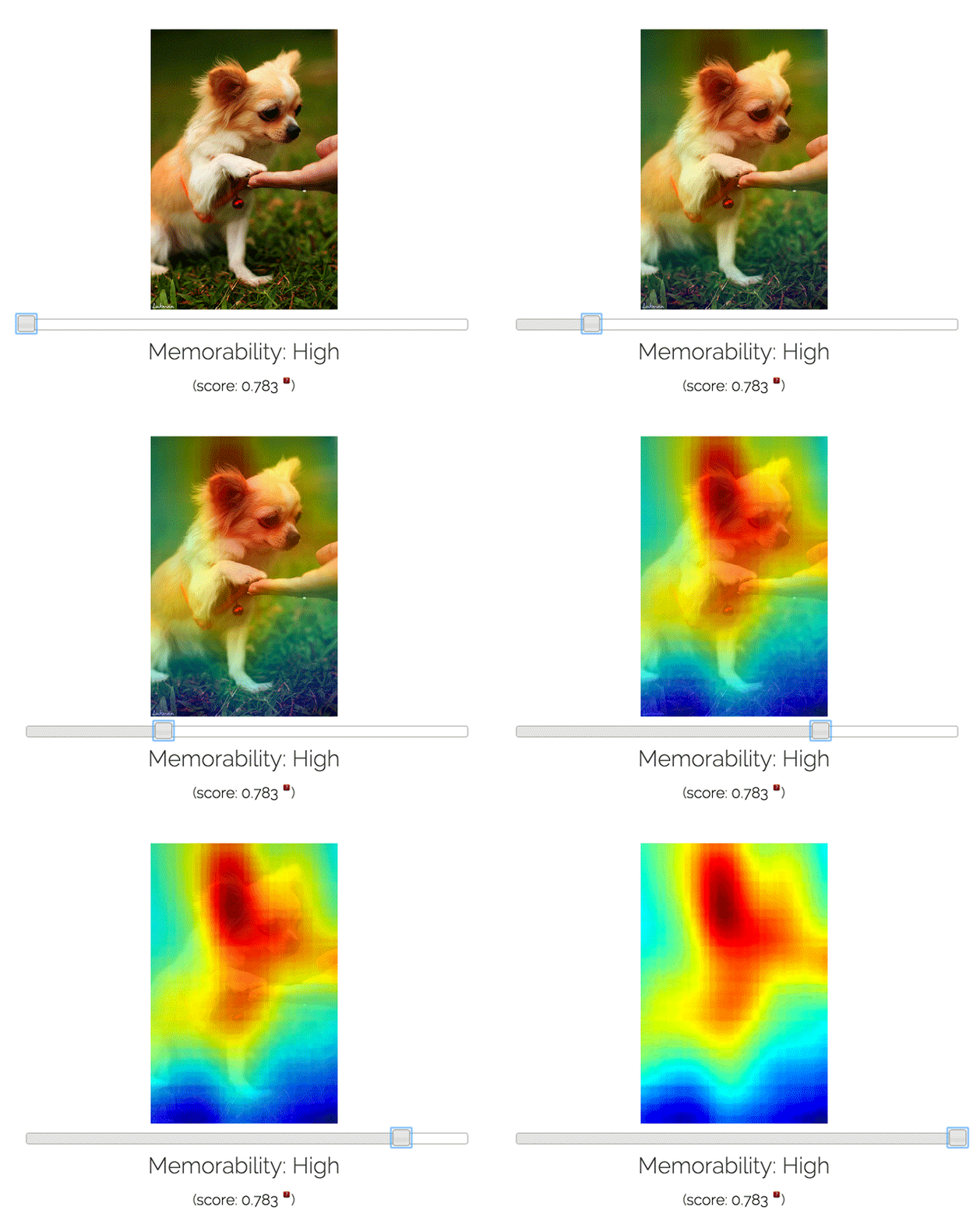
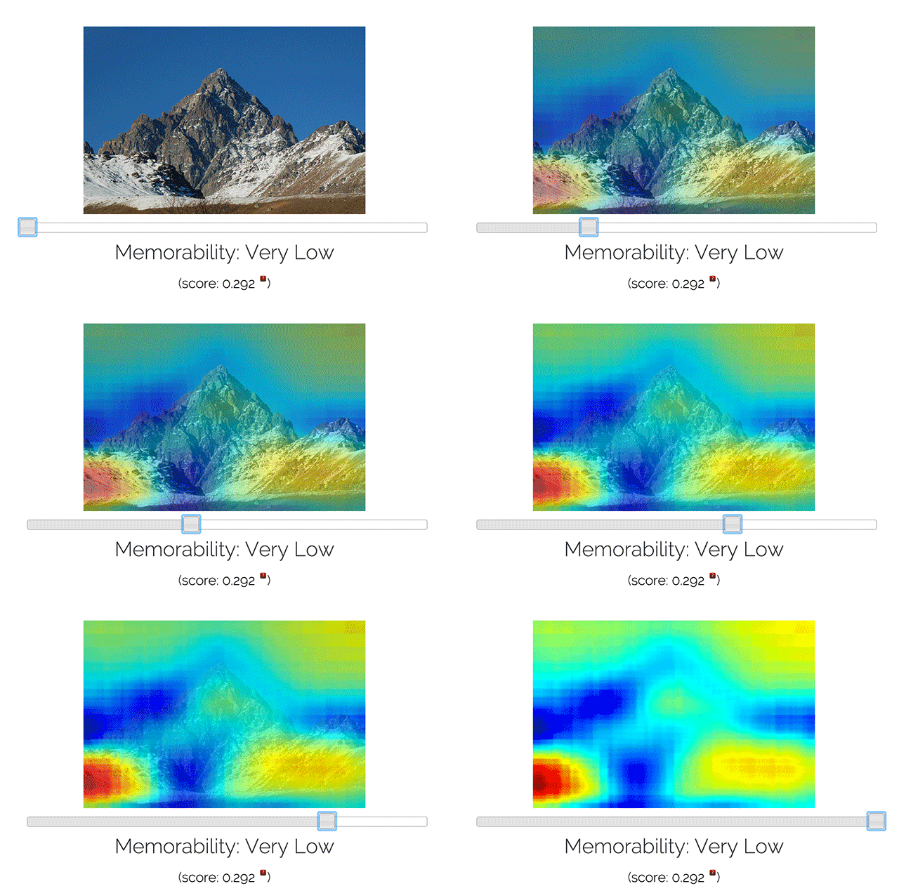
Like any other deep learning neural network, such as the one driving Google Photos, MemNet first needs to learn from a dataset that humans have previously gone over. In MemNet's case, that data came from LaMem, a library of about 60,000 images tested for how memorable people found them. Here, memorability means "how long were human observers able to remember the image after they stop looking at it?" Those scores were tabulated and fed, along with the initial images, into MemNet's neural network. MemNet then created its own model of what a memorable image looks like. Once that was done, it could apply the model to other images.

According to MemNet's creators, their memorability AI is pretty accurate when compared with humans. MemNet has a rank correlation rating of about 0.64 for memorability, compared to the average person's 0.68, and a computer that could just remember everything at 1.0. It also tends to find the same kinds of images compelling that humans do: pictures of faces, novel objects, highly contrasted colors, and animals. Consequently, MemNet can actually be used to show which images people are most likely to find memorable. It can even generate heat maps that show you the most memorable parts of a photograph.

There are a lot of potential applications here. The team behind MemNet say that understanding why certain things are memorable could help systems become smarter about what humans are likely to forget, leading to digital assistants that remind you about details in your agenda that you might miss. It could also help us create signs, posters, and other graphic materials that are better at conveying information succinctly and in a memorable way, which could be especially useful in learning environments—although expect Madison Avenue to get in on that game, too.

Try it for yourself here.

The Spectrum Of Earth-Like Planets, Visualized

$
0
0

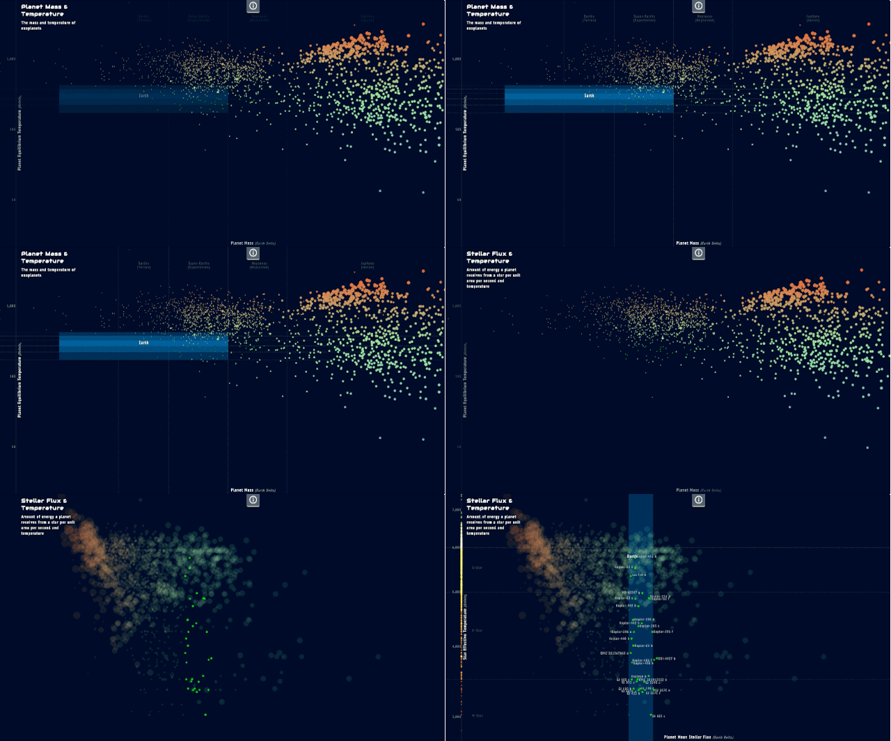
In the Brothers Grimm, Goldilocks refers to the hard-to-please home invader who ultimately gets eaten by three bears. In astronomical terms, Goldilocks refers to extrasolar planets that are "just right": Earth-like worlds that, through a fascinating combination of qualities, may allow them to support life.

To visualize the spectrum of possibly life-bearing planets, there's Goldilocks.info, a swirling nebula of worlds that can be broken down according to their similarity to Earth in various ways. The viz starts as just a look at where all 1,960 currently known exoplanets sit within our own night sky, but by clicking on the tabs at the bottom of the screen, those orbs whisk away like a cosmic Pachinko machine, to compare their make-up to our planet in other ways: where they are within their host star's habitable zone, its radius, its density, its surface temperature, its mass, its atmosphere, and more.

Goldilocks was commissioned by Visualized, a creative data viz conference held in New York, and was designed by Jan Willem Tulp, alongside members of the European Space Agency and the American History Museum's Earth & Planetary Sciences Division. The goal was to create a fun, engaging new way to compare the planets that could potentially hold life.

Enter Goldilocks.info in the rapidly expanding sub-genre of data viz that explore alien worlds, such as this one, fully explorable through a Minority Report interface or this staggering map of 500 exoplanets put to scale.

Check out Goldilocks.info for yourself here.


9 Clever Ideas For Improving Travel

$
0
0

Travel presents itself as a glamorous endeavor, but the reality is often anger-making and tedious. Thank goodness there are designers around the world working to fix problems such as cumbersome carry-on luggage, poor lighting in hotels, and more. Click through our slide show to see nine stories about clever ideas for improving the travel experience.

12 Great Apps From 2015

The Year's Boldest Ideas In User Interface Design

$
0
0

When design historians look back on 2015, they will likely point out two major trends.

The first? The UIs of 2015 effortlessly stride between cyberspace and meatspace, from Microsoft's HoloLens to MIT's Lineform, a snakebot that can morph into any gadget you want. The second: The rise of ambient interfaces, so-called zero UIs that can range from virtual secretaries to clothes that work like touchscreens.

In the slide show above, you'll see some of 2015's boldest ideas in interface design: from apps that let you paint in mid-air like Picasso, to earbuds that tune you into the world, instead of tuning the world out. As we head it into the New Year, consider it a primer on what the sci-fi visionaries of today are trying to make the reality of tomorrow.

Our 14 Best Design Longreads Of 2015

$
0
0

Deep dives, thrilling tales of derring-design, and damning essays by industry giants like Don Norman—we've put together a list of our favorite design longreads of the year (see our slide show above). We hope you enjoy reading them as much as we liked writing them.

Read More:

Stormtroopers Are The iPhones Of Star Wars

$
0
0

The new Star Wars movie is good. But it's not revolutionary. Its plot is a loose beat-by-beat remake of A New Hope, with a little bit of Empire thrown in at the end. There's a planet-sized star base, the Millennium Falcon, and a cute, round droid on a mission to find the last remaining Jedi. It even starts on a desert planet.

That goes for character and set design, too. Design-wise, the boldest thing about the The Force Awakensmight just be that hilted lightsaber everyone was so upset about last year. Because for the most part, the rest of the film's set, character, and creature designs are mostly just rehashes of the work of Ralph McQuarrie, the designer whose work informed the original trilogy's iconic look.

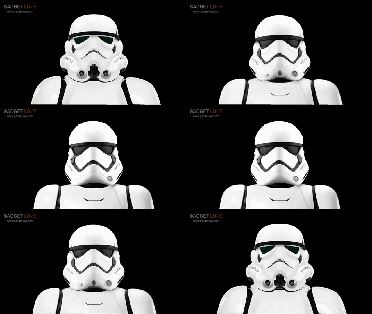
But you know what? That's okay. Because when I was watching The Force Awakens, one thing that really stuck out to me was that the reason it works is a lot why the iPhone works. Both owe their success to design visionaries who built their iconic product on a core set of design principles in such a way that it could be reiterated and refined over a series of generations. In that way, Ralph McQuarrie is Star Wars' Jony Ive. What I'm talking about is everywhere in the new Star Wars, but the most obvious example is the evolution of the Imperial Stormtrooper.

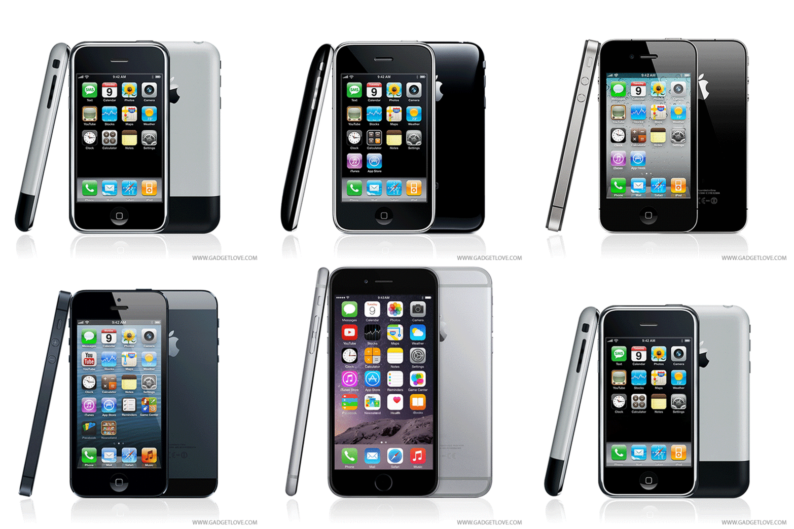
Look at this hypnotic GIF of the New Hope stormtrooper morphing into The Force Awakens trooper, courtesy of Gadget Love. Now compare it to this GIF of the iPhone evolving from the iPhone 2G to the iPhone 6. It's not just speculative to say that the new Stormtrooper took its design inspiration from Apple. J.J. Abrams's has openly talked about how they streamlined the Stormtrooper's iconic look to be more Apple-like. But these GIFs really put it in perspective: the Stormtroopers are the iPhones of Star Wars.

In both, the core design elements remain the same, but everything else becomes more streamlined. Like the iPhone's home button, its aluminum chassis, and its touch screen, the Stormtrooper design retains its most iconic materials and elements across generations: the white metal helmet with glassy black eyes, the mouth and breathing apparatus, and the tight black band across the forehead. Yet everything else evolves. Like the iPhone, the Stormtrooper helmet loses bulk and extraneous ports, while maximizing other design details for the sake of usability: for example, the Stormtrooper's eyes, which like the iPhone's touch screen, grow larger over time.

When I first saw the new Stormtrooper design in last year's The Force Awakens trailer, I thought it looked a little too thin and insubstantial, compared to the Stormtroopers I grew up with. A year later, when I see the old Stormtroopers, I can't believe how bulky they look (even though they still look great). For me, that feeling is the hallmark of good iterative design, which many of us feel every time we upgrade our iPhones: a feeling of intense personal loyalty to something old that is rapidly and invisibly transferred to its more streamlined successor. That's why the new Star Wars works. Same as an iPhone, it's great generational design.

Viewing all 2811 articles
Browse latest View live