Quantcast
Channel: Fast Company
Viewing all 2739 articles
Browse latest View live

Airbnb's Secret Tool For Designing For Every Person On The Planet

$
0
0

Designing an app like Airbnb's might not seem very complex. A dozen screens, maybe more, maybe less. But that's just in English. Airbnb's app also has to support 20 languages, some of which are compact (such as Korean), and some of which are extremely wordy (such as German). That increases the number of screens Airbnb needs to take into account to 2,400—and that's before you multiply for the vast array of screen sizes on the market today, or consider in-progress versions of coming app updates, or consider how an Airbnb host's site looks when viewed by someone in a different language.

By the time you're done with the math, Airbnb doesn't have 12 or even 2,400 screens to design for. It has exponentially more than that, like all the possible moves in a game of chess expanding to surpass the number of atoms in the known universe. It's a huge amount of variables to keep track of, not just for designers but for quality assurance. When you have this many possible permutations of screen sizes and languages, how can you possibly guarantee that your app design works on every single device?

Comparing a compact language, such as Korean, with a wordier language, such as German

That's why Airbnb built its own internal tool to handle the problem. It's called Airshots, and it allows Airbnb's designers and testers to see how the Airbnb app looks and functions in any language, on any smartphone, in any version—all in real time. But Airshots won't remain an internal tool for long: Airbnb intends on opening it up to outside developers later this year.

"If you think about it, design is historically pretty bad at creating tools," says Alex Schleifer, Airbnb's vice president of design. "Twenty years ago, someone figured out you could design interfaces in Photoshop, and that's pretty much been what we've done ever since. And while engineers have created version control and large QA systems, the way designers keep track of changes is by sharing a Dropbox folder with their name at the end."
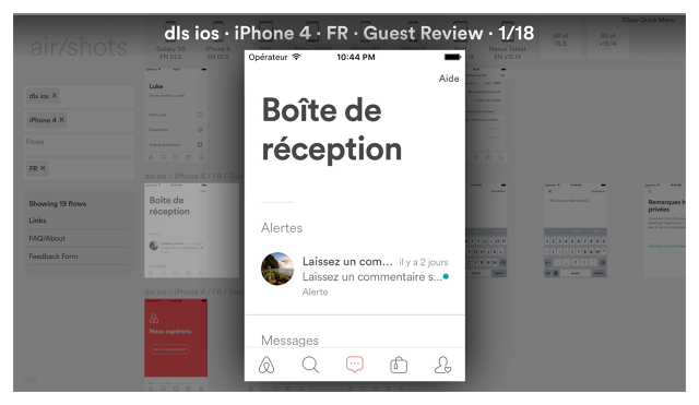
Airshots simulates a French iPhone 4.

At first glance, Airshots isn't obviously a design tool. You can't draw an interface or tweak some text in Airshots. In fact, it has more in common with a version control tool. You can use Airshots to search for how any screen in the Airbnb app looks on any device, using any version, in any language, on any operating system. So, for example, you can see how the private messages screen looks on a one-year old version of Airbnb running on a Russian iPhone 4 running iOS 7, just as easily as you can check out how a version of Airbnb being internally tested for release next month looks on a top-of-the-line Nexus phone running the latest Android M beta. And these results aren't just screenshots: They're actually working versions of the app being emulated in real time on individual virtual machines.

Airshots shows off what Airbnb's app looks like running on a German iPad.

From a quality assurance standpoint, Airshots is obviously useful to help troubleshoot customers' problems using the Airbnb app: for example, by allowing customer support to see exactly what's on a user's screen no matter their device, OS, or language. But Schleifer also insists it's a design tool, if not a design environment. "It's disconcerting to me that most app designers will only get to experience their work on maybe 5% of what's out there," Schleifer says. It closes designers' minds, and makes them assume their customers are basically using the same devices and speaking the same languages as they are. He says Airbnb created Airshots to be an "empathy and context tool" for its designers, so they can see how the app works in India on a $25 smartphone with a three-inch display just as easily as they can in English on their iPhone 6s Plus.

Airshots is still a work in progress. Soon, Airbnb wants to add support for wearables, such as the Apple Watch, and platforms such as smart TVs. But eventually, perhaps later this year, Airbnb intends on releasing Airshots for anyone to use: a useful tool at a time when companies and designers have to think of an increasingly fractured, global audience. But why risk giving away such a valuable tool to your potential competitors? To that question, Schleifer shrugs. "Philosophically, that's just the way we think about software. If you're depending on a secret design weapon as a competitive advantage, that's pretty shortsighted," he says. "Only good stuff comes from sharing design tools out. At Airbnb, we want to see design move forward at a faster pace, and that means sharing work we're doing, and letting others invest in it."

All Images: courtesy Airbnb


Moog Built A Synthesizer To Mix Every Sound On Earth

$
0
0

Since 2009, Yuri Suzuki—a sound designer whose diverse interactive works include a musical robot train and a kid-friendly circuit board that turns everything into a musical instrument—has traveled the world, collecting the sounds of the countries he visits with a dictaphone.

And after seven years of collecting sounds, Suzuki asked himself what an instrument that could "play" them would look like. And to create this instrument, which he calls the Global Synthesizer, he teamed up with Moog.

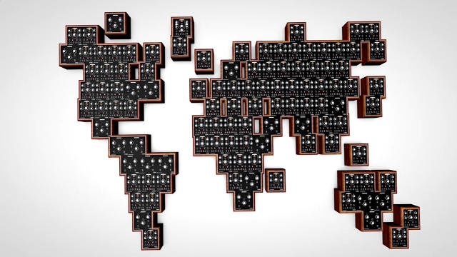
From above, the Global Synthesizer looks like a cubist's rendition of Earth, rendered in walnut audio cabinets. These cabinets are actually separate Moog modules, each of which contains a library of sounds crowdsourced from the international Moog community, as well as some from Suzuki's personal library. One module might contain sounds from Europe, and another, sounds from the South Pacific ocean. The audio files span everything from Ukrainian church bells to the keen of a Portuguese dog barking, or traditional Indian folk music that sounds remarkably like Samba. There are even modules for different acoustic spaces, so the Global Synthesizer can make a parrot squawking in Brazil sound as if it is doing so in the atrium of the Taj Mahal.

Most of us are familiar with modern electric synthesizers, which look like digital pianos. But the Global Synthesizer is modular, an old-school type of synthesizer that works by direct wiring. Suzuki describes it to me as working sort of like an early 20th-century operator's board: by plugging one module into others, you can create different sounds and effects.

Suzuki says this seemingly primitive form of synthesizer is coming back into vogue because it's flexible. If you have the know-how, you can directly program it to make any sort of music you want to make. (MIT's got an amazing one you can actually control from your browser if you want to try it for yourself.)

The Global Synthesizer debuted at Moogfest 2016 earlier in May. Suzuki says he wants to continue to build out the project, collecting more sounds. Eventually, he hopes the project might encompass every sound on the planet.

It's a nice little metaphor for the globalization of the musical world: the Global Synthesizer represents in microcosm the cross-pollination of sounds and influences that define world music as a whole. Cables string between cabinets representing different countries a continent away from one another, forming circuits and loops which can only be heard in the beat of the whole.

This Neural Network Reveals Your City's Secret Patterns

$
0
0

What if you could search the topography of the real world as easily as you search the Internet, all in real time? Terrapattern is a new search engine that does just that. Created by a team led by data researcher Golan Levin, Terrapattern combines satellite data and machine learning to let you search four major American cities for interesting patterns and points of interest, whether that's all the Christmas tree farms in San Francisco or the fracking wells of Pittsburgh.

While it's a great time waster for anyone, Terrapattern could have a big impact on the workflows of journalists, government agencies, urban designers, and more, within the next few years.

Like the neural network that powers Google's Deep Dream AI, Terrapattern uses a deep convolutional neural network to group patterns in satellite map data by type. For example, it can tell just by looking at a satellite map that two tennis courts, or sports stadiums, are of the same type. All neural networks like this need to be "trained" to identify content using a library of data. In the case of Terrapattern, this training library was provided by OpenStreetMap, a collaborative map of the world (complete with a satellite component) that volunteers have been building out since 2004. Using OpenStreetMap's data, Levin was able to train his neural network to "look" at a tile of satellite imagery, and "see" what it shows.

Unlike Google Photos, you can't just search Terrapattern for all examples of, say, swimming pools or skate parks. You need to know where one example of what you're looking for is located first—so you have to browse by city, dragging your way through a satellite map and clicking on features that interest you. Once you do so, Terrapattern suddenly shows off its power: You can use it to search for all the churches in Detroit, or all the topiary gardens in New York City, and so on.

Terrapattern has a couple limitations right now. One, it only works in four areas: Pittsburgh, New York, San Francisco, and Detroit, cities chosen by the team because they either lived there, or had friends there. In theory, there's no reason Terrapattern couldn't be expanded to encompass the whole world, but the bottleneck is computer power. Powering a single city's search in Terrapattern requires 10 GB of active RAM; Levin estimates they would require 2,000 times more to store and serve a searchable model of the whole United States.

The second limitation has to do with the size of a search area. Terrapattern isn't great about searching for features smaller than 10 meters (around 33 feet), or larger than 100 meters (328 feet), but that isn't a hard limit. Future versions of Terrapattern past the alpha prototype stage could well enable larger or smaller scale searches.

According to Terrapattern's creators, there is every reason to believe that within the next few years, access to whole-earth satellite imagery that is updated on a daily basis will be widely available online. Compare that to today, where the satellite imagery of your area in Google Maps might be weeks or months out of date. Once daily satellite imagery is widely available, Levin and his team believe that there will be a lot of interest in tools that can help make sense of it.

Humanitarian organizations could use satellite data to identify mass migrations of refugees as they happen, and predict where they're going before they get there. Journalists could also use this data to identify patterns for stories, proving (for instance) there's been a 30% increase in solar panel installations in the last six months, a 20% decrease in forest fires from a year ago, or where armies were building up their forces. Skaters could find new zones to conquer by watching what swimming pools in their area have been allowed to go empty over the summer.

Terrapattern is an attempt to prototype the sort of tool that will be needed when satellite imagery is updated regularly. It's a thought experiment that anticipates what we'll want from a real-time Google Earth when the time comes, and while it's not there yet—Terrapattern can't compare satellite imagery over time, nor can you use natural language to search, like you can in Google Photos—Levin hopes it will at least prove useful as a baseline for the planet-sized search engines to come.

You can try it for yourself here.

All Images: via Terrapattern

Turning Wi-Fi Network Names Into Art

$
0
0

Your router's SSID—or the field that lets you specify your Wi-Fi network's name—has long been a beloved haunt of techno-pranksters, who enjoy filling it with profane messages and strings of poop emoji. Russian media artist Dmitry Morozov is now putting Wi-Fi SSIDs to a slightly more noble pursuit—creating an array of what he calls Hotspot Poets, who transmit the poetry over Wi-Fi.

Each Hotspot Poet is actually a small microtransmitter each of which represents one of four classical poets: Matsuo Bashō (Japanese), Johann Wolfgang van Goethe (German), Boris Pasternak (Russian), and Petrarch (Italian). Each small, plastic pod has a QR-scannable rendition of the poet's face on the casing to indicate which poet it represents. Inside, each device contains a simple Wi-Fi transmitter, a microprocessor, and a copy of that poet's collected works.

But you can't actually connect to a Hotspot Poet. These little transmitters don't have access to the Internet, and they aren't programmed to allow incoming connections. But poets can be an antisocial bunch, so connecting isn't the point: it's all about broadcasting.

When you switch a Hotspot Poet on, he immediately starts broadcasting a new Wi-Fi channel to any local computers, smartphones, and tablets within a few dozen meters—and its network name is always drawn from a line of poetry.

Every 10 seconds, the name of its Wi-Fi channel changes. Given enough time, it cycles through the poet's works, line by line. Depending on what device you're using the Hotspot Poet with, these poems display in a few different ways. On Android, the SSID name of the Hotspot Poet will constantly refresh; on iOS, new lines will appear as a new network; on Mac, all lines of the poem will be visible until the Wi-Fi status menu button is deselected.

Right now, the Hotspot Poets only broadcast couplets and stanzas, but what's interesting to me about the project is how it rethinks Wi-Fi network names as a way of distributing information. You could put this same technique to work in more serious ways: for instance, in case of emergency, a Wi-Fi router could be programmed to give out instructions to local rescue centers, or if severed from the Internet, could transmit the number of a troubleshooting hotline.

Not as fun as the donger I've currently got as my Wi-Fi network name, perhaps, but a heck of a lot more useful.

These Shoes Help You Live In The Present--By Shutting Up Your Phone

$
0
0

Most companies working on smart fashion right now are trying to link your clothes to your devices. Google's Project Jacquard turns your jeans into a touchscreen; MIT is working on vibrating shoes that give you directions to your next destination.

Anatomic & Co, a men's footwear brand, thinks smart fashion is headed in the wrong direction—so it created Sociable Shoes. Instead of connecting your shoes to your smartphone, these dress shoes disconnect you, shutting down the constant pulse of incoming notifications so that you can focus on the present.

"The underlying idea behind the shoe was inspired by cognitive neuroscience and the fact our brains are 'restructuring' to shifts in technology and culture," says Duane Holland of DH Ready, the creative consultancy that created the Sociable Shoe concept for Anatomic & Co. "Our brains have shifted from memory-based learning to multitasking allowing us to manage multiple news feeds, across multiple platforms, on multiple devices. Technology is demanding more from us each day, so the only way for people and technology to get along is when it starts to get out of the way: essentially using technology to distract technology."

To anyone's eyes, the Sociable Shoe is a classic black leather brogue, suitable for wearing to a fancy restaurant, a gala, or the club. Inside the electric blue rubber sole is an Arduino chip, which communicates with an Anatomic & Co. app to control the notifications coming into your smartphone, only alerting you in case of an emergency. There are no switches or buttons to work on the Sociable Shoe: just wearing them is enough to switch your smartphone to silent.

As its name implies, the Sociable Shoe was created as a possible solution for the problem of mobile notifications constantly distracting people in social situations. "If you look around in a bar or restaurant you'll see most people on their phones rather than engaging in face-to-face conversations with their full attentions," says Holland. "These shoes allow people to filter out unwanted notifications, whilst avoiding the anxieties of not turning your phone off completely."

The Sociable Shoe might be part publicity stunt, but the ideas being put forward here are smart. As our devices demand an ever-increasing amount of our attention, they also increase our anxiety. Holland sees the Sociable Shoe as an example of a "well-being wearable" that brings technology and mindfulness together to allow people to live more balanced lives. "What makes well-being wearables different is the fact that it gives technology a purpose based on real human desires and needs," he says. "It's innovation which isn't just about being more digitally connected, it's about digital empathy."

The Sociable Shoe will launch on Kickstarter this summer as part of Atomic & Co's Beta Collection, a limited range of connected shoes, before scaling up to a full product launch, hopefully in early 2017, for a still unspecified price.

Google Built A Giant Display Out Of Arcade Buttons, And It's Amazing

$
0
0

Our displays feel magical, but in its simplest form a display is only an array of switches, flicking between states. Those switches can be anything: whether pixels of light or the cards on an old-time railway flip board. The biggest distinction between them from a practical perspective isn't that one is digital and the other is analog. It's that one is easy to program, and the other isn't.

To make programming any array of physical switches as easy as displaying something on a web page, Google is releasing a new open-source software and hardware library, called AnyPixel.js. It's a tool anyone can use to combine any number of individual "pixels" into a larger display, which can then be controlled by a web page.

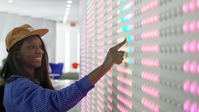
Wanting to come up with an eye-catching example of what AnyPixel.js can be used for, Google decided to use the new software to create a display for the lobby of its NYC office. It purchased about 6,000 light-up arcade buttons and wired them all together, using AnyPixel.js as a controller. Since each arcade button has a color-changing LED inside it, each "pixel" is capable of displaying any color, but because they're also buttons, the finished display works like a touch screen—allowing you to tap on any pixel to interact with it.

Sure, the finished display is decidedly low-res (with only 5,880 pixels, Google's arcade button display has less fidelity than your Apple Watch's screen). But it's big and messy and mesmerizing and fun. It recaptures a little bit of the analog charm that more primitive displays (like flipboards) evoke, while giving them 21st-century digital oomph.

Time will tell what the community will do with AnyPixel.js, but there's all sorts of possibilities. Imagine all the lights in an office building coming together to work as a display at night, or a million Android smartphones coming together to make a single interactive display as big as a football field. Hackers should have a lot of fun with this.

All Images: courtesy Google

How Sneaker Designers Are Busting Knock-Offs With Bitcoin Tech

$
0
0

Every year, as much as $100 million in counterfeit sneakers is seized by U.S. customs alone. And that's just scratching the surface: Worldwide, counterfeit fashion is estimated to be a $600 billion industry, and if U.S. customs figures are accurate, about 40% of all counterfeit goods are sneakers. That makes counterfeit kicks a $240 billion problem to sneaker makers like Nike, Adidas, Converse, and more.

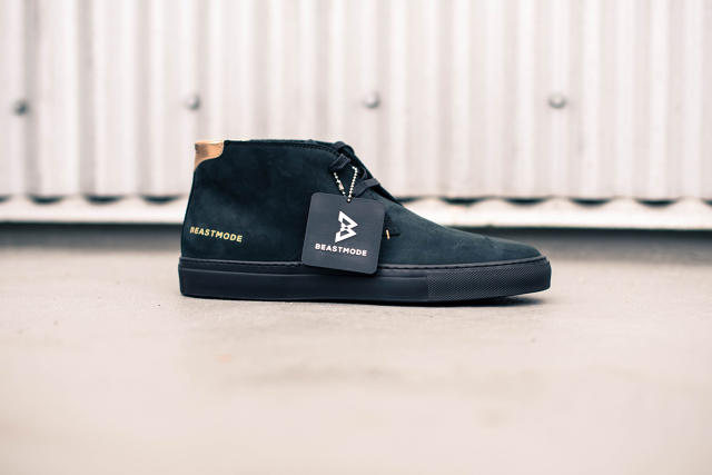
So if you're a small brand like Brooklyn-born Greats, and you've convinced NFL superstar Marshawn Lynch to endorse a pair of your sneakers, how do you prevent the $149 design from being counterfeited? You embrace technology popularized by Bitcoin to create 3-D printed smart tags that can track any pair of the new Greats x Beastmode 2.0 Royale Chukkah sneakers back to the factory—and which are impossible to fake.

A Brief History Of Knock-Off Kicks

Anti-counterfeiting technology in the fashion world has traditionally relied on two things. First, manufacturing process: The more complicated it is to manufacture something, the harder it is for counterfeiters to duplicate that process cost effectively. But material science also plays a factor. Take Nike's Flyknit shoes. The result of four years of research and development, Nike required entirely new machines to be built to Flyknit pairs of sneakers like socks. Consequently, Flyknits are right now pretty much the only sneakers on the market that experts can tell apart from a quality pair of counterfeits.

But in both material science and manufacturing, time is ultimately on the side of the counterfeiters. Any pattern that a licensed Chinese factory can mass produce, a counterfeit factory can also eventually make just as well, and at a cheaper price, since they don't need to recoup marketing or R&D expenses. This makes counterfeiting in the sneaker world is particularly damaging, since the market puts such a premium on vintage kicks—shoes that are trivial for counterfeiters to fake after years of advances in material science and manufacturing.

Companies have tried to give buyers an assurance that they're buying the real thing through elaborate seals and certificates of authenticity, but these too can be faked.

A Solution From A Cryptocurrency

To break this pattern, Greats turned to two companies, Chronicled (a sneaker and fashion software authentication company) and Origin (a San Francisco 3-D printing manufacturer), to design smart tags for their new Beast Mode sneakers.

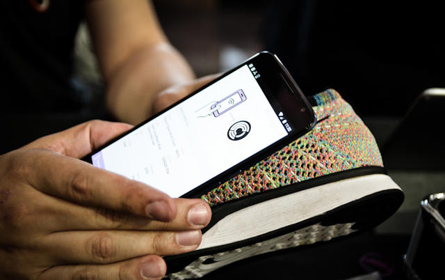
Each 3-D printed smart tag has a unique identifying code stamped into it, linking it to a specific pair of shoes, but it's what is inside this smart tag that really counts: a small encrypted NFC chip like the one found inside a modern passport, which can be tracked just by scanning it with your phone. Because this chip is baked into the smart tag during the 3-D printing process, it's impossible to break it out of the plastic without destroying it. But none of this would matter without the software.

Reduced to its essence, the problem facing those who would design a system to thwart counterfeiters is this: How do you allow anyone purchasing that product to easily track it through countless middlemen back to its source of origin? What Chronicled realized was that someone has already solved this problem: Satoshi Nakomoto, the enigmatic inventor of the digital currency Bitcoin. His solution to make sure that Bitcoins couldn't be counterfeited was to authenticate them through something called a blockchain, an encrypted database that inseparably links every Bitcoin transaction to the one that preceded it. If you have a Bitcoin, the blockchain not only authenticates it, it can tell you anyone who ever spent it.

Chronicled and Origin have done something clever. They've created their own blockchain, specifically dedicated to sneaker transactions, treating each smart tag almost like a Bitcoin. When you scan a smart tag with the mobile app, it not only tells you if it's authentic, it will tell you everyone who ever owned that pair of sneakers. If you sell your sneakers later, you just transfer ownership of the smart tag within the Chronicled app—again, just like Bitcoin. And at a few bucks each, tags aren't too expensive for sneakers manufacturers to include.

The Greats x Beastmode 2.0 Royale Chukkah was the first consumer item to come with a Bitcoin-like smart tag, but Chronicled wants to bring its smart tags to more than just sneakers. Dynes, a high-end fashion label, plans to also incorporate the technology later this year. Chronicled is also trying to market its smart tags to the vintage sneakers aftermarket, so those companies can assure their customers of authenticity; sneakers sold without a smart tag at purchase would need to be authenticated directly through Chronicled before they were assigned a smart tag.

There will always be people for whom authenticity is an afterthought, and who really just want something close enough at a good price, so Bitcoin technology isn't likely to stop counterfeiting for good. But if it catches on, smart tags will make it impossible for counterfeiters to charge a premium by claiming their fakes are authentic.

A Simple Button Could Fix One Of Mobile's Most Annoying UX Flaws

$
0
0

Imagine this scenario. You want to get a reservation for four at your favorite restaurant. How do you do it? Chances are, even if you're on a smartphone, you open your web browser, Google the restaurant's URL, and click the "Make a reservation" link. You probably don't open an app like OpenTable or Resy first, even though the experience is better, because you just don't know which app or service your restaurant is partnered with . . . if any!

The makers of Button think they've found a solution, by allowing apps to pass users back and forth between each other to perform actions, kind of like a cross between UI and ads. The idea is to provide broader access to information within the streamlined experience of an app.

"App discovery and mobile commerce are just awful in the current ecosystem," lead designer Patrick Lewis says. "Some of the best apps that make life easier and more accessible for people are still unknown by many, especially outside major metropolitan areas. Mobile commerce has been around for a long time but the experience is often so cumbersome for the user, they'd rather just do it on the computer."

Button works by making it easy for developers to drop code-integrating contextual buttons into web pages and apps. Those buttons perform discrete actions in other web pages and apps. In the aforementioned scenario, a visit to my favorite restaurant's website might contain a Button, allowing me to specify the time and date I want a reservation, then continue to the reservation process in the OpenTable app on my phone. Or maybe my music app would have a Button, so when I'm listening to my favorite album I can open up the Ticketmaster app to buy live tickets for the band's next show.

What if the right app isn't installed on my smartphone? In that case, a Button would launch that app's App Store page, while storing its context. For example, if a Foursquare user doesn't have OpenTable, the user could tap the OpenTable Button, select a time for his or her party size on the Commerce Card, and be taken to the App Store. Once the app is finished downloading, the user then would be brought to that specific reservation in OpenTable, with all of their previously filled-in details intact.

According to Lewis, Buttons only take about an hour to integrate, and they save developers the time of having to individually program partner-to-partner integrations. They also earn some money by passing along users to other apps. "Every time a user presses 'Home' on their device, it's a missed opportunity [for developers] as that app failed to give the user what they wanted to do next," he says. And publishers (who are reeling right now from declining ad revenues) can benefit, too, earning money by sending their readers contextually to the right app in a way that isn't as disruptive as normal ads. "With Buttons, publishers are able to earn revenue for the users they send to commerce apps, and give their users a better experience."

That's why Buttons are also a good solution to the problem of discoverability. When every app is a silo unto itself, users are always left second-guessing whether the app they've opened is the one they actually need. Buttons not only allow for apps to more elegantly hand users over to the right app, but to raise awareness of their apps contextually. In a sense, Buttons are almost like interactive ads, except users want to tap on them, because they're also UI elements.

Buttons aren't conceptual. Foursquare, among others, features Buttons from Uber, OpenTable, Ticketmaster, Delivery.com, and Groupon. If you're a developer or a publisher, you can add Buttons from OpenTable, TicketMaster, Uber, and more to your website or app here.


Inside The Design Of The Largest Telescope On The Planet

$
0
0

The arid climate of Chile's Atacama Desert is already one of the best places in the world to stargaze. But when the Giant Magellan Telescope opens there in the Las Campanas Observatory in 2025, it will allow humans to see the universe more clearly than ever.

The $1 billion telescope is the first of several next generation telescopes expected to come online; the GMT will be about 10 times more powerful than Hubble, allowing humans to see into space with unprecedented detail. The secret to the GMT's amazing fidelity? Seven mirrors, each around 28 feet in diameter, arranged in an 80-foot lotus pattern.

How do you design a telescope meant to peer back to the earliest moments of the universe? "When you design a telescope, you need to make engineering choices based on the questions you want to answer," says Patrick McCarthy, president of the Giant Magellan Telescope Organization. In the GMT's case, McCarthy said they wanted to make "the biggest light bucket we could build" so that they could explore extra-solar planets, and the earliest days of the universe. And that meant taking tips from Mother Nature.

Designing A Time Machine

First, let's talk about the history of telescope design. The earliest telescopes were refracting telescopes. Created by European lens makers in the early 17th century, refracting telescopes worked by lining up two lenses so that an object viewed through them appeared magnified. By the late 19th century, though, telescope makers had pretty much reached the limits of what could be accomplished with refracting telescopes: Past about 40 inches in diameter, glass lenses tended to fracture and crack under their own weight.

At this point, reflecting telescopes—which use mirrors instead of lenses—became popular. Reflecting telescopes were originally invented around the same time as refracting telescopes, when the only way to reflect light was to polish metal until it was shiny. But metal quickly tarnishes, which made reflecting telescopes impractical for centuries. "Astronomers would literally spend all day polishing their mirrors, and all night observing," says McCarthy. It was exhausting.

At the end of the 19th century, astronomers finally perfected the process of making mirrors out of glass. These mirrors were as shiny as metal, but didn't tarnish. Soon, reflecting telescopes broke through the 40-inch barrier, and grew to 60-, 100-, and even the 200-inch Hale Telescope. But by 1950, reflecting telescopes had seemingly topped out, too. You just couldn't reliably make mirrors larger than that without cracking. After three grueling attempts, the Soviet Union managed to build a 240-inch mirror for its BTA-6 telescope in 1975, but for all practical purposes, 200 inches was the limit for decades.

In 1993, astronomers figured out a way to get past the 200-inch limit. Built in Hawaii, the W.M. Keck Observatory featured a 33-foot primary mirror, which they created by using 36 smaller, hexagonal mirrors with identical optical qualities to work together as a single larger unit.

Since then, at least four other multi-mirror telescopes have been built around the world, and all of the big next generation telescopes, such as the European Extremely Large Telescope (or E-ELT), use segmented primary mirrors to provide images of the far universe with unprecedented clarity.

A Blueprint Found In Nature

What sets the Giant Magellan Telescope apart from other next gen telescopes primarily has to do with the way its mirror segments have been designed. While a telescope like the E-ELT will eventually be made up of 798 hexagonal segments, the Giant Magellan Telescope is made up of seven round mirrors, arranged in a lotus pattern and polished into one optical surface. They're just a lot bigger.

When so many other new telescopes are using so many more segments to make up their primary mirrors, why is the GMTO opting to use fewer? According to McCarthy, it all has to do with minimizing points of failure. Between polishing them, stringing them together, and controlling them, the more mirror segments your telescope has, the more things there are that can go wrong. Only having seven larger segments keeps things comparatively simple. In fact, thanks to material science and manufacturing advances, the Giant Magellan Telescope's mirrors will each be more than 330 inches in diameter.

But the size of the mirrors is not the only design consideration for a telescope like the GMT. There was also the question of the mirrors' shapes, and how they should be arranged. These factors affect in the way the final image in a telescope appears, says McCarthy. For example, the cross-shaped light pattern we often associate with stars has nothing to do with the way they actually appear, outside of a reflecting telescope. Instead, the cross-pattern is created by the struts that hold a telescope's secondary mirror behind its primary mirror. Likewise, square mirrors in a telescope will result in more cubist final images, says McCarthy, while triangular mirrors will make stars look more triangular.

But the universe is mostly spherical. That's why the GMT uses round mirrors, and it's also why the segments have been aligned in a lotus pattern. "In optics, the lotus pattern is just the most natural and efficient way to combine circular apertures," he says. According to McCarthy, the goal of a telescope is to create the most efficient light bucket, and that's something natural selection did with the lotus flower long ago. "There's a very good reason they have the shape that they have."

When the GMT finishes completion in 2025, McCarthy and his colleagues hope that the telescope will be used to tell us more about how the universe formed after the Big Bang, and possibly detect life on other planets. But even he's not really sure what they're going to see when they turn it on a decade from now. "We build new telescopes to open up a discovery space, and to learn about things we don't even know of yet," he says.

"It's like what George Ellory Hale, the founder of the Mount Wilson Observatory, said to financiers when they asked him what he expected to discover with his telescope. 'If I knew that, I wouldn't have to build it.'"

All Photos: via Giant Magellan Telescope

This Interactive Proves Just How Wrong Our World Maps Really Are

$
0
0

There are millions of reasons to love The West Wing, especially in a literally insane election year. But for design nerds, these four minutes in which White House Press Secretary C.J. Cregg takes a meeting with the Cartographers for Social Equality might be the highlight of the series. It's probably the only pop culture explanation of how well and truly borked our world maps actually are:

Across the board, the Mercator projection of the Earth—which has been our baseline for world maps since the 16th century—skews the actual size of countries so they look bigger (and therefore, more important than they are) when they fall within the middle of the Northern Hemisphere. It's not just bad design, it has real geopolitical implications. For example, in most people's minds, Greenland is a much larger country than Australia. But the reality is that Australia dwarfs Greenland. Likewise, you probably think Africa and North America are roughly the same size, but Africa can swallow all of North America and Greenland with room for all of Western Europe to spare. And so on.

Inspired by the aforementioned episode of The West Wing, James Talmage and Damon Maneice created The True Size. The web app lets you drag-and-drop different countries on a world map and see how they shrink or grow on a standard Mercator Projection map. It's a simple tool, but an eye-opening one that can be quickly used to show just how skewed our maps really are.

So what's the alternative to Mercator Projection? There are a number of alternatives, but the truth is, all 2-D maps are going to be inaccurate in one way or another, because there's no 100% accurate way to take the surface of a sphere and map it to a plane without distortion. For example, an Albers projection is superior to Mercator Projection in that it shows sizes accurately, but at the expense of distorting shapes.

That's why the best visualization of the world is always going to be something 3-D, like a globe. Failing that, all we can do is open our minds—and be aware that objects in maps, like rear view mirrors, are often larger than they appear.

Can Learning To Code Be As Simple As Lego?

$
0
0

Coding is notoriously abstract, yet consensus increasingly says we need to be teaching it to our kids as early as possible. So how do you teach abstract logic to kids who haven't even necessarily worked out their core motor functions yet? By making the process of getting better at one the same as improving the other.

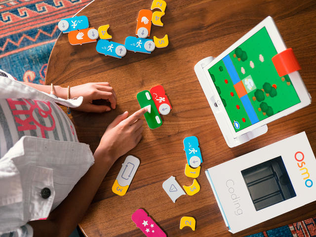
That's the idea behind Osmo Coding, the latest game to promise to help eager parents teach their kids how to program. The game borrows Lego-like design principles to transform abstract bits of computer code (if-then statements, loops, and so on) into colorful blocks that magnetically snap together.

Like many other programming games such as Robot Turtles, Osmo Coding asks kids to move a fun character to achieve a goal or move past obstacles using simple coding concepts. In Osmo's case, that character is named Awbie, a blue cartoon anthropophage and strawberry glutton.

Awbie is a digital character, living behind the screens of a nearby iPad, who asks children for help navigating around his island home and finding new fruit to eat. To move Awbie, kids snap together Osmo blocks for walking, jumping, or grabbing, into a chain of commands. Each command is modifiable with a counter, so by snapping a number onto the side of a block, you can tell Awbie to walk four steps ahead, or jump twice in succession. You can even loop commands.

One distinct thing about Osmo Coding is that the blocks are completely analog, even though they control a digital character. There's no Wi-Fi or Bluetooth in these blocks. Instead, Osmo Coding uses computer vision technology to recognize the colors and patterns of blocks placed in front of an iPad's camera and translate that into commands. That keeps the price of Osmo Coding cheap: The core game costs only $49.

But even though the blocks in Osmo Coding are quote-unquote "dumb," they were the most important thing to get right, says Osmo CEO and cofounder Pramod Sharma. "Physical interaction is still a really powerful way to teach children," Sharma says. "Comparatively, putting together something on a screen is still really hard for them." Kids still need to learn by play.

For inspiration on how their blocks should work, Osmo's team looked at what they saw as the core design principles of Lego. First of all, says Sharma, Lego bricks are intuitive: "Kids don't need to be told how to put them together." Osmo couldn't exactly steal Lego's extremely well-patented interlocking system, but by using magnets, it was able to mimic the intuitiveness of Lego. They snap together easily, and they're impossible to connect incorrectly.

Osmo also noted that, while colorful, Lego bricks are not explicitly gendered: "They come in colors that feel good to both boys and girls," says Sharma. That was a design trick Osmo decided to copy for its blocks, taking pains to choose primary colors that wouldn't subliminally discourage boys or girls from engaging.

Another important consideration for Osmo's blocks is that they be as expandable as Lego. Every kid who gets into Lego starts with one or two sets and builds their collection out over time; Osmo should do the same. So in the future, Osmo Coding might add new blocks, representing new commands. Since the "blocks" themselves are just physical tokens, which an iPad's camera translates into code, it should be easy to add new functionality over time and expand the library of blocks so that kids are constantly able to do new things.

"Lego inspired an entire generation of engineers," says Sharma. "We want to try to be the same thing for the next generation of coders."

These Woven Chairs Are Like Flyknit For Butts

$
0
0

What Nike's Flyknit technology does for your feet, Benjamin Hubert of U.K. design consultancy Layer wants to do for your butt and your back. Alongside the contemporary home furniture brand Moroso, Hubert has created a pair of attractive new chair designs that apply the same design principle behind the use of 3-D knits in high-performance footwear to the living room.

His Cradle collection was born out of Hubert's frustration with the visual heaviness of most living room furniture. "The thick, heavy blocks of foam wrapped in textiles seem like such a dated approach [to furniture design]," Hubert says. Instead, he wanted to create a living room chair with the same sort of light material efficiency as Herman Miller's Aeron chair, which uses a highly breathable technical knit stretched across a light frame to support the back.

The Cradle family comprises a high-back chair, a low-back chair, and a room-dividing screen. Each is made of a lightweight aluminum frame, stretched through a three-dimensional knitted textile. Woven using similar 3-D knitting technology used by Nike's Flyknit, the textile is both supportive and elastic. This isn't just any textile, though: When you sit in one of the chairs, apertures that are specially knitted into the pattern of the fabric open up, allowing your lower back or head to comfortably sink into those areas—while the rest of the knit offers support.

Hubert admits the focus of the collection is the chairs, but calls the room divider an "easy win." It's still quite beautiful, though. Using the same textile as the Cradle chairs, the screen is slightly transparent, and has hinges knitted into the weave of the fabric to allow the screen to fold.

Although the Cradle chairs have an undeniable aesthetic appeal, the benefit of using a 3-D knitted textile isn't just visual. Because most of the chair's surface area is made up of a thin weave stretched around a metal frame, the chairs needs only a fraction of the material of other chairs to handle the same weight and support. In addition to the material efficiency, it's also easier to clean, and costs less to manufacture.

"There's a lot of talk about smart furniture in the industry right now, but you don't need to put circuits in your furniture to make it smarter," says Hubert. "I think using less to do more is an even better way to make furniture smarter."

Why Type Designer Tobias Frere-Jones Follows Trends, Not Rules

$
0
0

Co.Design has partnered with the Brooklyn design studio Hyperakt to bring you Lunch Talks, a video series of conversations with smart, creative people.—Eds

Having designed over 700 typefaces, Tobias Frere-Jones is as close to a living legend as the modern typeworld has. As a former partner at Hoefler & Frere-Jones (now Hoefler & Co) and the principal designer of Frere-Jones Type, Frere-Jones has designed fonts for the Obama 2008 campaign, the New York Times, the Whitney Museum, and even Martha Stewart.

In this video, Frere-Jones explains what got him into type design in the first place. ("It was an intersection between being a writer and working with language and being a painter and concentrating on form that I never thought I'd find.") He also shares the best compliment he ever got as a typeface designer: When the Wall Street Journal switched to his Retina typeface, an elderly reader wrote in to say that since the switch, he no longer had to put on his glasses to follow his stocks.

But it's not all reminiscing. Frere-Jones also goes over some of the design lessons he's learned in type, such as the fact that sometimes it's just as much a design decision to leave something alone as it is to change it, and that being able to recognize trends is perhaps the most important skill for a type designer to have: "There are few if any rules in typeface design, but trends provide reliable directions on the way things will move."

Has Cardboard Architecture's Moment Finally Arrived?

$
0
0

Houses built out of cardboard don't exactly scream luxury. The concept seems suited to playhouses at best, and homeless shelter at worst. But inspired by a crate of tomatoes, Dutch creator collective Fiction Factory decided there didn't have to be anything ugly or flimsy about a cardboard house. Their cardboard Wikkelhouses aren't just gorgeous—with proper care, the designers claim they can last 100 years.

Can a cardboard house really survive for over a century? After all, the dream of permanent cardboard architecture is nearly as old.

In the 1940s, Buckminster Fuller experimented with the idea of using corrugated cardboard instead of traditional materials. He was attracted to cardboard because it was low cost, environmentally sustainable, and recyclable. Fuller even ended up prototyping a house in 1944, using cardboard as a primary or secondary construction material, but ultimately shelved his vision—because it was so vulnerable to fire and water. Following his lead, some other architects also experimented with corrugated cardboard for the next decade, but ultimately, other alternative materials such as laminated plastic and Formica won out.

Stephen Goodenough via Shigeru Ban Architects

It wasn't until the Japanese architect Shigeru Ban started experimenting with the material in 1986 that cardboard architecture became a thing again. Like Fuller, Ban was attracted to the material for its cost, strength, and environmental sustainability. By 1994, Ban perfected a technique of using simple cardboard tubes and plastic tarps to create waterproof emergency shelters for Rwandan refugees, which he then continued to explore in dwellings in Turkey and India. Eventually, Ban became so good at his so-called paper architecture that he was able to erect more permanent structures, such as a paper schoolhouse in China, a cardboard concert hall in Italy, and even the Cardboard Cathedral in New Zealand, which is specced to survive for at least 50 years—and maybe longer.

The Wikkelhouse is more Ban than Fuller. It's a modular house that can be placed nearly anywhere. It's incredibly light compared to a traditional house; while even a light house might normally weigh 40 tons, the Wikkelhouse only weighs around 1,000 pounds per module, which can be pieced together to build larger and larger homes. It doesn't need a traditional foundation, and can be placed nearly anywhere—though it needs two concrete slabs and a few wooden beams to stay in place, guaranteeing that only hurricane-blast winds could actually pick it up.

The name Wikkelhouse comes from the Dutch verb wikkelen, meaning "to wrap." That's a reference to the process that makes the Wikkelhouse's cardboard walls sturdy. Each wall is made of 24 layers of standard corrugated cardboard, which is glued together and then wrapped up in a special foil to keep rain from turning the Wikkelhouse into a soggy mess while allowing trapped moisture to radiate outward.

What makes cardboard such a suitable house-building material isn't necessarily its strength, though. It's flexibility. Because cardboard is uniquely flexible, each Wikkelhouse can essentially be made from a single piece of cardboard, wrapped around a house-shaped mold. Not only does this increase the strength of the structure by minimizing the potential points of failure (there are no screws, nails, or joints in the Wikkelhouse to wear out) but it allows the structure to flex under stress while otherwise keeping its shape. The whole process was inspired by a company called Rene Snel, which invented a similar method of molding cardboard crates for fruits and vegetables, with each layer of cardboard increasing the box's overall strength.

But what about this claim that the Wikkelhouse can last 100 years? Anyone who has ever seen a cardboard box turn to mush in the rain would be rightly skeptical of such an assertion. Asked how a cardboard house can last 100 years, Monique Wijnands of the Fiction Factory tells me that it all has to do with proper care and conditioning. Cardboard, after all, is just another form of wood, and "wooden buildings last for decades when well conditioned," she says. "It's the same for ancient books. It's all about proper conservation."

So maybe the Wikkelhouse can last 100 years. As Shigeru Ban once said, "I believe that the material doesn't need to be strong to be used to build a strong structure. The strength of the structure has nothing to do with strength of the material." It's all about the design and the process. The reasons to embrace cardboard as a construction material—cost, strength, and environmental sustainability—are just as valid now as they were in Buckminster Fuller's day. It's just that new laminates and processes are finally making long-lasting paper architecture plausible.

With a three-room Wikkelhouse costing a little more than $28,000, it seems that cardboard architecture is poised to become just as much of a trend as cardboard furniture.

IKEA Redesigns Its Big Blue Bag For The First Time Ever

$
0
0

Short of Swedish meatballs and Billy bookcases, the simple blue-and-yellow bag (technically known as the Frakta) might be IKEA's most iconic product. Debuting in 1996, more than 3 million Big Blues are sold annually in America alone. As of writing, they cost around $0.99 each, can carry up to 30 pounds of stuff without ripping, and are rated for about 1,000 trips.

Despite being possibly the best-selling tote bag on Earth, though, the Frakta isn't fashionable (though some would beg to differ). Previous attempts to give the Frakta a haute-couture overhaul have been fetching, but expensive. Now IKEA's getting into the game itself—tasking the Danish design brand Hay to redesign the Frakta and making it fashionable at a low price.

While the original Frakta bags are emblazoned all over with the IKEA logo, Hay's revised bags come without any obvious branding. The blue-and-yellow of the old Fraktas is gone, replaced with an understated forest green and white pattern, which Hay co-founder Mette Hay says were chosen because they will be "long-lasting" and never completely out of fashion. In addition, the crinkly polypropylene material is gone, replaced with a thin woven fabric.

IKEA

The new bags should be available later this year, alongside the classic Fraktas. No price details have been announced for the new Frakta bag, though the material cost should be similar to other woven thin fabric totes you can pick up at stores and supermarkets. In other words, a little more expensive than $0.99, perhaps, but probably not more than a couple bucks apiece.

If you're one of the many, many, many people who give their Frakta bags a second life hauling around your laundry, carrying groceries, or carting your stuff to the beach, that slight premium will probably be worth it.


This Is Why Computers Crush You In Chess

$
0
0

There are more possible moves in a game of chess than there are atoms in the known universe. So how do computers, which are officially better chess players than humans now, know which moves to make and which to avoid? The Thinking Machine visualizes the thought process of a simple chess computer, as it traces its way through all of the possible moves it can make in a given game in real time.

Very roughly speaking, there are two objective ways of seeing who is winning a game of chess at any given time. The first is the numeric value of the pieces left on the board, where a pawn is worth 1 point, a knight 3 points, a queen 9 points, and so on. More important than points, though, is board position. Every chess piece on a board controls a certain range of squares, in that an opponent can't move to those squares without the threat of being captured.

So when computers think about chess, they tend to measure their performance against these metrics. They want to increase the relative value of their pieces compared to their opponent, while dominating the largest area of the board. Where it gets complicated is that they don't necessarily want to do it just for the next move, but three moves, five moves, and even 10 moves down the line. Computers literally need to think in multiple dimensions to track all the possible outcomes of even the simplest move.

You can see this at work in the Thinking Machine. The board is constantly pulsing with dark and light checkerboards showing which squares the computer sees as being most strongly controlled by which player. For example, if the square d4 is pulsing a dark checkerboard pattern, the Thinking Machine thinks that black has the biggest influence on that square in all the multiverses of moves it has plotted out so far.

When you make a move in the Thinking Machine, you can also see how the computer is thinking, not just about the move it will make next, but the move you will make in response. Orange lines traced between squares and pieces represent what the computer thinks black's move should be, green lines represent what the computer thinks white's responding move would be. As these lines overlay each other, they become brighter, representing what the Thinking Machine believes white and black's best moves are. Ultimately, the Thinking Machine tends to make moves along the paths of bright orange lines (black's best move, averaged across thousands of possible chess games), as long as they aren't connected to bright green lines (white's best move, in the same multiverse of possible moves.)

This all sounds extremely complicated, but believe it or not, this is actually an incredibly simple model of how chess computers work, based upon techniques pioneered over 60 years ago. Today's chess supercomputers are even more powerful. Try to visualize what's going on in their silicon cortex, and your screen might explode.

The Adult Coloring Book Trend Gets A Very Violent Parody

$
0
0

Modern Toss is a decade-old British cult comic by Jon Link and Mike Bunnage that is defined by its artists' misanthropic humor and a grubby art style, which looks like an anarchist's doodle book. It's not a style that would seemingly lend itself to the trappings of an adult coloring book, but Link and Bunnage have still figured out a way to adapt their unique sense of humor to today's mindfulness trend—with The Mindless Violence Coloring Book.

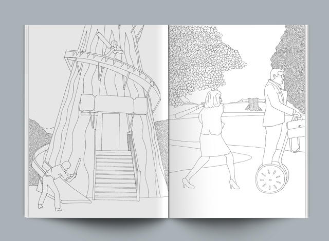
If the title didn't already clue you in to what scenes you'll be coloring in the slim 64-page volume, the official blurb will. "Achieve a mindful state as you color in these adrenalin-soaked scenes of mindless violence, created for you by a dedicated team of plain clothes therapists." Monochrome scenes in the book include "a man bending a lamppost; a woman setting about a fruit tree with a baseball bat; some blokes fighting over a parking space," and more.

Despite the orgy of violence on display, little of it is of the artery-spattering variety, so adding blood to the scenes in question is purely optional. Most of the scenes in the Mindless Violence Coloring Book have an almost dadaist quality to them, as men kick each other in the groin, strangle an inflatable floppy man, chase each other with cricket bats, and speed bag bird houses.

The ultimate sign of a design trend hitting its peak is the emergence of the inevitable mocking parody, presented without commentary. So in case you didn't think we'd already reached peak coloring book, consider it now official. You can purchase the Mindless Violence Coloring Book from Modern Toss for around $16 here.

A Designer's Guide To Apple's WWDC

$
0
0

On Monday, Apple will be holding its Worldwide Developer Conference, an annual gathering in which Cupertino traditionally announces all of the major changes coming to its mobile operating systems—as well as a new product or two, usually. That makes it a huge day for designers and design-lovers—not just those working within Apple's ecosystems, but those who want to stay up to speed on the company that made "Design is law" a commandment in Silicon Valley.

Until Tim Cook gets on stage on Monday, we can't know for certain about what Apple will announce. In the meantime, here are the main design topics we expect Apple to focus on at WWDC.

Siri Gets Smarter

Conversational interfaces are an important topic right now. Yet compared to the likes of Google Assistant and Amazon Alexa, Siri—the conversational interface that started it all—is hopelessly underpowered. Siri has none of Google's Knowledge Graph or contextual smarts, and unlike Alexa (which gets new features every week thanks in part to smart Amazon partnerships), Siri gets smarter at a glacial pace.

To put this in perspective, if you asked either Google Assistant or Alexa to order you an Uber, one would show up at your doorstep in just a few minutes. Siri, on the other hand? She probably wouldn't even transcribe the question correctly.

Next Monday, Apple is expected to take steps to finally make Siri competitive with her peers. It's believed that Cupertino will open up the Siri SDK to App Store developers, letting them tap into Siri's voice recognition engine for the first time. That would allow any app installed on your iPhone, iPad, or Apple Watch to be controllable by voice (as long as developers supported the functionality).

Considering that there are currently over 1 billion iOS devices in use around the world, and almost 3 million apps in the App Store, it could be a huge move in taking conversational interfaces mainstream. And it's not entirely unprecedented: On the new Apple TV, Apple has already opened up Siri to third parties, so users can use Siri's voice search feature on TVs.

It's also important for Apple to try to supercharge Siri now, before it's too late. Not only are conversational interfaces the key to controlling tomorrow's smart homes and wearables, but they're also the most natural way to interact with smart automobiles, like the much-rumored Project Titan Apple Car.

The Apple Watch Stops Sucking

Okay, okay. The Apple Watch is a flop. But that doesn't mean that Apple is going to give up on the Apple Watch. And at WWDC, Apple will likely tip its hand with regards to the Apple Watch's future direction as part of an announcement on the watchOS 3 beta.

So far, we don't know what Apple intends for watchOS 3. But it's easy to guess: As far back as last June, Apple made it mandatory for apps to be able to run natively on the Apple Watch without being connected to an iPhone. Since the Apple Watch doesn't actually have a cellular radio, that functionality ended up being pretty limited for any app that requires the Internet to work.

But now, we're starting to see smartwatch chipsets with integrated 4G or LTE radios hit the market. Google's Android Wear 2, in fact, added support for cellular radio connections back in May. It seems insane that Apple wouldn't do the same thing, heralding the debut of an Apple Watch 2 in the fall that would finally exist as something besides a mere parasite device to the iPhone.

What does this mean for developers or designers? Simply put: The Apple Watch might soon be a self-contained ecosystem that doesn't require an iPhone within range to be useful. If anything's going to make the Apple Watch a viable platform, this is going to be it.

A Whole New App Store

This one isn't a rumor, or a speculation. In an extremely rare move, Apple has flat out told developers before WWDC that the App Store is going to be making changes to the way it allows developers to monetize their apps. And since design doesn't exist outside of an economic bubble, this news is potentially huge for any designer who does business on iOS.

The major change is this: Previously, Apple only allowed certain kinds of apps to offer in-app subscriptions—publications, for example, or streaming services. Now, Apple's going to let anyone monetize their app through subscriptions. And while previously, Apple took 30% off the top of all App Store transactions, it's now making subscriptions more lucrative for developers. After the first year, Apple's cut of the subscription fee will drop down to 15%.

These sound, at first, like mere bookkeeping changes. But it's likely that they will have real design ramifications. Up until now, most developers have pursued small, single-serving apps on iOS—because that's what the App Store's monetization structure has supported. The result was a race to the bottom, in which the vast, vast majority of iOS apps are free. It's hard enough to monetize great app design, even when things aren't free.

If Apple allows developers to offer subscriptions to their iOS apps, things could get interesting. It incentivizes apps that keep on updating with new features, and keeps users engaged for more than a year. How developers will respond to these changes remains to be seen. But it could result in an App Store that is balanced toward more substantive apps with rapidly evolving feature sets.

iTunes Gets Overhauled

iTunes has been a design disaster for the better part of a decade. In fact, two years ago, we declared it so behind the times as to be totally irrelevant. Word has it, though, that iTunes will get yet another overhaul this year, to be announced at WWDC.

It's doubtful that it will solve any of the long-lasting design issues with iTunes, most of which deal with the fact that iTunes simply must have more functionality than is reasonable to build into a single UI: buy media, play local songs, stream media, sync connected devices, and so on. But tweaks are expected, which will also hopefully put Apple Music, its Spotify competitor, on the Mac for the first time ever. If nothing else, it will be interesting to see how Apple's design team tackles this thorny challenge.

New MacBook Pros

The last major update to the MacBook Pro came almost four years ago, when Apple updated its top-of-the-line laptop to a Retina display. Since then, except for spec bumps, the MacBook Pro has kept the same industrial design, even as Cupertino's computer line has gone in a radically different direction—toward crazy thin MacBooks that can be charged over USB power and boast a minimum of ports.

The new MacBook Pro may be unveiled at WWDC, and like the new 12-inch Retina MacBook, will abandon its old USB-A, ThunderBolt 2, and MagSafe 2 ports in favor of thinner, lighter USB-C and Thunderbolt 3 ports. It's also believed that the new MacBook Pro will abandon its physical function keys for a context-aware OLED touch screen, which will allow app developers to reprogram the MacBook Pro's keyboard with the most relevant shortcuts—complete with custom icons.

A New iOS Home Screen?

There isn't much information about what design changes will occur in the next iteration of Apple's mobile operating system, iOS 10. Or the next version of OS X, which all evidence indicates will be rechristened macOS this year to match Apple's branding schemes for iOS, watchOS, and tvOS. That's not to say they aren't coming! Just that the rumor mill hasn't caught onto them yet—and they don't appear to involve drastic refreshes, like previous years.

That said, at least a few of Apple rumor sites have a likely hypothesis: that iOS 10 will be custom-tailored to better support the iPad Pro. For example, the default iOS home screen—which has gone virtually unchanged since the original iPhone was released in 2007—just isn't a good UI anymore, especially for giant screens like the iPad Pro, where most of the home screen ends up just being empty space.

Could Apple change how the iOS home screen works this year, at least on the iPad Pro? For example, by allowing Notification Center widgets to run on the home screen, like in Android? Unknown, but it seems possible, and if that happens, expect those changes to eventually filter down to other iPhones and iPads.

These Hypnotic Dresses Respond To Ambivalence

$
0
0

Fashion is not just about covering up our naughty bits, or even about expressing ourselves. It's also about causing the people around us to feel something when they see what we're wearing: delight, envy, puzzlement, lust, or even disgust.

Interactive designer Ying Gao is no stranger to making dresses that react to the ogling of viewers. She previously designed a photoluminescent dress that transformed when people stared at it.

Her Neutralité dresses, though, takes things in a different direction. Called Can't and Won't, the dresses are evocative of microbial life. They are made up of lacy tendrils that gently undulate when viewed, thanks to robotic actuators running through the fabric attached to a facial recognition sensor — but only if the viewer keeps a completely neutral expression on his or her face. The second he or she begins to react to what he's seeing, the Neutralité dresses demurely stop moving, and go limp.

Gao describes her dresses as as much a fashion statement as a paradox. "[My dresses] demands a level of humility clearly out of synch with today's over-the-top expressiveness," the project's Vimeo description says. It's a Zeno Effect of a dress, which only moves as it's meant to when people feign to not be noticing it at all.

The London Underground's Iconic Typeface Gets A Redesign

$
0
0

There's no font as synonymous with a single city as Johnston, the official typeface of the London Underground. First commissioned in 1913 from its eponymous creator Edward Johnston to be used in London's Underground Electric Railway, Johnston today is used in all of Transport for London's signage and branding, as well as materials for the Mayor of London.

Over the past century, Johnston has evolved alongside the system it's most closely associated with, the Tube. As London has become more thickly populated, high-tech, and modern, its subways have become more cramped and antiseptic. The same is true of Johnston, says Malou Verlomme, senior type designer of Monotype. As the original design was transferred from metal to phototype, then again to digital, it lost some its roominess and quirkiness.

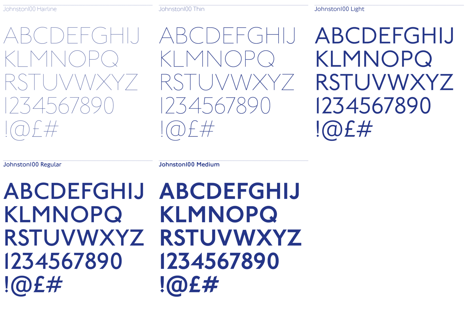
Those qualities are part of what Monotype is trying to bring back. Today, the type foundry is announcing a new remastering of Johnston called Johnston100. As the first major overhaul of Johnston to be completed since 1979, it's designed to bring Johnston more firmly into the 21st century with a new ultra-thin weight, perfect for today's high-res displays. It also tries to bring a little bit of Johnston's original spirit back, with wider characters, looser spacing, and a slightly more eccentric feel.

Typographic Manspreading
"With Johnston100, we wanted to try to bring back some of Johnston's relaxed feel," says Verlomme, "like the trains of the early 20th century that originally inspired it." This more relaxed feel is reflected in the slightly adjusted proportions of many of the characters: for example, the capital M and H. You could hardly call it manspreading, but compared to its direct predecessor, New Johnston, Johnston100's letters tend to feel more comfortable and less pinched.

Embracing The Quirks
Much of Monotype's work concentrated on trying to give Johnston back some of the eccentricity that marked the original design.

"When you look over Johnston's original sketches for this typeface, you can tell he wasn't really a typeface designer, but more of a calligrapher," says Nadine Chahine, type director of Monotype's U.K. offices. The distinction is that a type designer is always thinking of how a character's form will look when it's mass produced, while a calligrapher is more interested in its pure form.

For example, a character with delicate features that a calligrapher can draw might not work in type, because of how the ink spreads when pressed between paper and metal. Typeface designers also employ a lot of optical tricks to make things "look right," even if, geometrically, they're "wrong." Horizontal strokes are a good example. They look thicker than vertical strokes to people because of an optical illusion. Type designers would make these strokes thinner to compensate, while a calligrapher would not.

Edward Johnston didn't really bother with these sorts of type designer's tricks, resulting in a typeface with some idiosyncrasies. Johnston (the font) is almost chimeric, straddling both geometric and humanist schools of sans-serif type design. Yet somehow, this works. "It's like the Mona Lisa," says Chahine. "Sometimes when you look at it, she's smiling, and sometimes, she's frowning. This typeface is the same. Is it geometric, or is it humanist? That's the secret to its appeal, and why it's so loved."

If Johnston is the Mona Lisa of fonts, though, attempts to tweak the typeface over the years to make it more robust and flexible sometimes resulted in the corners of her lips being pulled up or down a shade too far.

Chahine admits many of these tweaks seem extremely tiny, and maybe even invisible, on their own. "That's the difference between designing a new font, and remastering one," she says. "It's all about subtle little differences, applied with a masterful touch, not about totally redesigning what a letter should look like." Still, they're there if you know where to look: the diamond dotting the lowercase 'i' and 'j' isn't nearly as high in Johnston and Johnston100 as it is in New Johnston, while the top half of the lowercase 'g' has been stretched out to be less perfectly geometric, like it was back in the early 20th century. The end result, Monotype hopes, is a typeface that is closer to Johnston's original intent, feeling more personal and less utilitarian than it did before.

New Characters
Ironically, this is a change which is most obvious in two characters that Johnston didn't actually design himself: the @ symbol and the hashtag symbol. While major typographical marks in the digital age, Johnston originally didn't contain these symbols, and when eventually added, they were ill-proportioned and generic. Johnston100 redesigns these symbols to feel native to the typeface, giving the hashtag Johnston's pointy strokes, or giving the @ symbol geometric shoulders.

Going forward, Johnston100 will be used in all of Transport for London's new signage and branding materials. It will be particularly highlighted in the construction and branding of London's new Cross Rail Elizabeth line, which is due to open in 2018. With any luck, Monotype's work on Johnston100 will be enough to keep Johnston synonymous with London for another 100 years.

All Images (unless otherwise noted): courtesy Monotype. Cover background photo: Flickr user Dunja Klar

Viewing all 2739 articles
Browse latest View live